Brenvia Engineering Group
Identity, design system and homepage for a Madrid group that builds, secures and runs IT for regulated companies.
Not a real company. Brenvia, its people, clients and every figure in the mockups are fictional, made for this portfolio concept.
A homepage that doesn’t say who answers the phone.
I started by reading a typical Madrid IT consulting group homepage the way a buyer, or a hiring team, would. The same problems kept coming up.
- The hero is a stock photo of smiling consultants and a line that could belong to any company.
- Section order wanders: sister companies, an essay, services, a training calendar, method, clients, certificates, cases, then a second essay.
- Services, sister companies and the in-house product are spread across the page, so nobody sees what the group does and who does it in one place.
- There is no single next step: no phone, no incident line, and a contact form that asks for the visitor’s tech stack before their problem.
- Trust is thin. Client names sit in body copy, certifications are logos without captions, and the cases have no outcomes.
- On a phone the page runs to more than twenty screens, and the cookie banner covers most of the first one.
The brief I set myself: one clear promise, one place that shows the whole group, and proof that the operations side works, shown rather than claimed.
Two routes through one tile.
The name is built on “via”, route in Spanish. The mark is a rounded tile, read as a network port or a block of the city grid, cut by two routes that turn at 45 degrees. One route ends in a lime node, the live point on the network.
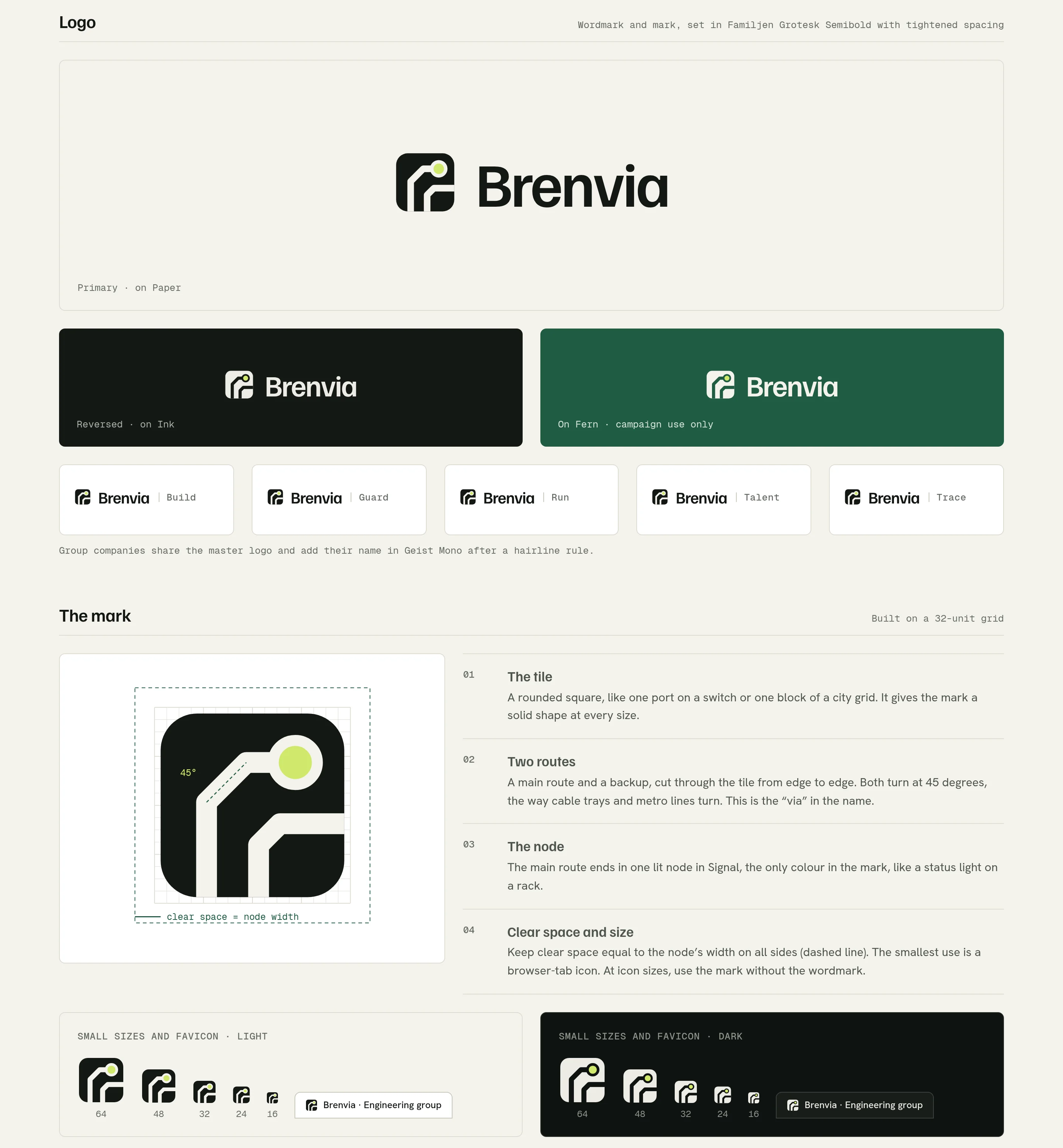
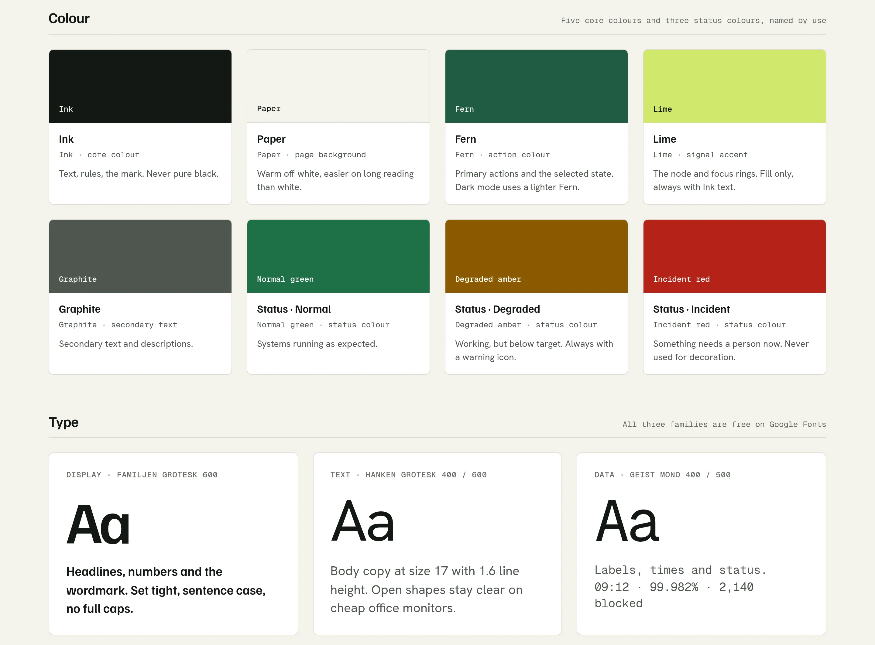
The palette is warm Paper and Ink, Fern green for actions, and lime used sparingly as a signal. Familjen Grotesk sets the headlines, Hanken Grotesk the body, and Geist Mono the data: times, figures and status labels.
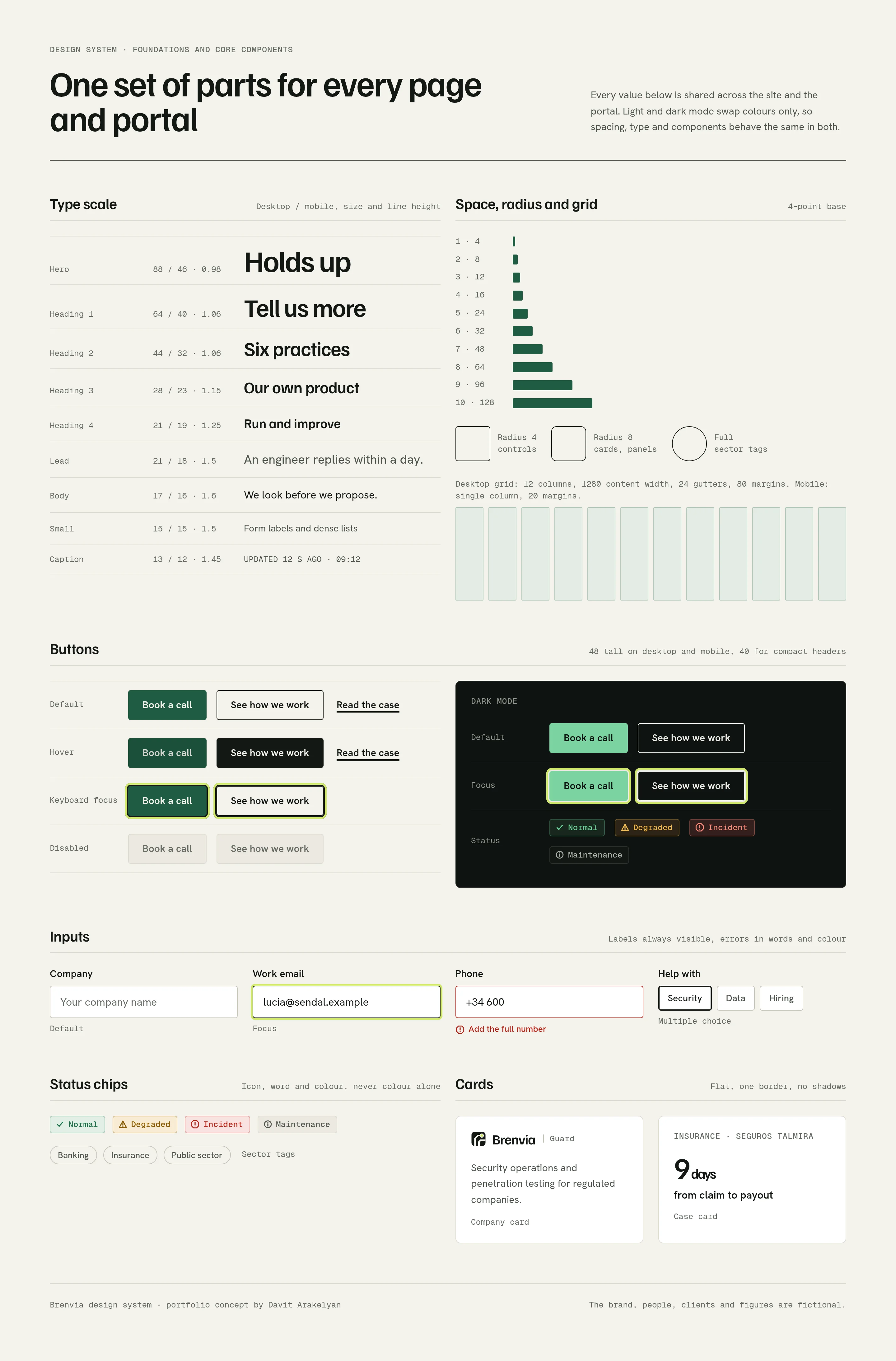
One set of parts for the site and the client portal.
The system sets colour for light and dark, a type scale, spacing, corner radius and a twelve-column grid. Dark mode swaps colour only, so every part keeps its size and rhythm.
Buttons come in four states, plus dark. Inputs, status chips and cards share one radius and one line weight, and status chips always pair colour with an icon and a word.
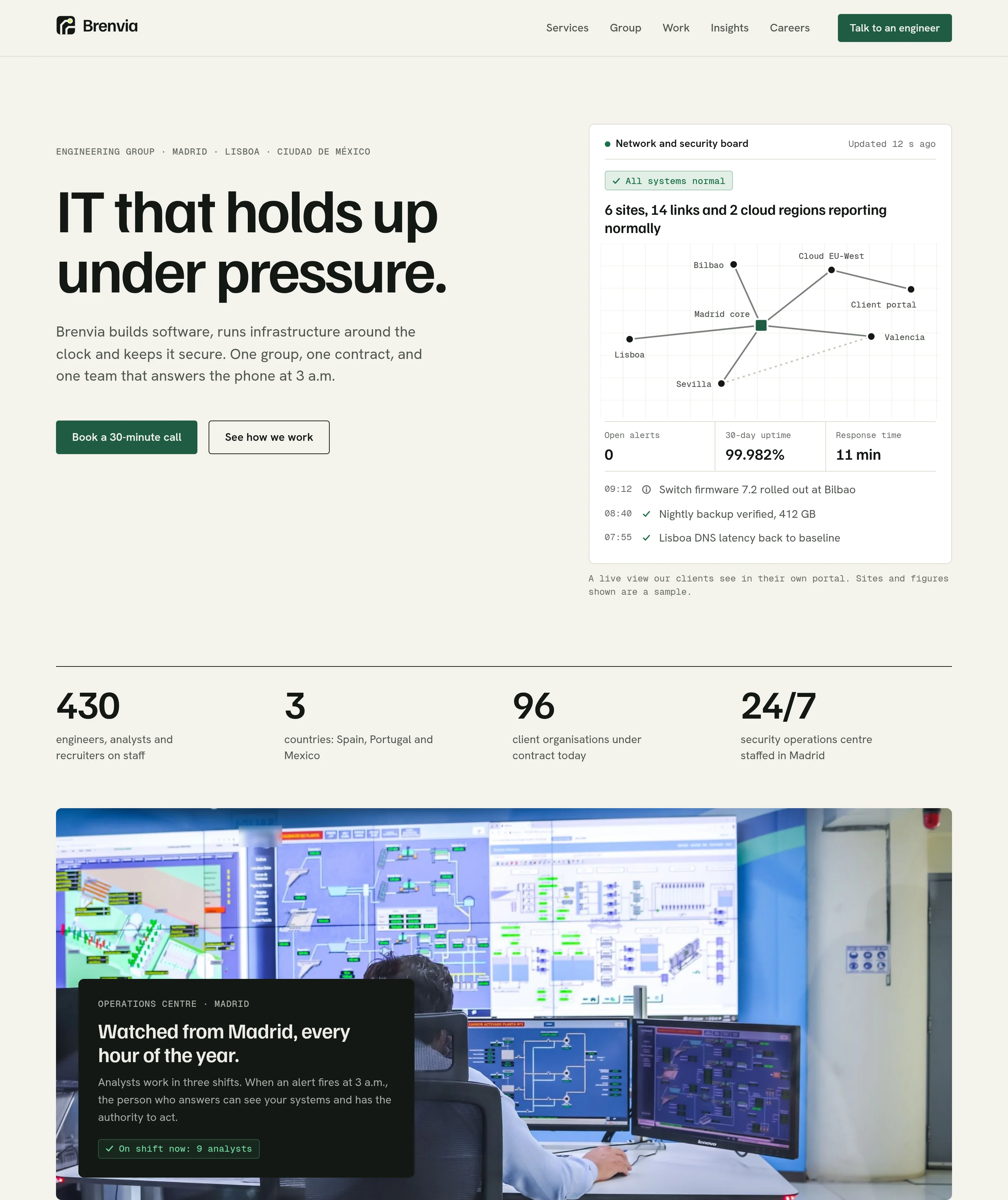
What we do, who does it, and proof that it works.
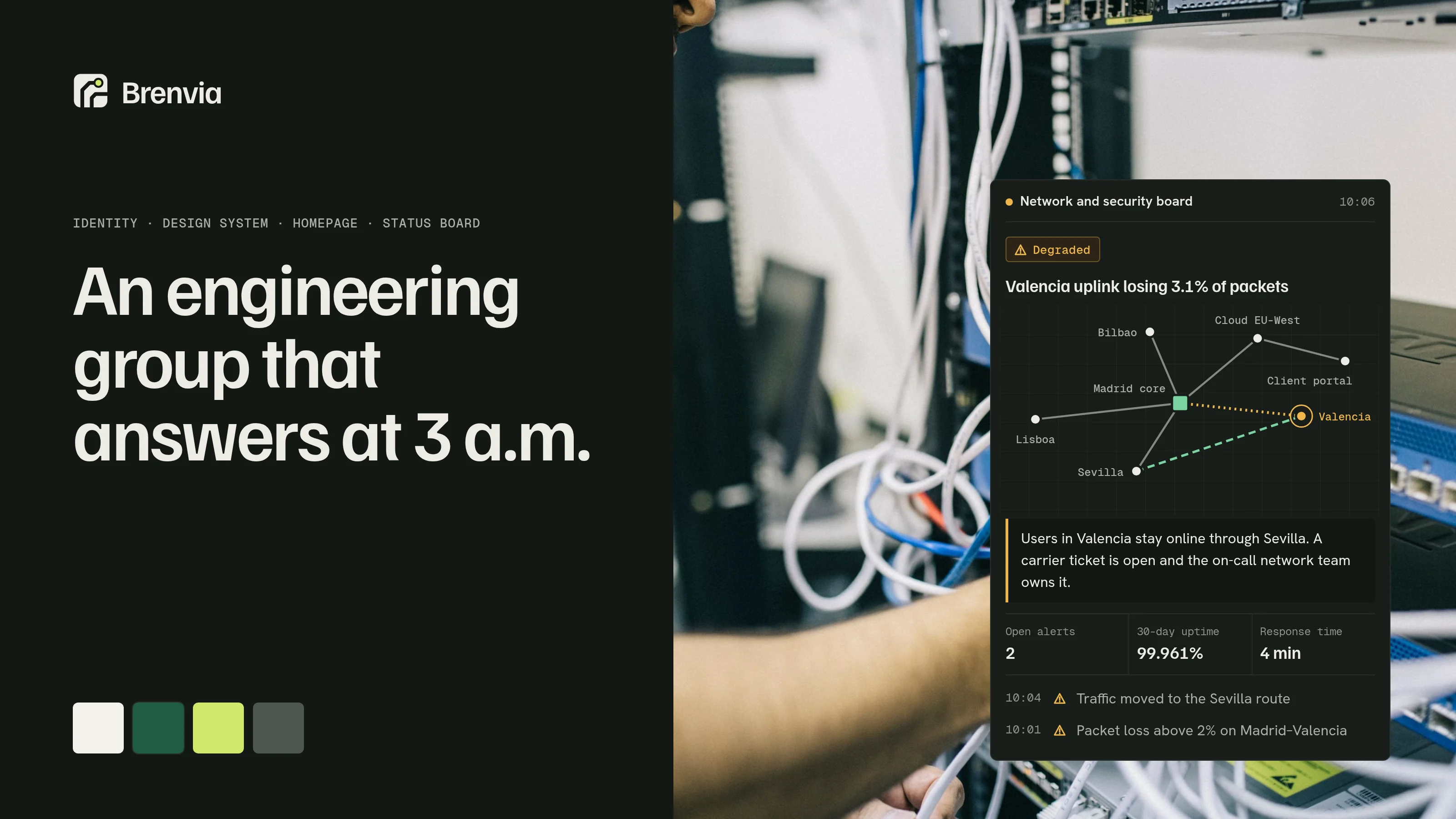
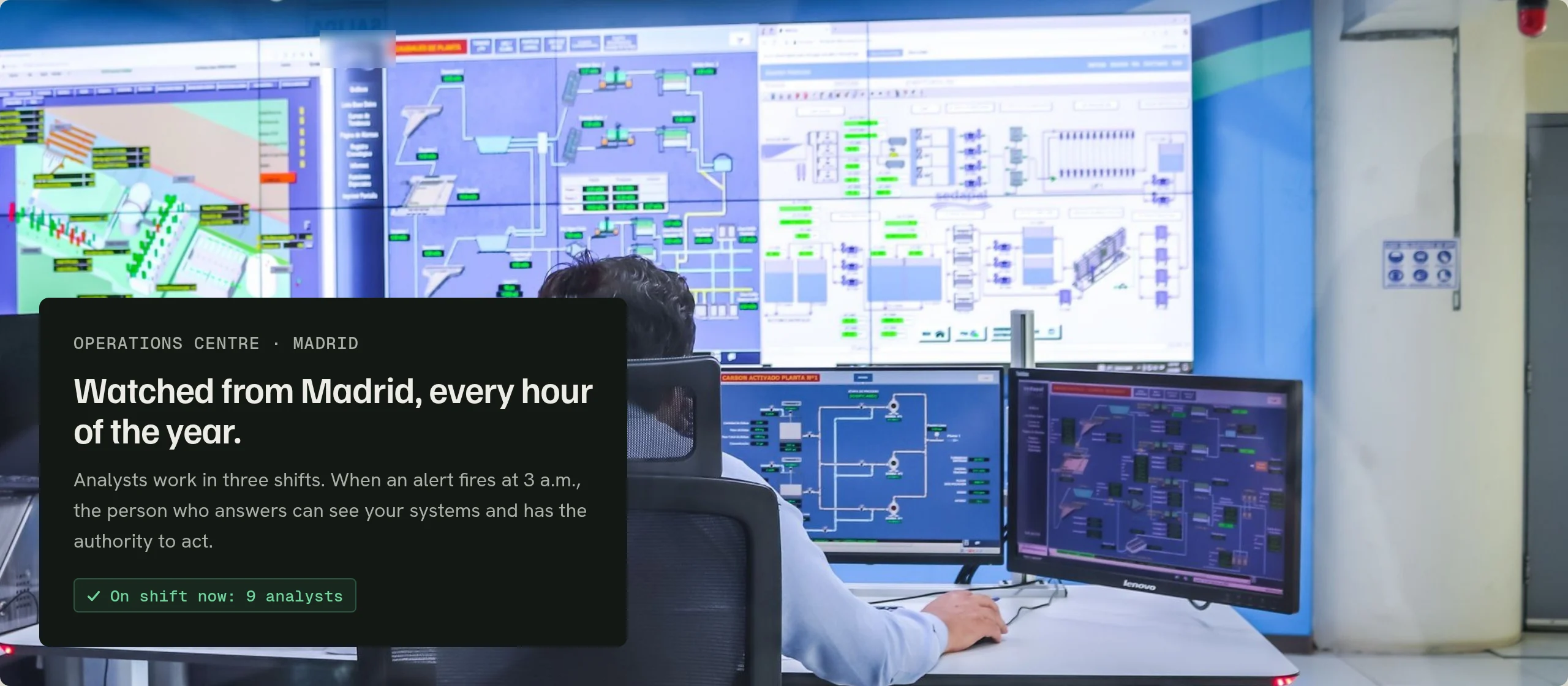
The hero makes one promise, “IT that holds up under pressure”, with the live status board beside it instead of a stock photo. Below it sit four plain facts about the group and a banner from the operations room.
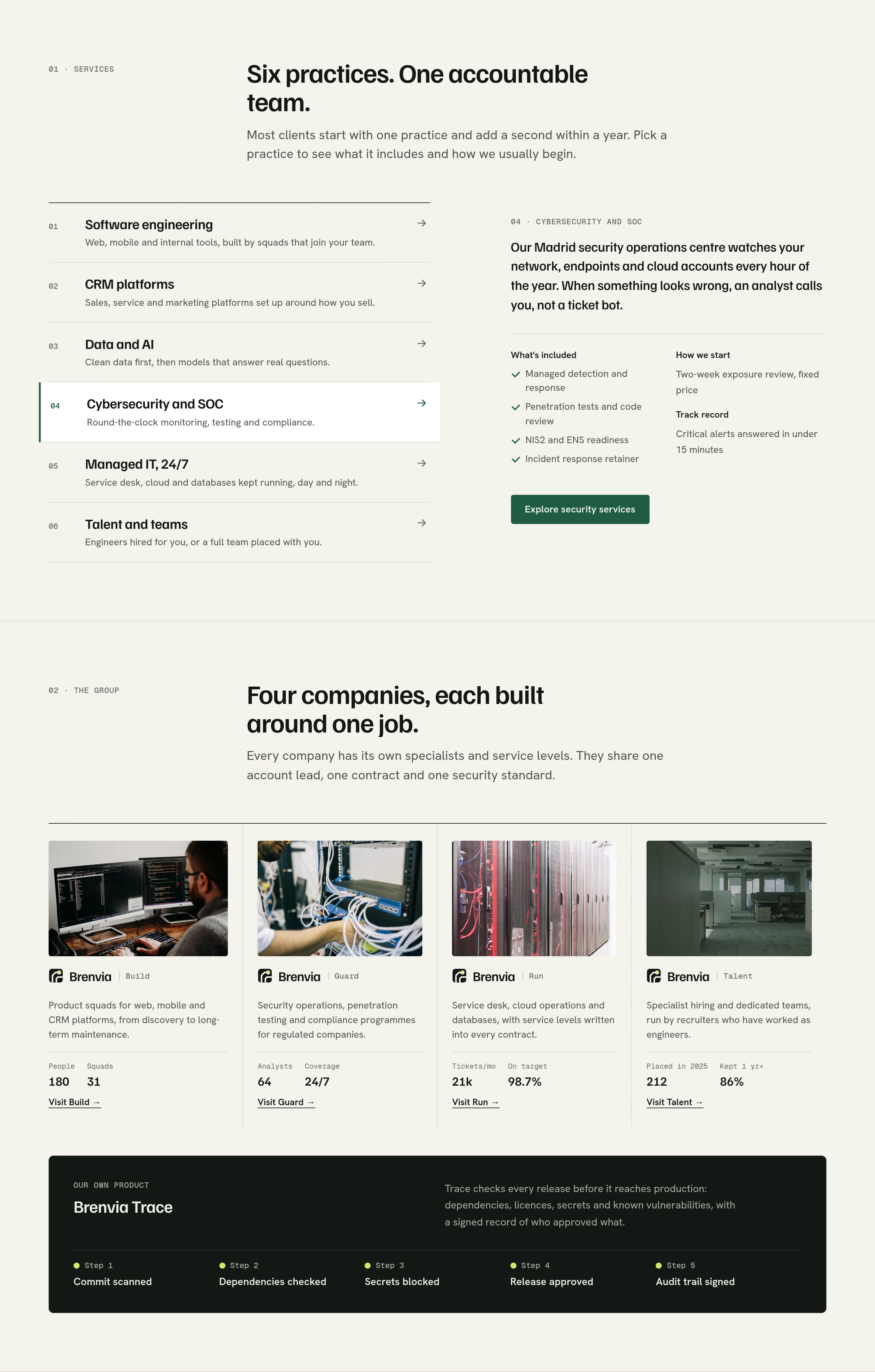
Six practices sit in one explorer, tabs on desktop and an accordion on mobile, and each names the company that delivers it. The four group companies follow, each with a photo of its kind of work, then a four-step method that starts with an audit before any proposal.
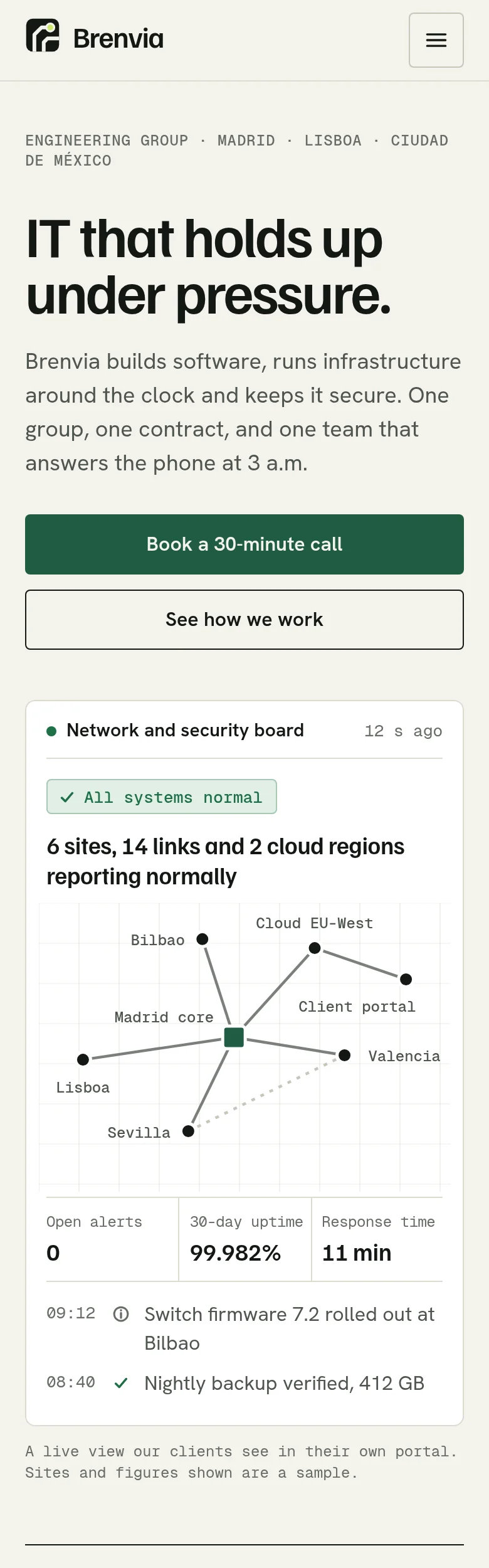
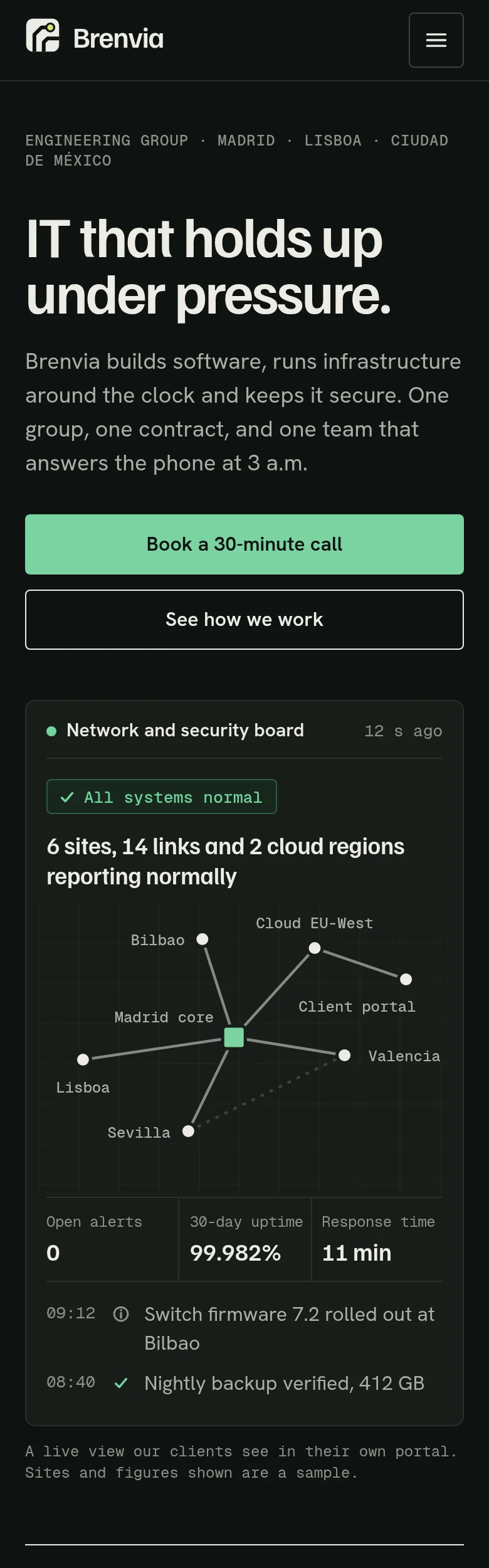
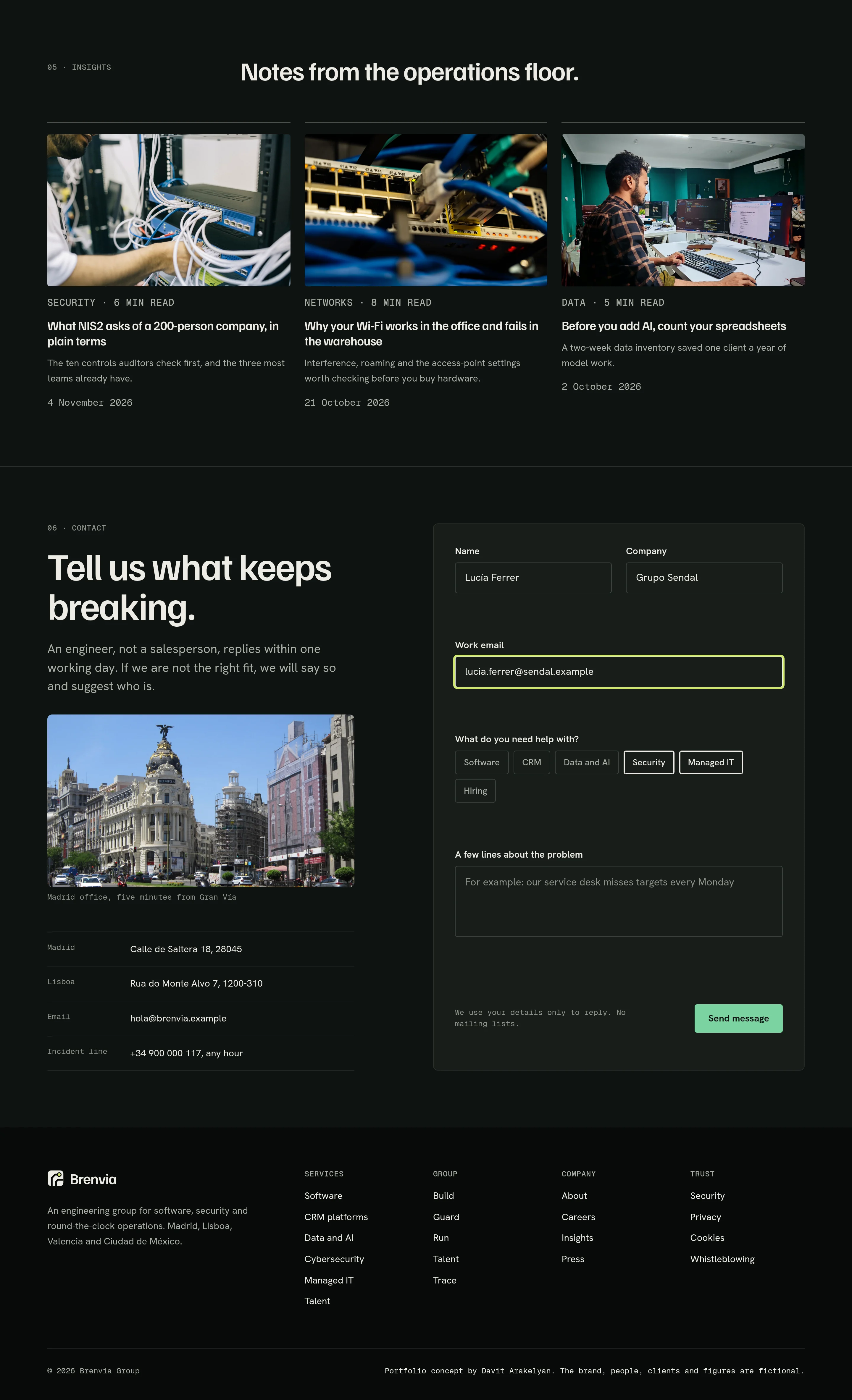
Regulated sectors come with their outcomes, the ISO certifications sit right next to them, and the contact form asks about the problem first. A direct incident line is listed for any hour.
Three states, written as sentences.
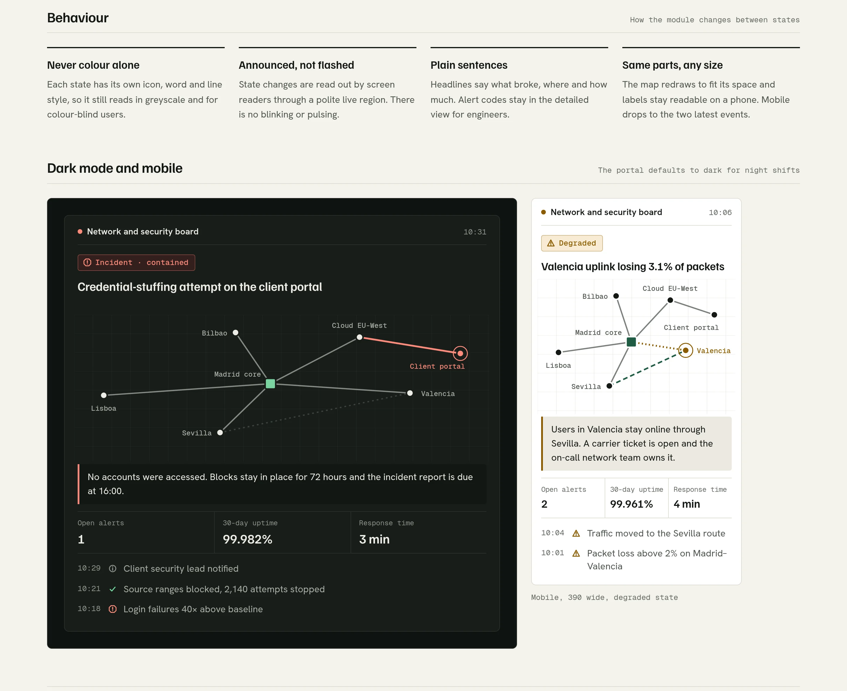
The board is the proof on the homepage and the main view in the client portal. It shows a fictional network of six sites, two cloud regions and a client portal in three states.
- Normal: everything reports in and the board stays quiet.
- Degraded: the Valencia uplink loses packets, traffic moves to the Sevilla route, and a note says who owns the fix.
- Incident, contained: a login attack on the client portal, with the impact stated first: no accounts were accessed.
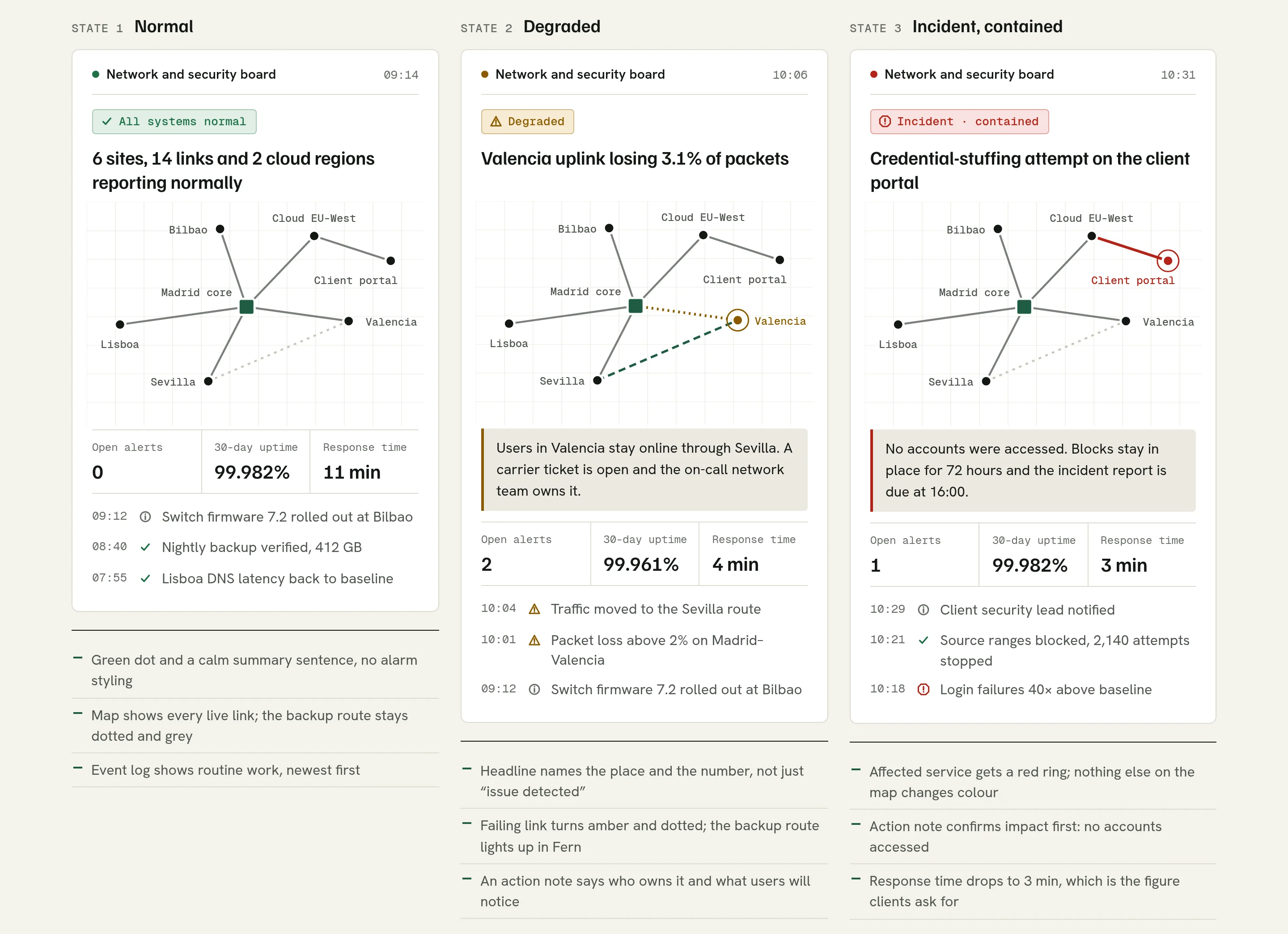
Each state has its own icon, word and line style, so it still reads in greyscale. Changes are announced to screen readers without blinking, and the map redraws to fit its space, from the hero down to a phone.
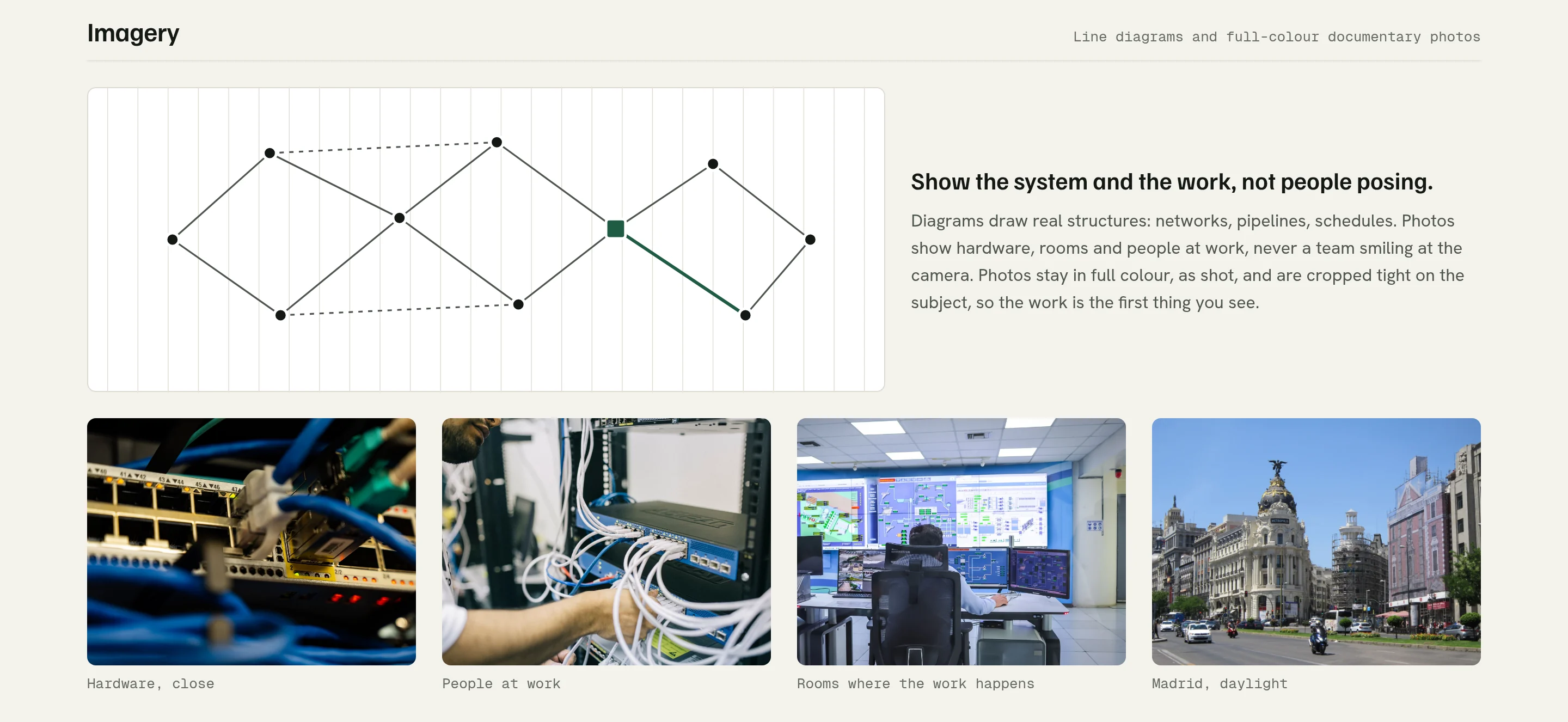
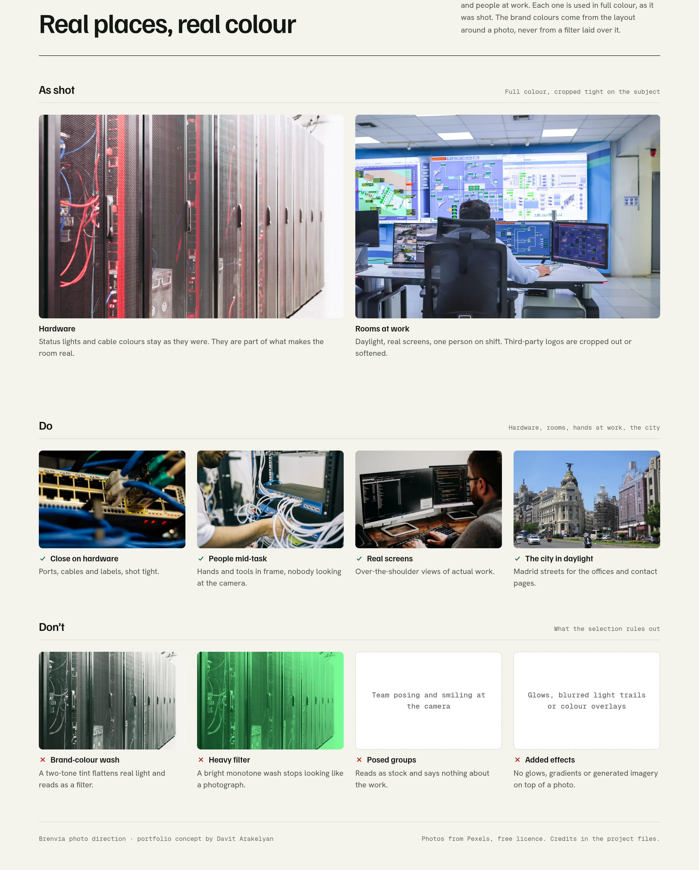
Real photos in full colour, and the identity at work.
The photos are free-licensed documentary shots of hardware, an operations room, engineers at work and Madrid. They run in full colour, as shot, cropped tight on the subject. The brand colours come from the layout around each photo, not from a filter laid over it.
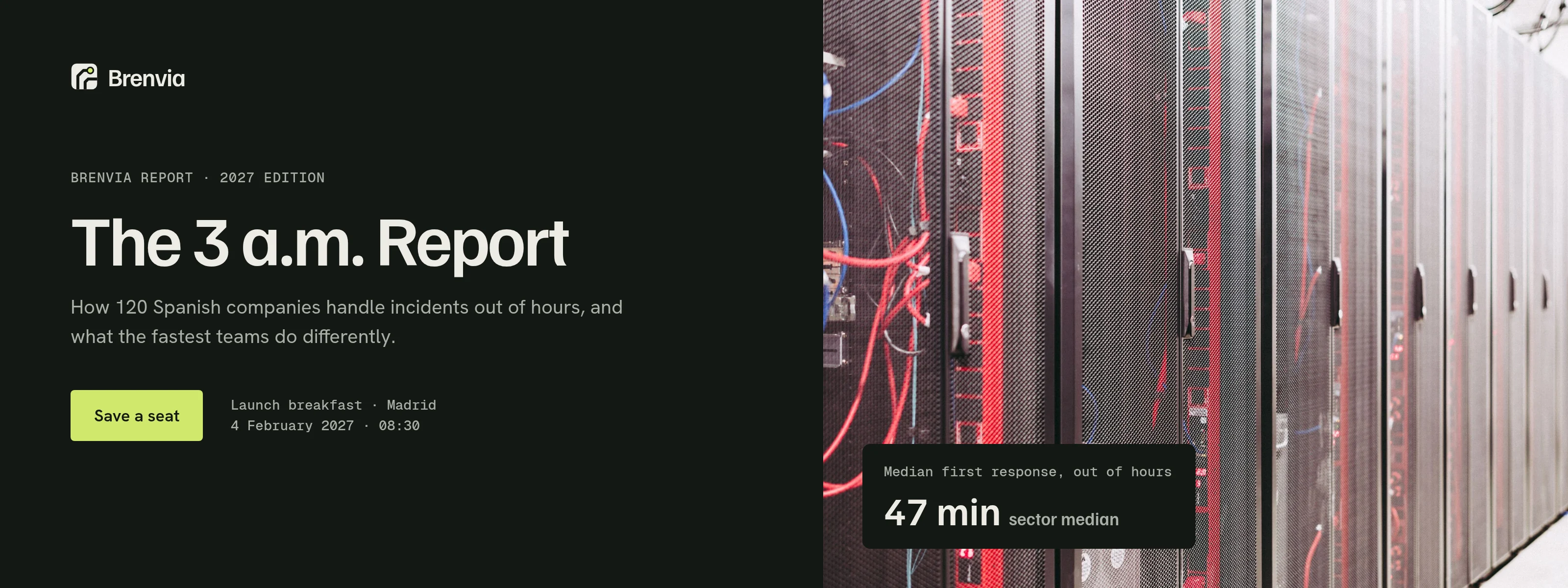
The banners take the identity outside the website: a section banner for the homepage, a launch banner for an invented report, a portfolio cover and three social posts.
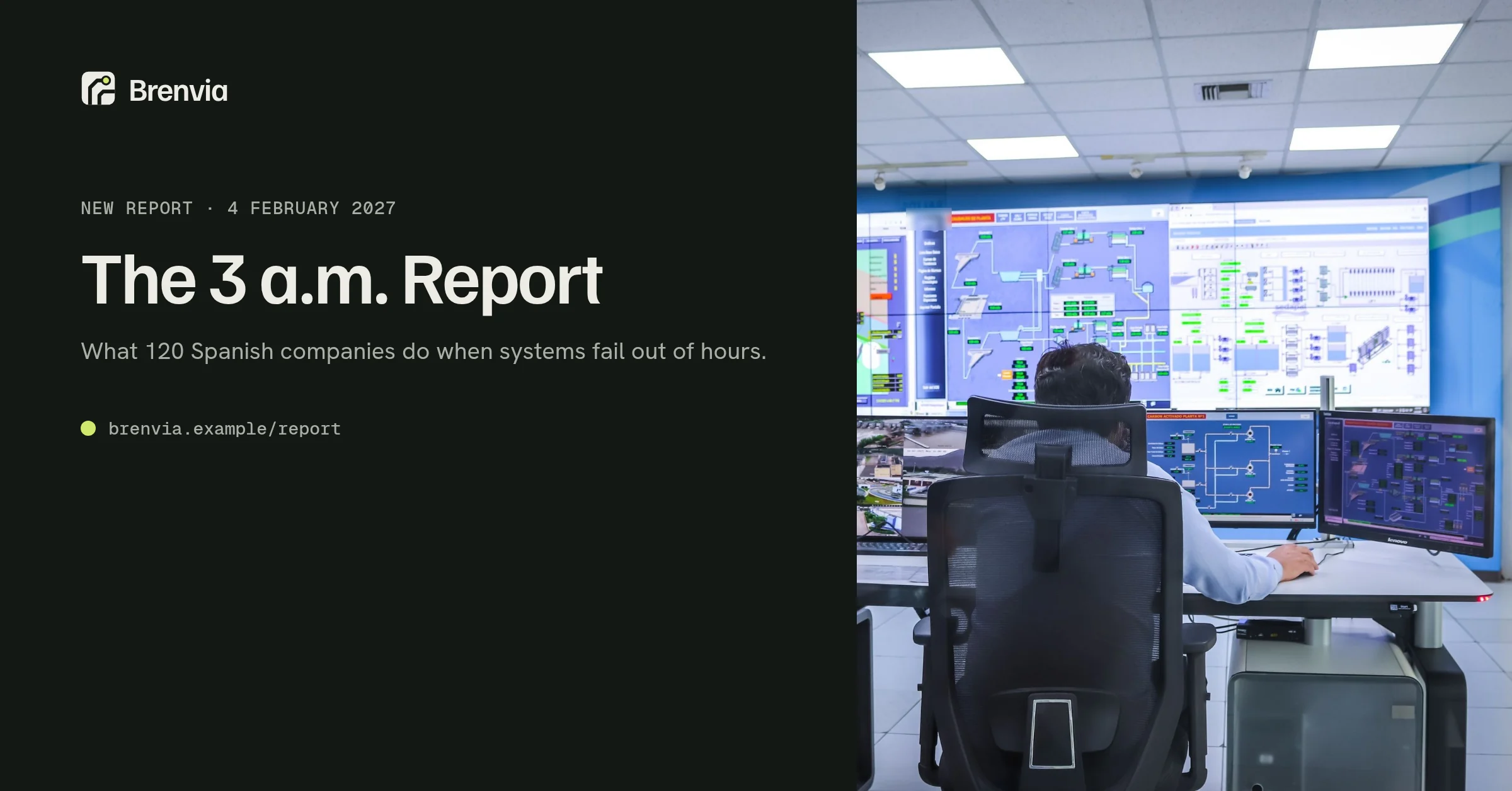
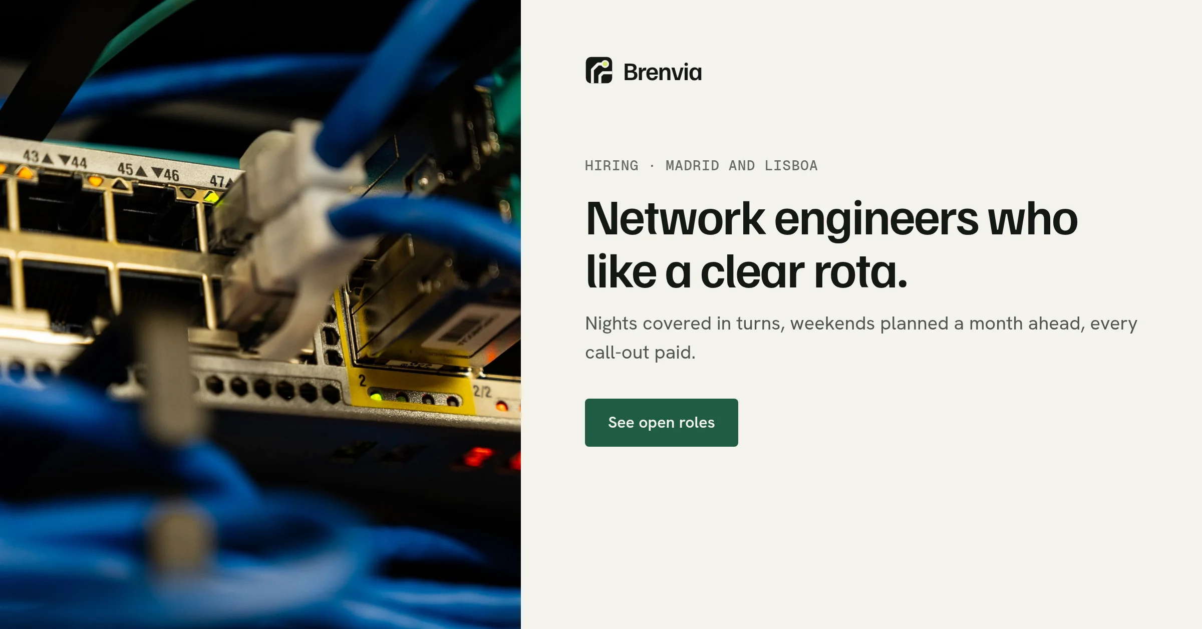
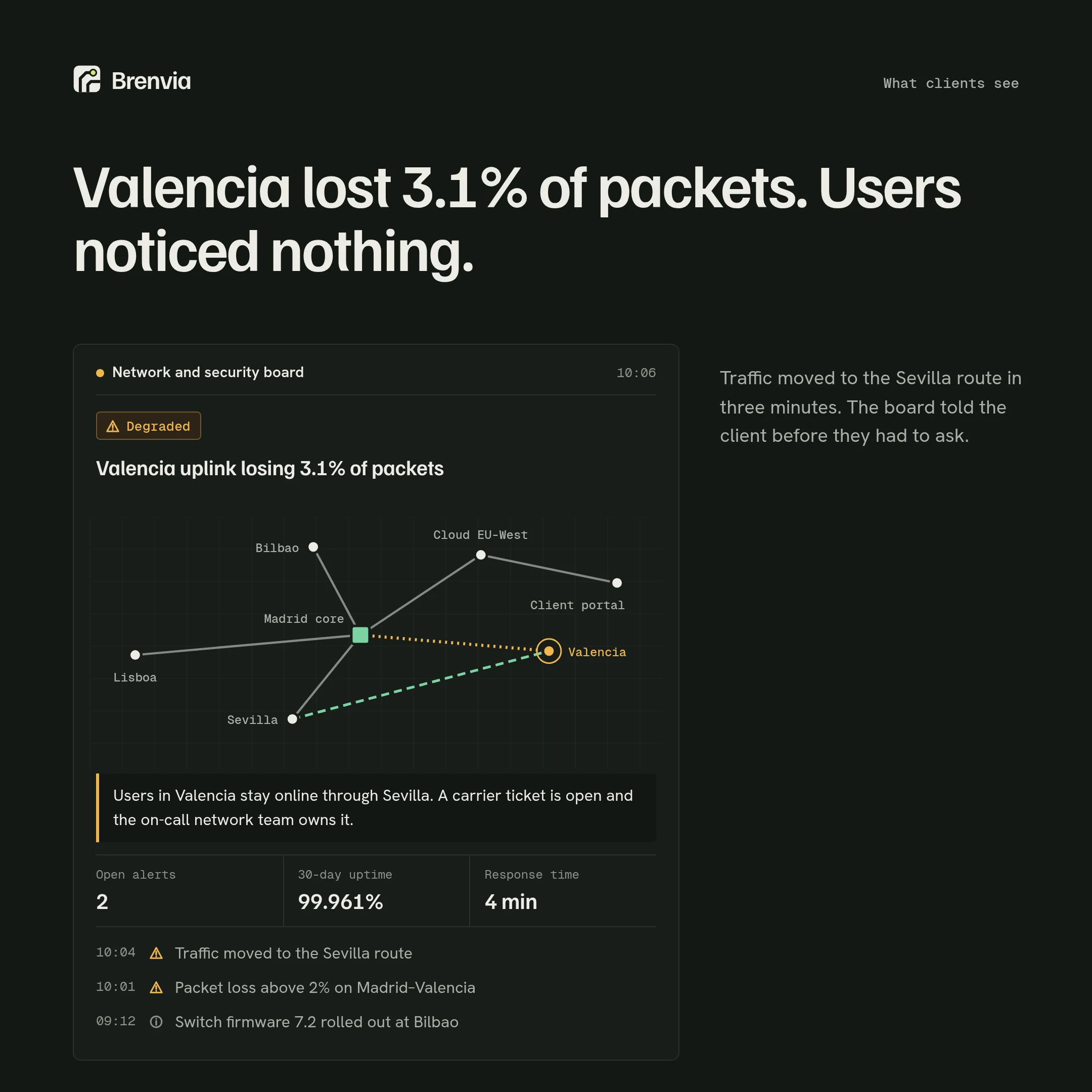
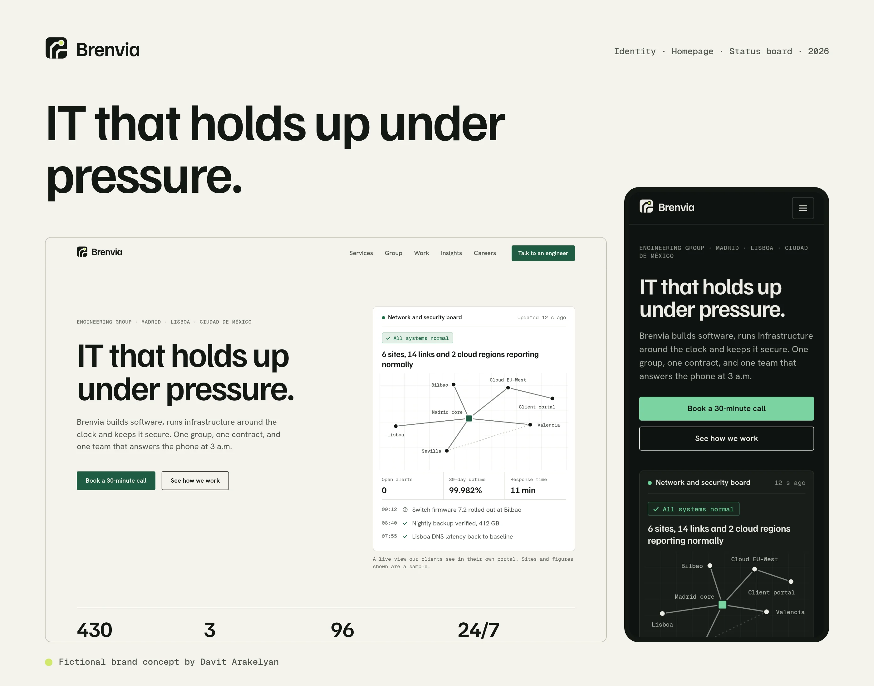
Photos from Pexels, used under the Pexels License. Photographers are credited in the project files.
What I’d test next
- Whether buyers trust a live status board on a homepage or read it as decoration. A five-second test against a version with a photo hero would show it.
- Whether “IT that holds up under pressure” beats a line that names the services, judged by how many visitors open the practices explorer.
- How quickly IT managers find who delivers a given service, on a phone.
- Whether the incident line gets real incidents or sales calls, and what that means for where it sits.
- How the full-colour photos hold up at small sizes in social feeds, next to brighter posts.
Tellroom Video Platform
AI video platform concept
View case study →← Previous: Sixwell Multi-brand Fashion Store