Tellroom Video Platform
Identity, design system, homepage, a try-it module and pricing for a London platform that turns a few lines of script into a presenter-led video.
Not a real company. Tellroom, its people, customers and every figure in the mockups are fictional, made for this portfolio concept.
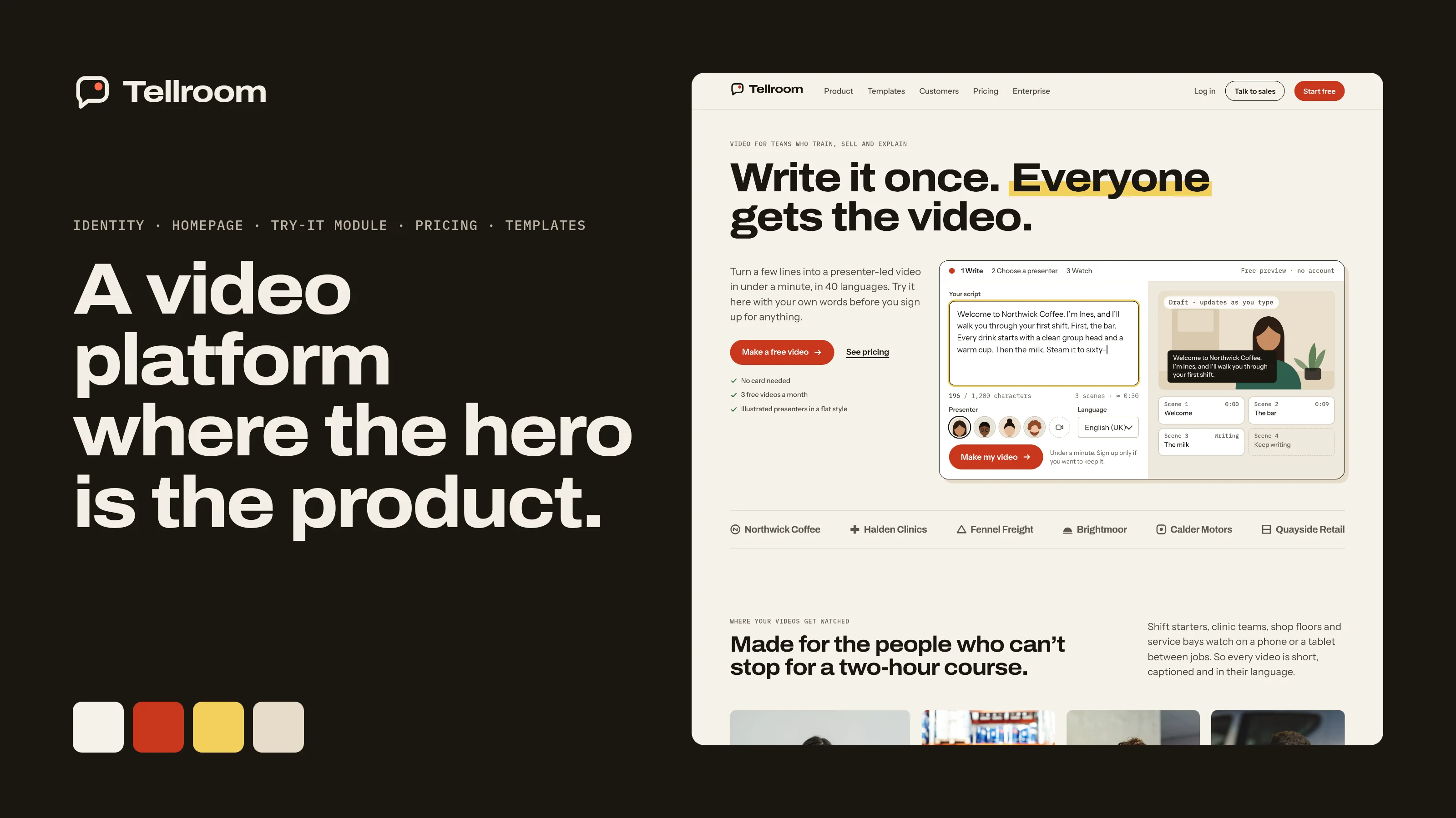
A homepage that asks you to sign up before you see the product.
I started by reading a typical AI video platform homepage the way a buyer, or a hiring team, would. The same problems kept coming up.
- The hero is a promise and a button. The product itself only appears after sign-up, so the visitor has to take it on trust.
- The same two buttons repeat down the page and again across pricing, so none of them says what happens next.
- Pricing counts in several different units at once, so nobody can work out what a month of video will cost their team.
- Colour and type follow the category defaults, blue-violet and soft gradients, so the brand is hard to tell from its neighbours.
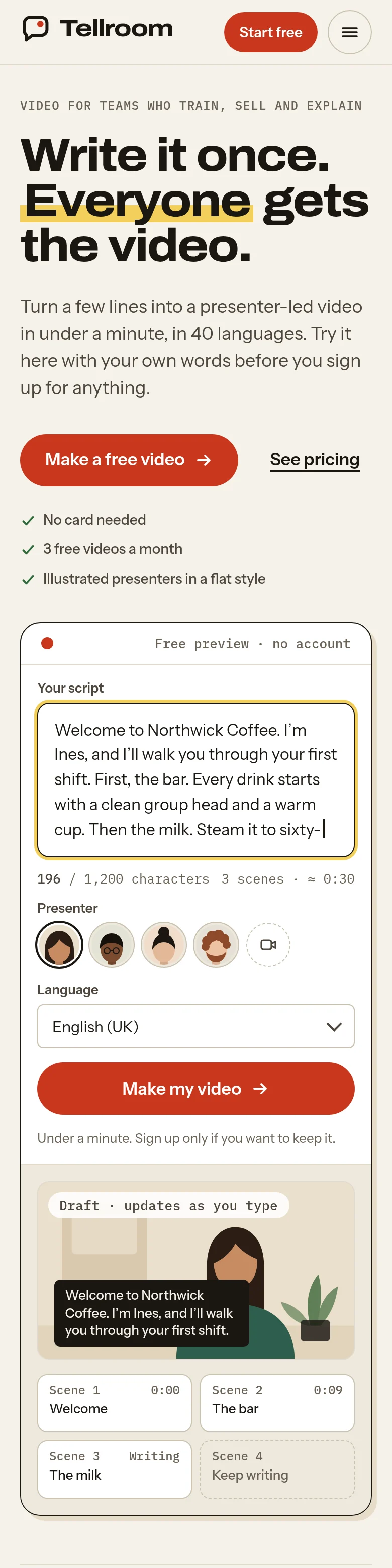
- On a phone the homepage runs to dozens of screens, and many images have no text description for screen readers.
- Proof is thin where it matters: customer names without outcomes, and no sign of who actually watches the videos.
The brief I set myself: let people try the product in the first screen, price it in one unit, make the brand unmistakable, and show where the videos are watched.
A speaking frame with the tally light on.
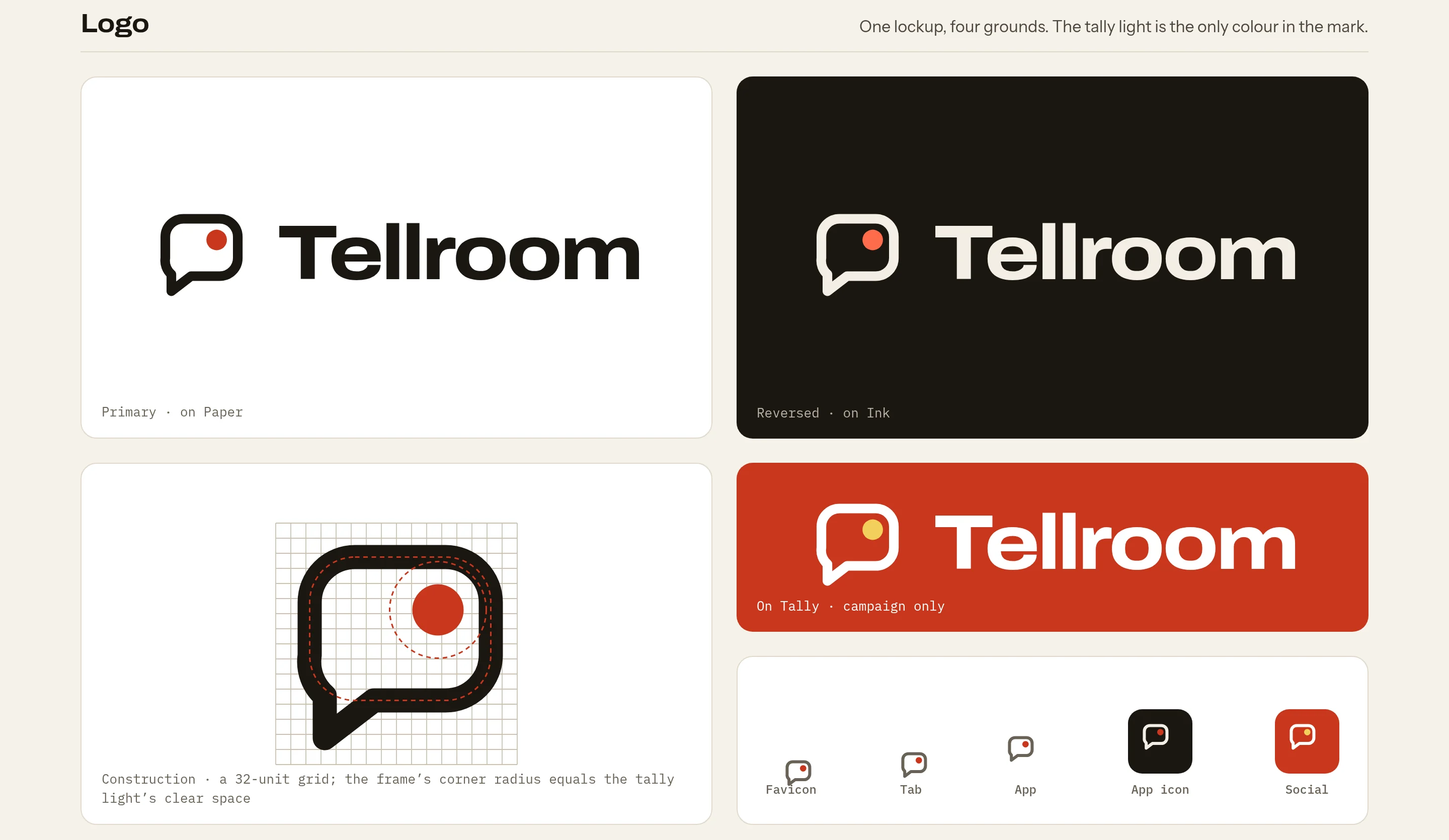
The name says what the product does: it tells a room full of people something. The mark is a speech bubble that is also a camera viewfinder, with the small red tally light lit in its corner, the light that comes on when you record. The light is the only colour in the mark.
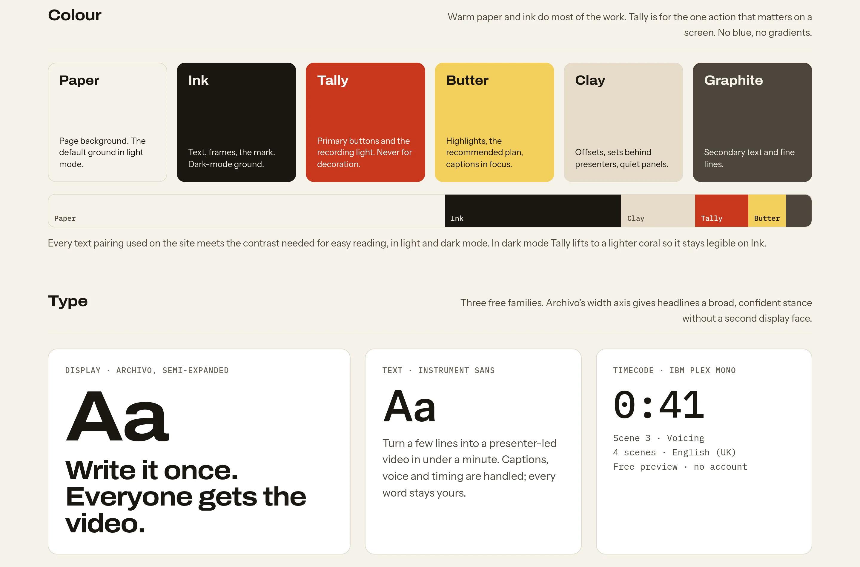
Warm Paper and Ink do most of the work. Tally red is kept for the one action that matters and for the recording light. Butter marks a highlight, and Clay quiets a surface. There is no blue and no gradient anywhere. Archivo, set semi-expanded, carries the headlines, Instrument Sans the text, and IBM Plex Mono the timecodes, counts and labels.
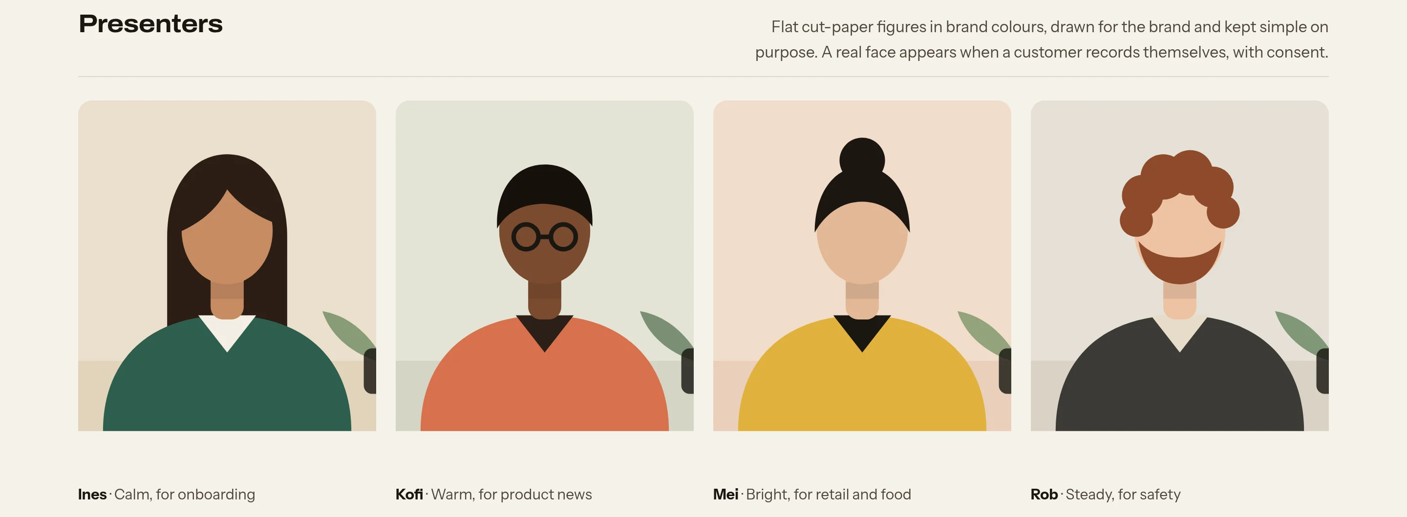
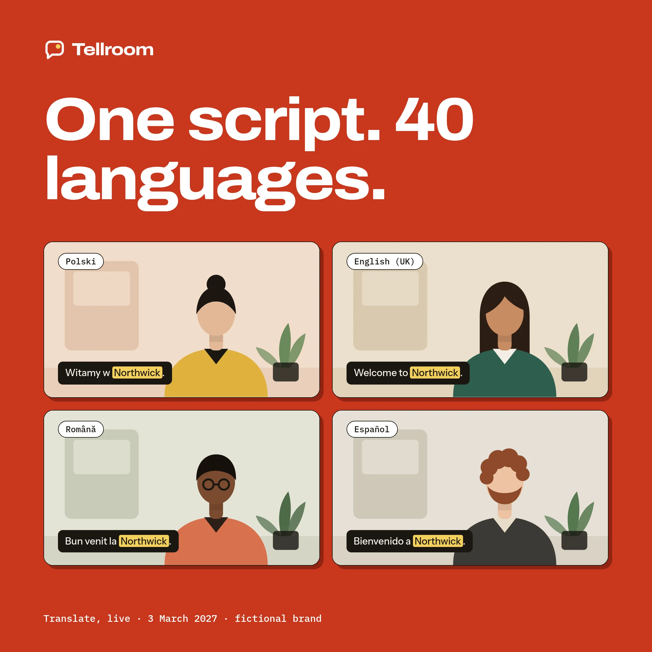
Presenters are flat cut-paper figures in the brand colours, drawn for the brand and kept simple on purpose. A real face appears when a customer records themselves, with consent they can withdraw.
One set of parts for the site, the product and the marketing pages.
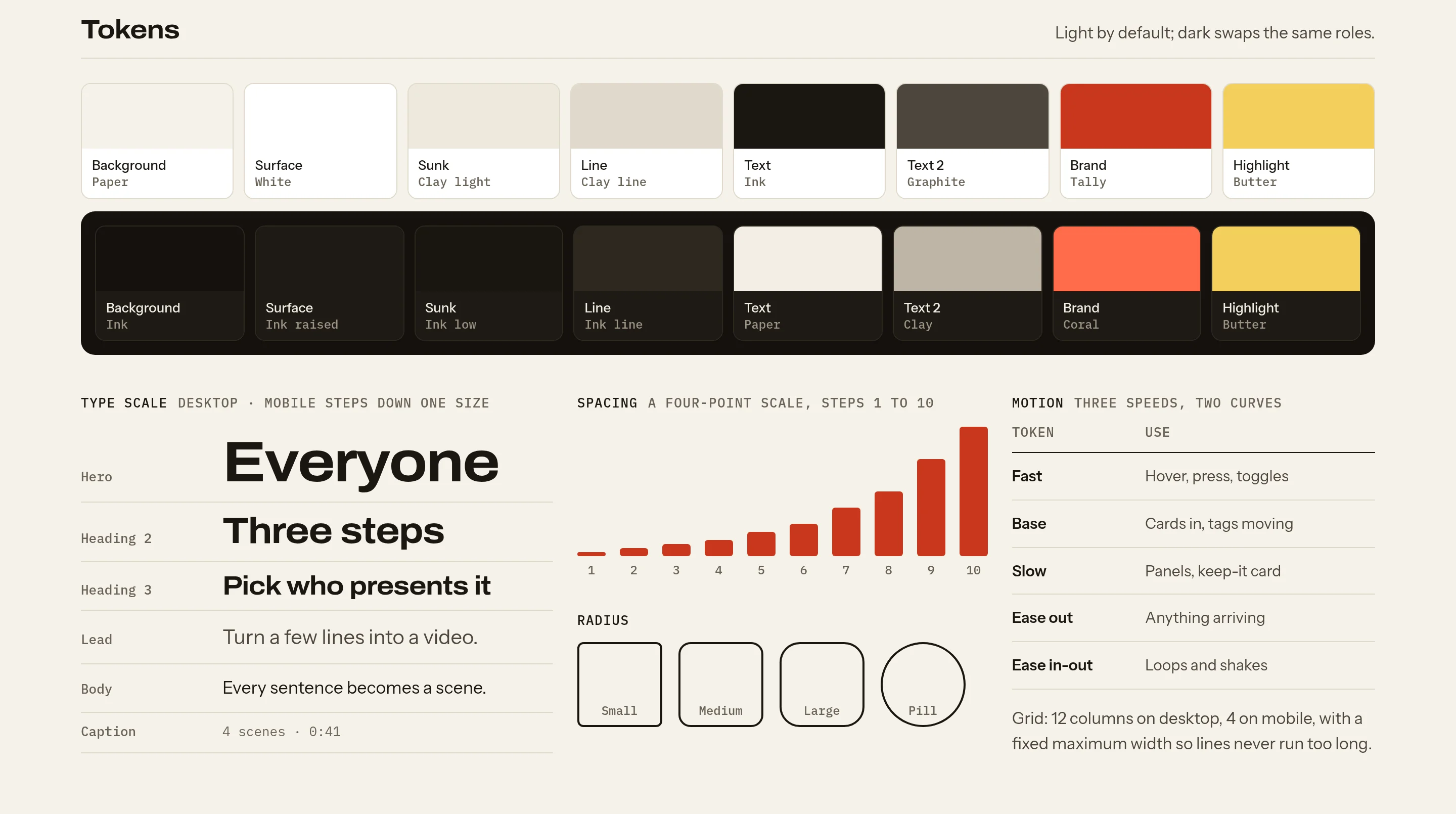
Tokens are named by role, not by colour, so dark mode swaps colour only and every part keeps its size and rhythm. Every text pairing was checked for readable contrast in both modes.
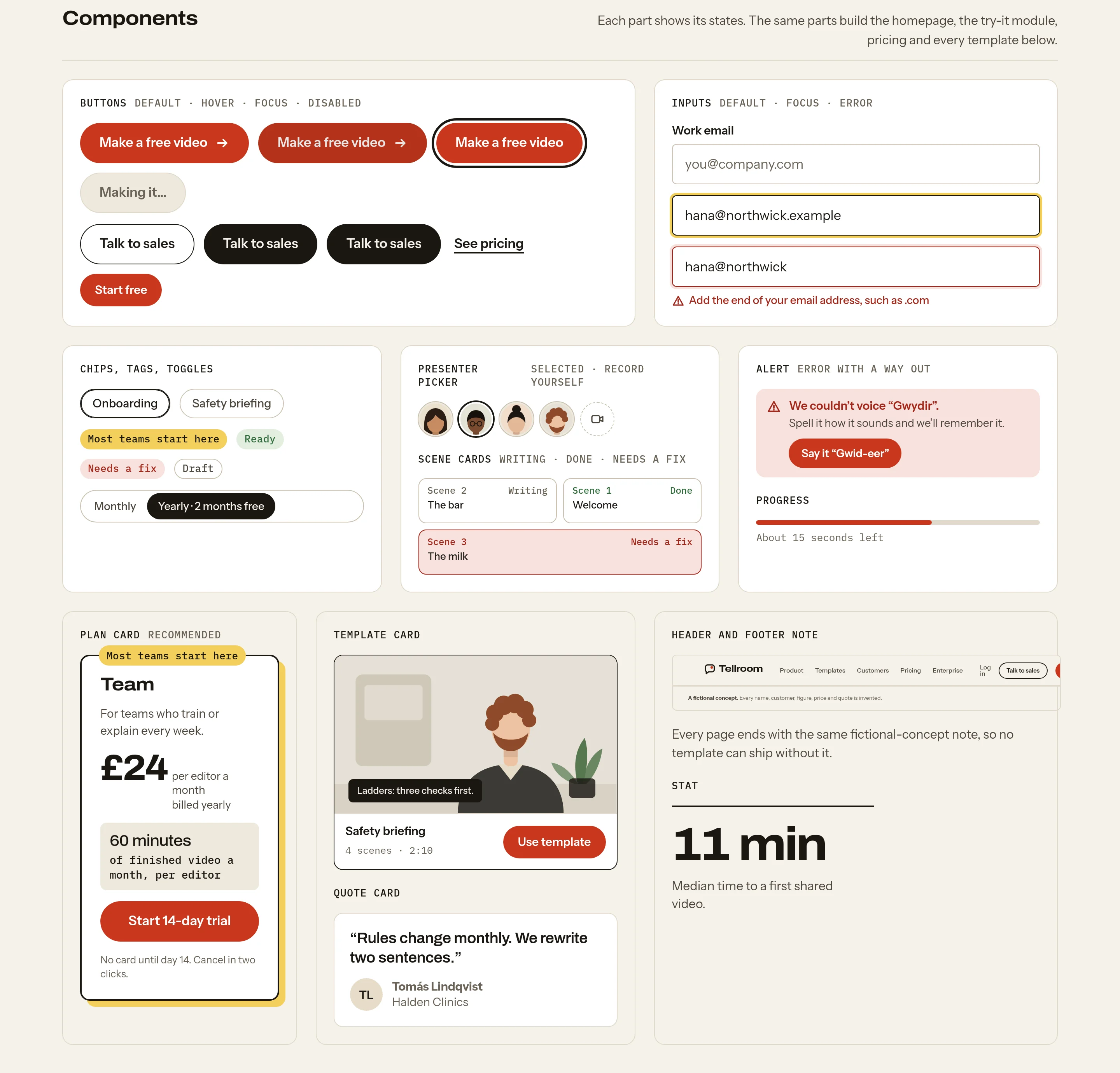
Buttons come in every state, inputs show their error and success states, and the plan card, template card, quote card and alert are built from the same parts as the homepage.
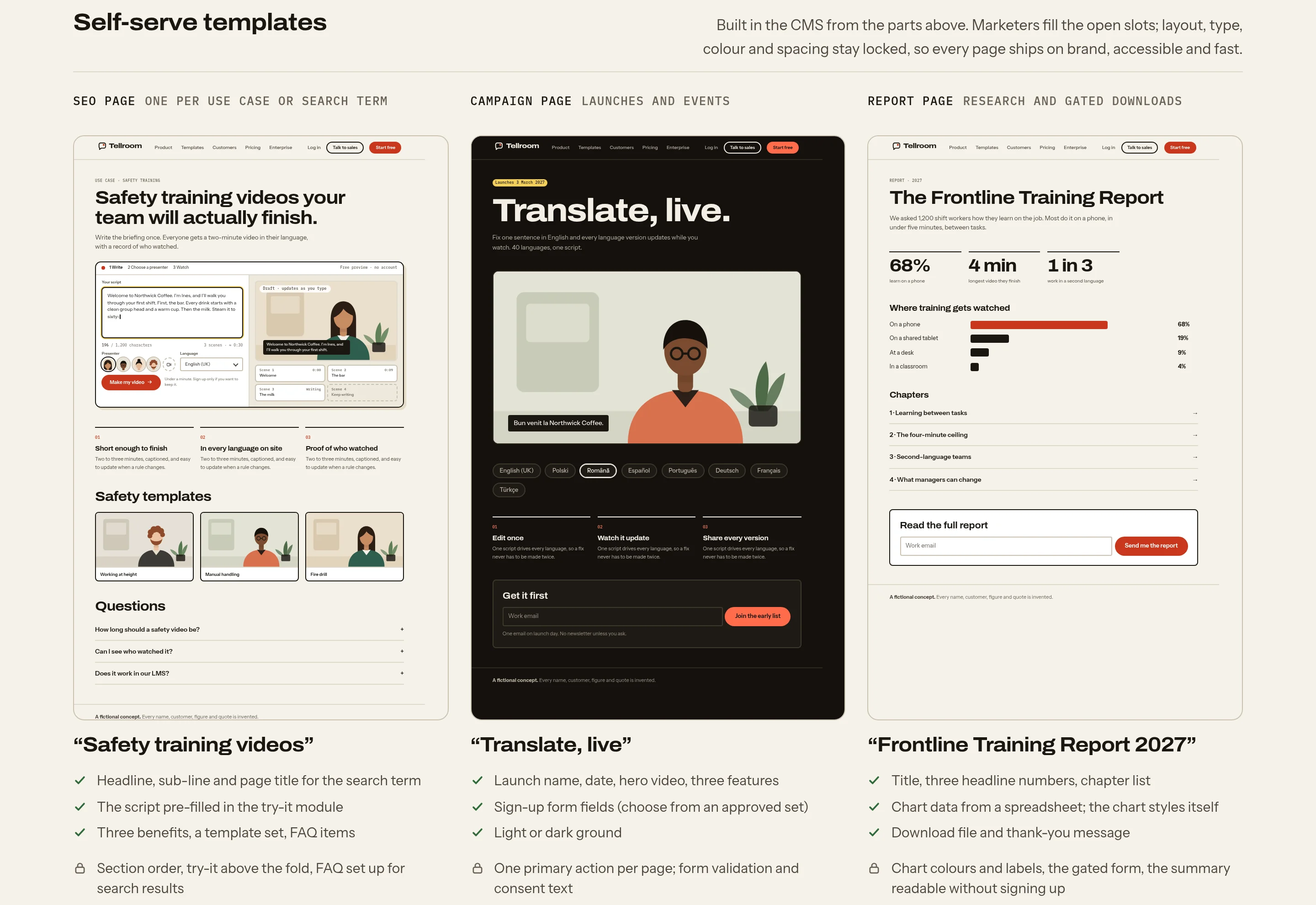
Three self-serve templates sit on top: a search page for each use case, a campaign page for launches, and a gated report. Marketers fill the open slots, while layout, type, colour and spacing stay locked, so every page ships on brand and loads fast.
The hero is the product.
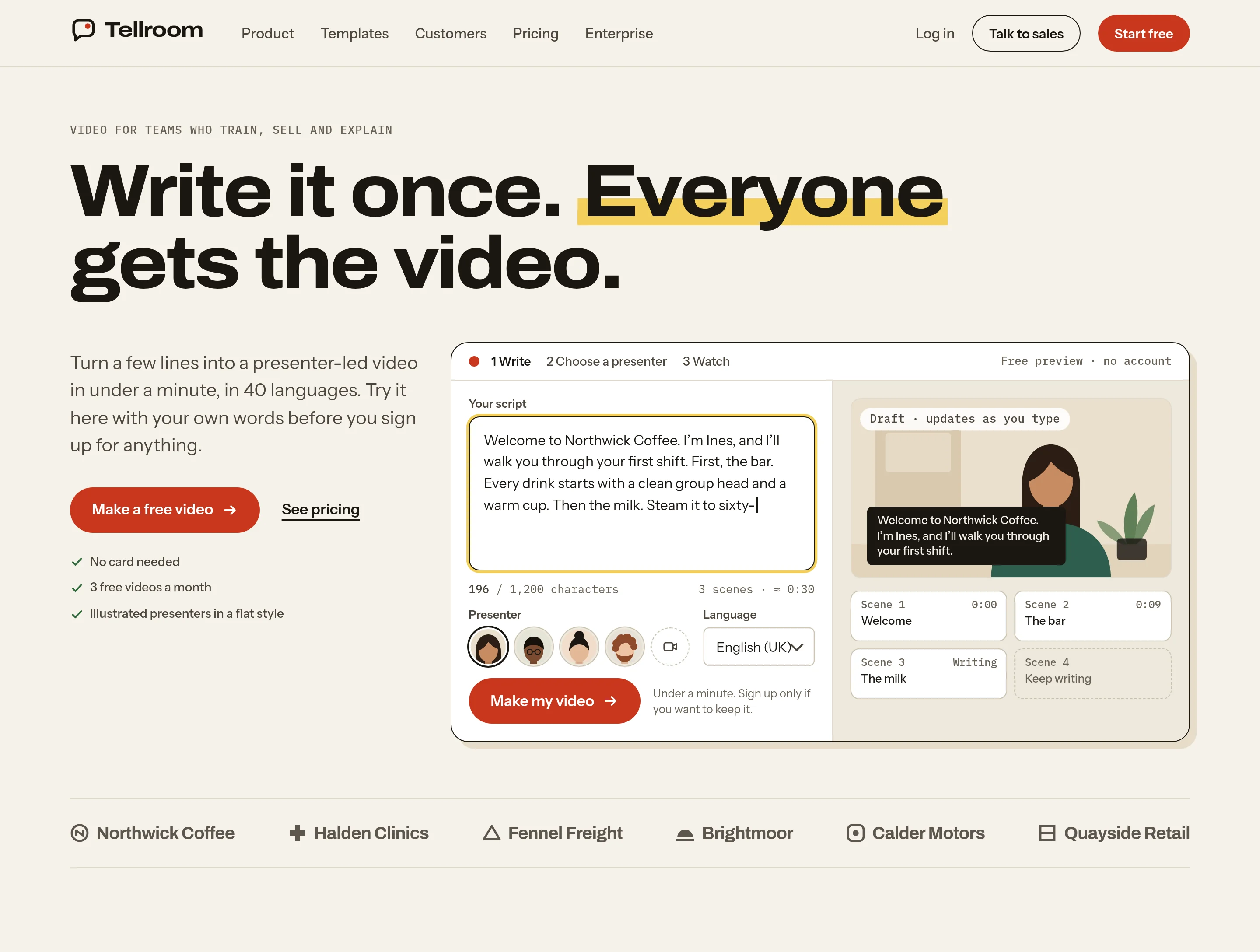
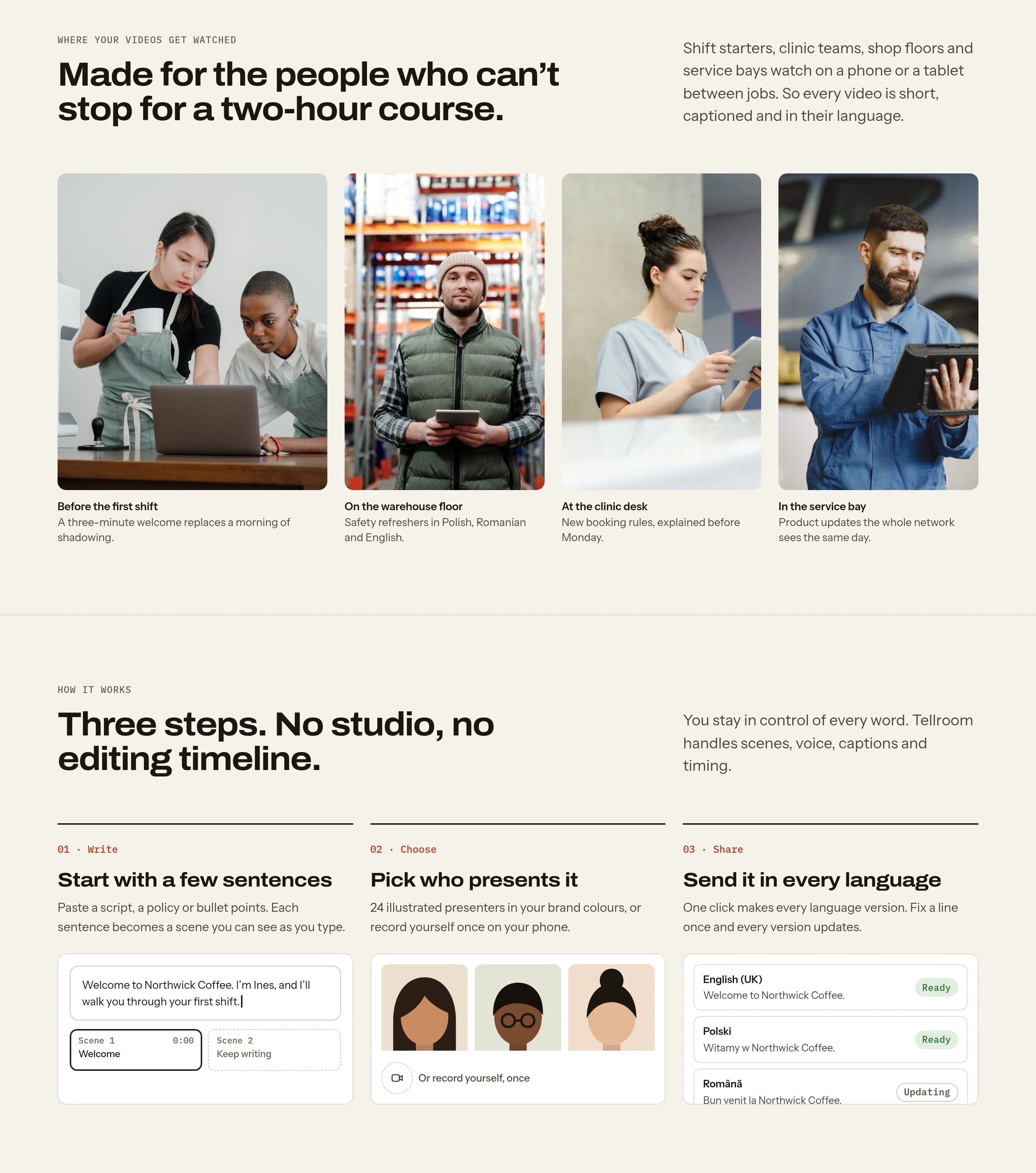
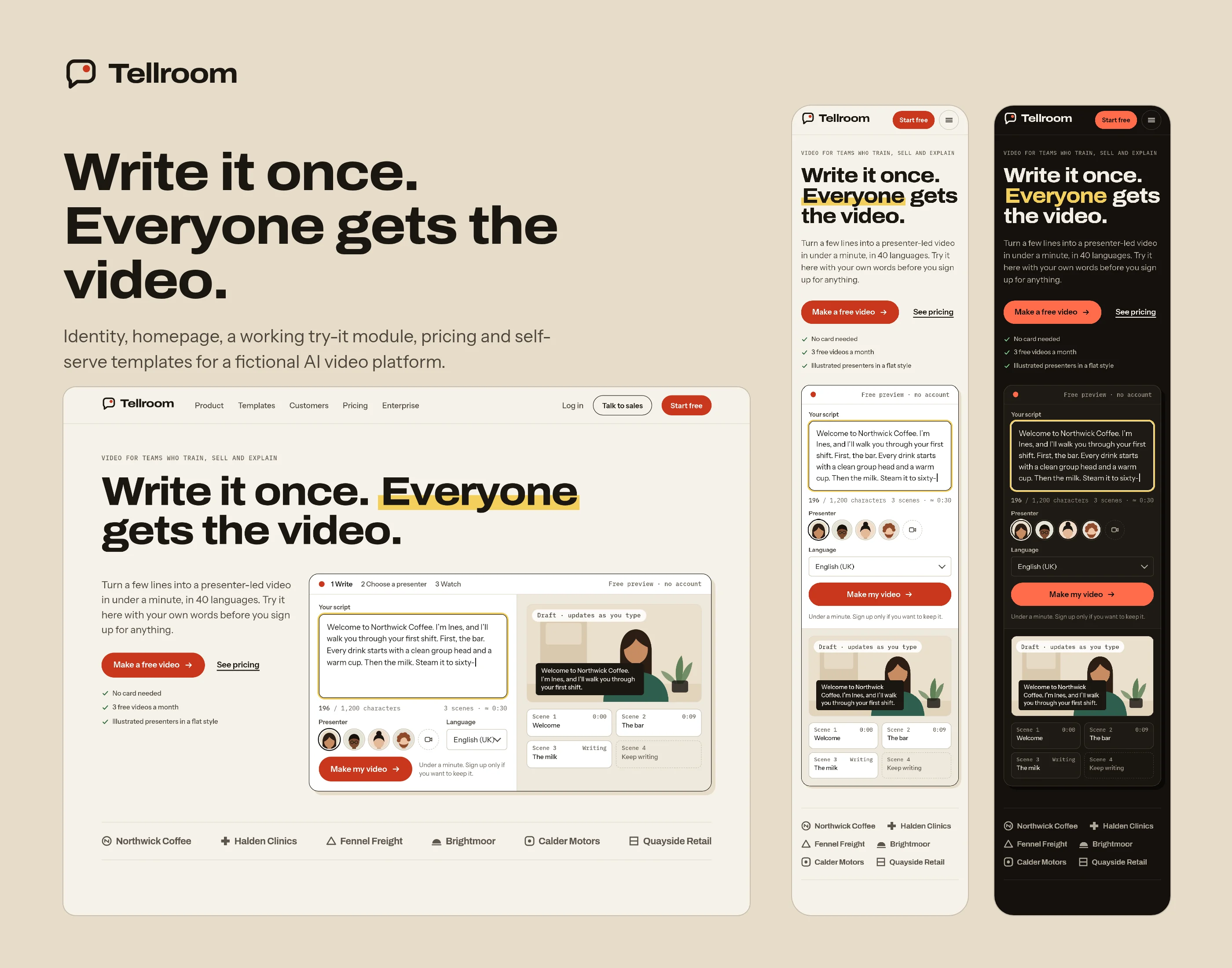
The first screen holds a headline, one sentence and a working try-it module, with the script already filled in. Below it come the customers, then photos of the places where training videos are actually watched.
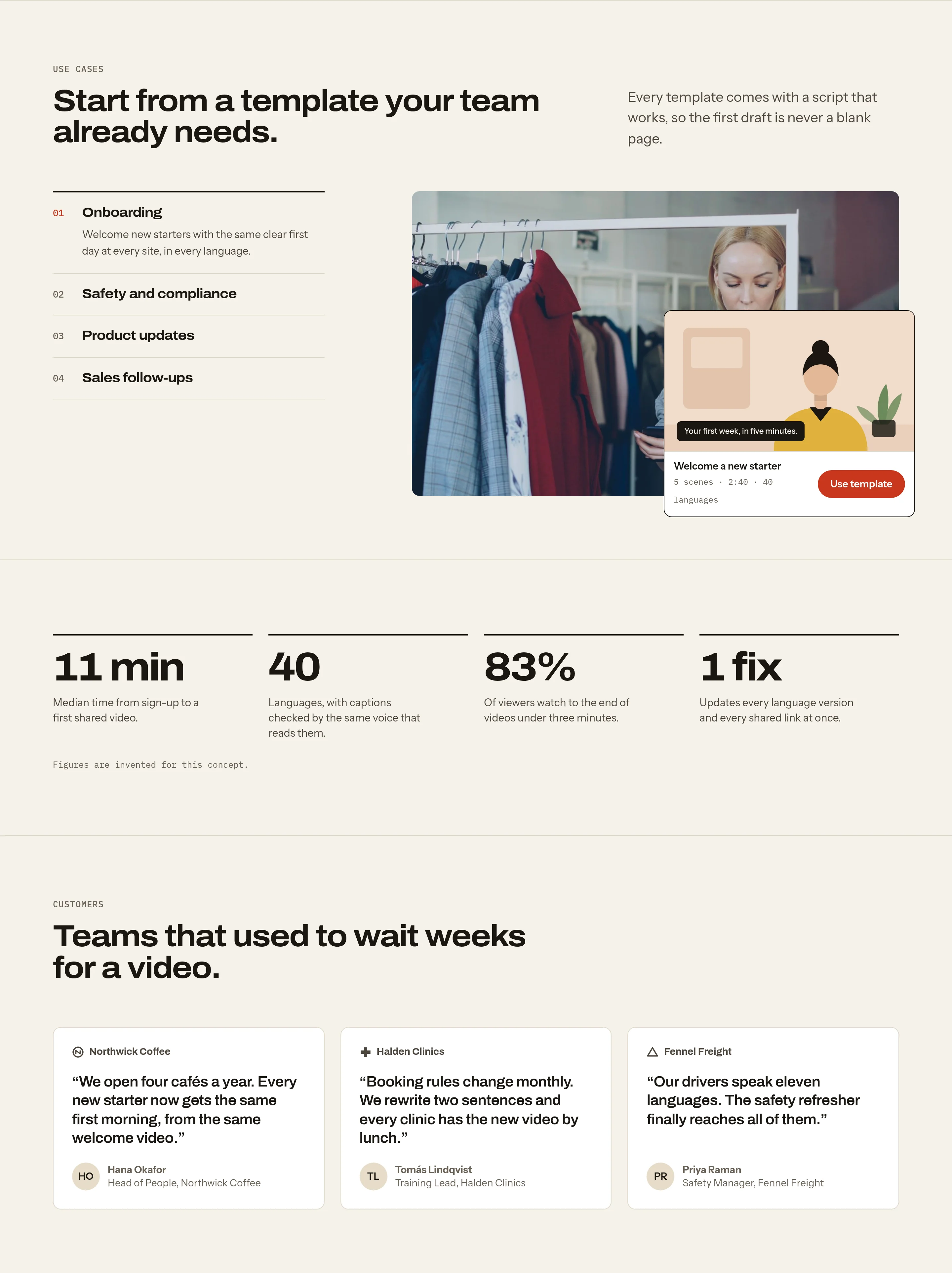
Three steps explain the flow in plain words. The use cases follow, each with a ready template, then the figures and short quotes from invented customers. Photos only ever sit beside a caption about the setting, never beside a quote, so no pictured person appears to endorse the product.
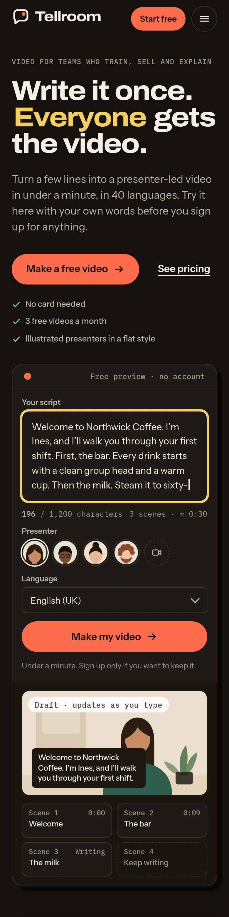
Near the end, a consent block explains that you can use a drawn presenter or record yourself. Pricing follows in compact form, then a closing band.
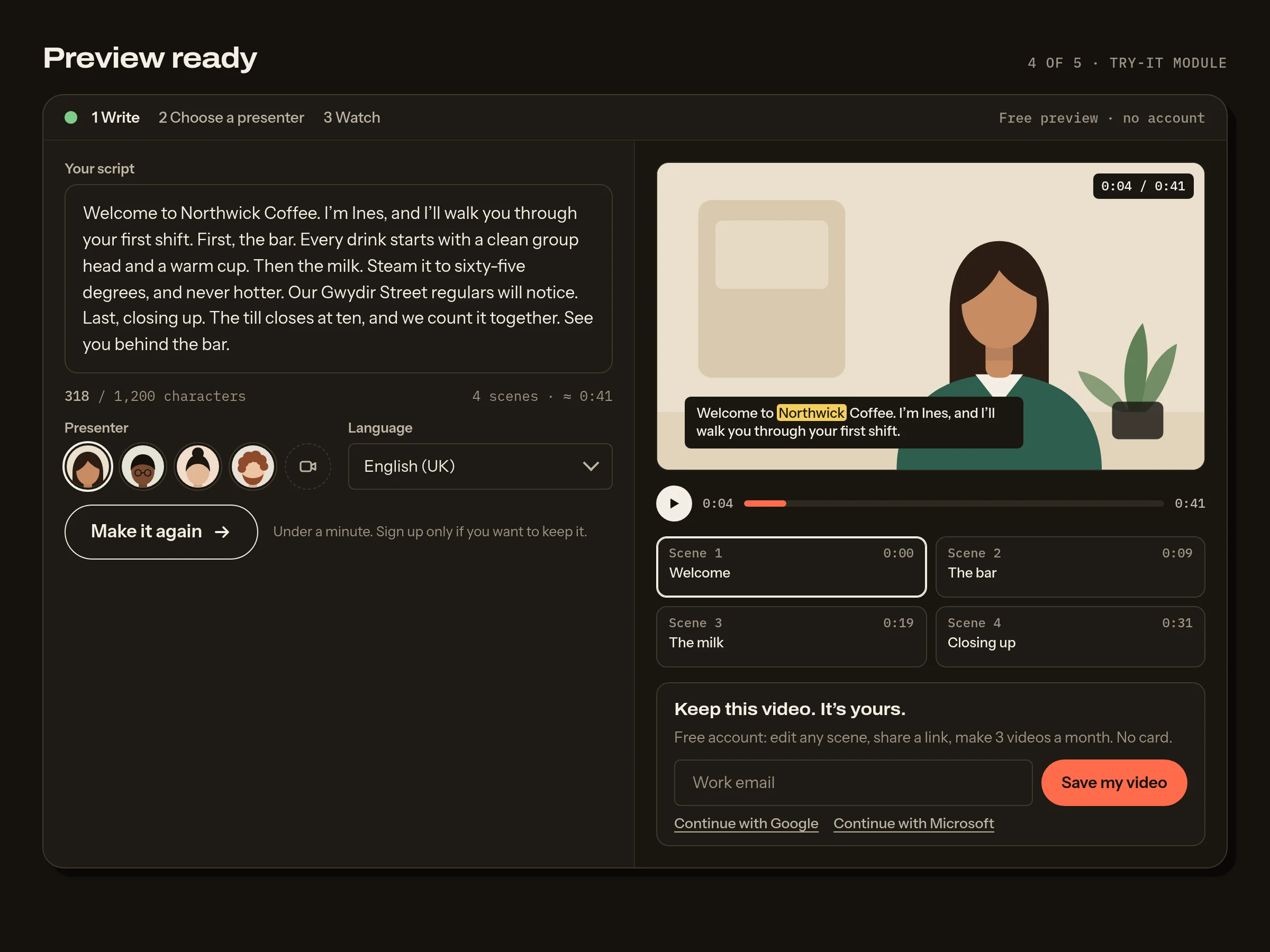
Watch your own words become a video, before you sign up.
The module is the homepage hero and the main screen of the product. It has five states, and the layout never changes between them, so nothing jumps. The script stays editable even while the video renders.
- Empty: starter chips remove the blank page.
- Typing: each sentence becomes a scene as you type.
- Generating: honest progress, with the steps named.
- Preview ready: the video plays, and only then does it ask for an email to keep it.
- Needs a fix: it says which word it couldn’t voice, and offers a spelling that sounds right.
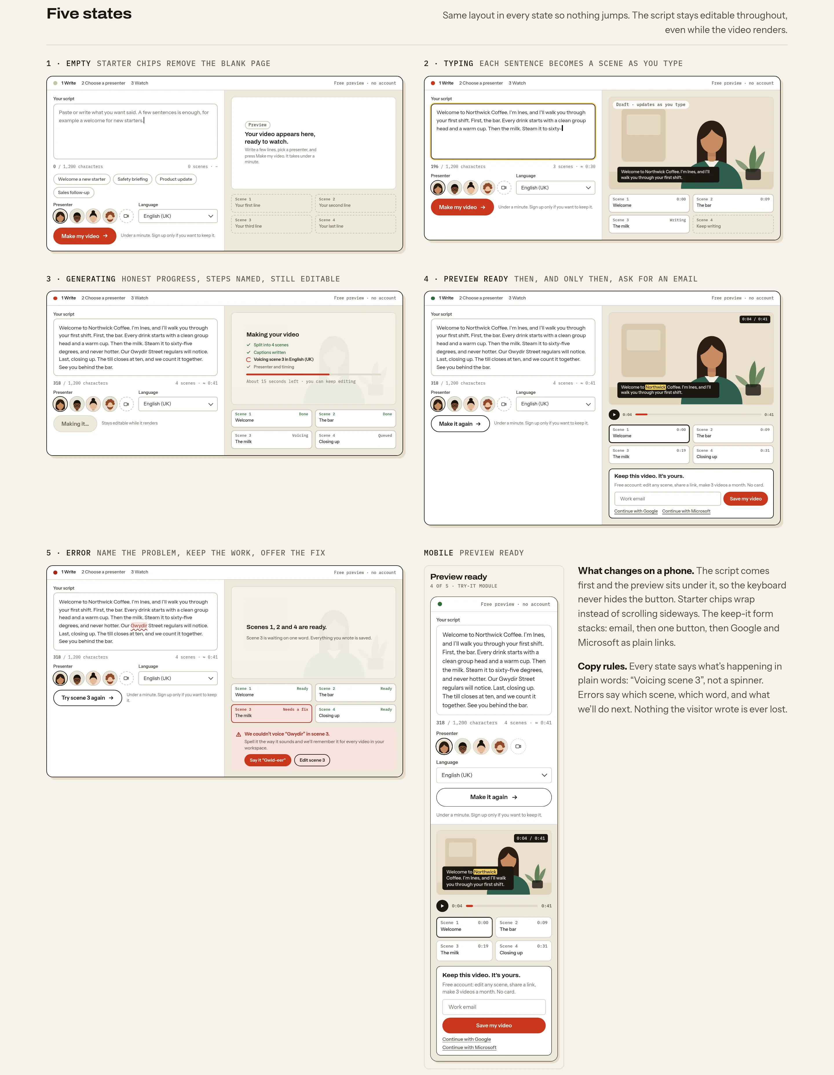
The error is written for a person: “We couldn’t voice “Gwydir” in scene 3”, then two buttons. The first teaches the pronunciation once for every video, and the second goes to the scene. Nothing the visitor wrote is lost.
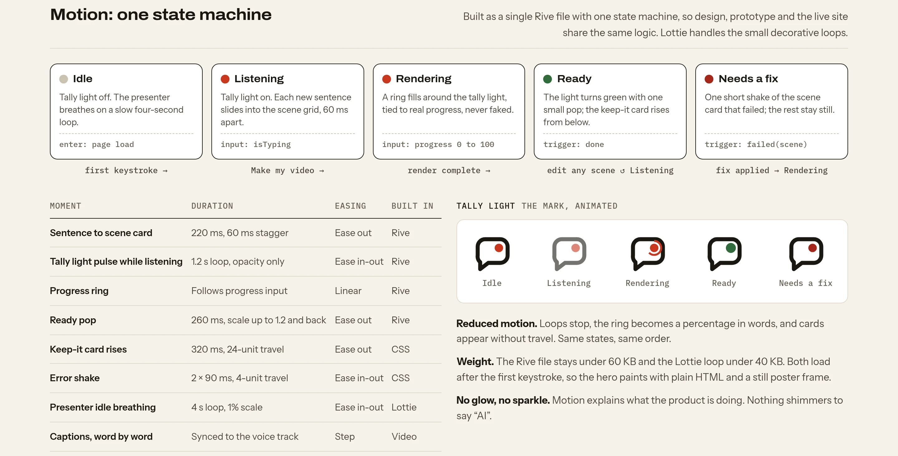
The motion is one small state machine, built to be exported to Rive or Lottie, with the tally light as its anchor. It idles, listens while you type, fills a ring while it renders, lights up when the video is ready, and turns amber when a scene needs a fix. All of it switches off with reduced motion.
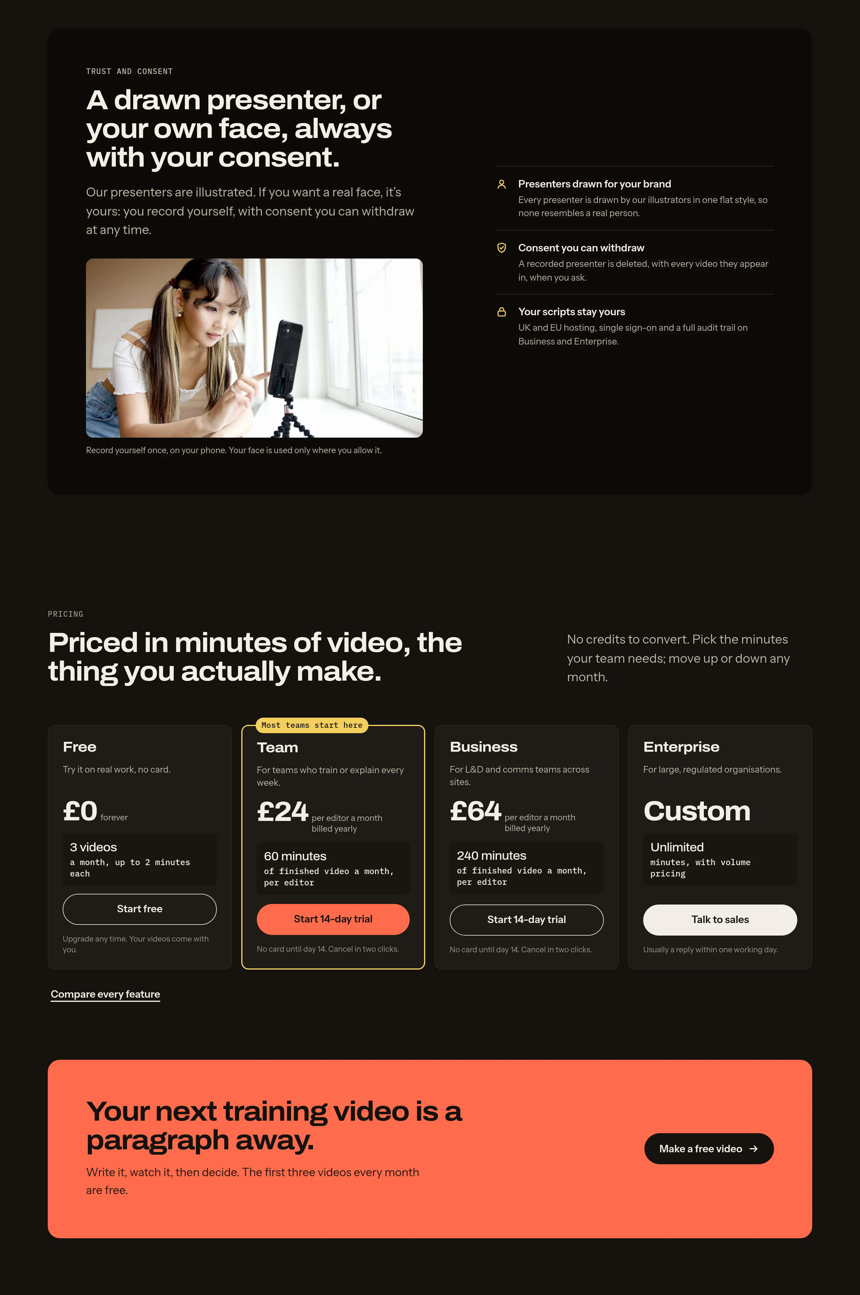
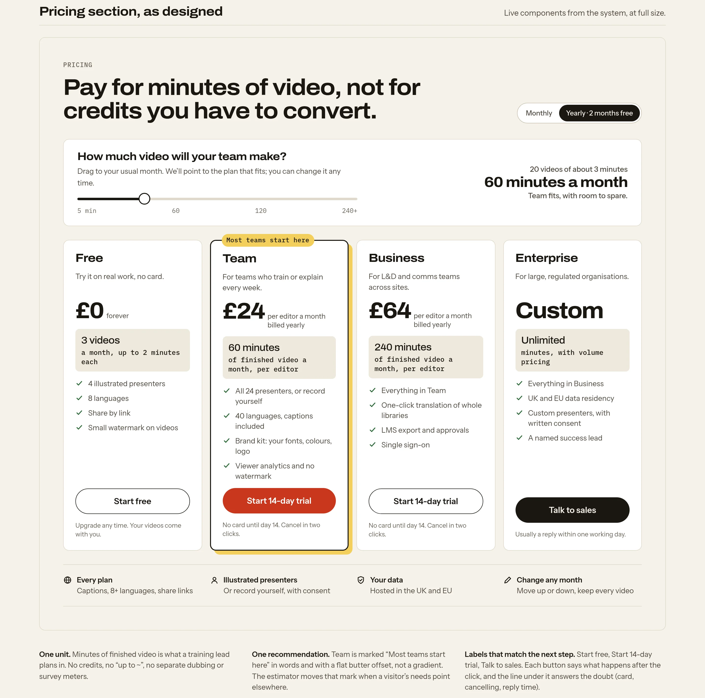
One unit, one recommended plan, one next step.
Pricing is counted in minutes of finished video and nothing else. A small estimator asks how much video the team makes in a month and points to the plan that fits. Team is the recommended plan, one honest discount covers yearly billing, and every button says what happens next: “Start free”, “Start 14-day trial”, “Talk to sales”.
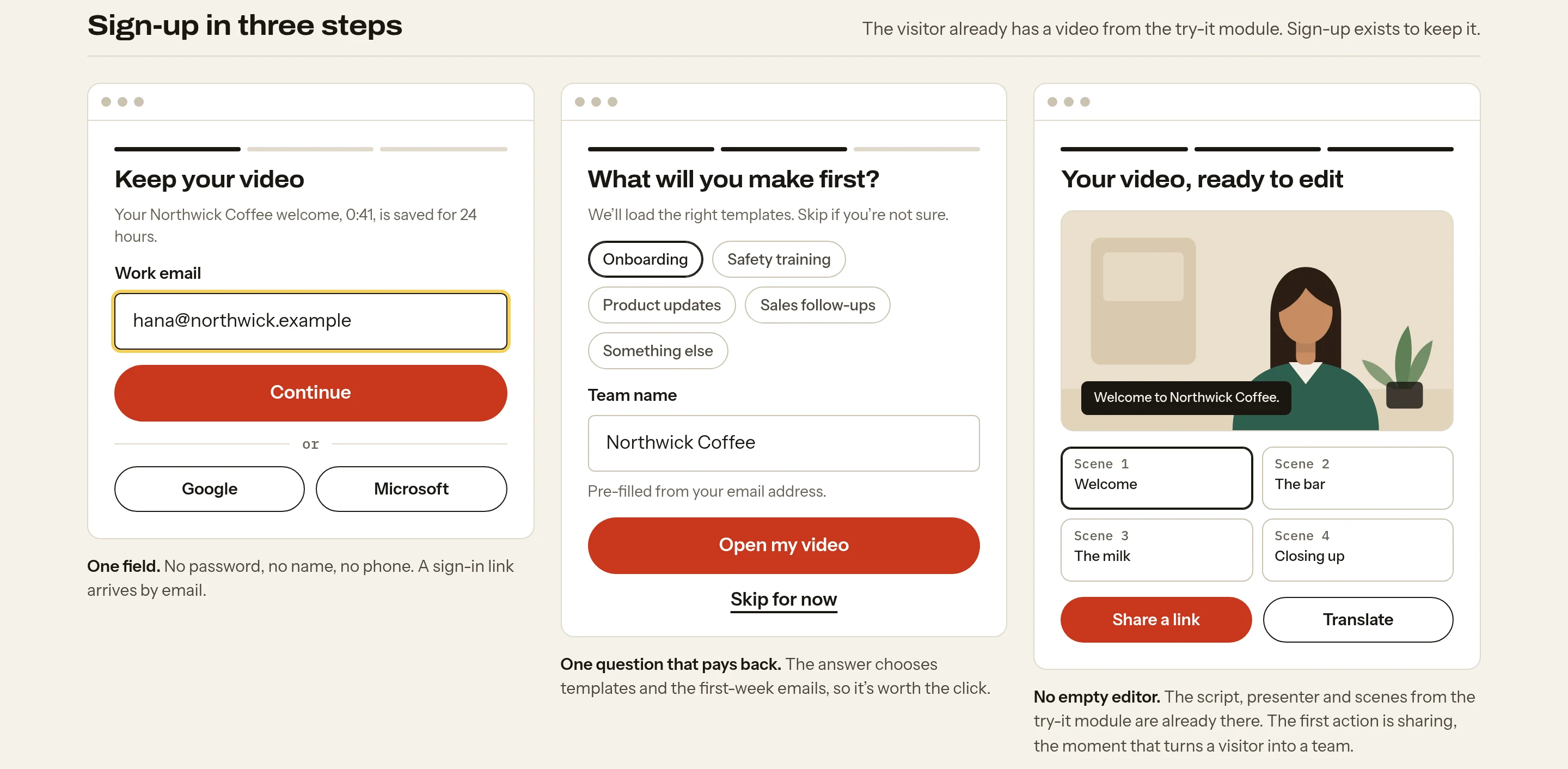
Sign-up takes three steps and carries the visitor’s own script into the editor. The first asks for one email, the second for one question that decides which templates they see, and the third opens the video they already made.
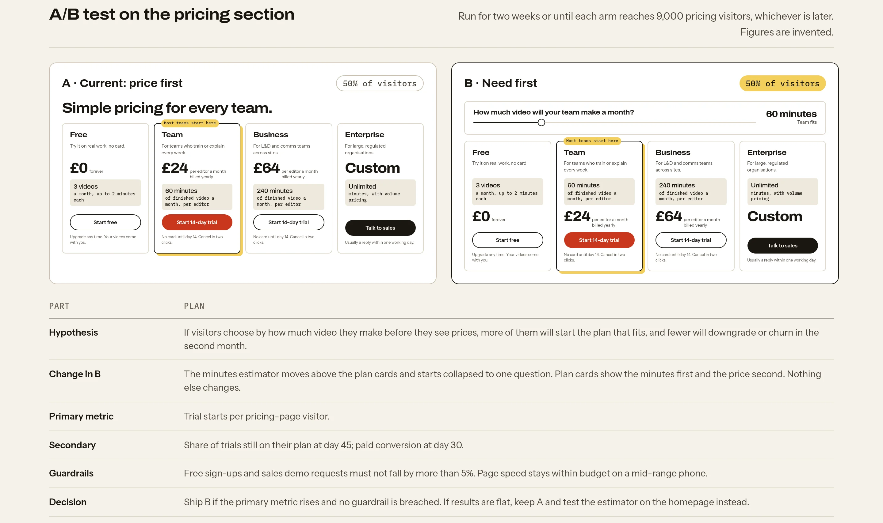
The A/B test sets the current price-first layout against a need-first version, where the estimator moves above the plans. It comes with a hypothesis, a main metric, guardrails and a rule for deciding.
Real photos in full colour, and the identity at work.
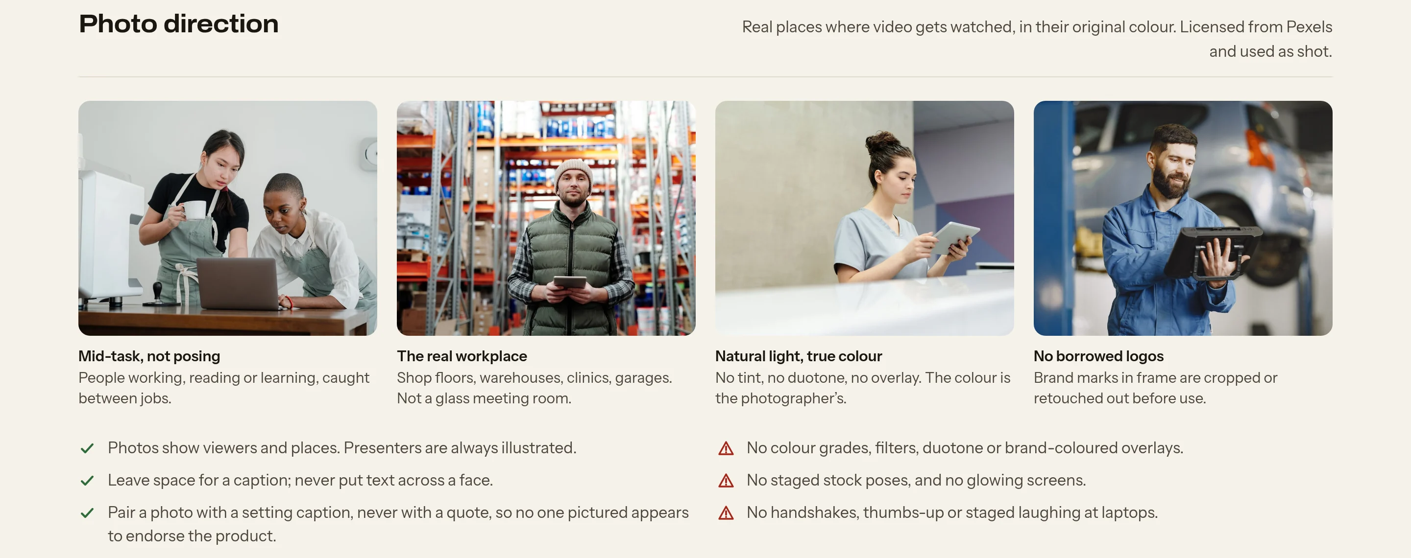
The photos are free-licensed documentary shots of cafés, warehouses, clinics, shops and workshops, the places where training videos are watched. They run in full colour, as shot, cropped tight on the subject. The brand colours come from the layout around each photo, never from a filter laid over it.
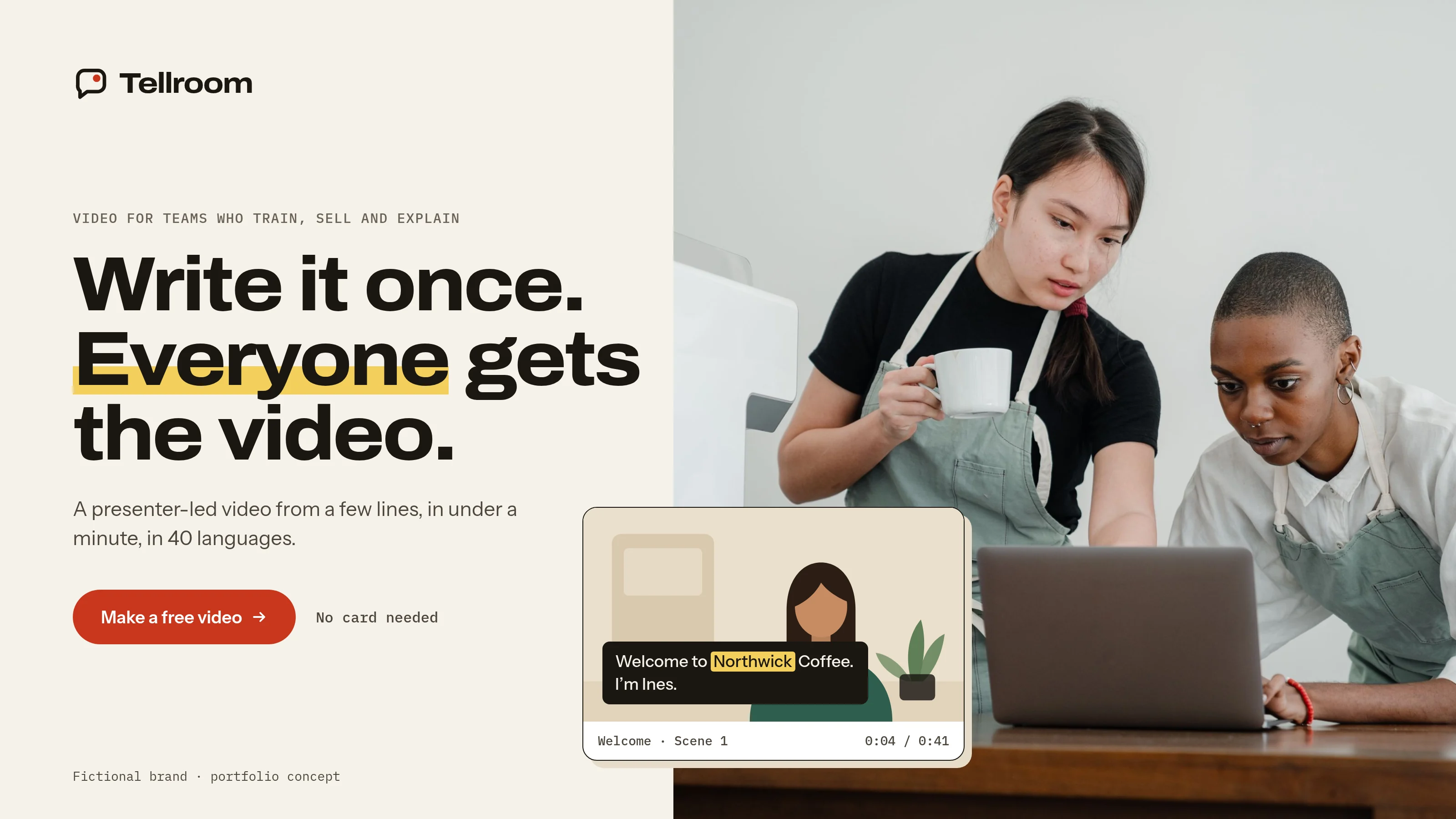
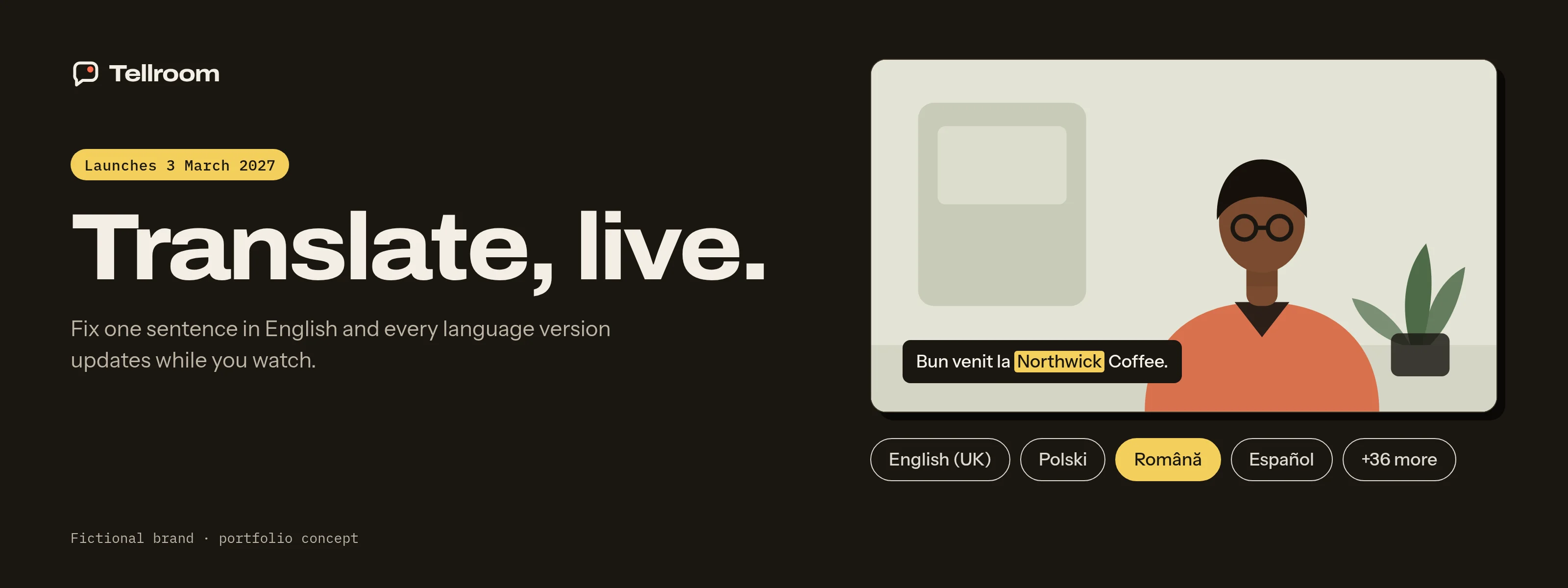
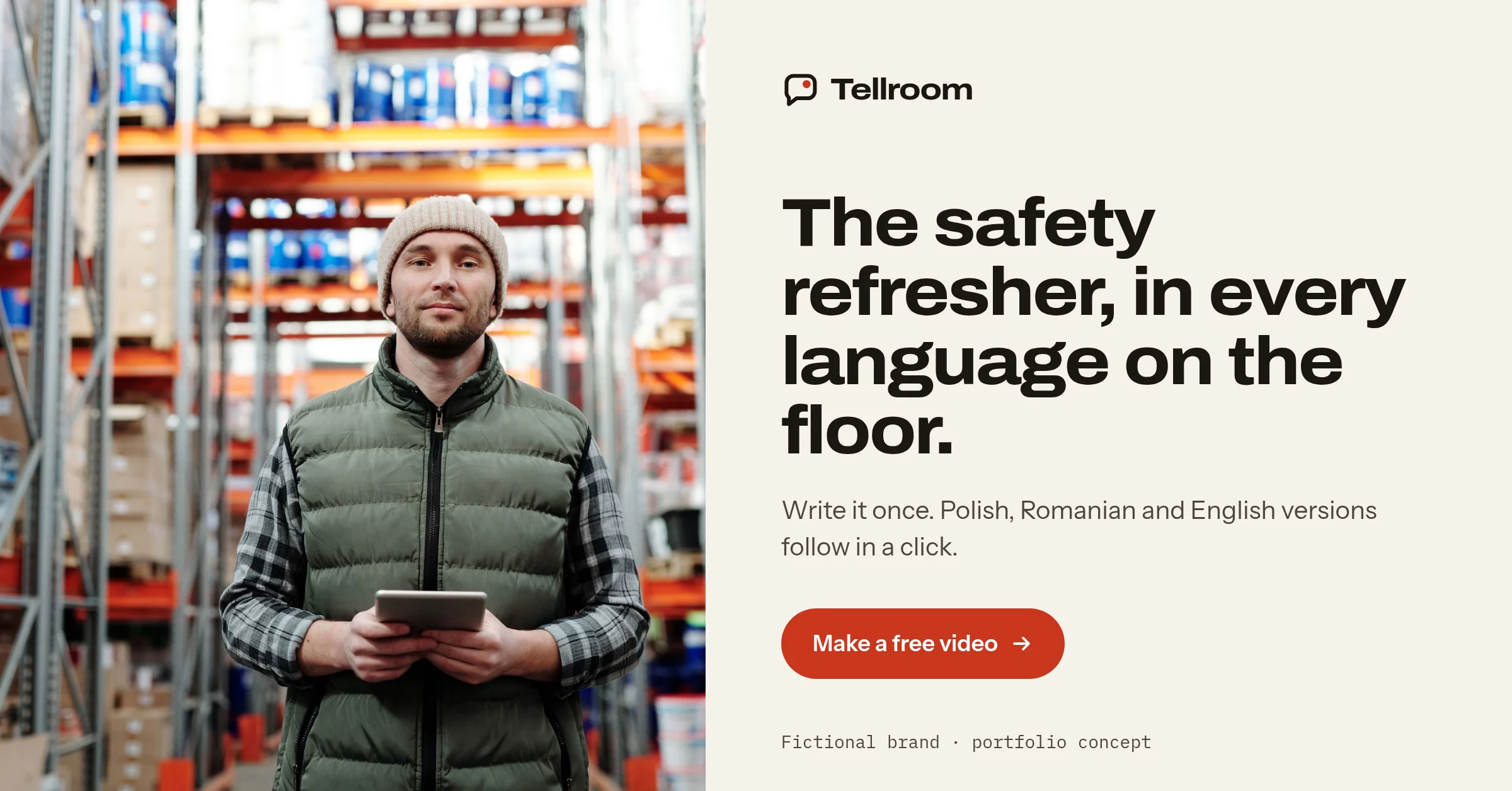
The banners take the identity beyond the website: a hero, a launch banner for an invented feature, two social posts and a portfolio cover.
Photos from Pexels, used under the Pexels License: Ketut Subiyanto, Tiger Lily, Cedric Fauntleroy, Vitaly Gariev, Gustavo Fring and Artem Podrez. Printed lettering on one photo was removed; no colour was changed in any of them.
What I’d test next
- Whether a visitor who has seen their own words become a video converts better than one who read about the product. A homepage with the try-it module against one with a plain hero would show it.
- Whether illustrated presenters are taken seriously by training leads, or read as a children’s tool, judged in short interviews with five of them.
- Whether the minutes estimator helps people choose a plan, using the price-first and need-first test already written up.
- How many first-time users hit the pronunciation error, and whether the one-tap fix is used or ignored.
- How the warm Paper palette holds up next to cooler competitor pages in paid search and social feeds.
Laneforth Fleet Operations
Fleet operations platform concept
View case study →← Previous: Brenvia Engineering Group