FastBank.
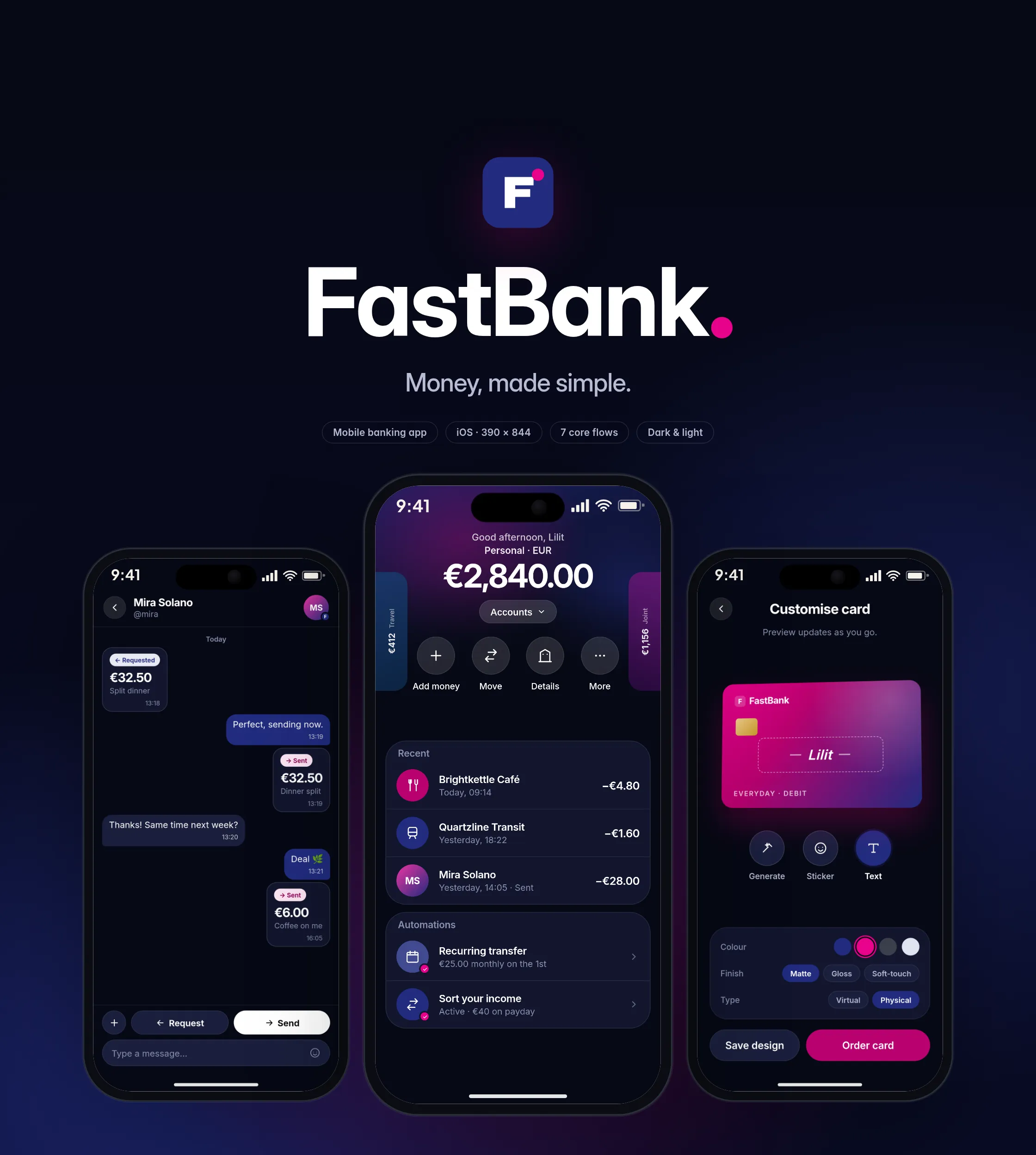
Money, made simple. A concept for a mobile bank that makes everyday money jobs feel simple: check a balance, pay a friend, share an account, save for a goal.
Everyday banking, with nothing in the way.
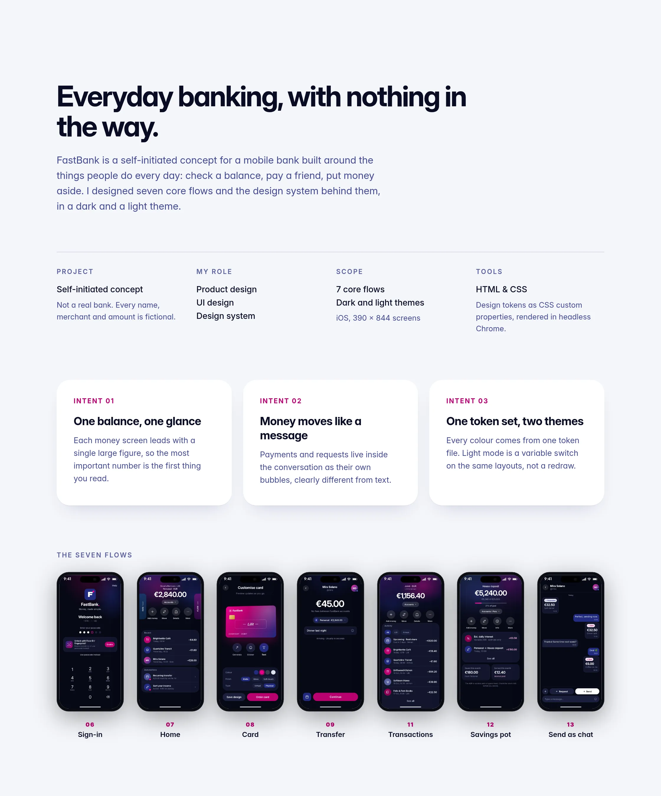
FastBank is a self-initiated concept for a mobile bank built around the things people do every day: check a balance, pay a friend, put money aside. I designed seven core flows and the design system behind them, in a dark and a light theme.
Not a real bank. Every name, merchant and amount is fictional.
Banking apps can make simple jobs feel heavy.
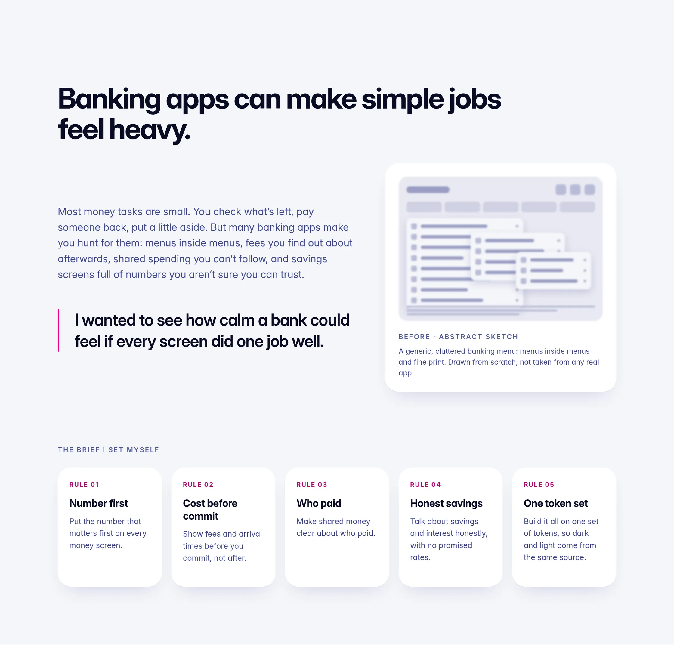
Most money tasks are small. You check what’s left, pay someone back, put a little aside. But many banking apps make you hunt for them: menus inside menus, fees you find out about afterwards, shared spending you can’t follow, and savings screens full of numbers you aren’t sure you can trust.
I wanted to see how calm a bank could feel if every screen did one job well. The brief I set myself:
- Put the number that matters first on every money screen.
- Show fees and arrival times before you commit, not after.
- Make shared money clear about who paid.
- Talk about savings and interest honestly, with no promised rates.
- Build it all on one set of tokens, so dark and light come from the same source.
Starting from the jobs, not the features.
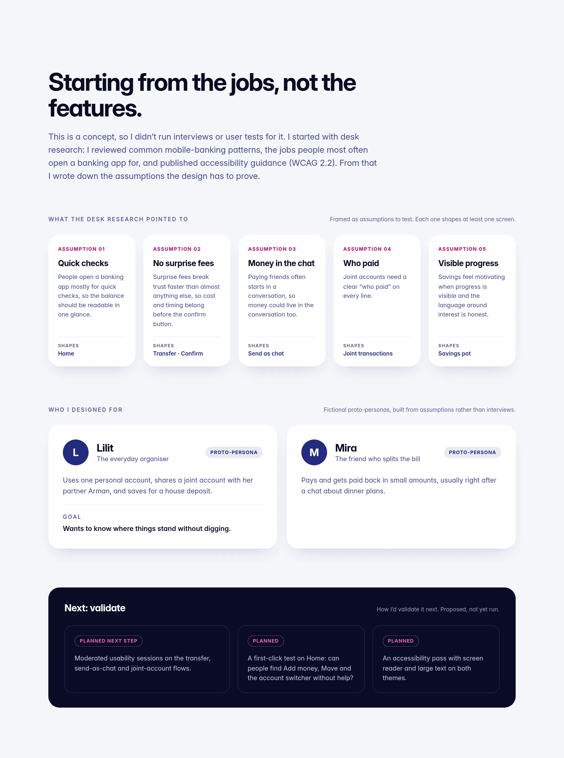
This is a concept, so I didn’t run interviews or user tests for it. I started with desk research: I reviewed common mobile-banking patterns, the jobs people most often open a banking app for, and published accessibility guidance. From that I wrote down the assumptions the design has to prove.
Who I designed for: two proto-personas, built from assumptions rather than interviews. Lilit, the everyday organiser, shares a joint account with her partner and saves for a house deposit. Mira, the friend who splits the bill, pays and gets paid back in small amounts, usually right after a chat about dinner plans.
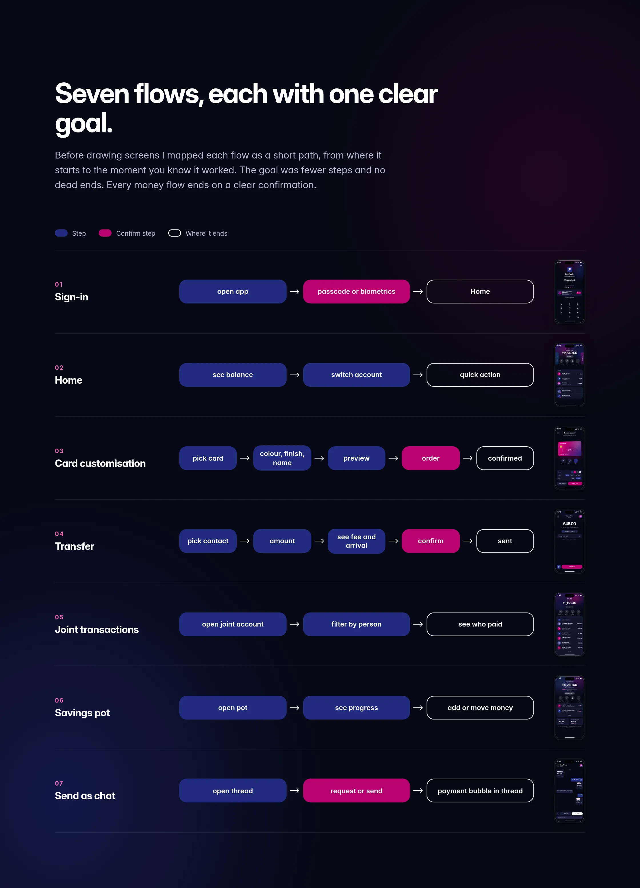
Seven flows, each with one clear goal.
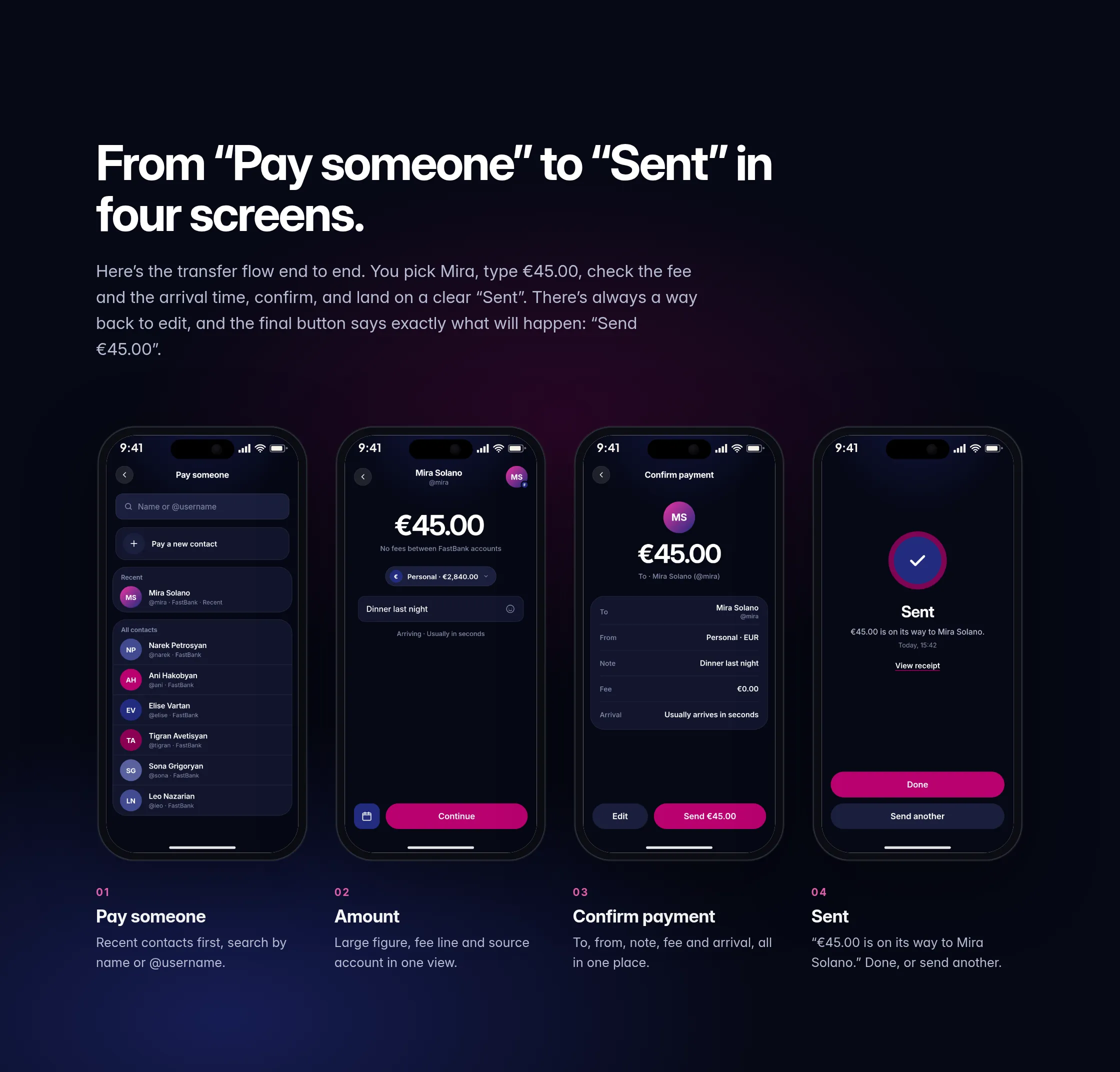
Before drawing screens I mapped each flow as a short path, from where it starts to the moment you know it worked. The goal was fewer steps and no dead ends. Every money flow ends on a clear confirmation.
Seven core screens, in dark and light.
Each screen does one job. The number that matters comes first, and cost and timing show before you commit.
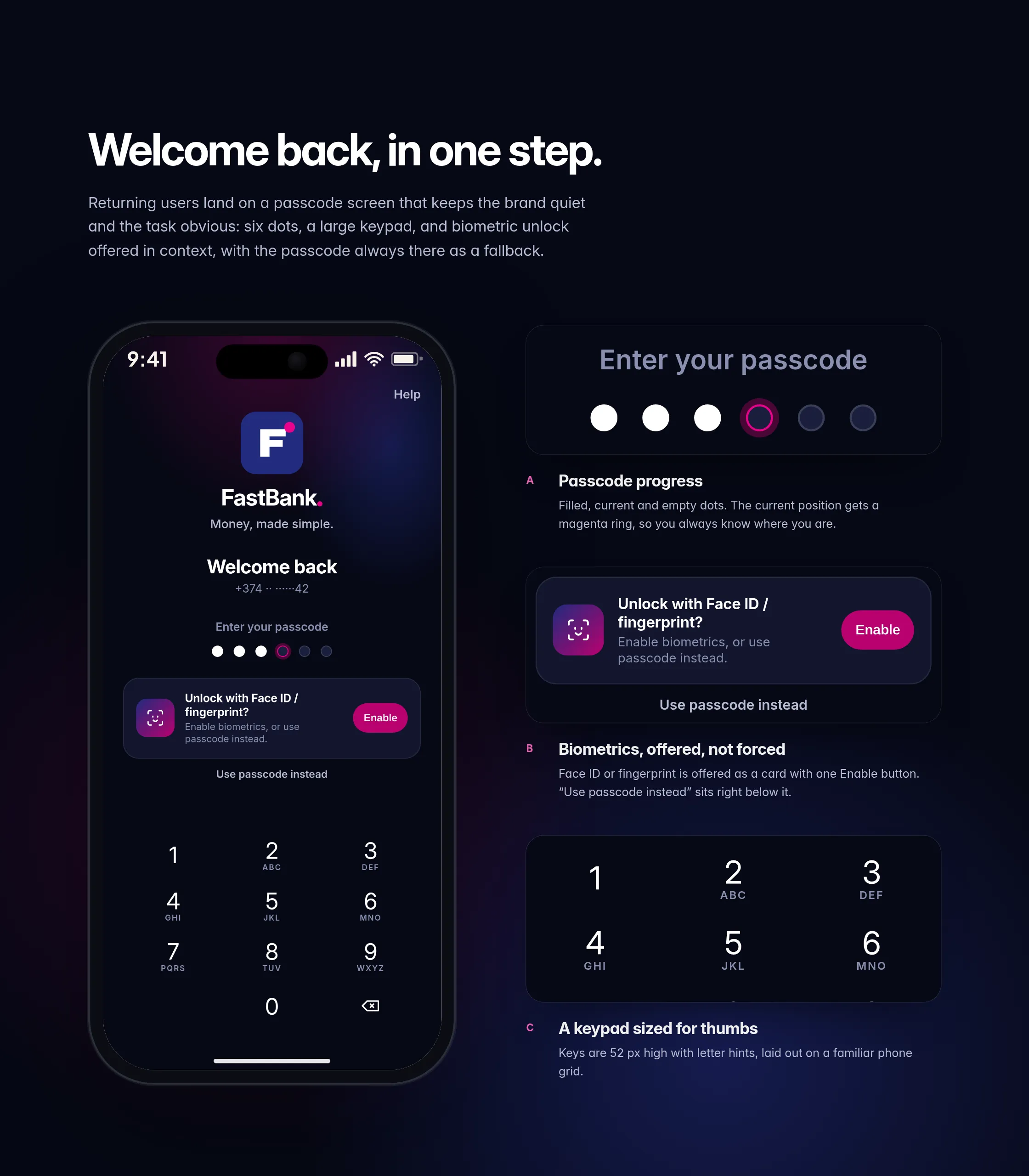
Sign-in: welcome back, in one step.
Returning users land on a passcode screen that keeps the brand quiet and the task obvious: six dots, a large keypad, and biometric unlock offered in context, with the passcode always there as a fallback.
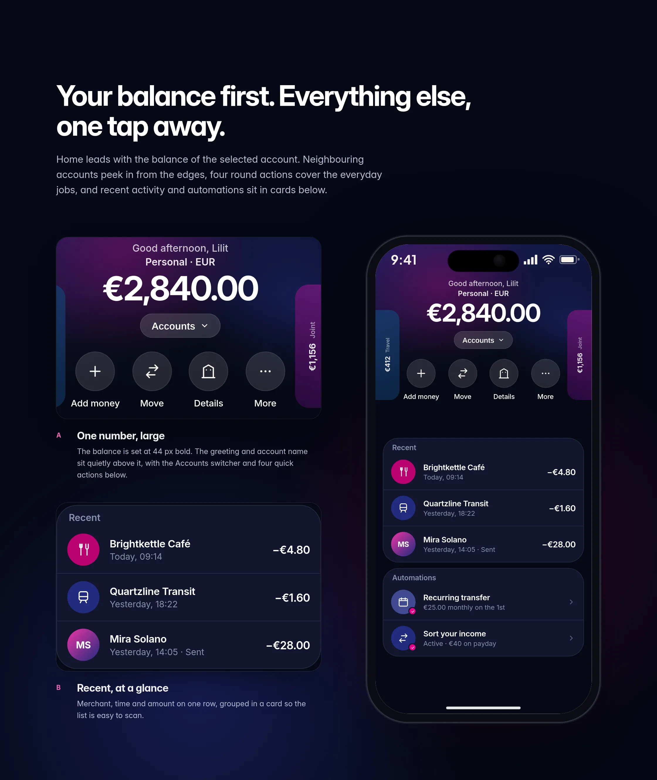
Home: your balance first.
Home leads with the balance of the selected account. Neighbouring accounts peek in from the edges, four round actions handle the everyday jobs, and recent activity and automations sit in cards below.
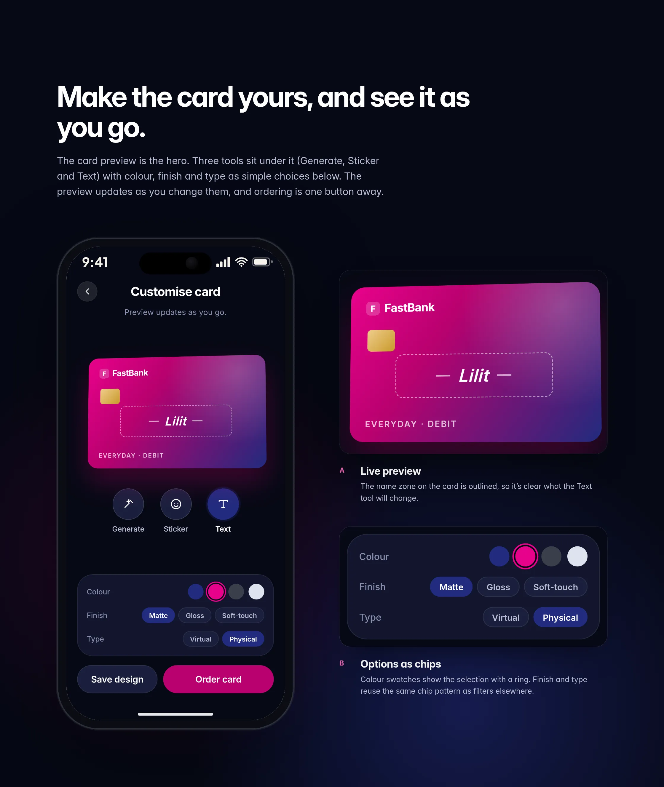
Card customisation: see it as you go.
The card preview is the hero. Three tools sit under it (Generate, Sticker and Text) with colour, finish and type as simple choices below. The preview updates as you change them, and ordering is one button away.
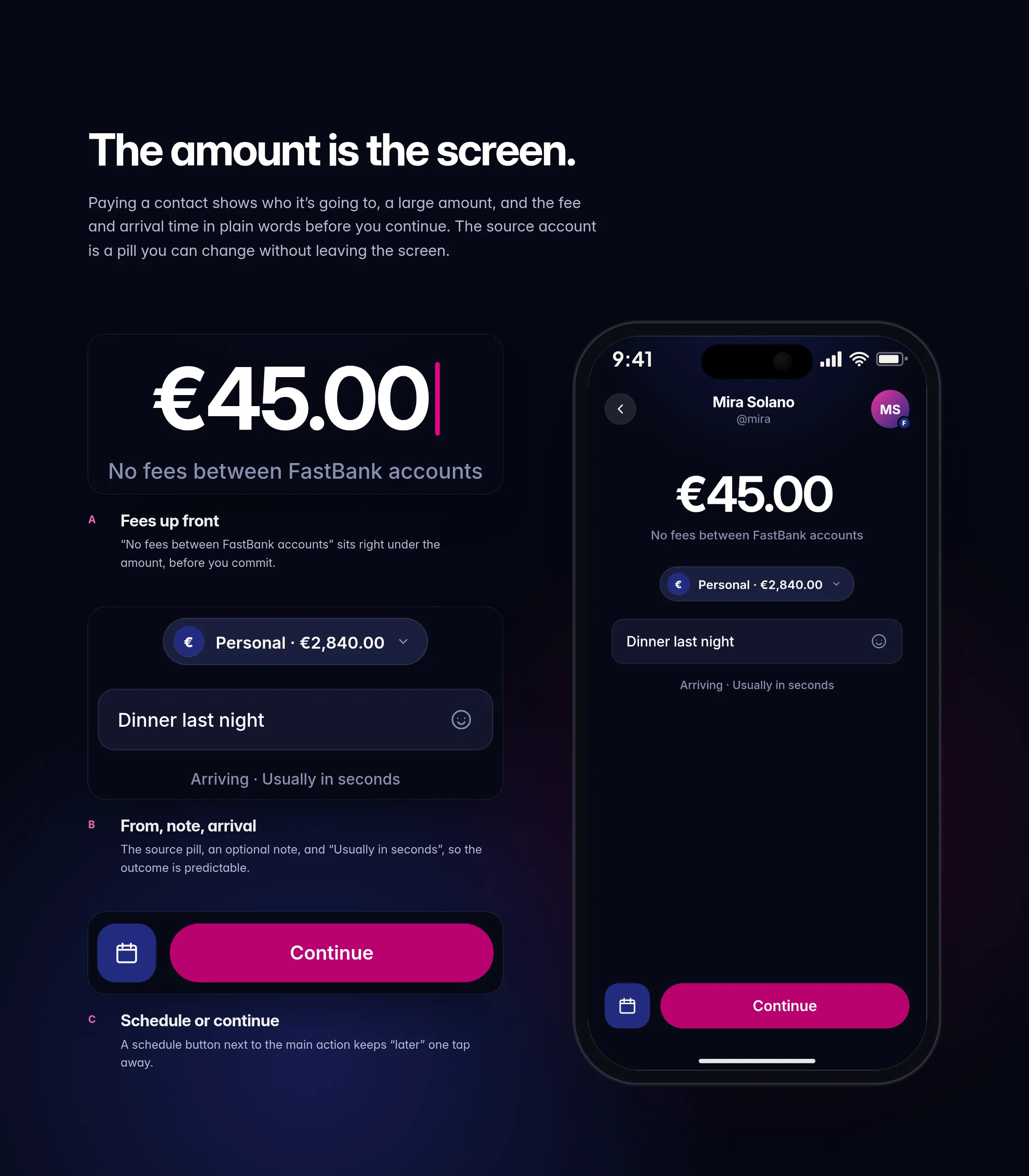
Transfer: the amount is the screen.
Paying a contact shows who it’s going to, a large amount, and the fee and arrival time in plain words before you continue. The source account is a pill you can change without leaving the screen.
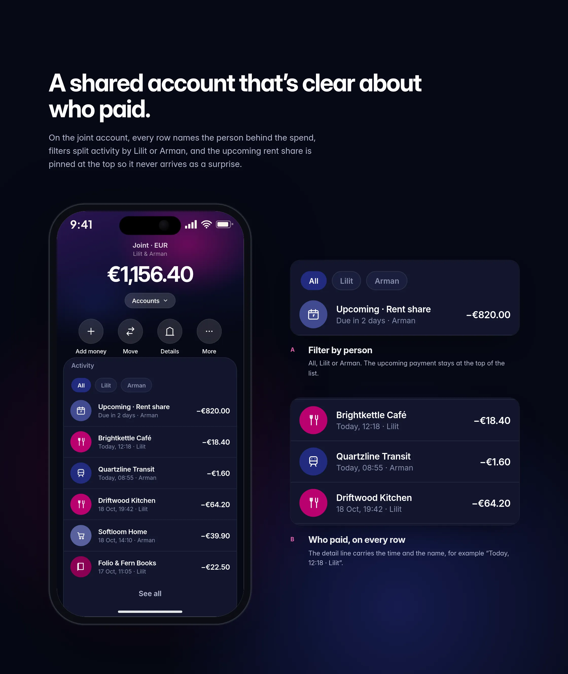
Joint account: clear about who paid.
On the joint account, every row names the person behind the spend, filters split activity by Lilit or Arman, and the upcoming rent share is pinned at the top so it never arrives as a surprise.
Savings pot: progress you can see.
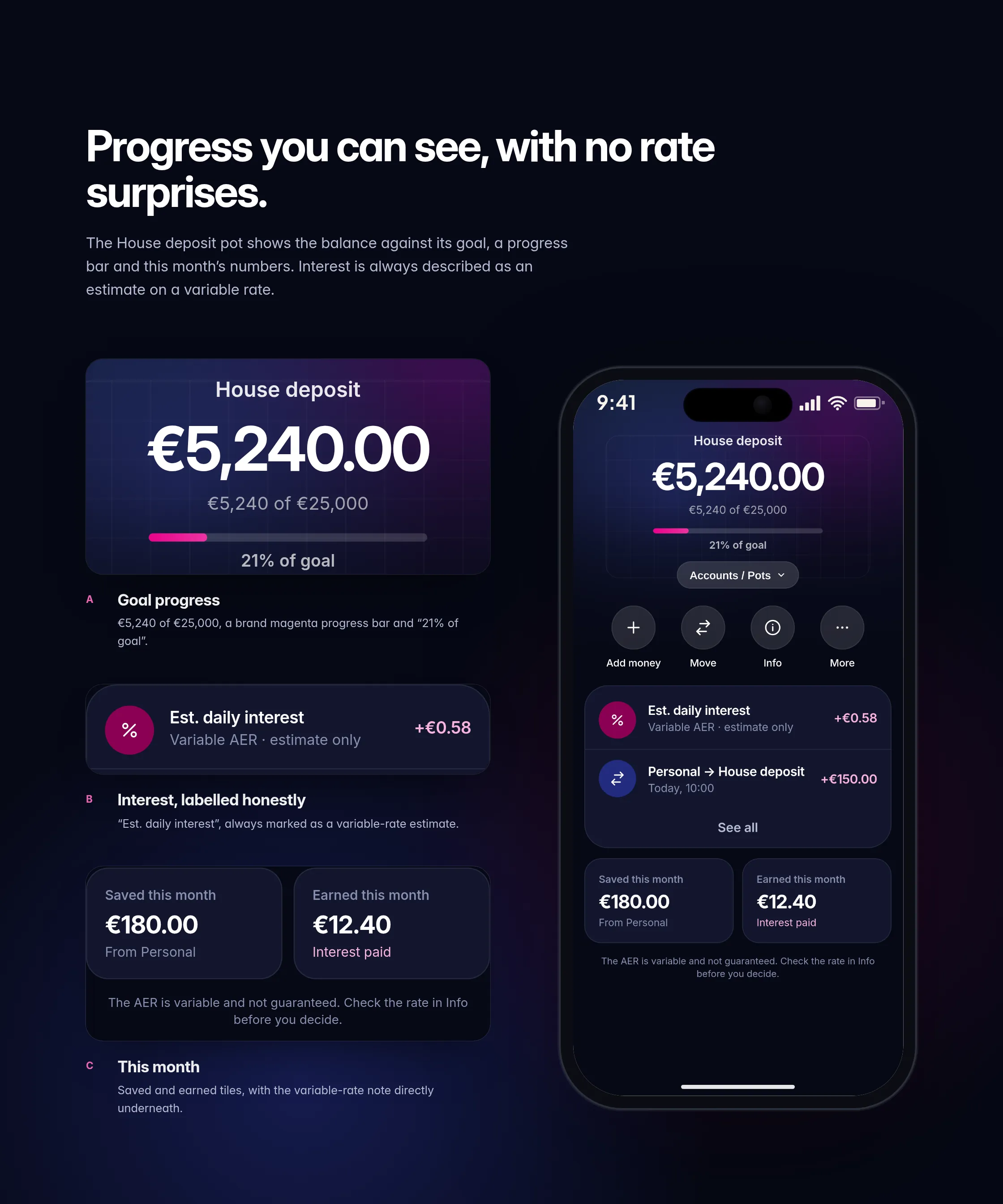
The House deposit pot shows the balance against its goal, a progress bar and this month’s numbers. Interest is always described as an estimate on a variable rate, and no real rate is shown in this concept.
Send as chat: paying a friend, inside the conversation.
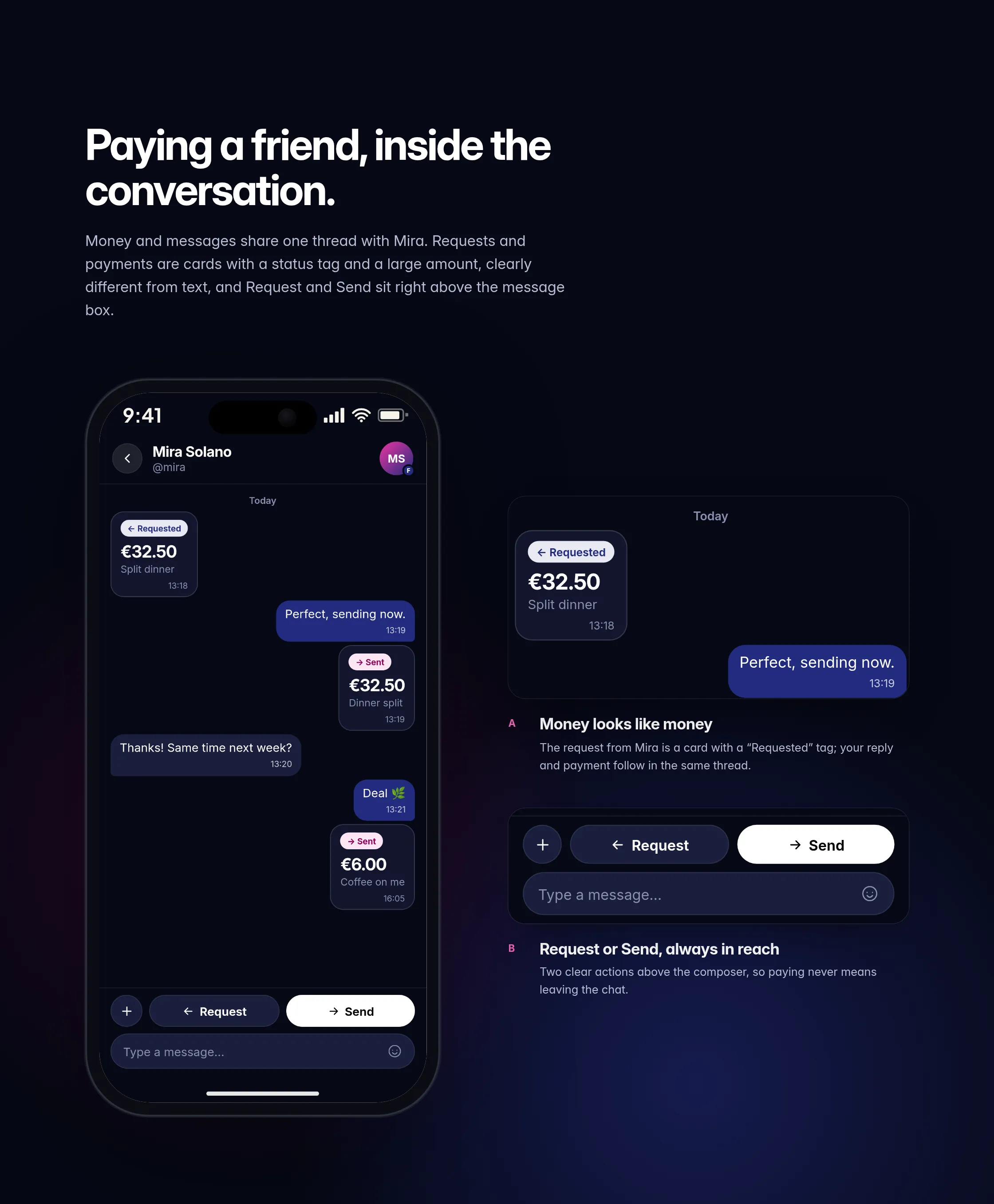
Money and messages share one thread with Mira. Requests and payments are cards with a status tag and a large amount, clearly different from text, and Request and Send sit right above the message box.
Dark & light: same app, two moods.
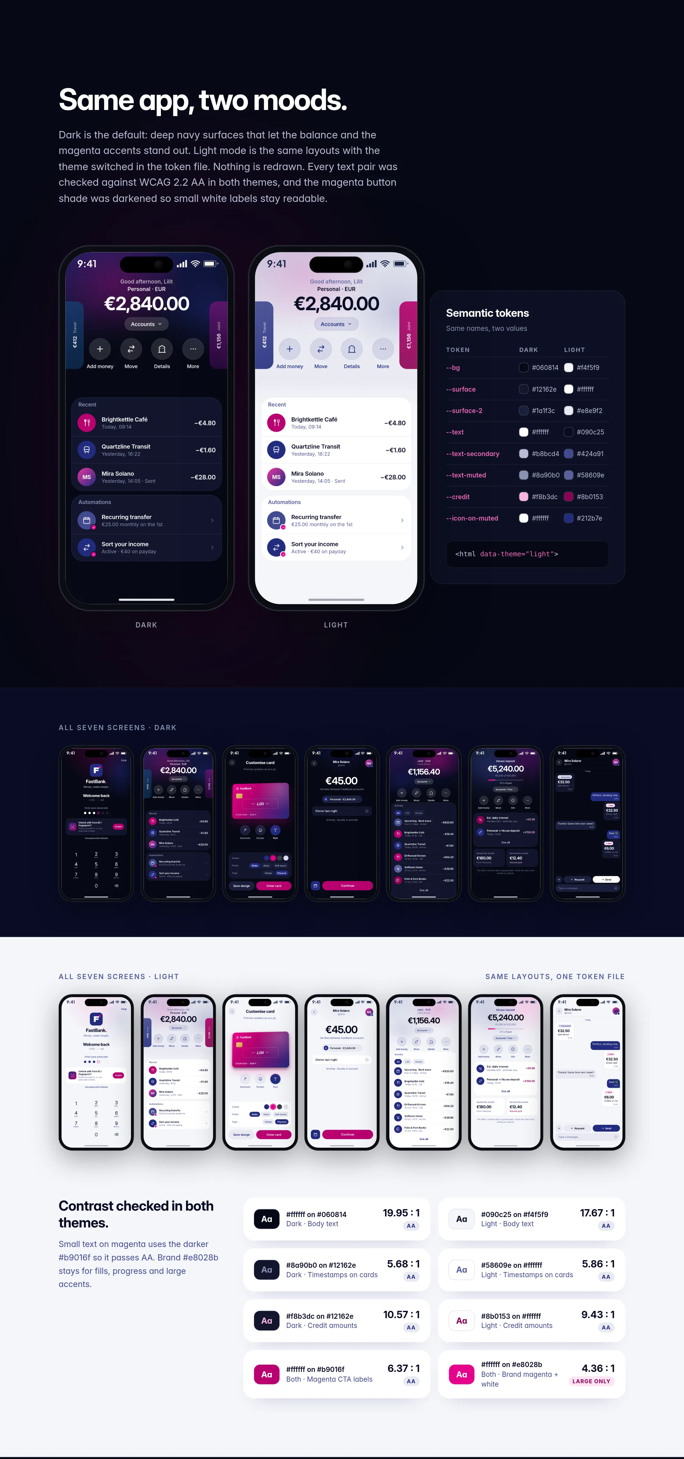
Dark is the default: deep navy surfaces that let the balance and the magenta accents stand out. Light mode is the same layouts with the theme switched in the token file. Nothing is redrawn. Every text and colour pair was checked for comfortable contrast in both themes.
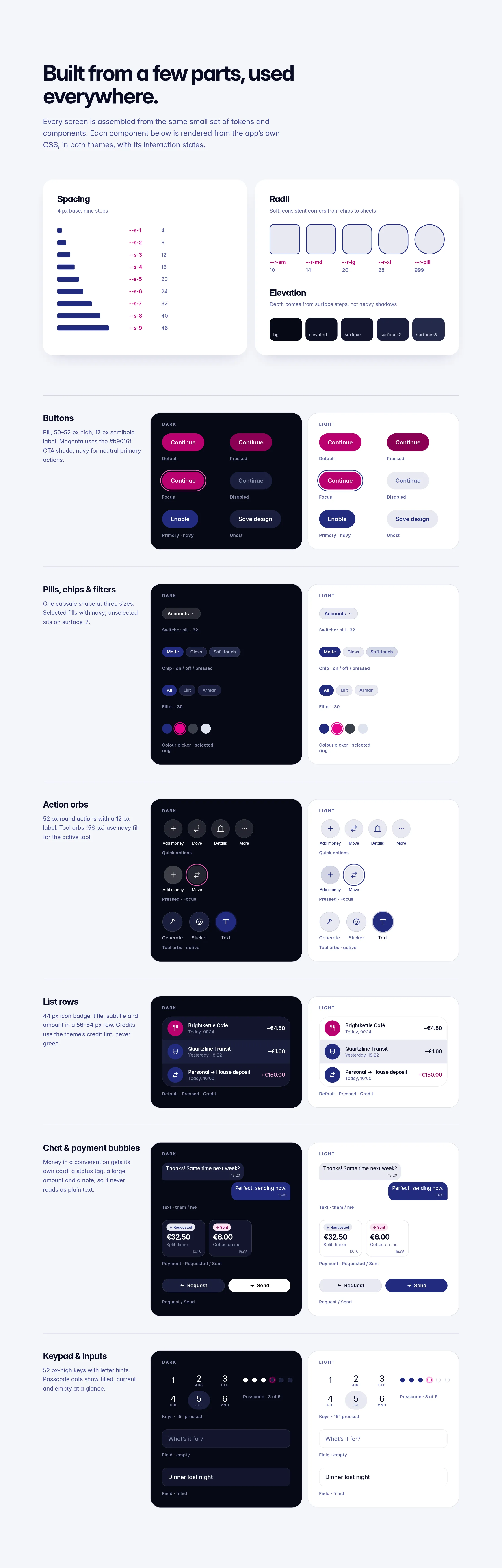
Built from a few parts, used everywhere.
Every screen is assembled from the same small set of tokens and components, rendered in both themes with their interaction states.
Brand: a full stop that says “done”.
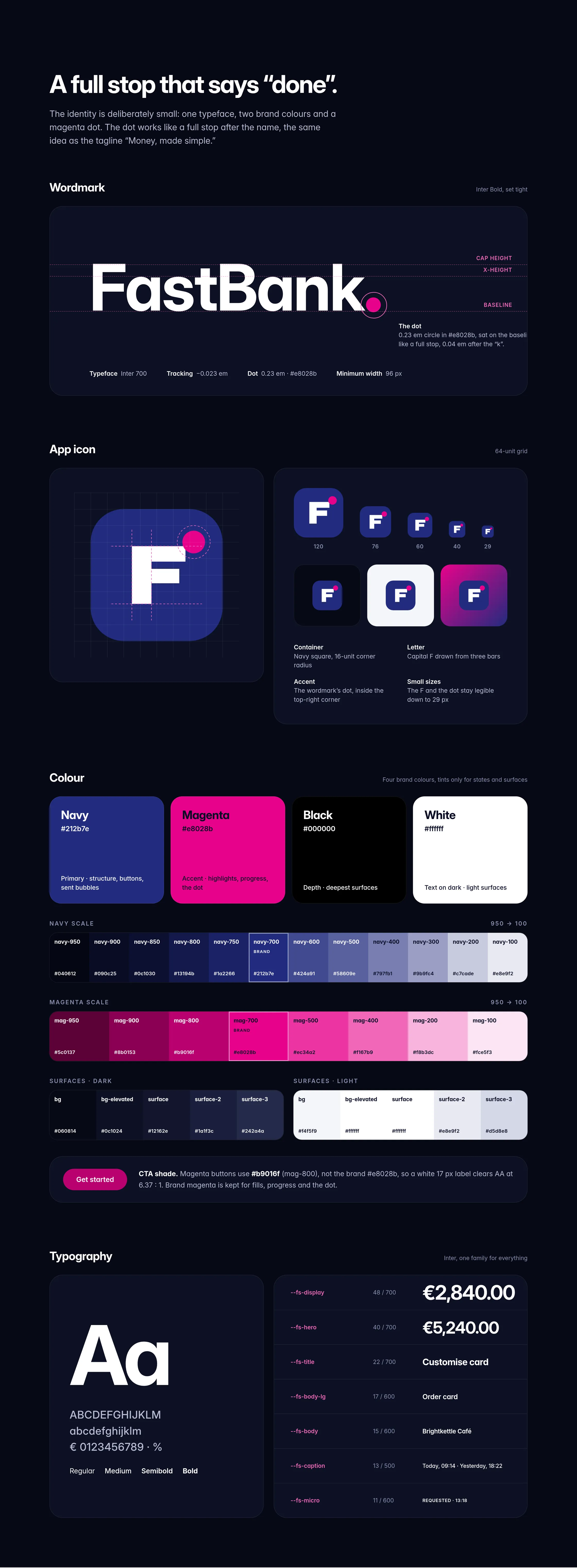
The identity is deliberately small: one typeface, two brand colours and a magenta dot. The dot works like a full stop after the name, the same idea as the tagline “Money, made simple.”
Components and tokens.
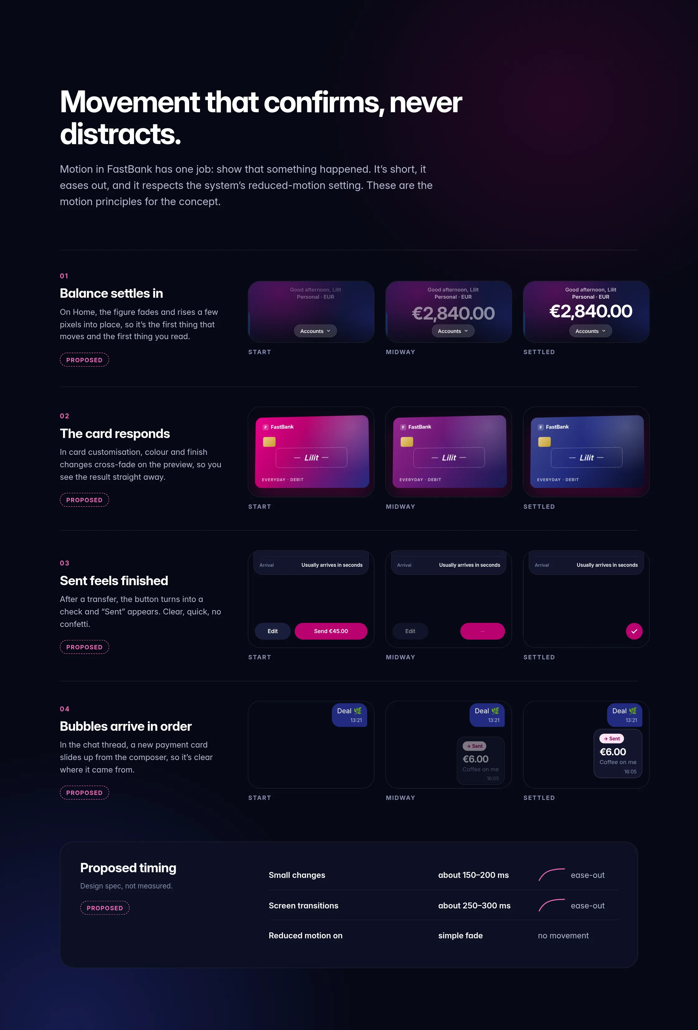
Motion (proposed): movement that confirms, never distracts.
Motion in FastBank has one job: show that something happened. It’s short, it eases out, and it respects the system’s reduced-motion setting. Proposed timing, a design spec rather than a measurement: small changes about 150–200 ms, screen transitions about 250–300 ms, ease-out. With reduced motion on, everything becomes a simple fade.
What I set out to do, and what comes next.
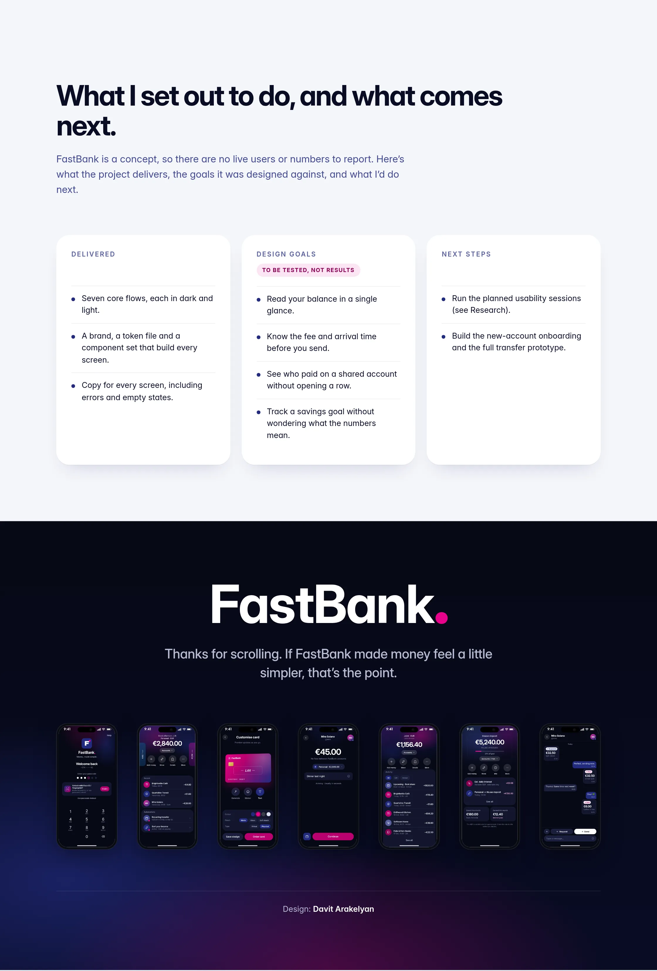
FastBank is a concept, so there are no live users or numbers to report. Here’s what the project delivers, the goals it was designed against, and what I’d do next.
Delivered
- Seven core flows, each in dark and light.
- A brand, a token file and a component set that build every screen.
- Copy for every screen, including errors and empty states.
Design goalsTo be tested
- Read your balance in a single glance.
- Know the fee and arrival time before you send.
- See who paid on a shared account without opening a row.
- Track a savings goal without wondering what the numbers mean.
Next steps
- Run usability sessions on the transfer, send-as-chat and joint-account flows.
- Run a first-click test on Home and an accessibility pass with screen reader and large text.
- Build the new-account onboarding and the full transfer prototype.
Aurelume Live Casino
Live casino brand concept
View case study →← Previous: Tuckbell Food Delivery