Davit Arakelyan
← All work
Case study · Fictional brand concept · 2026

Tuckbell Food Delivery

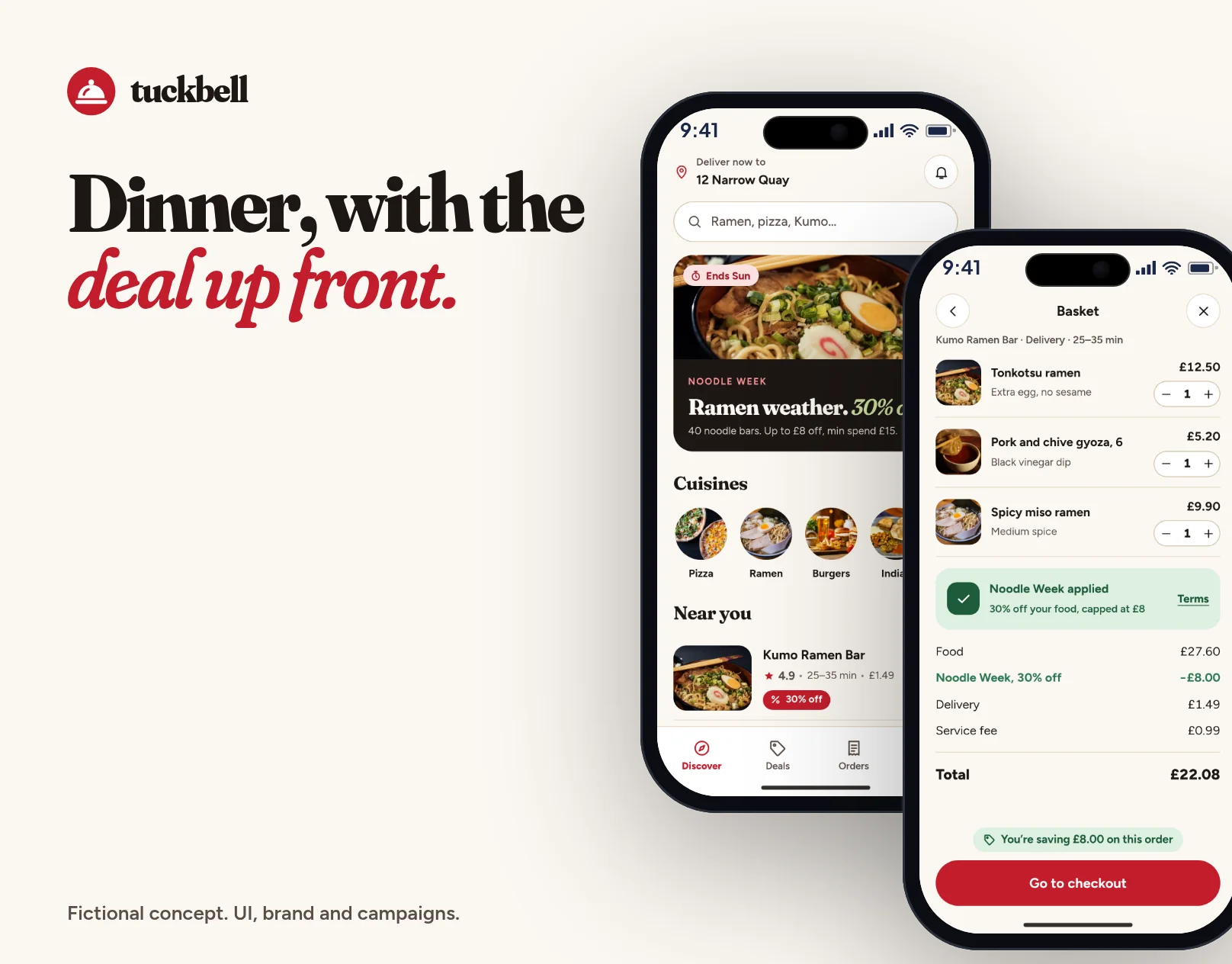
Identity, a promotions-led homepage and app for a food delivery service in Bristol: a deals hub, a Noodle Week campaign, a restaurant menu, a basket that unlocks the saving, and tracking that still shows what you saved.

Not a real company. Tuckbell, its restaurants, people and every figure in the mockups, including the offers, are fictional, made for this portfolio concept.
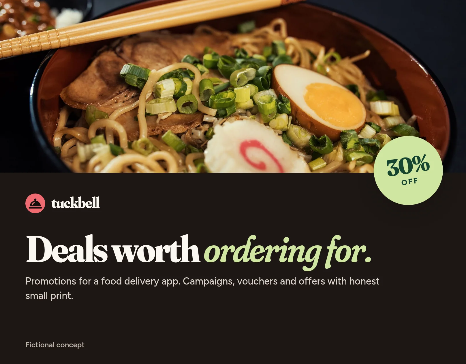
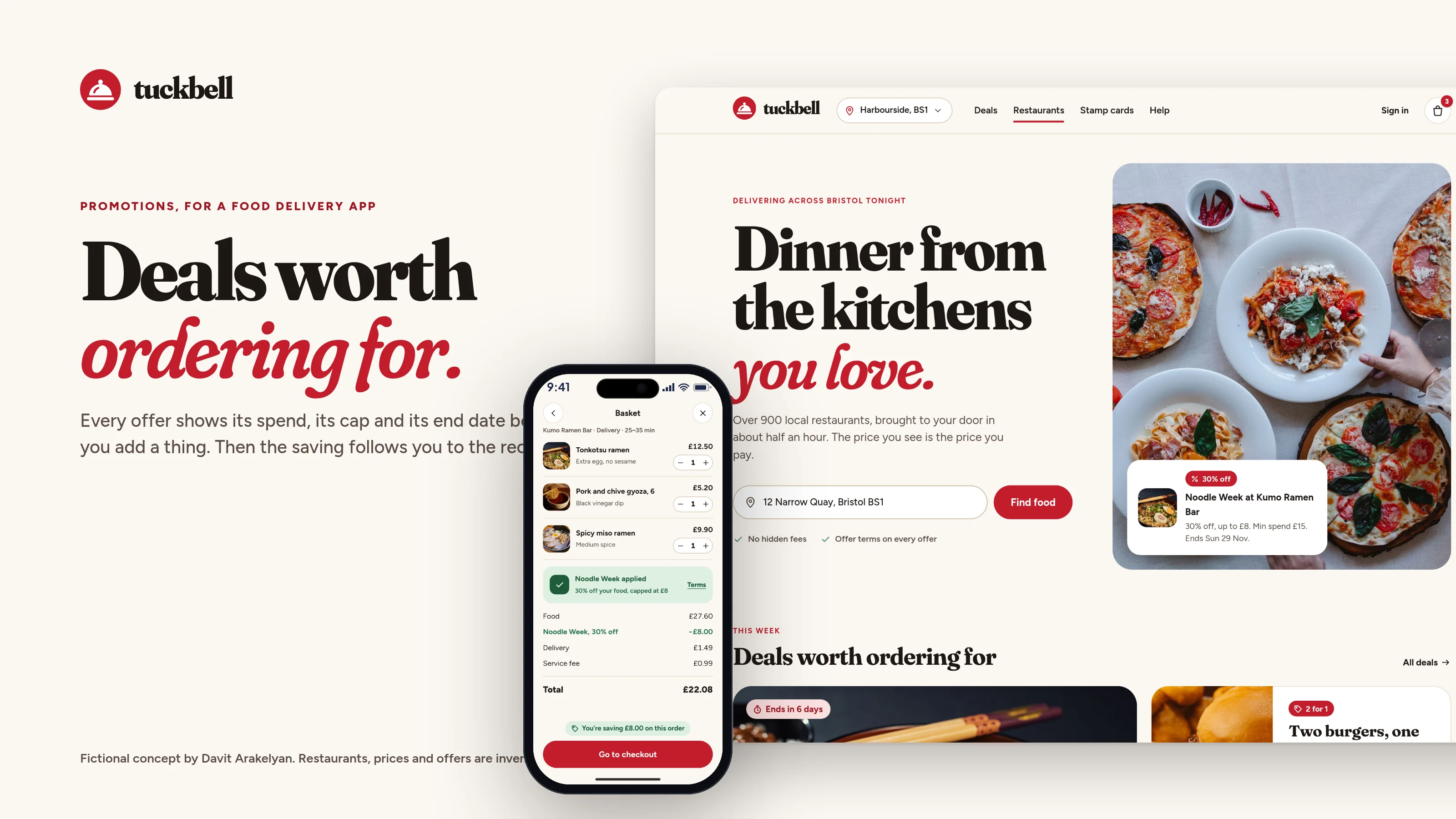
Tuckbell cover: a bowl of ramen, the line “Deals worth ordering for.” and a 30% off badge
Fig. 01Work cover: a bowl of ramen, the line “Deals worth ordering for.” and a 30% off badge.
Role
Brand identity, promotions UI, product design
Scope
Self-initiated concept
Year
2026
Deliverables
Identity, design system, homepage in light and dark, promotions hub, restaurant menu, basket and checkout with an offer applied, order tracking, Noodle Week and welcome campaign set, app icon, banners
01The brief

A food delivery app where the promotions do the selling.

Food delivery is a crowded visual field. This concept is a Bristol-based app built around the moment that actually wins an order: a deal you can trust. The work is the homepage, a promotions hub, a Noodle Week campaign, a restaurant menu with the offer and its terms, a basket that unlocks the saving, and tracking that still shows what you saved.

  1. Make the offer the first thing you see, and the terms one tap away.
  2. Show the cap, the minimum spend and the end day in the same breath.
  3. Apply the best offer for you, and say so.
  4. Design Noodle Week as a real campaign, not a poster: the web, email, social, in-app and a push.
  5. Keep photography in its own colour, and never put type over a dish.
  6. One design system for badges, vouchers, stamp cards and the basket.

All restaurants, dishes, prices, ratings, people, offers and dates are invented and labelled as such.
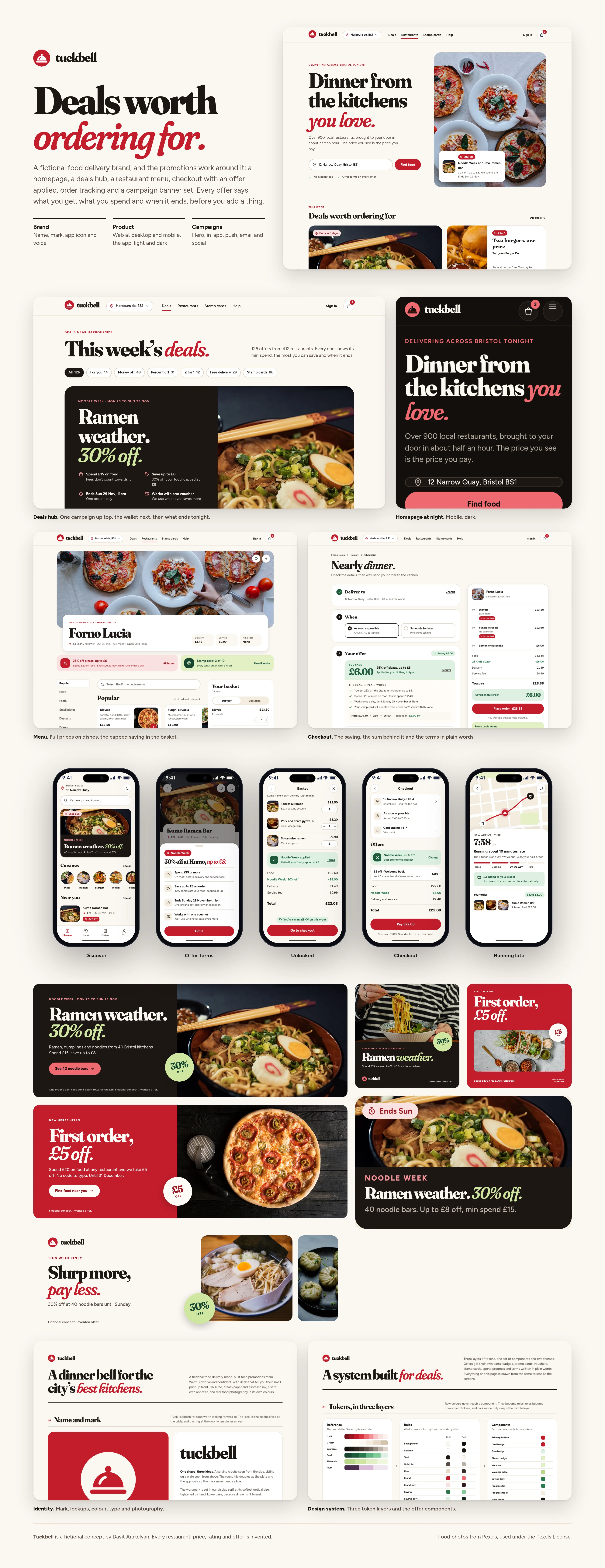
Overview of the Tuckbell homepage, deals hub, campaign, app screens, identity and design system
Fig. 02The whole project on one page: the site, the deals, the campaign, the app and the system. Every figure is invented.
02Naming

Tuck in, and a bell when dinner arrives.

Tuckbell comes from “tuck”, British slang for food worth looking forward to, and the bell: the cloche lifted at the table, and the ring at the door when dinner arrives. It suggested the mark and the voice (“Delivered. Tuck in.”). I also considered Saucebell, Ladlebell, Sizzlebell and Pottlebox. Domain, app-store and trade-mark sanity checks were clear; the official registers should still be searched before any real use.

03Homepage

Dinner from the kitchens you love.

The homepage has to look like a place you’d order from tonight, and still tell the truth about the deal. The hero leads with a Bristol address, a promise about the price, and this week’s campaign card sitting on real food, in its own colour.
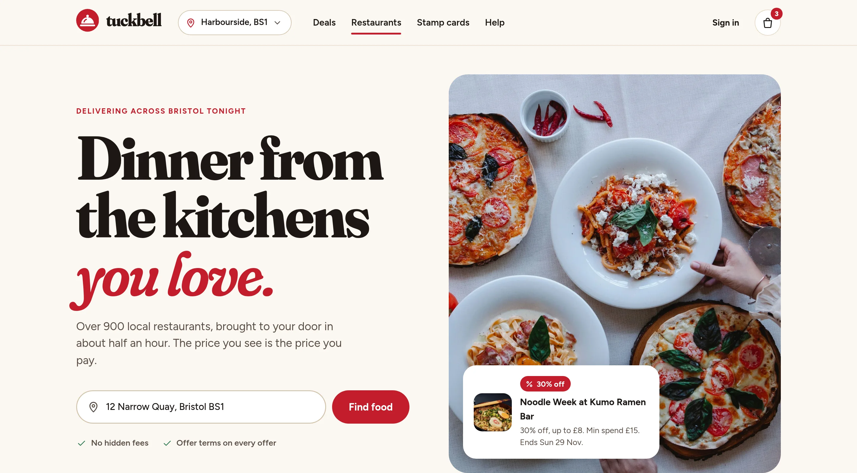
Homepage hero with the headline Dinner from the kitchens you love, a table of pizza and pasta, and a Noodle Week offer card
Fig. 03The homepage hero: a Bristol address, a clear price promise, and Noodle Week on the dish.
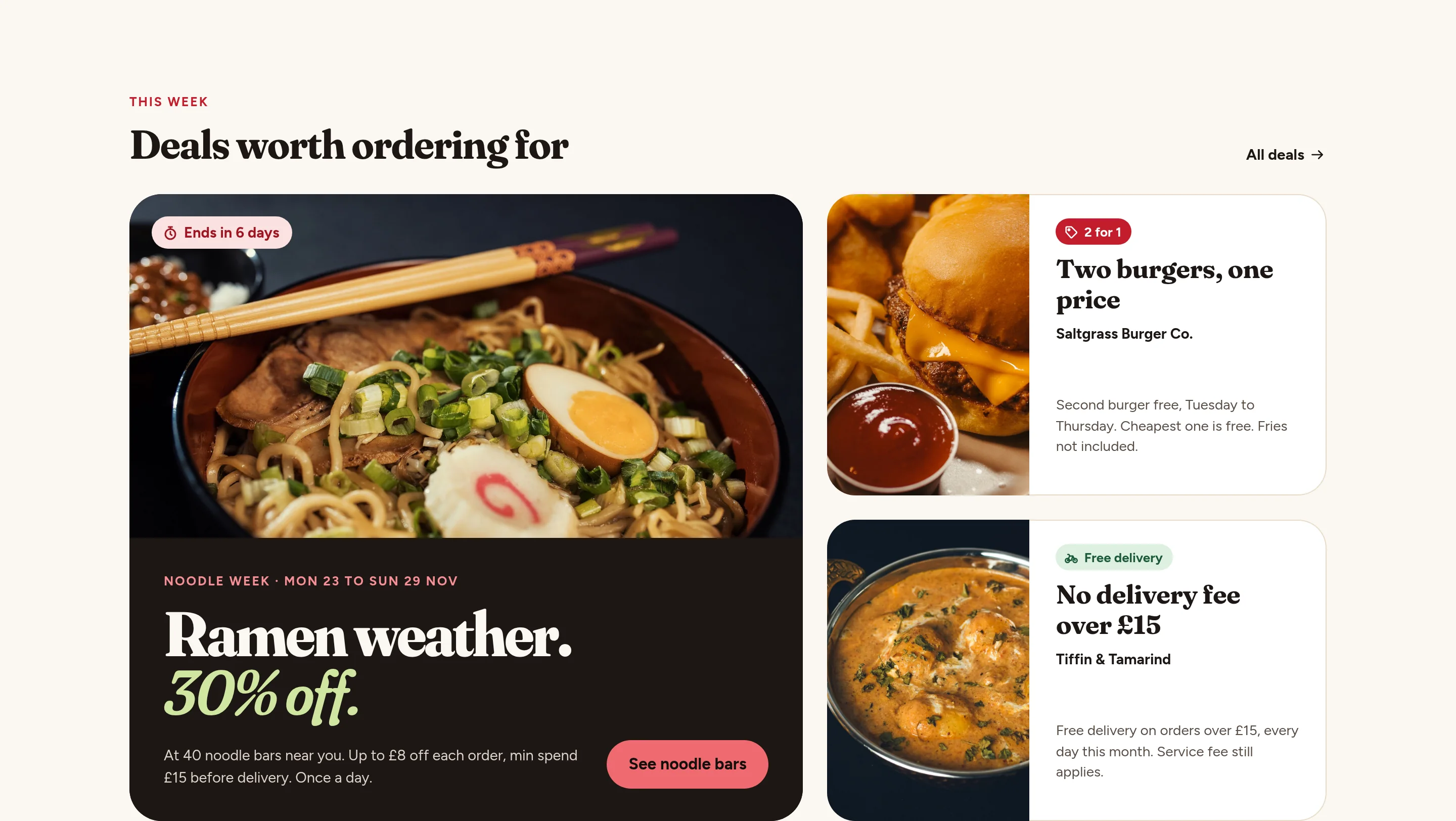
Homepage deals section with the Noodle Week campaign card and other invented offers
Fig. 04Deals worth ordering for: the campaign first, then what ends soon.
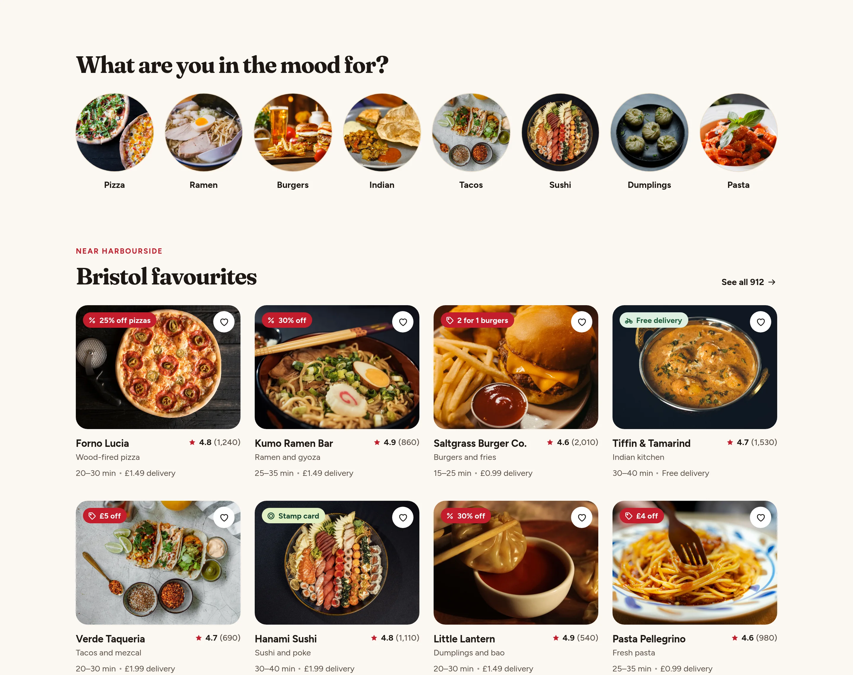
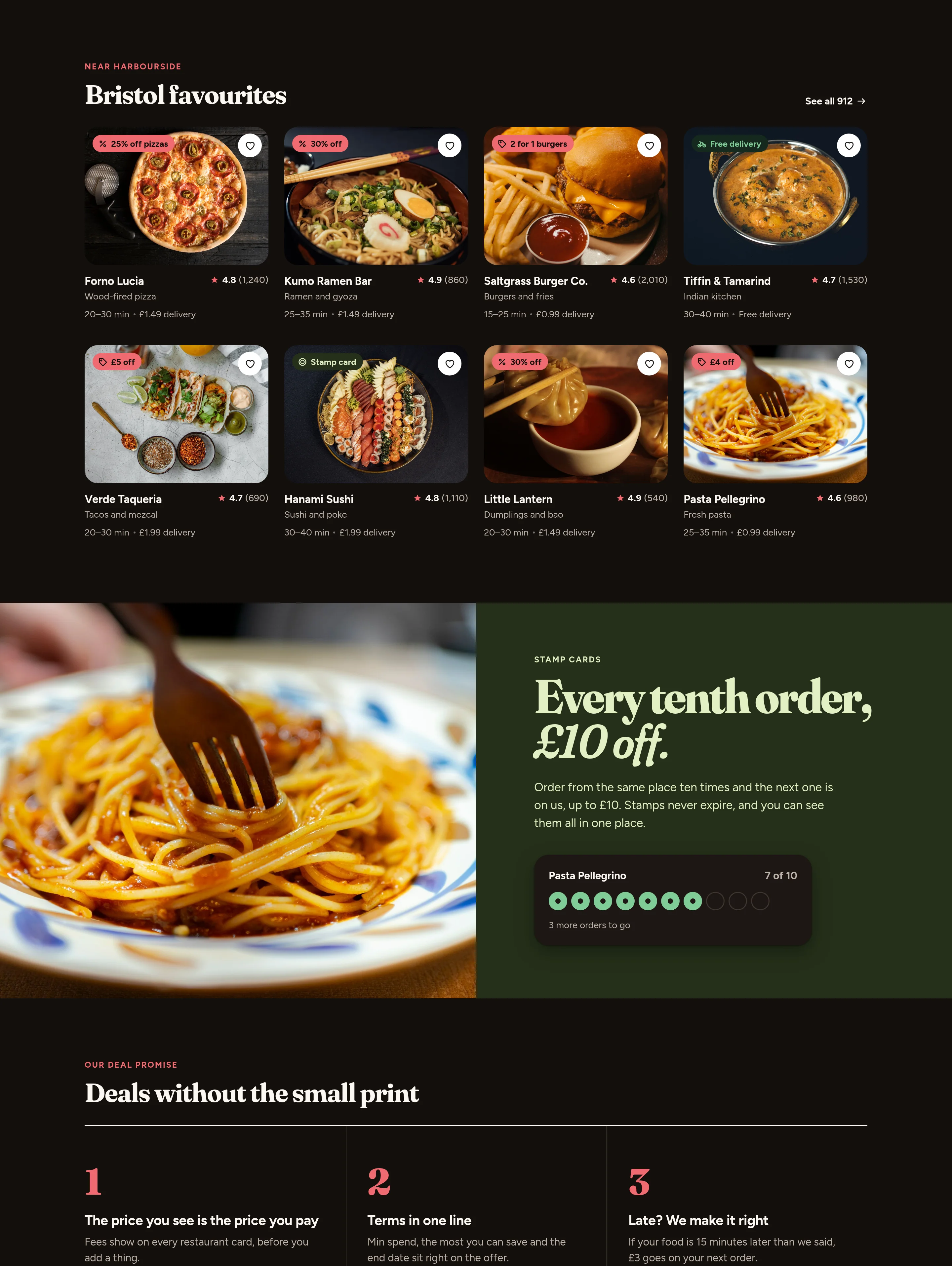
Cuisine row and restaurant cards near Harbourside, each with a single offer badge
Fig. 05What you’re in the mood for, then Bristol favourites with one badge each.
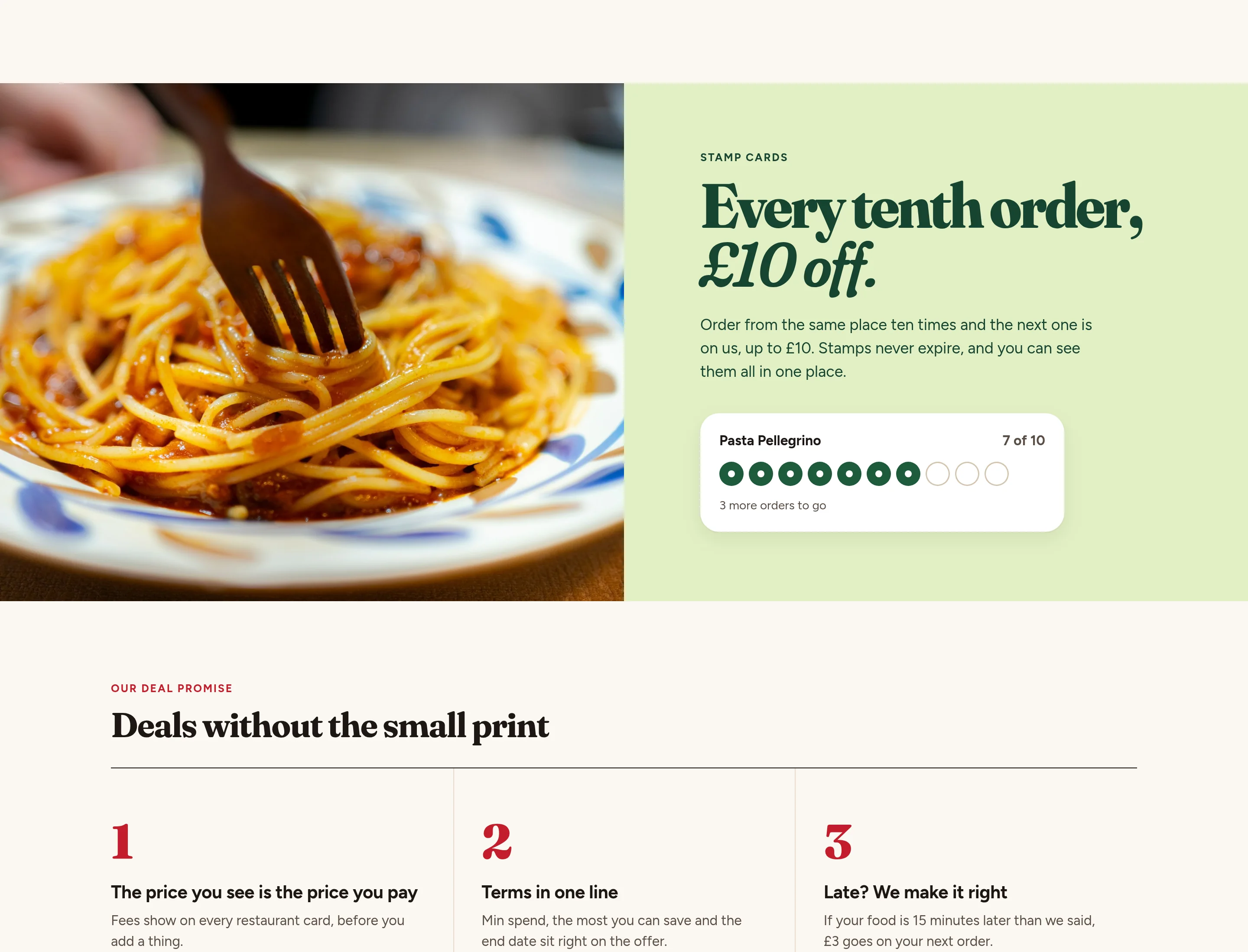
Stamp-card band and a deal-promise section explaining that the price you see is the price you pay
Fig. 06Every tenth order, up to ten pounds off, and a short list of how deals work here.
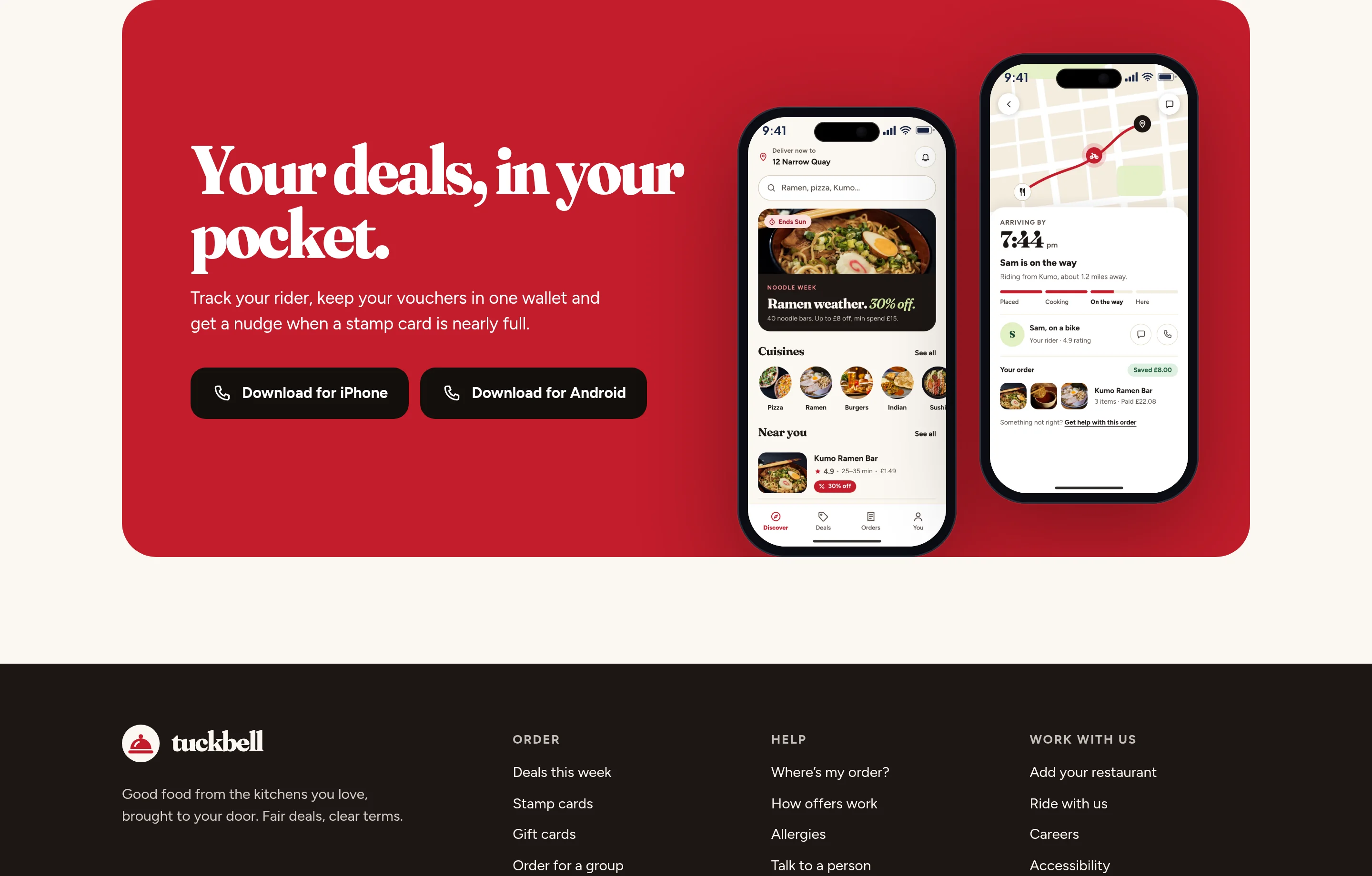
Closing homepage band inviting the visitor to get the app, with a phone showing deals
Fig. 07The same deals, in your pocket.
Mobile homepage, light, showing the hero and the Noodle Week campaign
Fig. 08The homepage on a phone, from the hero through this week’s deals.
Mobile homepage, dark, showing the hero and the Noodle Week campaign
Fig. 09The same stretch in dark mode.
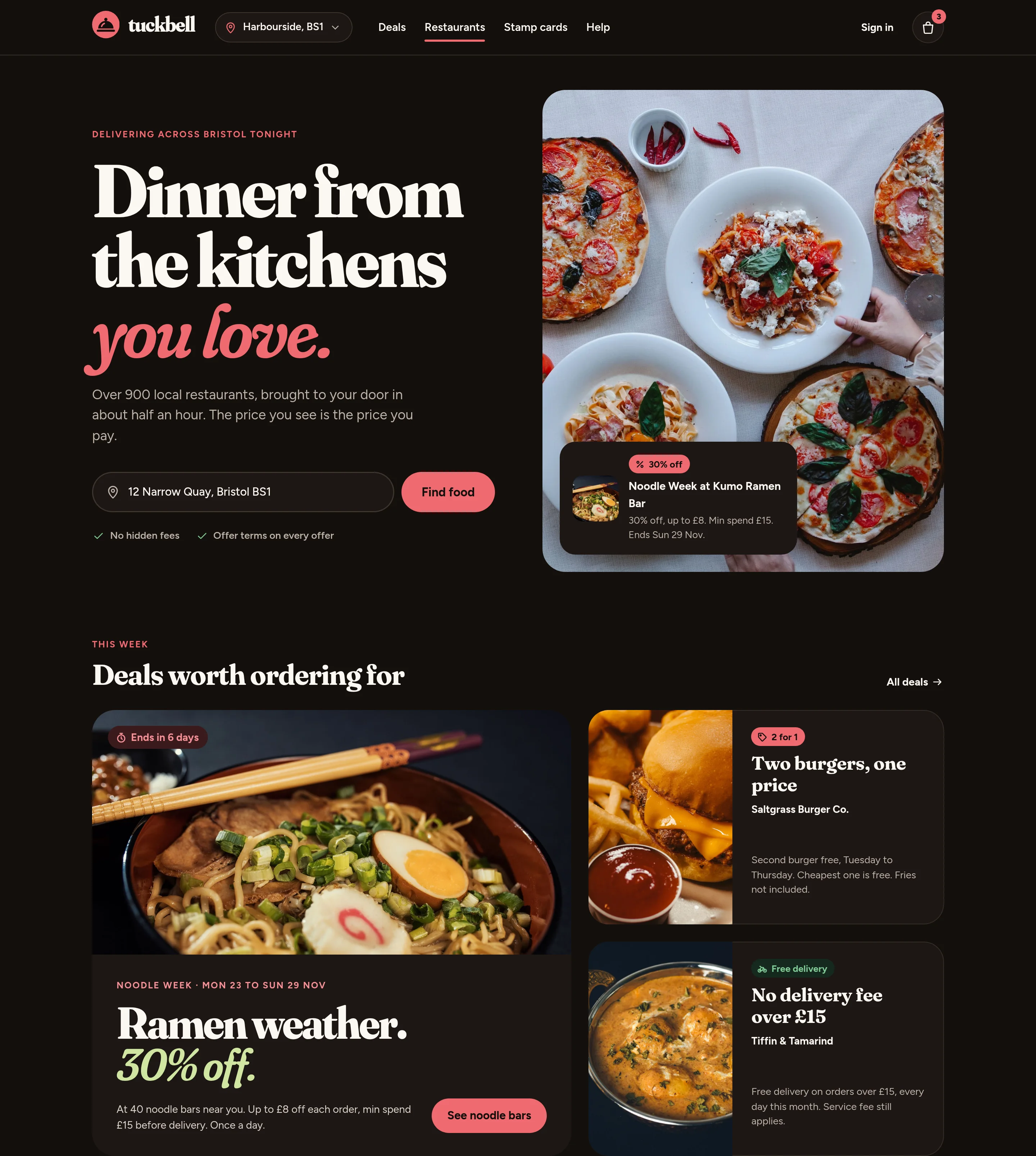
Dark homepage hero and deals section
Fig. 10Desktop, dark: the hero and this week’s deals.
Dark homepage restaurant cards and stamp-card band
Fig. 11Desktop, dark: Bristol favourites and the stamp card.
04Promotions and deals

This week’s deals, with the small print on the card.

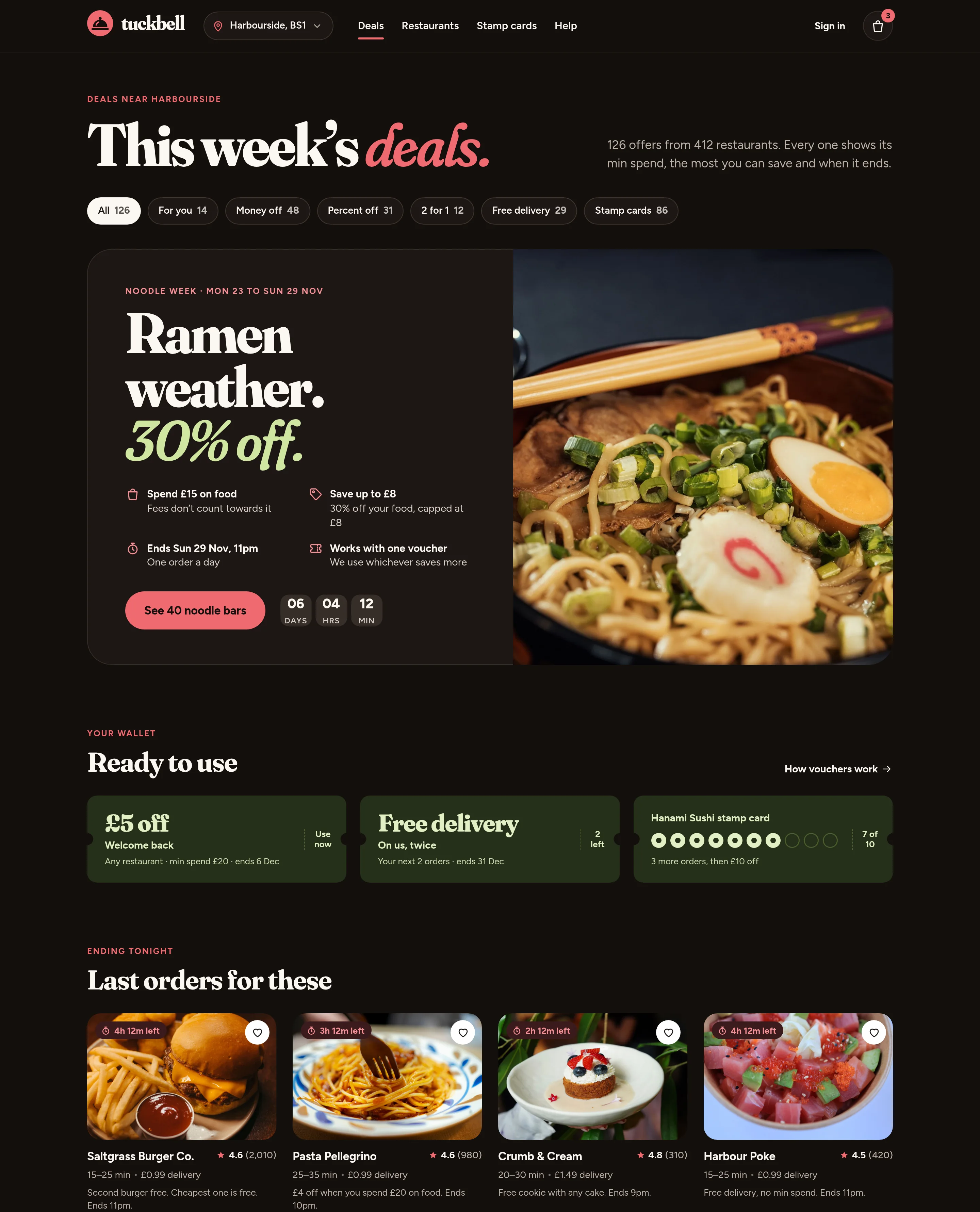
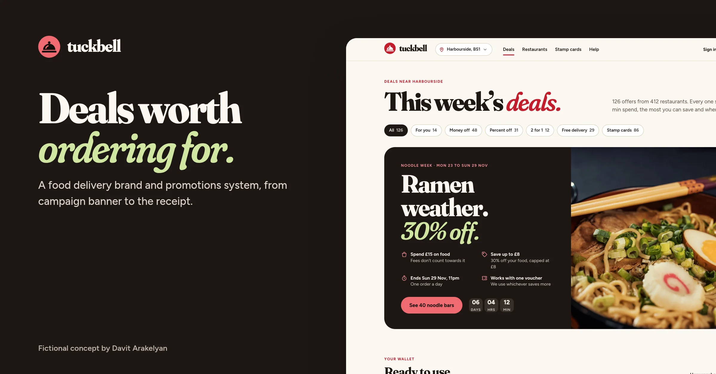
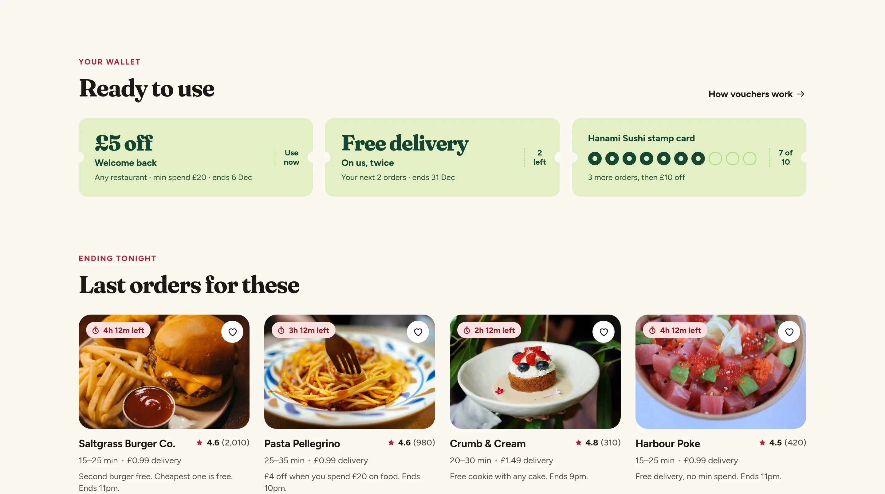
The deals hub is the lead product screen. One campaign sits up top, with the spend, the cap, the end day and whether it stacks, written in plain words. Your wallet comes next, then what ends tonight, then everything else near you. Invented restaurants and numbers throughout.
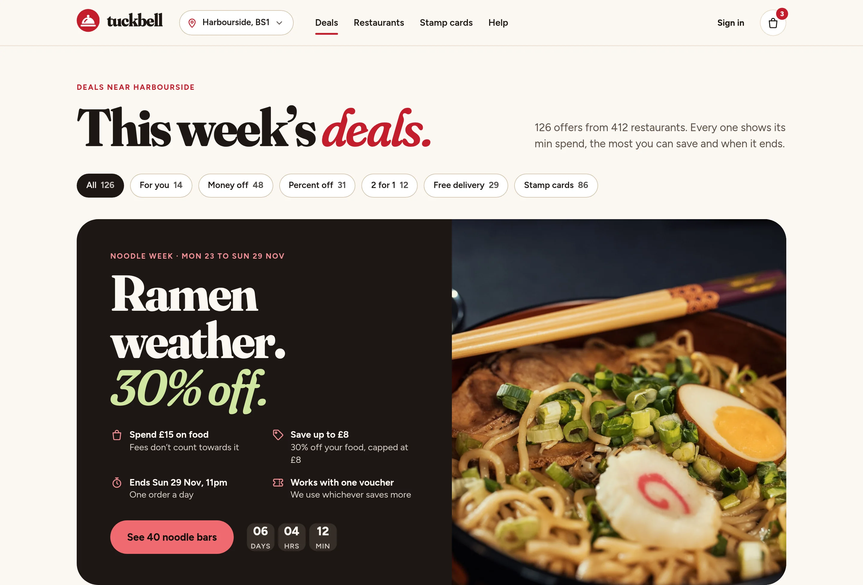
Deals hub hero with the headline This week’s deals and a Noodle Week campaign panel beside a ramen photograph
Fig. 12Noodle Week leads the hub: ramen weather, 30% off, and the terms on the card.
Wallet of invented vouchers and a short list of deals ending tonight
Fig. 13Vouchers ready to use, then the offers that end tonight.
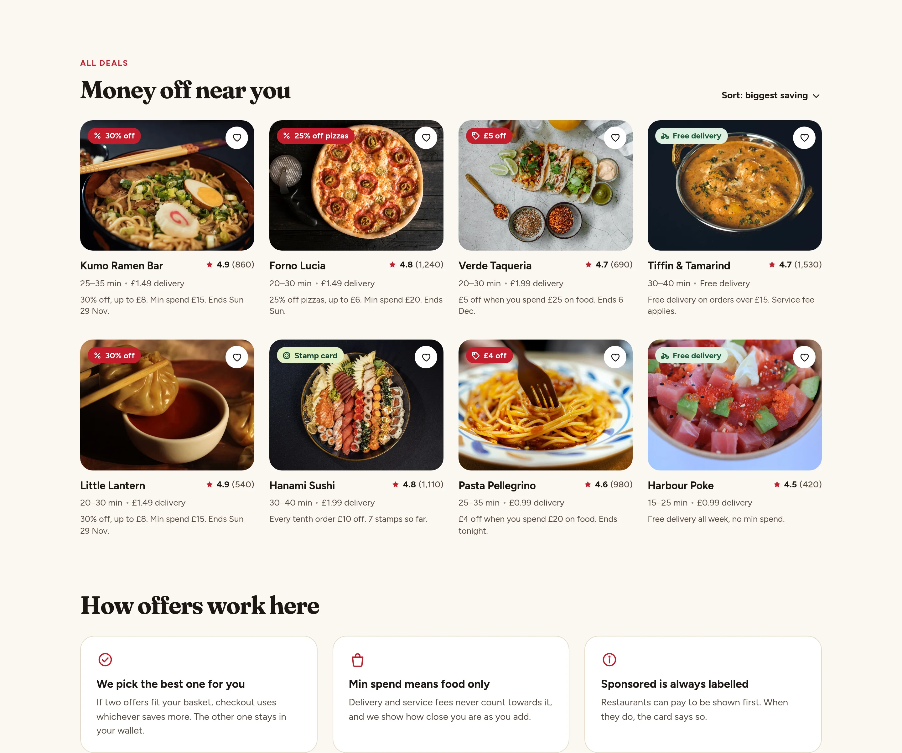
A grid of restaurant deals and a plain-words explanation of how offers are applied
Fig. 14Money off near you, then a short note on how offers work.
Mobile deals hub, light, showing Noodle Week and the wallet
Fig. 15The deals hub on a phone, from the campaign through what ends tonight.
Mobile deals hub, dark, showing Noodle Week and the wallet
Fig. 16The same stretch in dark mode.
Dark deals hub hero and ready-to-use vouchers
Fig. 17Desktop, dark: the campaign and the wallet.
05Restaurant menu

The offer sits above the dishes, with terms one tap away.

On a restaurant page the offer is not a surprise at the end. It sits above the menu, with the cap in the basket and the terms a tap away. Prices stay on the dishes. Forno Lucia and every figure here are invented.
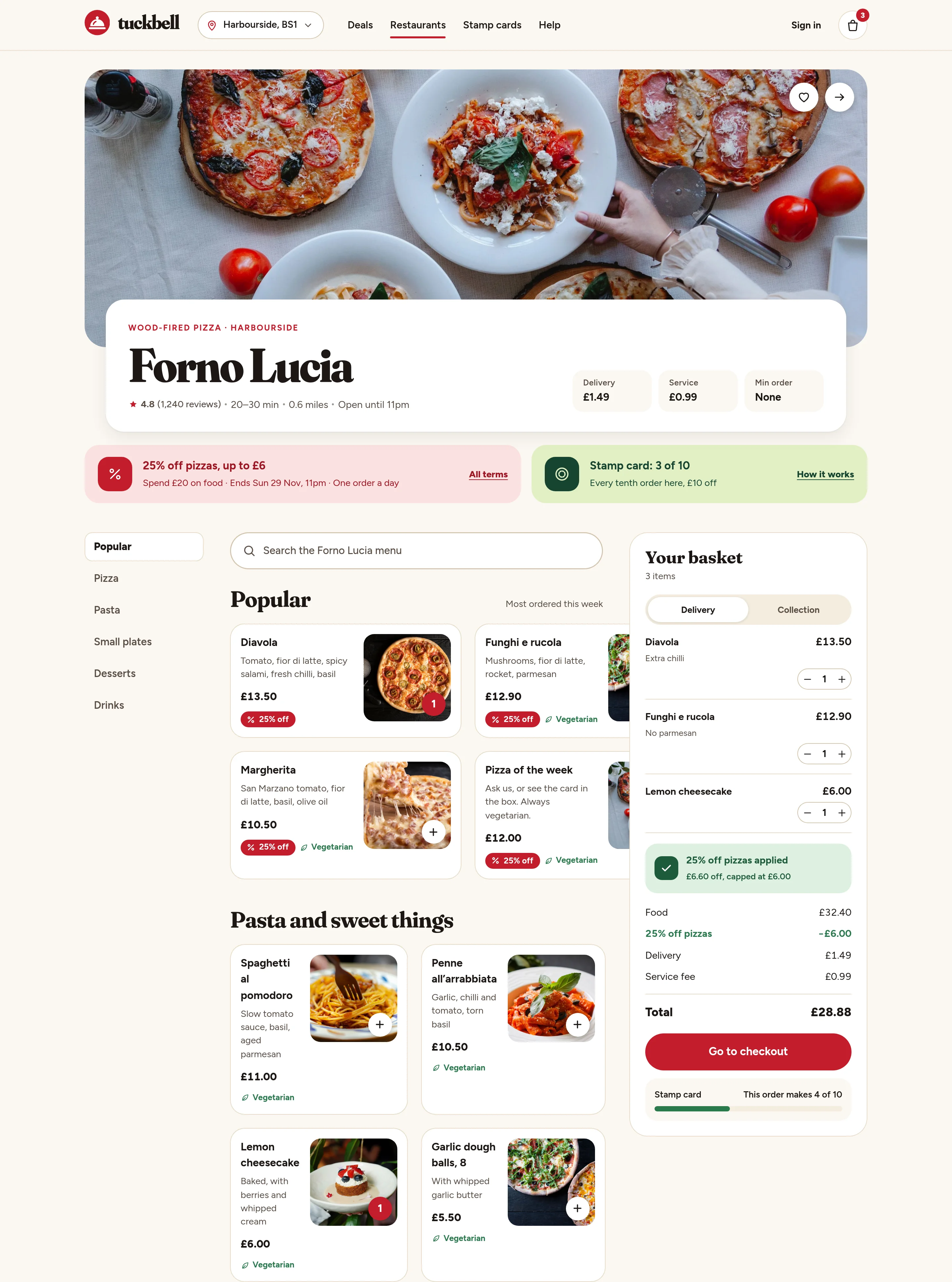
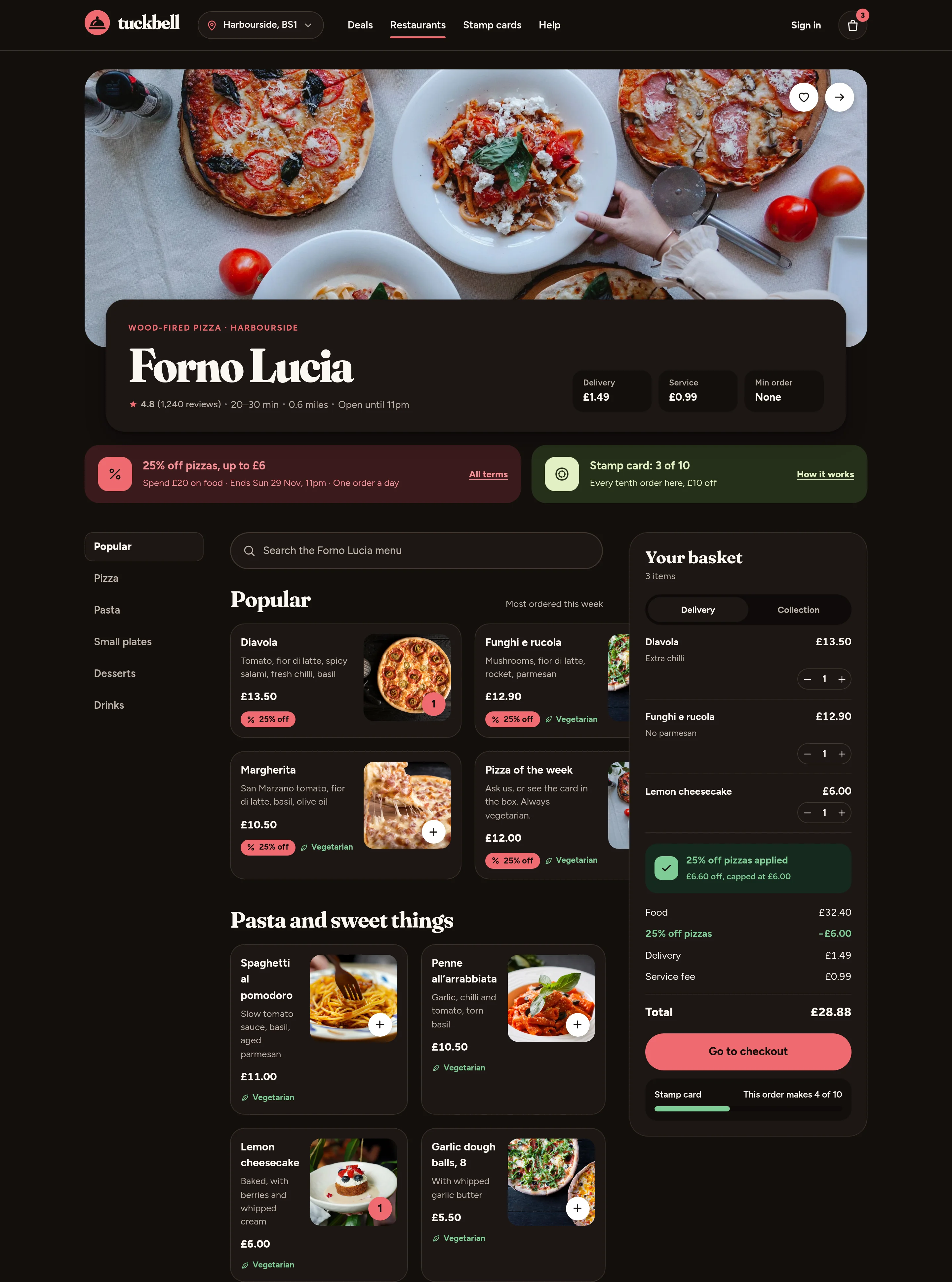
Desktop restaurant menu in light mode, with an offer banner, dishes and a basket panel showing the saving
Fig. 18A pizza restaurant with 25% off, the cap in the basket, and the terms at hand. Light.
Desktop restaurant menu in dark mode, with the offer, dishes and basket
Fig. 19The same menu in dark mode.
Mobile restaurant menu, light, with the offer at the top and dishes below
Fig. 20The same restaurant on a phone.
Mobile restaurant menu, dark
Fig. 21And in dark mode.
06Basket and checkout

Show how close you are, then the saving in plain numbers.

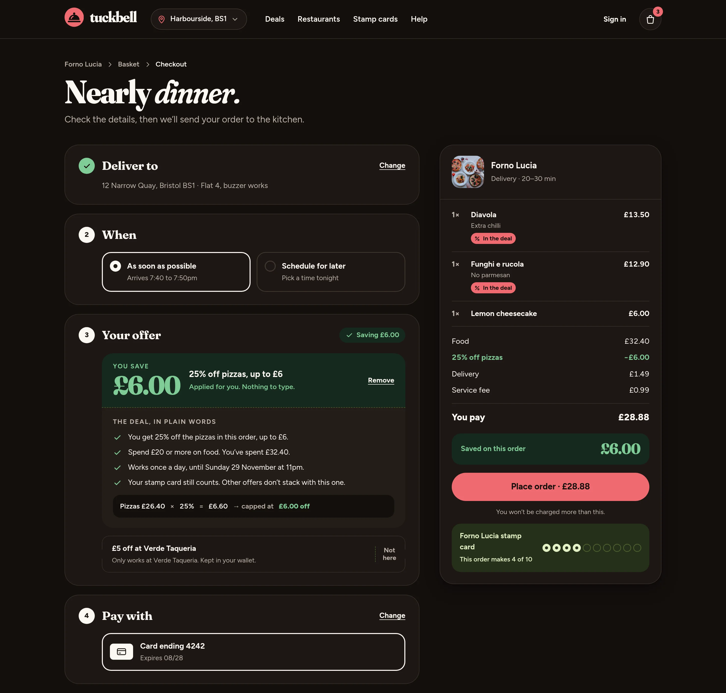
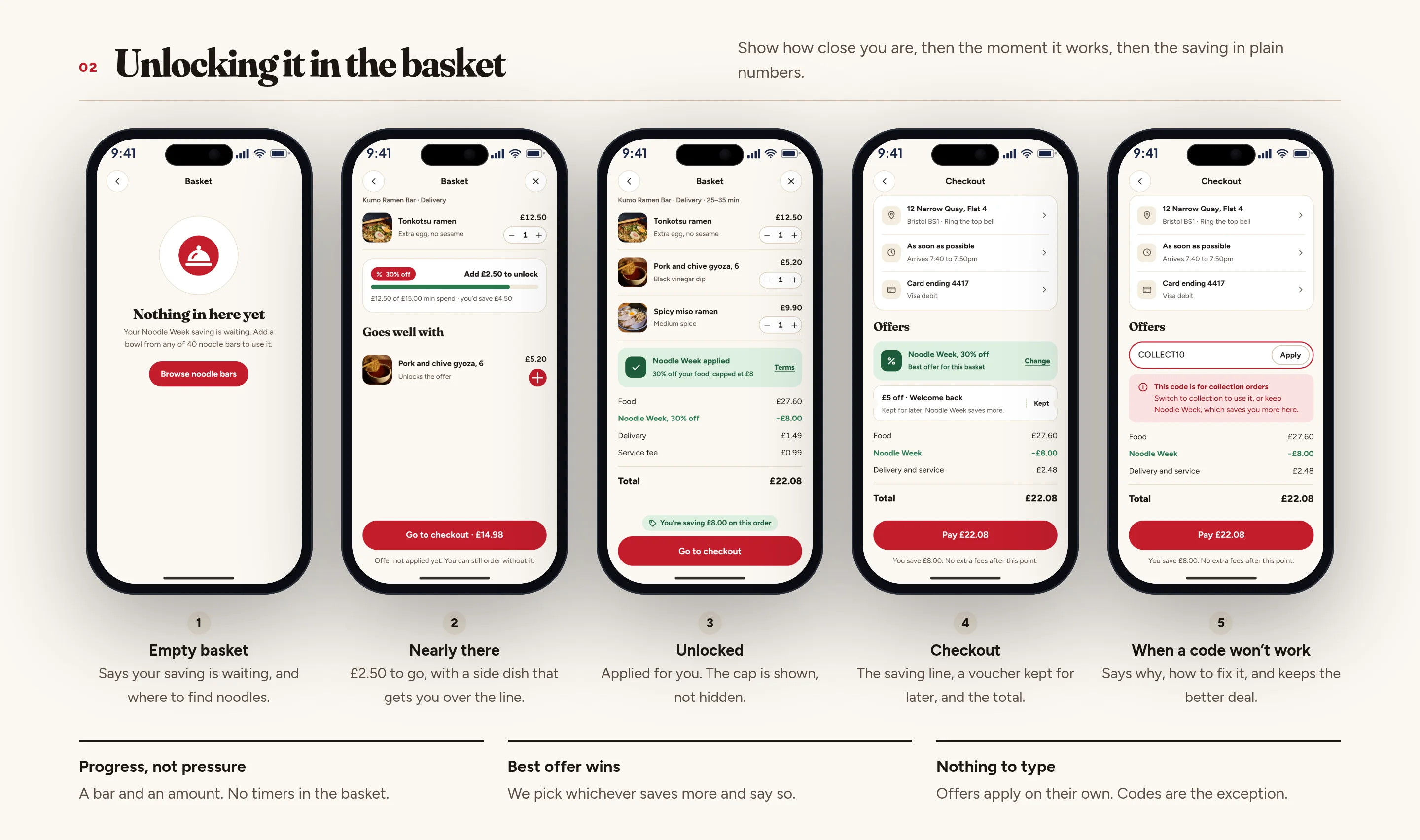
The basket applies the better offer for you and says so. A nearly-there state shows how much more will unlock it, without a timer. At checkout the saving is a line of its own, any leftover voucher is kept, and a code that fails says why — without dropping the better deal. Invented address, items and totals.
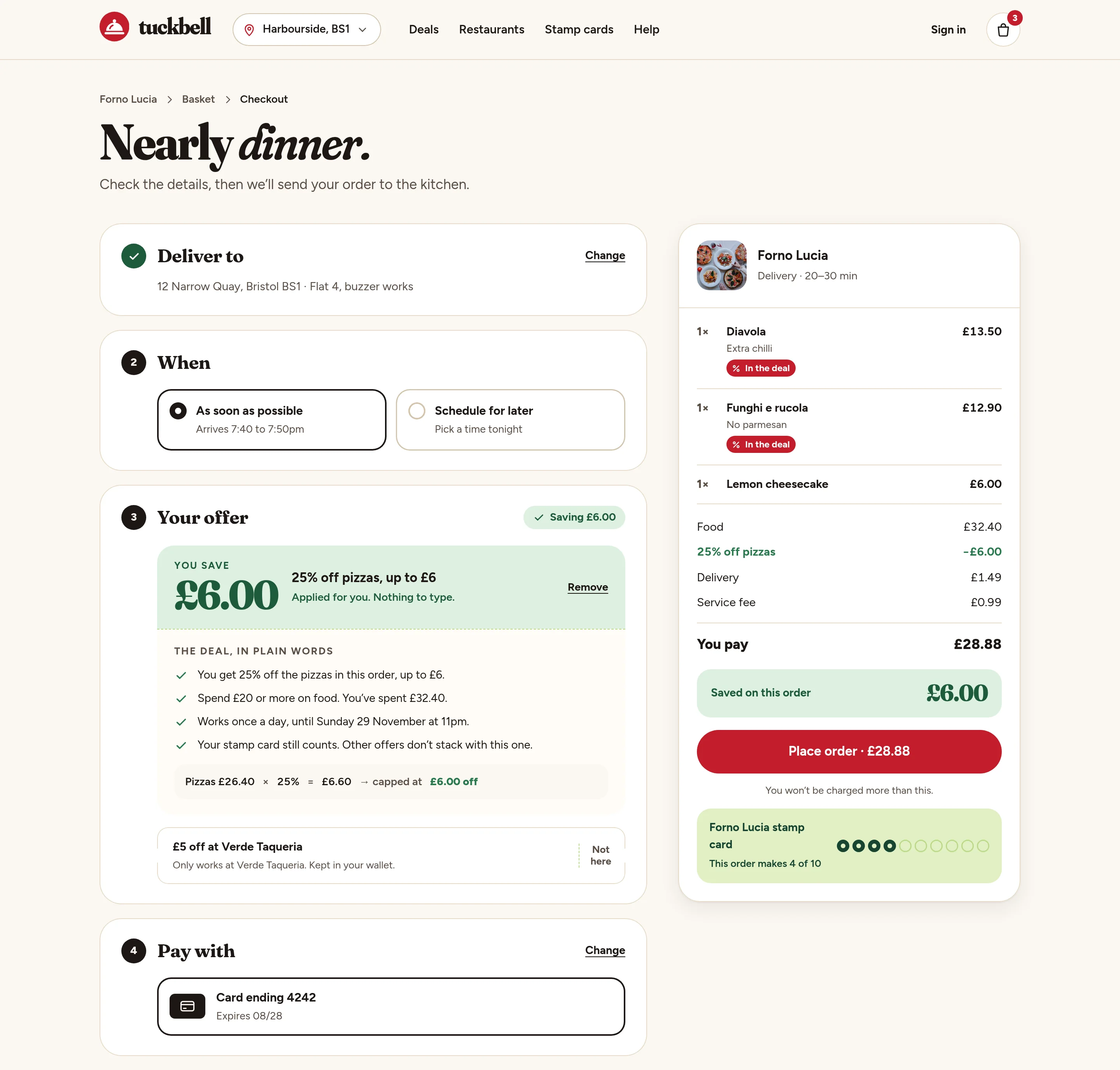
Desktop checkout in light mode, with a delivery address, the order and a visible saving
Fig. 22Checkout with the offer applied: the saving, the cap, and the total. Light.
Desktop checkout in dark mode, with the saving shown in the total
Fig. 23The same checkout in dark mode.
Mobile checkout, light, showing the saving and the total
Fig. 24Checkout on a phone, with the offer already applied.
Mobile checkout, dark
Fig. 25The same checkout in dark mode.
07The app journey

From a deal you spot, to dinner at the door.

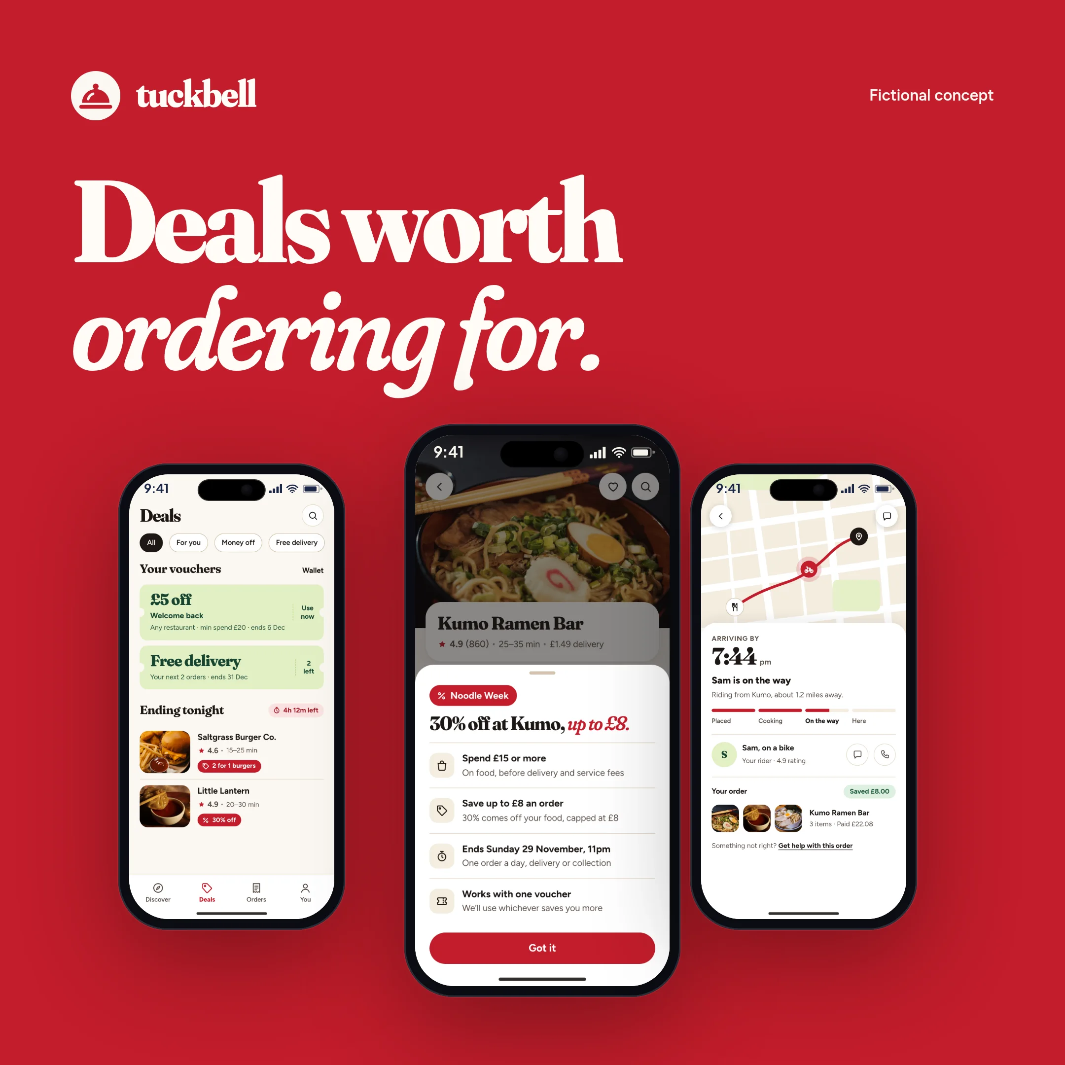
The app follows one campaign all the way through: finding Noodle Week, reading the terms, unlocking it in the basket, seeing the saving at checkout, and tracking the order — including the late one. Every screen in light and dark. All restaurants and amounts are invented.
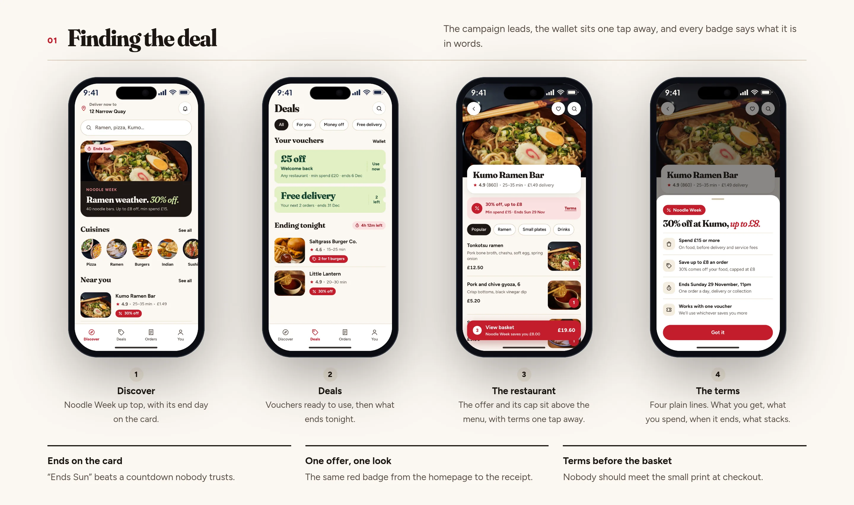
Four phone screens: the app home with Noodle Week, the deals hub, a restaurant menu and the offer terms
Fig. 26Finding the deal: Discover, the deals hub, the restaurant, and the terms in four lines.
Five phone screens for the basket and checkout, including a nearly-there state and a failed code
Fig. 27Unlocking it: an empty basket, nearly there, applied, checkout, and a code that won’t work.
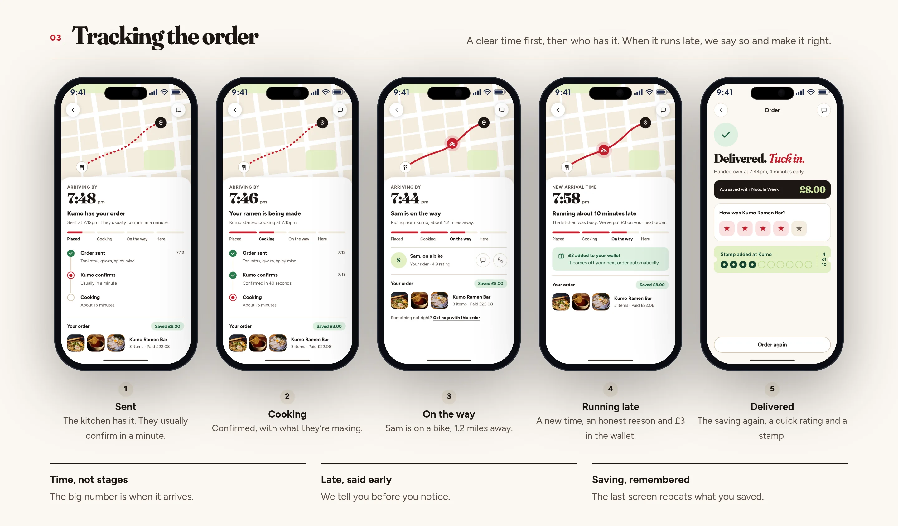
Five phone screens tracking an order, including a late order with money back in the wallet
Fig. 28Tracking: sent, cooking, on the way, running late, and delivered — with the saving remembered.
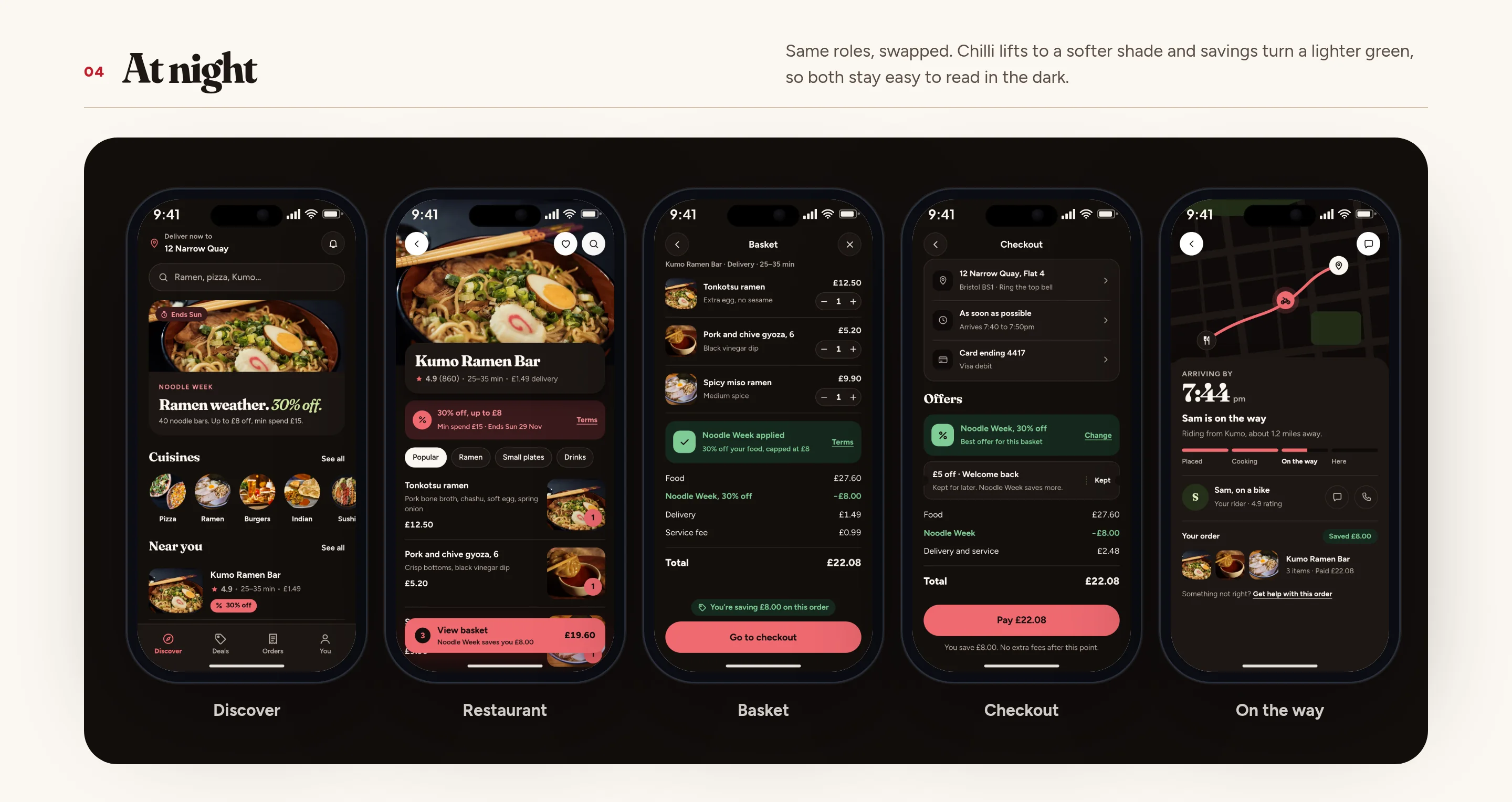
Five phone screens in dark mode: discover, the restaurant, the basket, checkout and an order on the way
Fig. 29The same journey at night, from the same set of parts.
08Campaigns

Noodle Week, and a welcome offer, designed as a set.

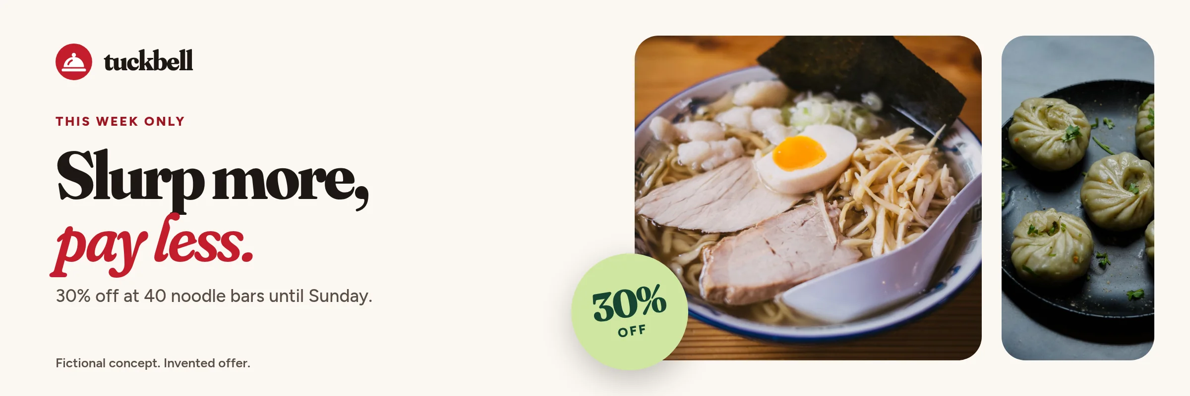
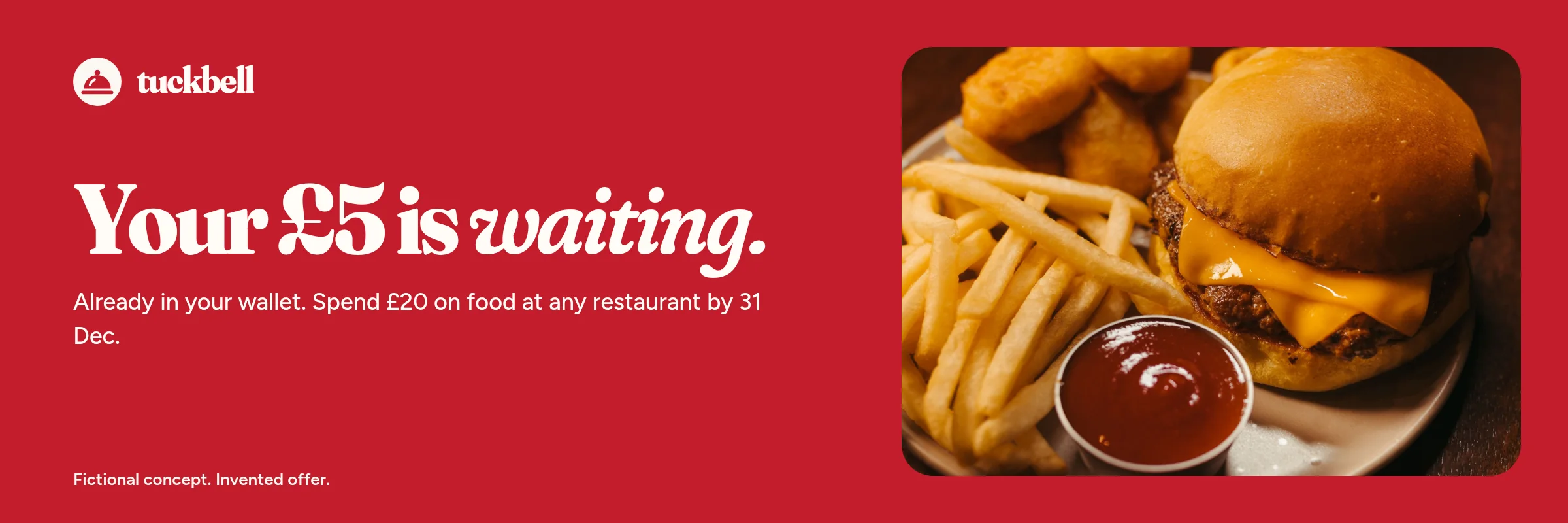
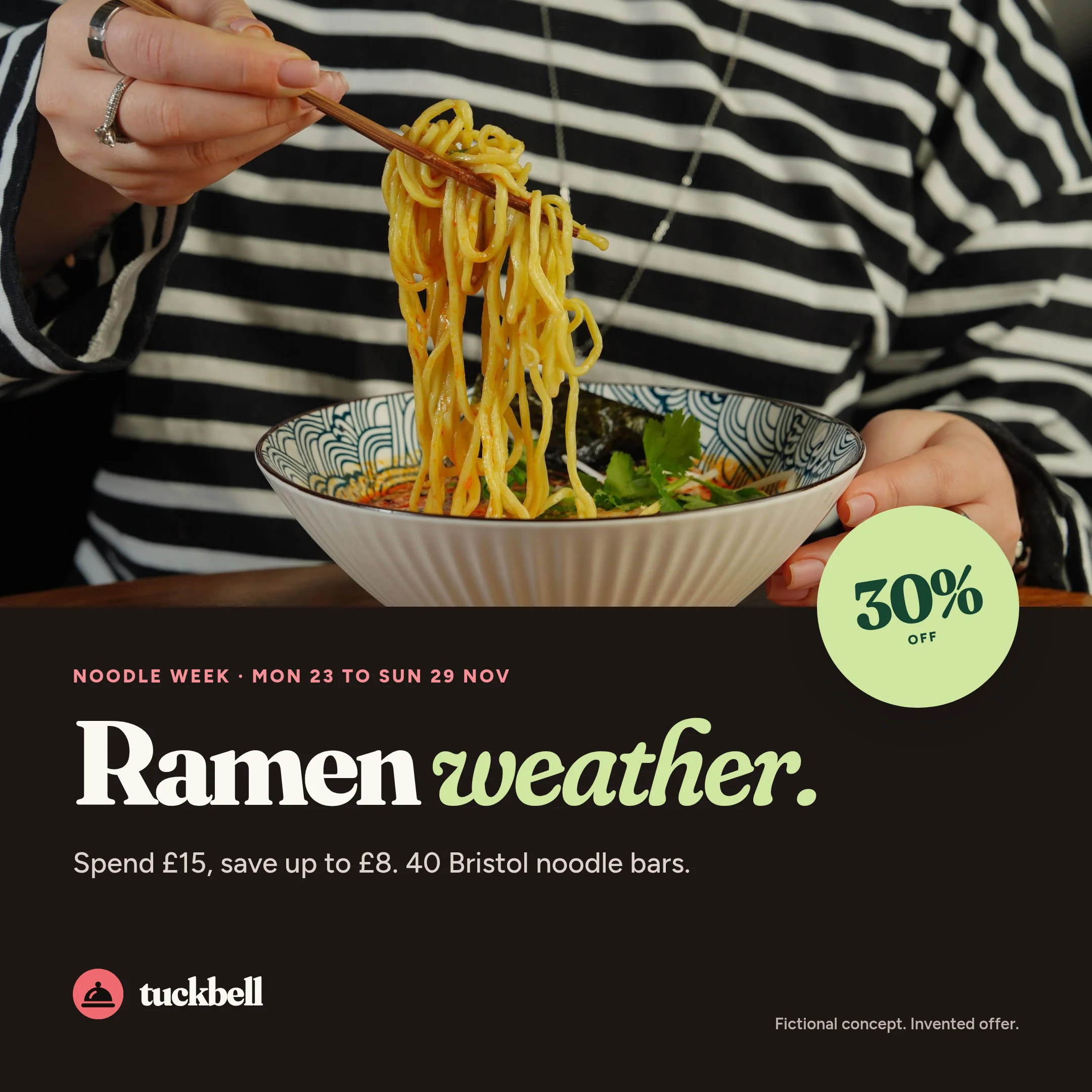
Noodle Week is the retention campaign: a week of noodle bars, 30% off, with a cap and an end day that appear on every piece. The welcome offer is the acquisition pair. Both are invented, and both reuse the same photography and the same terms, from the web hero to a push on the lock screen.
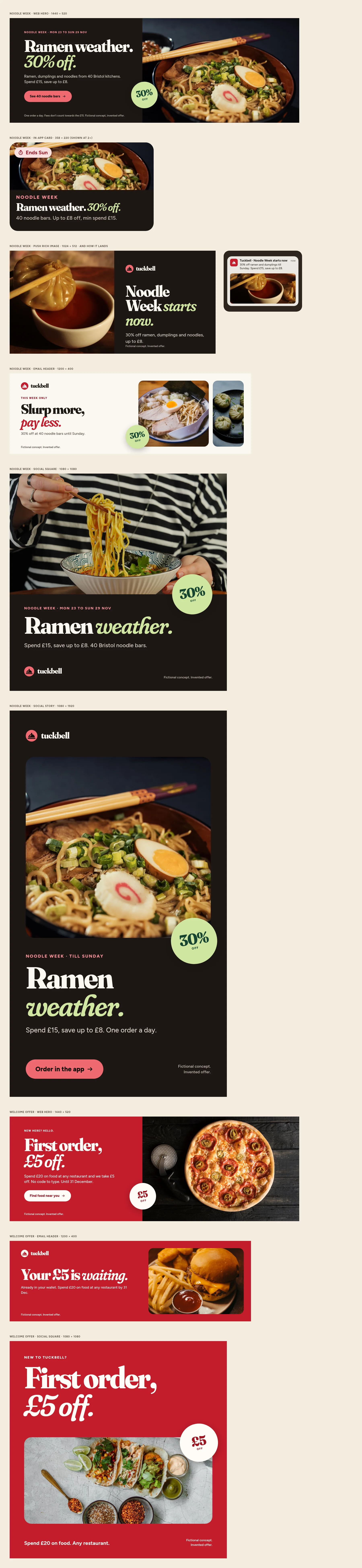
Board of Noodle Week and welcome-offer campaign pieces across web, email, social and in-app
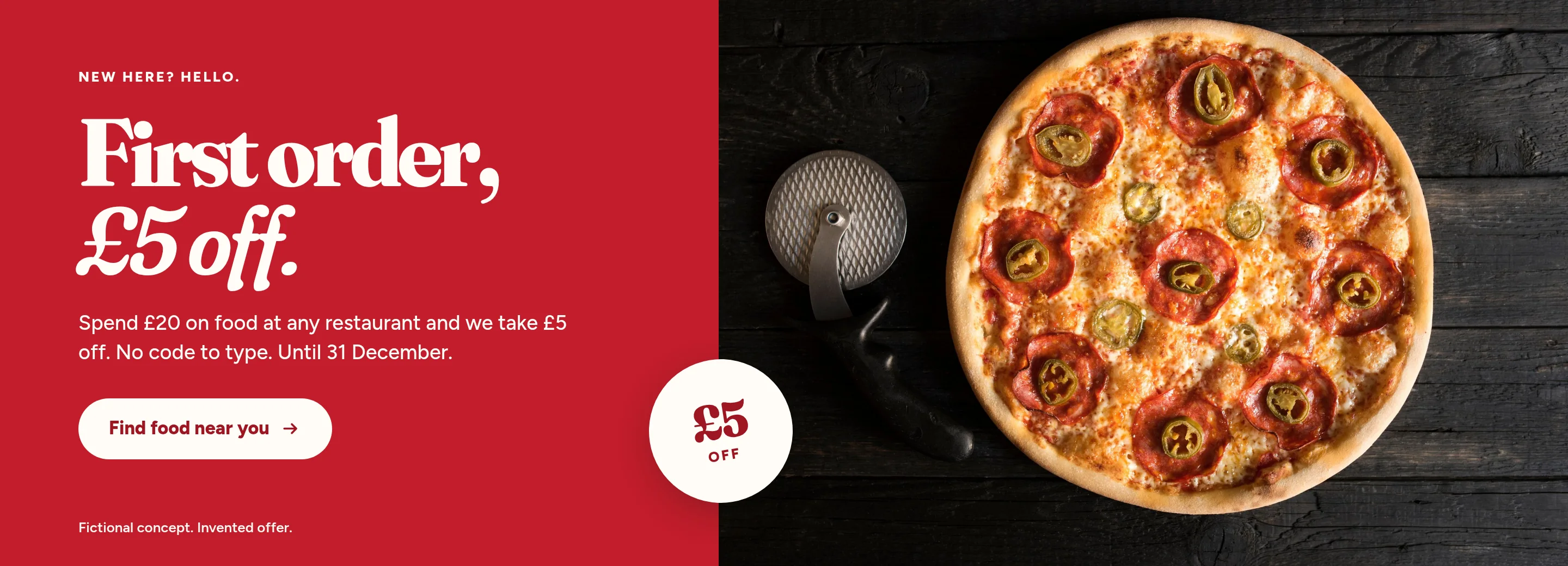
Fig. 30The full campaign set on one board: web, email, social, in-app, a push and a story.
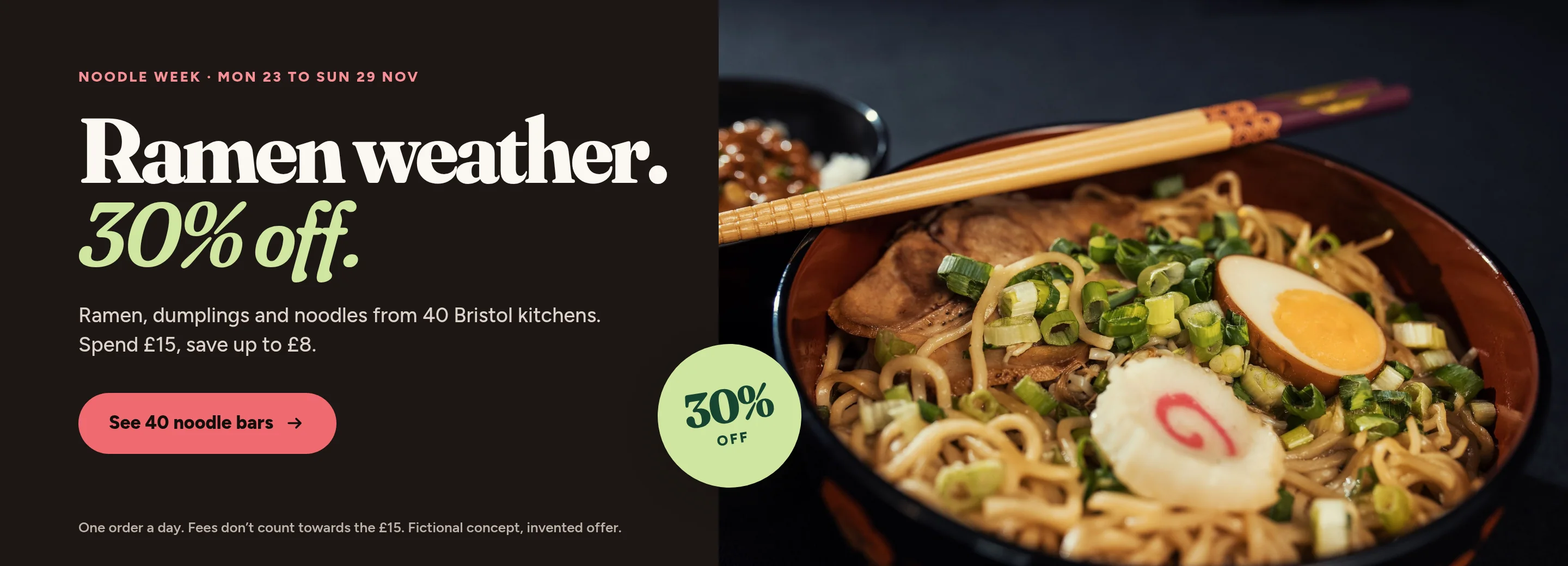
Noodle Week web campaign banner with a ramen photograph and the offer terms
Fig. 31Noodle Week on the web: ramen weather, 30% off.
Welcome-offer web campaign banner with a pizza photograph
Fig. 32The welcome offer on the web.
Noodle Week email header with dumplings and the offer
Fig. 33The Noodle Week email header.
Welcome-offer email header with a burger photograph
Fig. 34The welcome email header.
Square Noodle Week social post with a ramen photograph
Fig. 35Noodle Week, square, for a feed.
Square welcome-offer social post with tacos
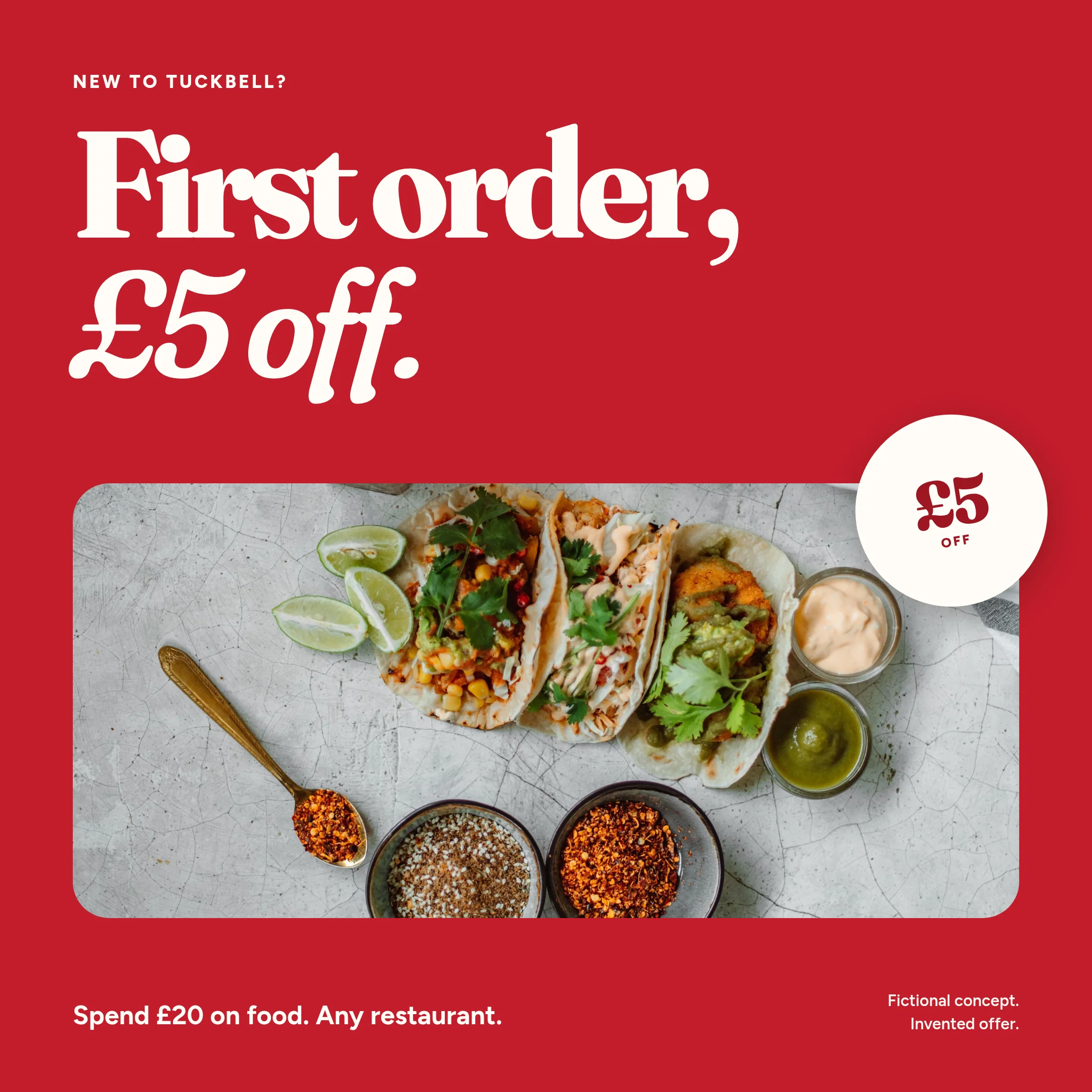
Fig. 36The welcome offer, square.
09Identity

A dinner bell for the city’s best kitchens.

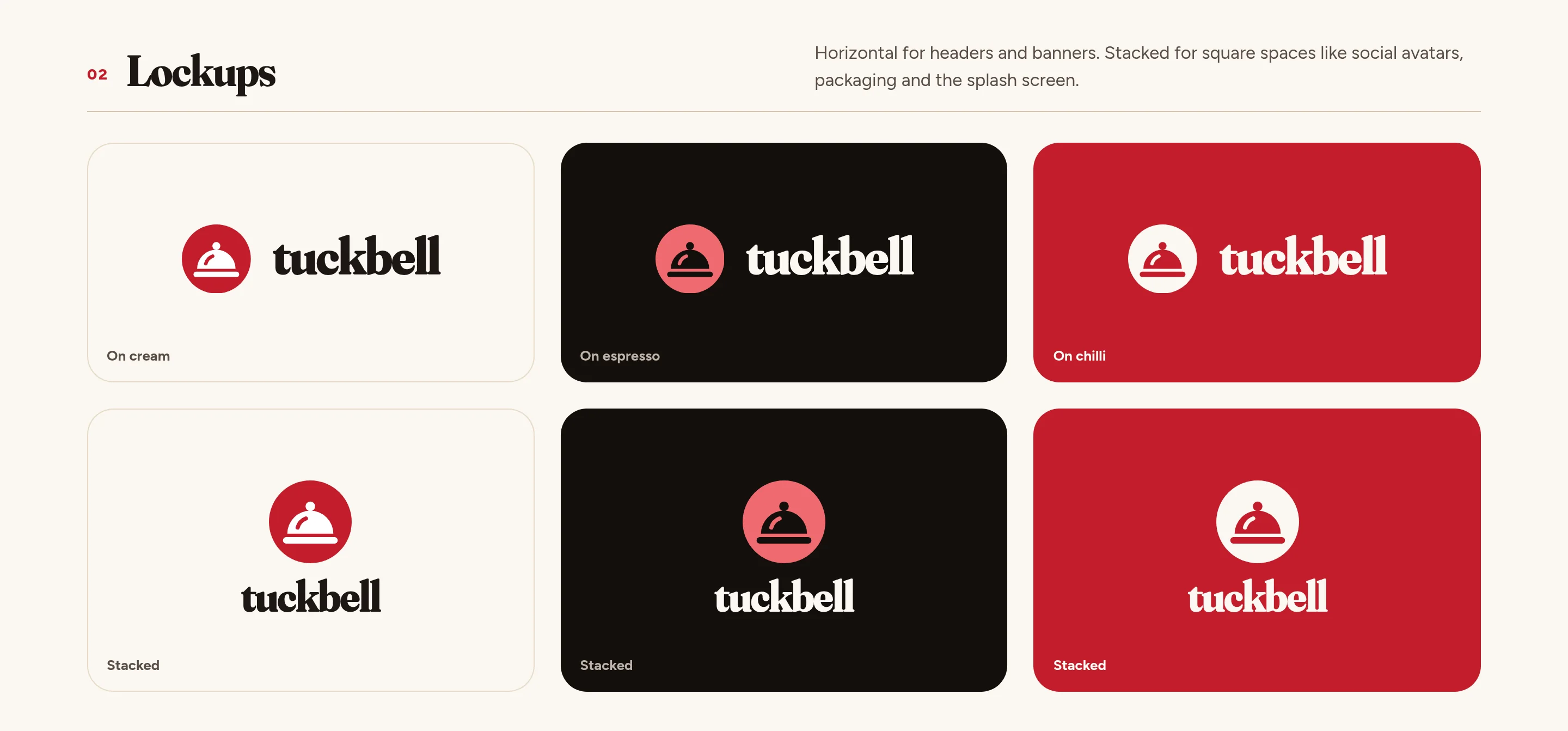
The mark is a serving cloche on a plate, seen two ways at once: the cloche from the side, the plate from above. The round tile is also the app icon, so the mark never needs a box. The wordmark is lowercase, because dinner isn’t formal.
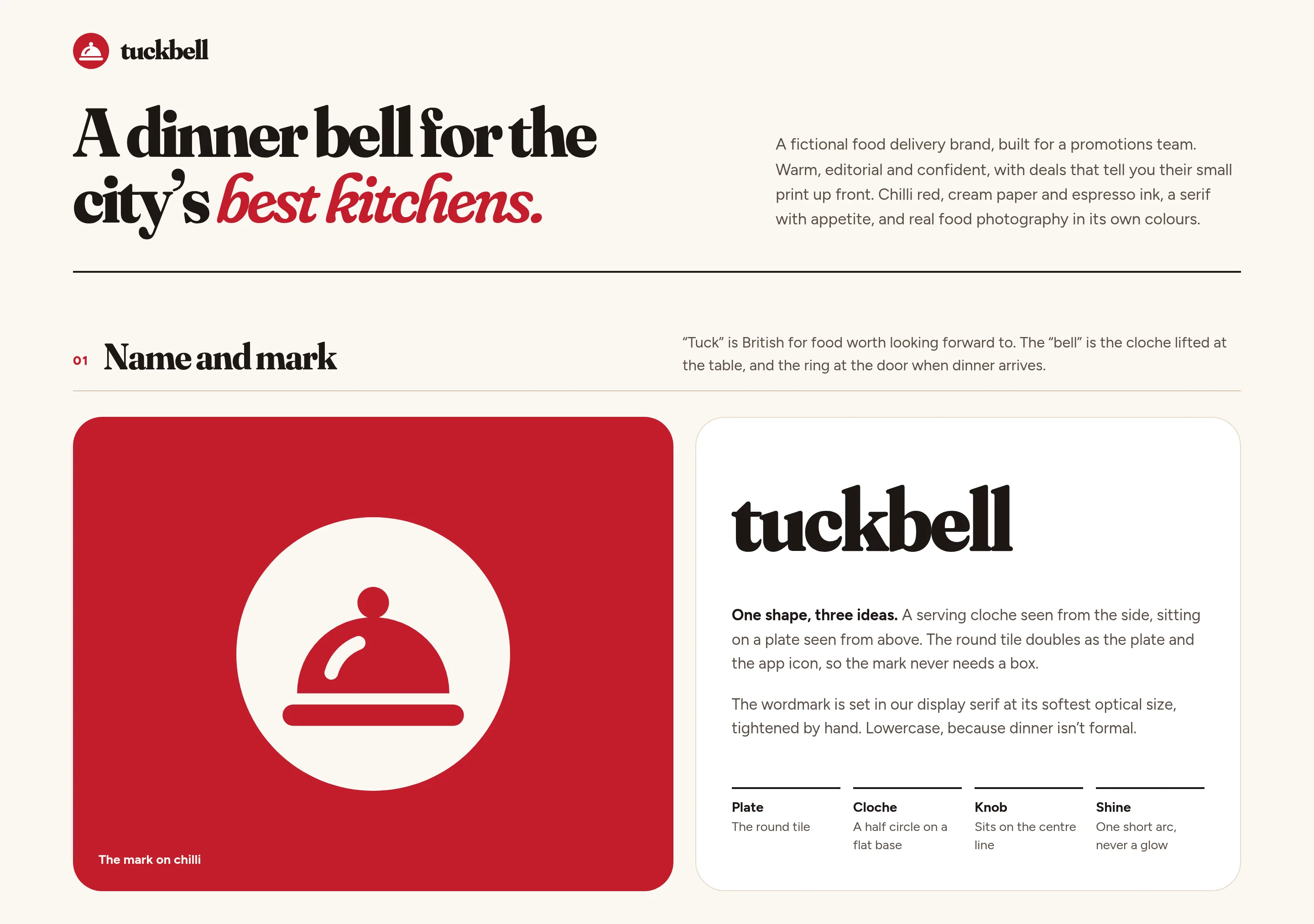
Identity sheet: a large chilli-red tile with the Tuckbell cloche mark, and the lowercase wordmark
Fig. 37The cloche on chilli, beside the wordmark and the three ideas in the shape.
Logo lockups on cream, chilli and espresso, horizontal and stacked
Fig. 38Horizontal for headers and banners, stacked for square spaces.
Clear-space diagram, smallest-size examples and a row of logo misuse
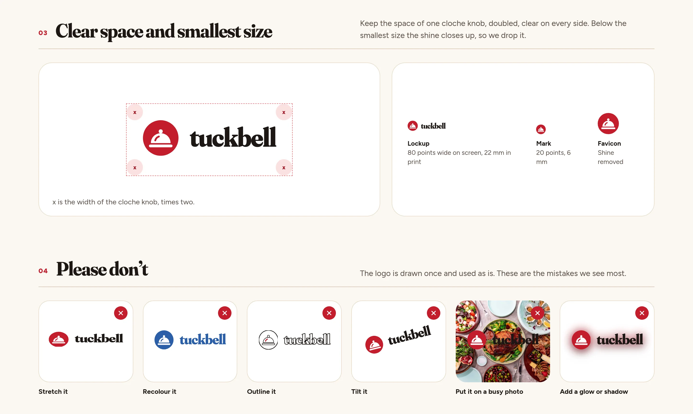
Fig. 39Clear space, the smallest size, and the mistakes to avoid.
Colour palette and type specimens for Fraunces and Figtree
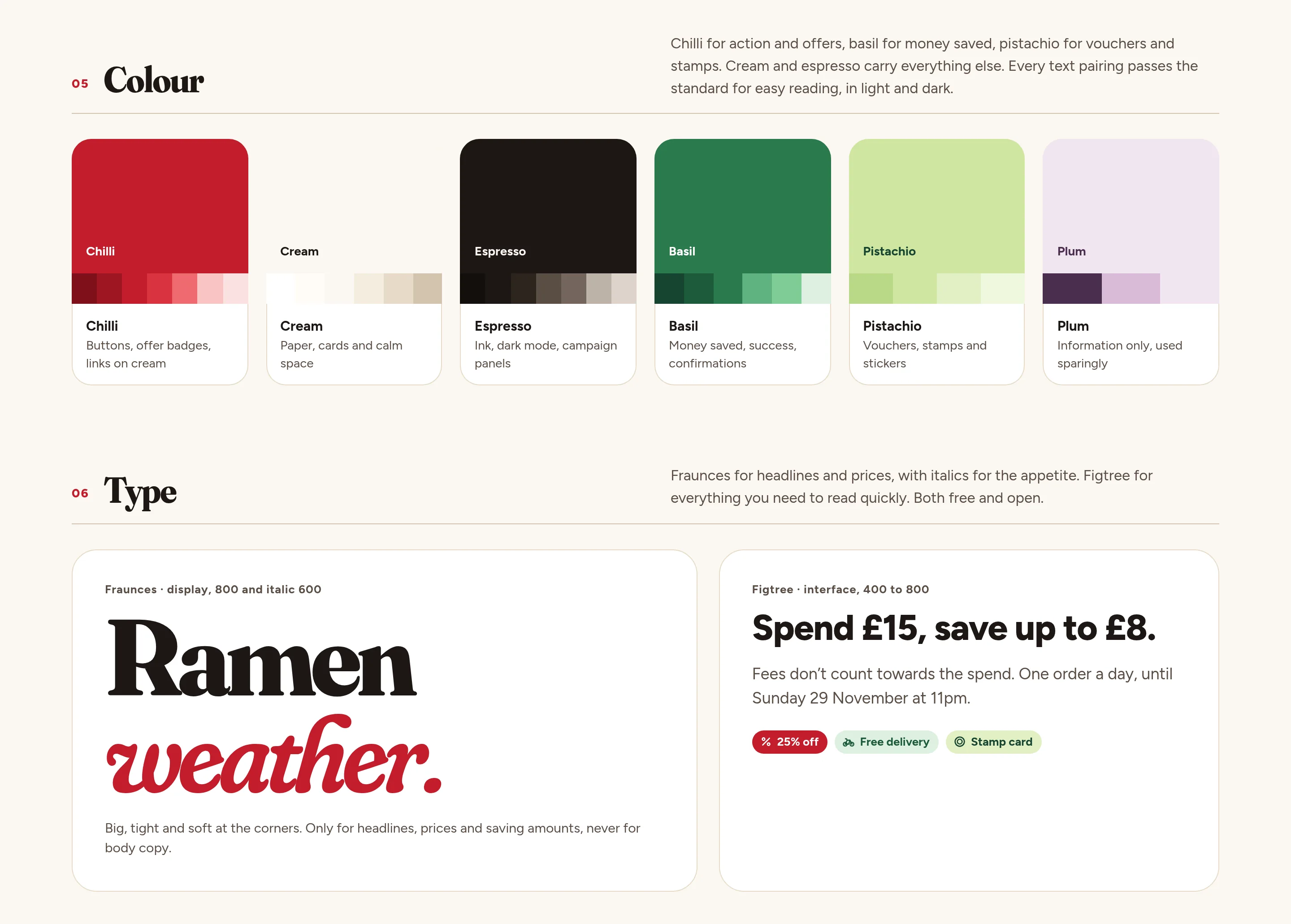
Fig. 40Chilli for action and offers, basil for money saved, pistachio for vouchers. Fraunces for headlines and prices, Figtree for reading.
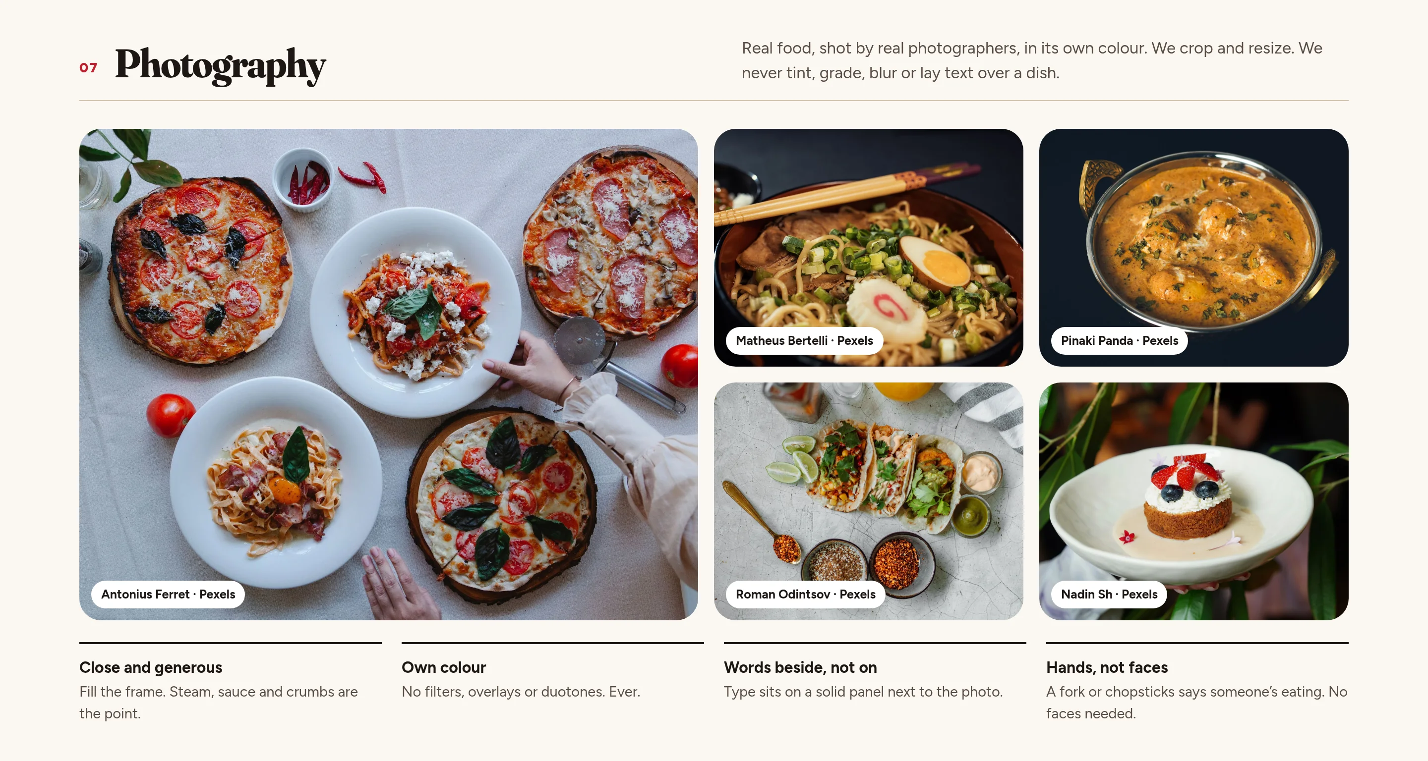
A grid of licensed food photographs used in the brand
Fig. 41Real food, in its own colour. We crop and resize. We never tint, grade, or lay text over a dish.
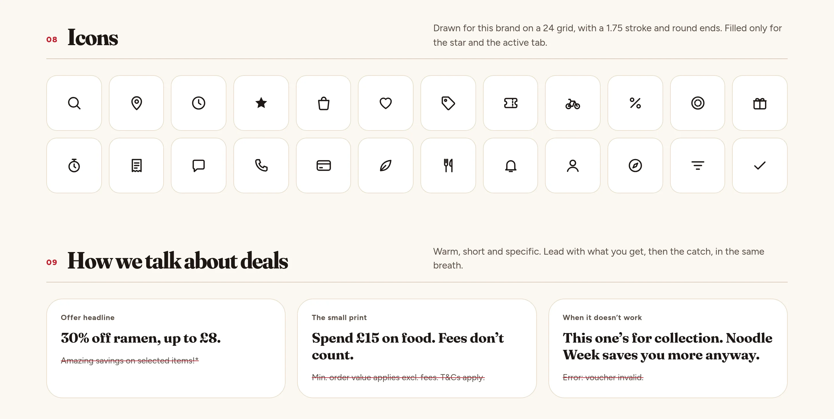
Icon grid and a voice table for how Tuckbell talks about offers
Fig. 42Icons on one grid, and a short voice for talking about deals.
10Design system

A system built for deals.

Components never touch the raw palette. They read roles, roles point at named colours, and dark mode only swaps the middle layer. The parts that matter most are the ones promotions live in: badges, campaign cards, vouchers, stamp cards, the basket offer and the terms card.
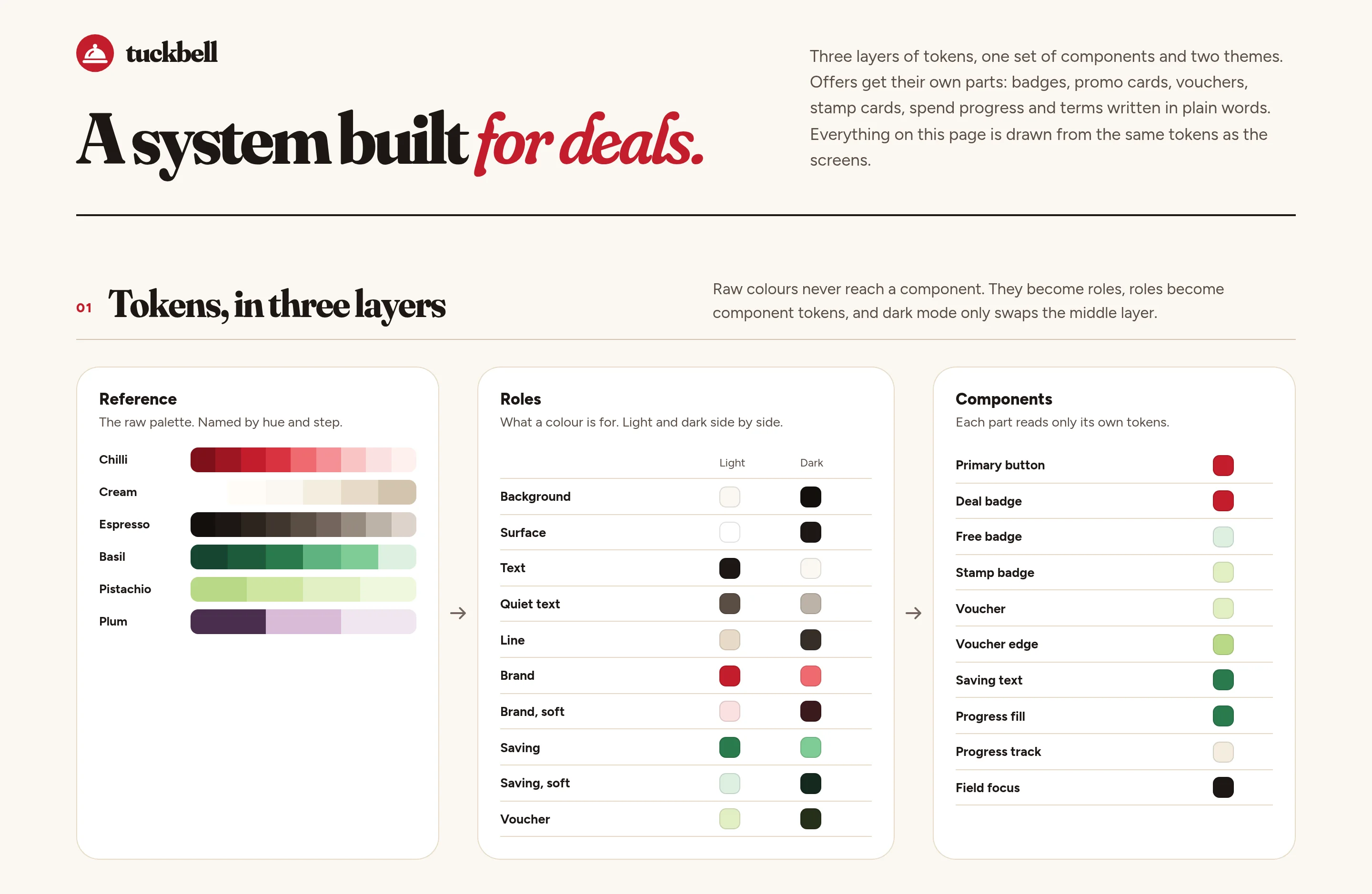
Design-system token sheet with reference colours, roles and component mappings in light and dark
Fig. 43Tokens in three layers: the palette, the roles, and what each part reads.
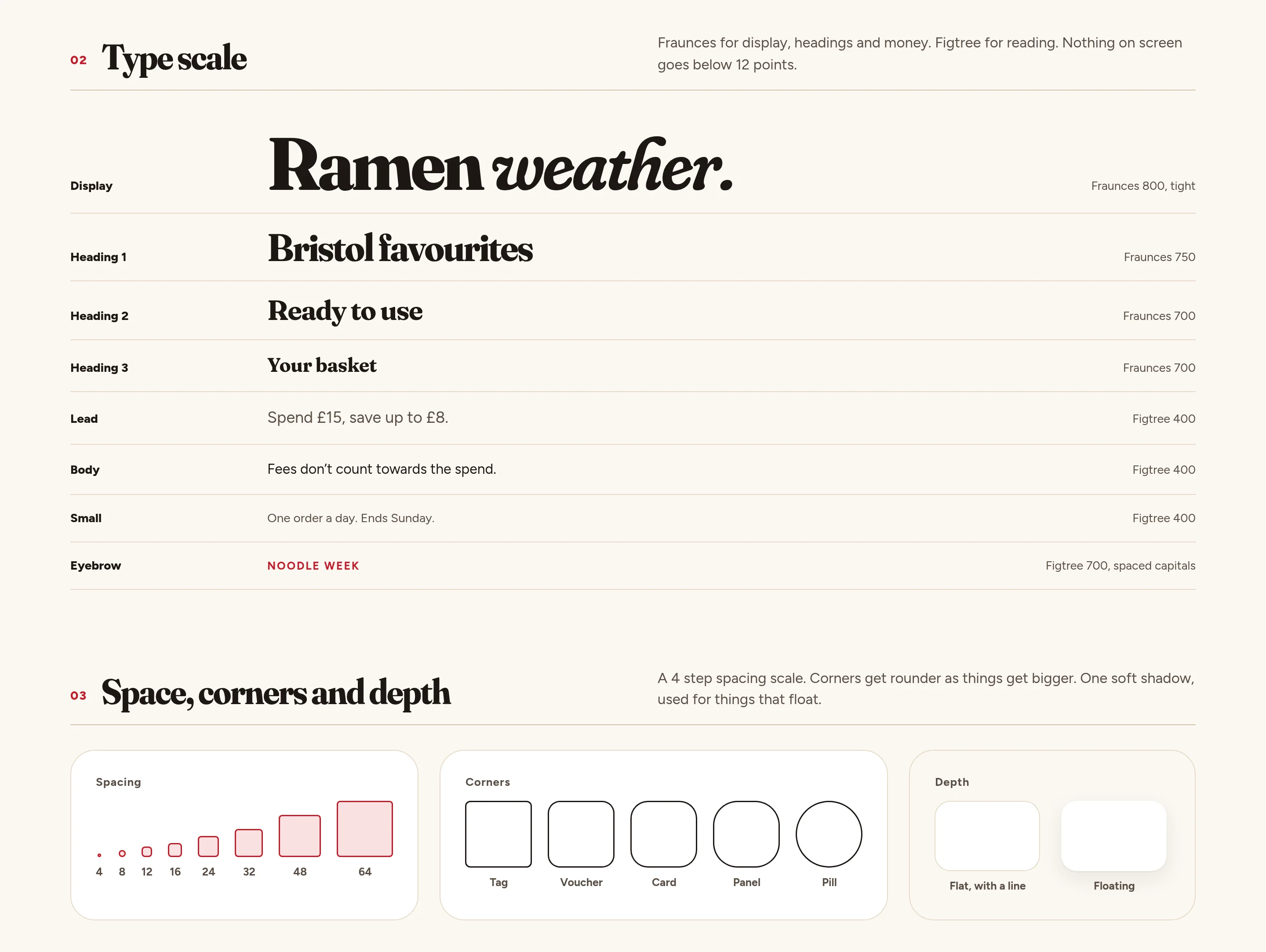
Type scale and spacing and corner rules
Fig. 44A type scale for headlines and for money, and a four-step rhythm for space.
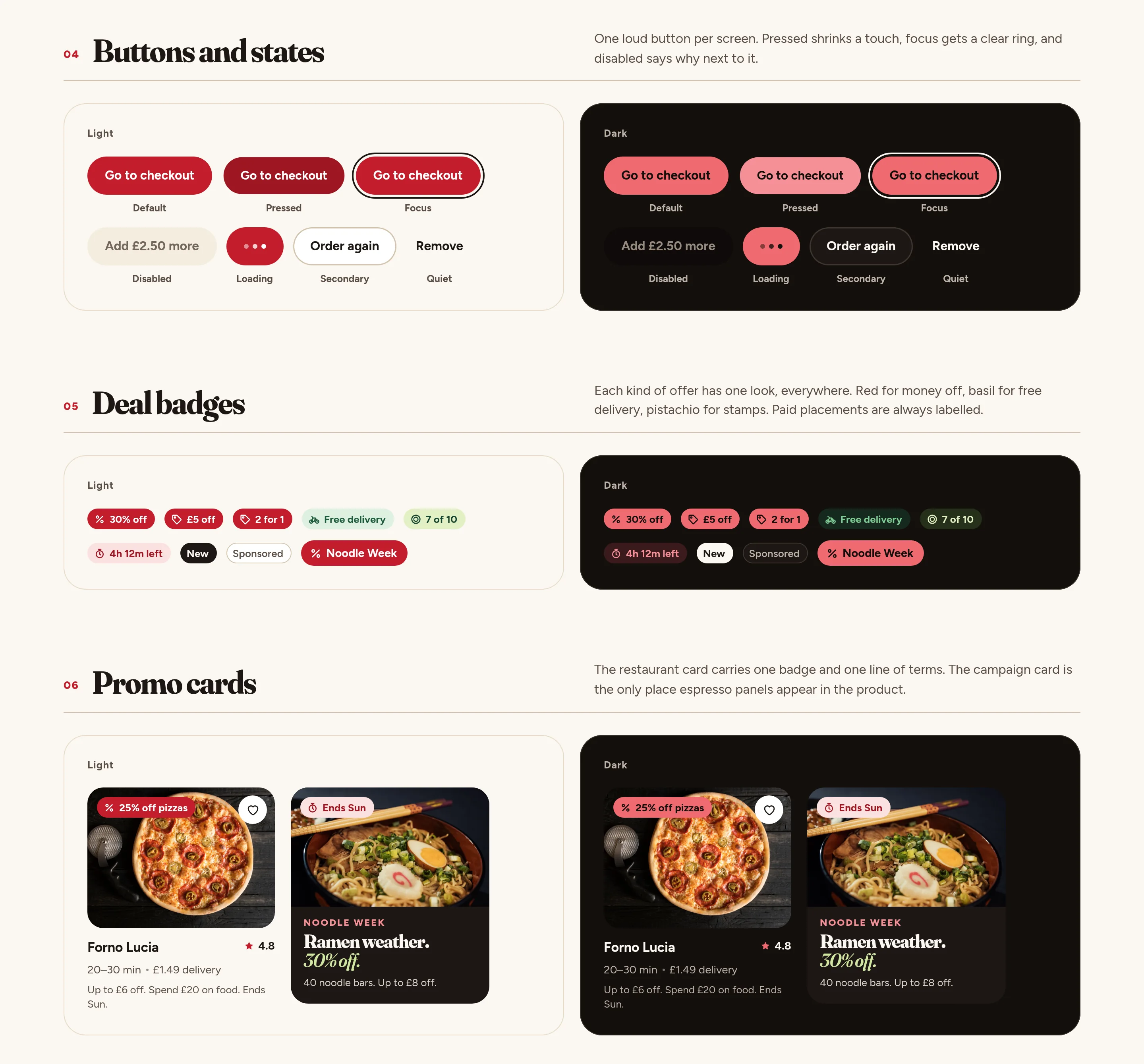
Button states, offer badges and restaurant and campaign card examples
Fig. 45Buttons and their states, deal badges, and the promo cards they sit on.
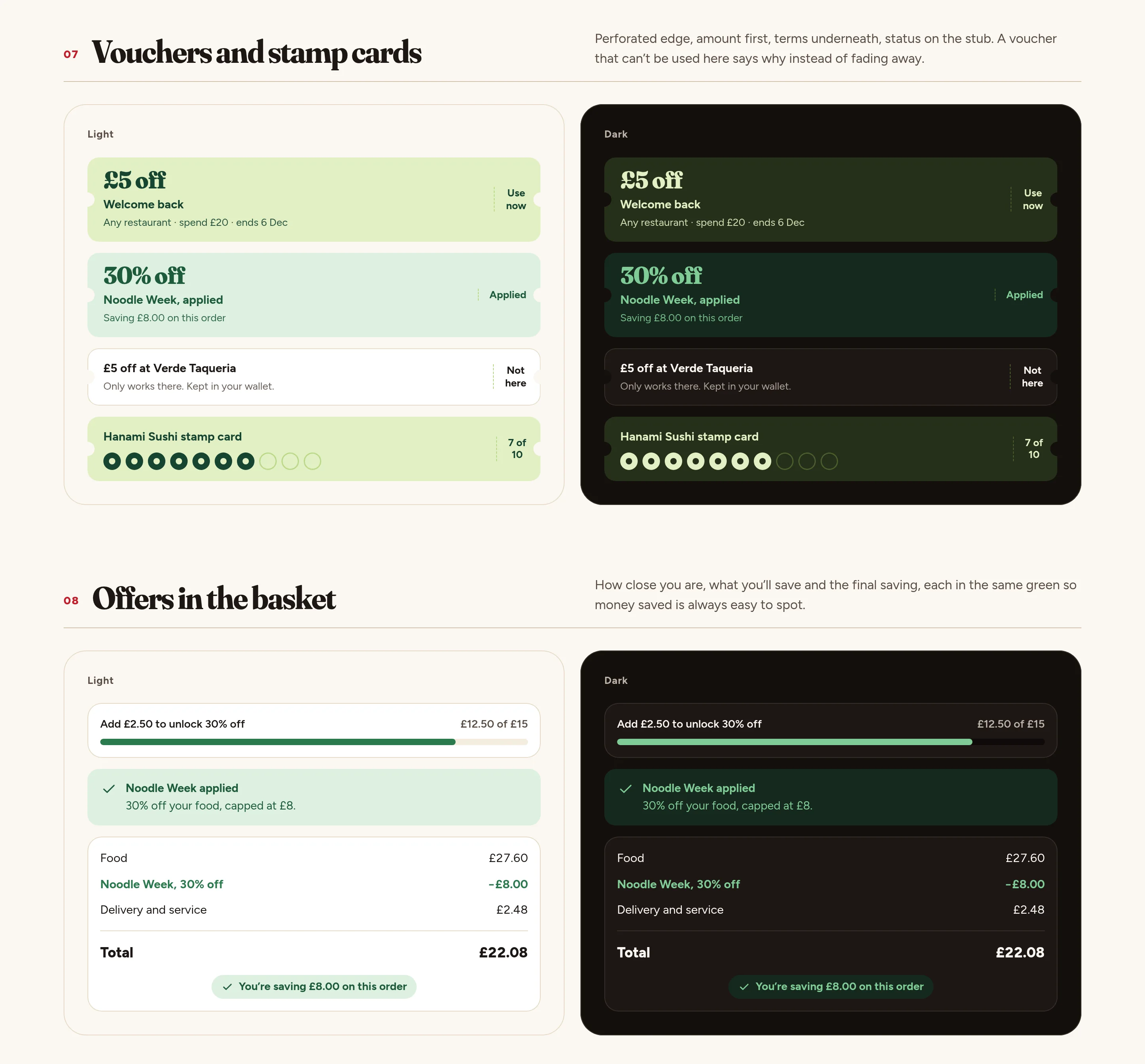
Voucher and stamp-card components, and basket states that show progress and the final saving
Fig. 46Vouchers and stamp cards, then how an offer appears in the basket.
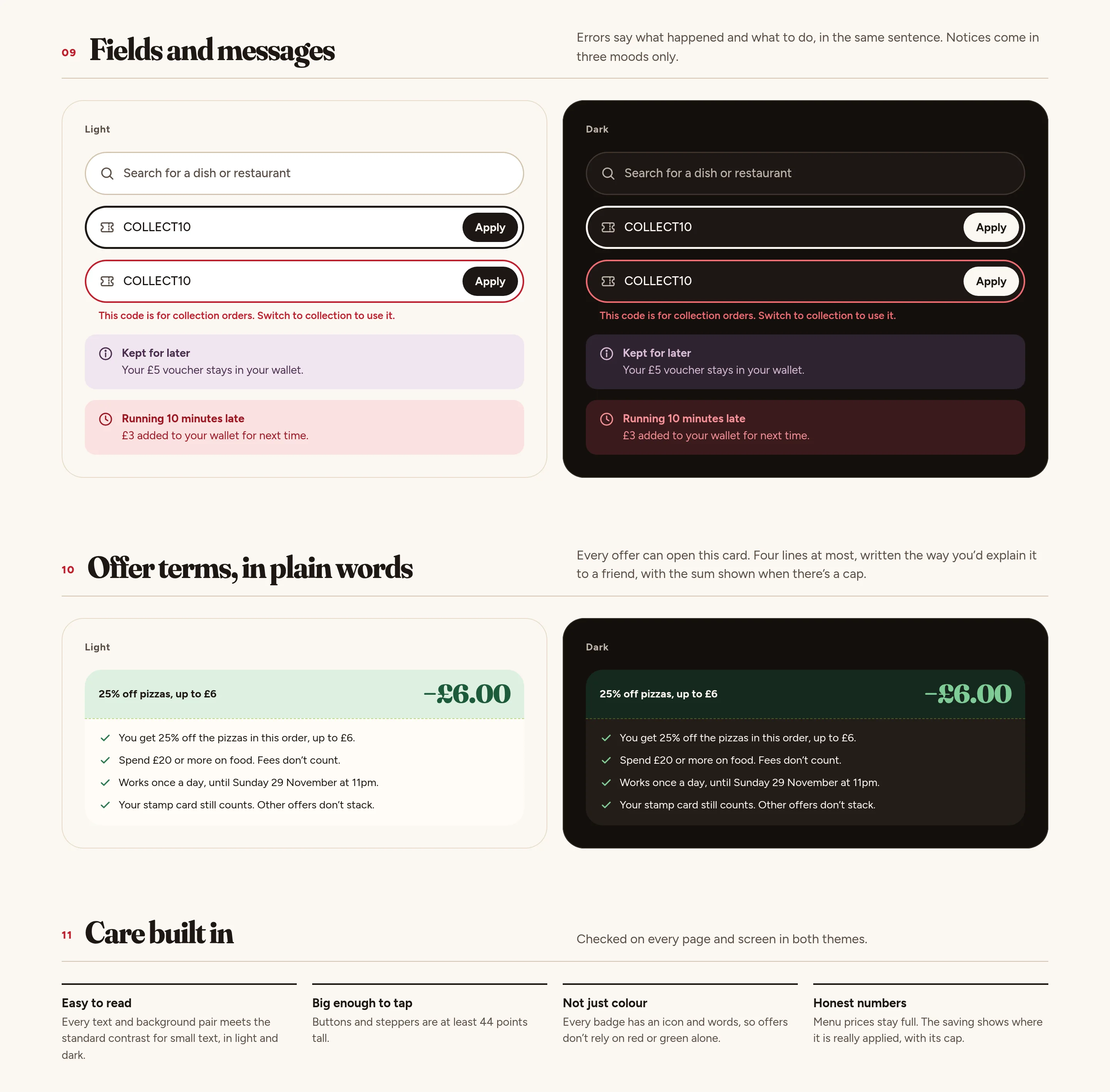
Form fields, a plain-words terms card, and a care checklist
Fig. 47Fields and messages, offer terms in four lines, and care built into the parts.
11App icon and banners

One idea, from the icon to the feed.

The app icon is the mark, used light, dark and tinted. The banners reuse the product and the photographs, not a separate campaign world: one short line, the cloche, and a dish in its own colour.
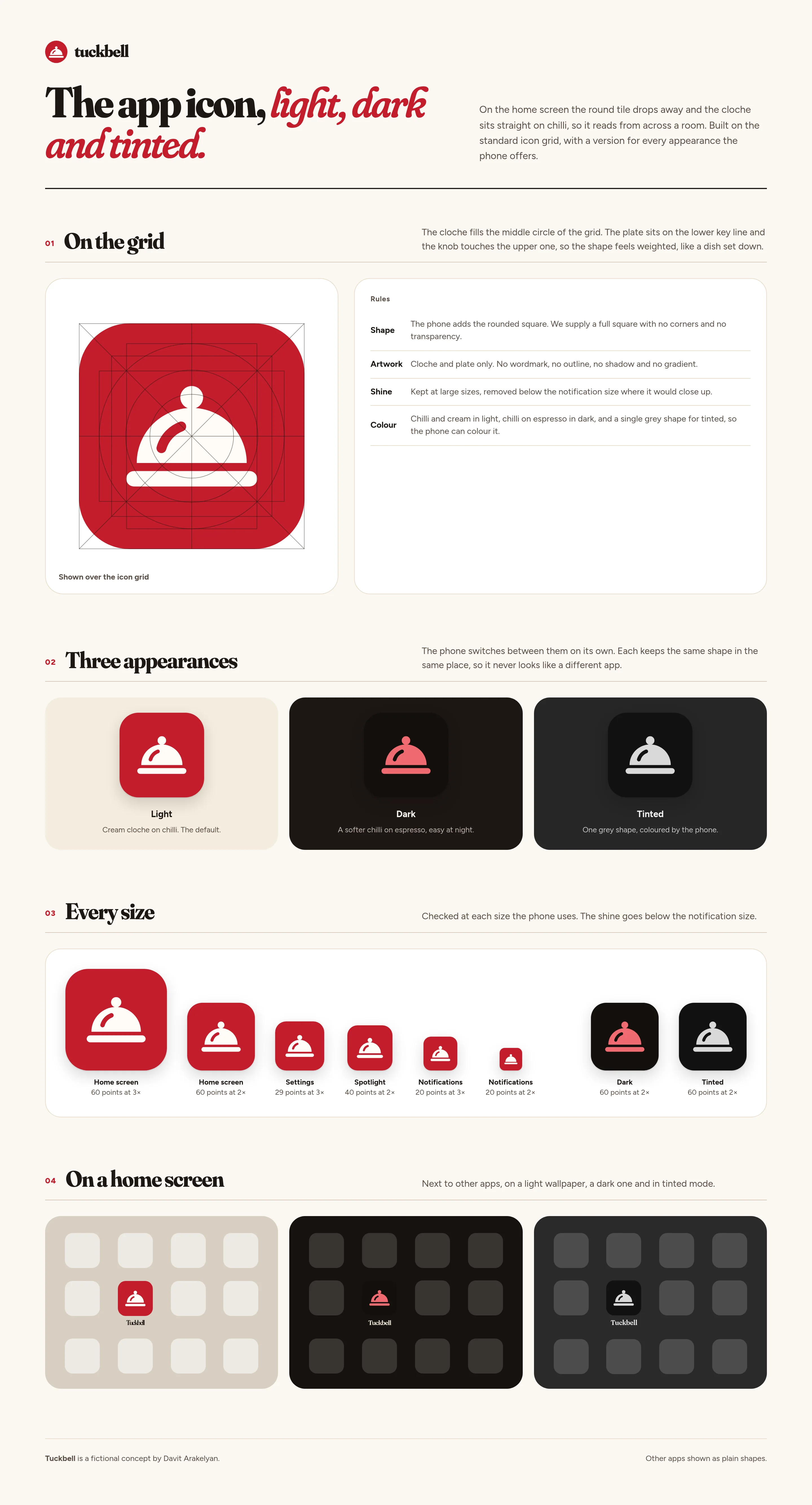
App-icon sheet showing the cloche on a grid, light, dark and tinted, a size ladder and home-screen mockups
Fig. 48The app icon on the grid, at every size, and on a home screen.
Presentation hero banner with a table of food, the headline and the Tuckbell mark
Fig. 49A wide hero: dinner from the kitchens you love.
Wide social banner with food photography and the Tuckbell lockup
Fig. 50A wide post for the feed.
Square social post with a dish and the line Deals worth ordering for
Fig. 51A square post.
Portfolio cover: Deals worth ordering for, with photography and product tiles
Fig. 52A portfolio cover with the mark, a dish, and the product.
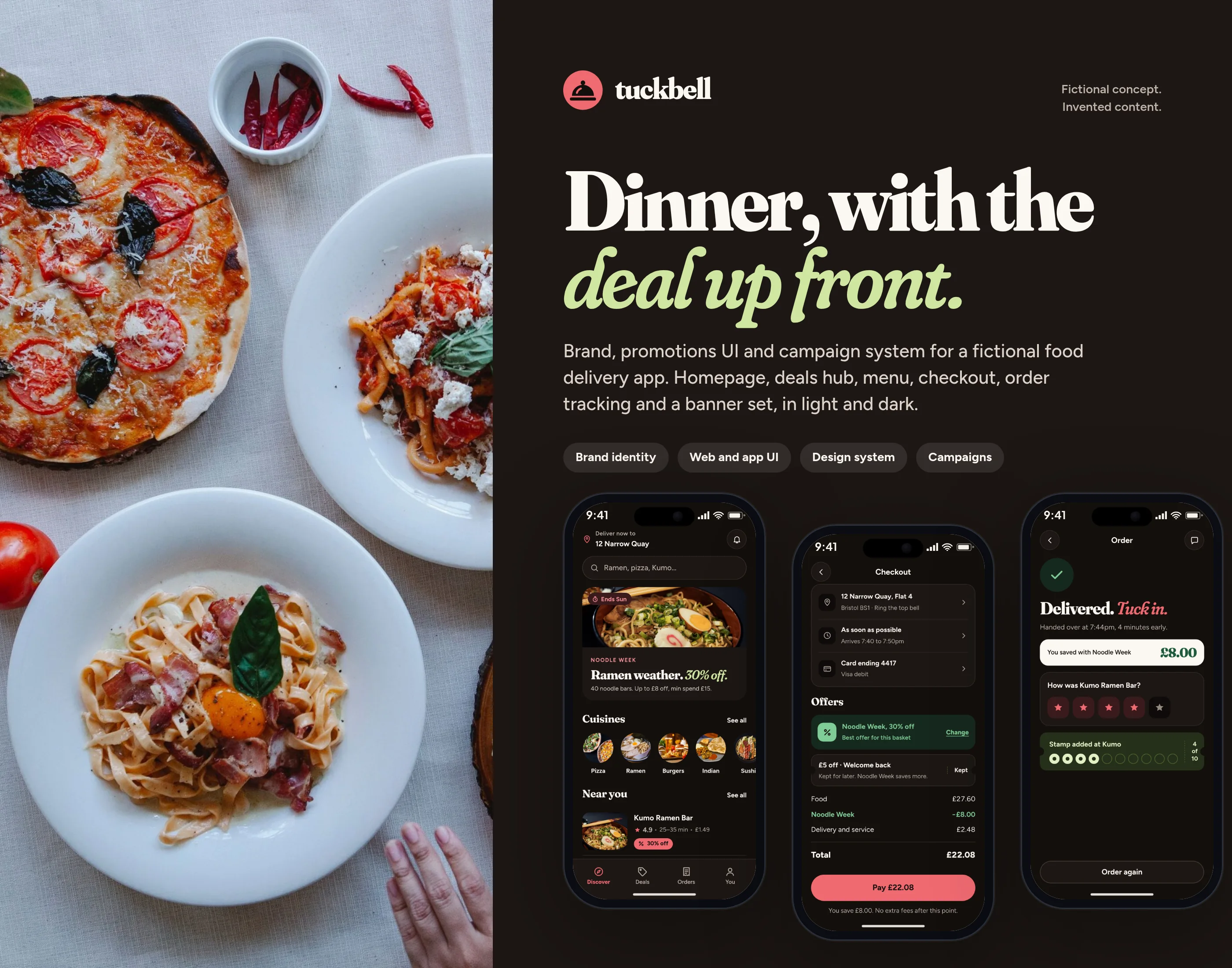
Case cover with the Tuckbell lockup, a ramen photograph and the campaign line
Fig. 53The case cover.
12

What I’d test next

  1. Whether people understand the cap (“30% off, up to £8”) before they add to the basket, versus only seeing it at checkout.
  2. Whether “Ends Sun 29 Nov” on the card is trusted more than a countdown.
  3. Whether the “nearly there” basket state, with a side that gets you over the minimum, helps Noodle Week without feeling pushy.
  4. Whether starting on the deals hub or the homepage leads to more first orders during a campaign week.
  5. How the chilli badges and basil savings hold up for people with colour-vision differences, given that every offer is also named in words.
  6. Whether a second campaign can be built from the same tokens and campaign templates in a week.
Next project

FastBank

Mobile banking concept

View case study →
FastBank cover
Contact

Let’s get in touch.

Open to remote roles. Let’s talk.

davitarakelyan92@gmail.com