Haybeck Accounting Portal
Identity, a design system shared by four products, a homepage, a client portal, a tax-return flow and a staff tool for an accounting firm in Saskatoon that serves owner-run businesses and farms, in English and French.
Not a real company. Haybeck, its offices, people, clients and every figure in the mockups, including the pilot results, are fictional, made for this portfolio concept.
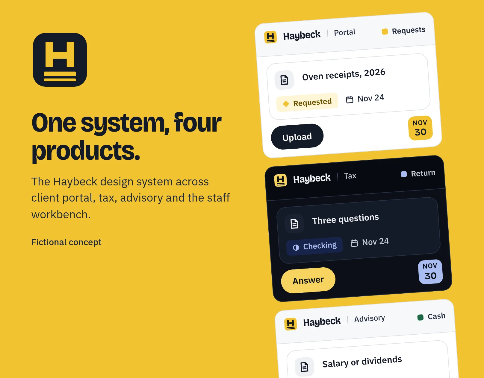
One design system, many products, two languages.
Accounting firms that serve owner-run businesses rarely sell one product any more. There is a public site, a client portal for documents and payments, a tax-return flow, advisory dashboards and the tools staff use behind them. Each tends to grow its own look, and the client feels the seams at the worst time of year.
So this concept is less a homepage and more a study in how I’d grow a system like that: one library that serves a client portal, a tax product, an advisory product and an internal staff tool, in light and dark, in English and French, without any of them forking.
- Open on a promise a business owner can act on, not on the latest news item.
- Make the client software the story: show what a document request looks like, why it’s needed and by when.
- Give every product the same parts, and let a product change only one accent colour.
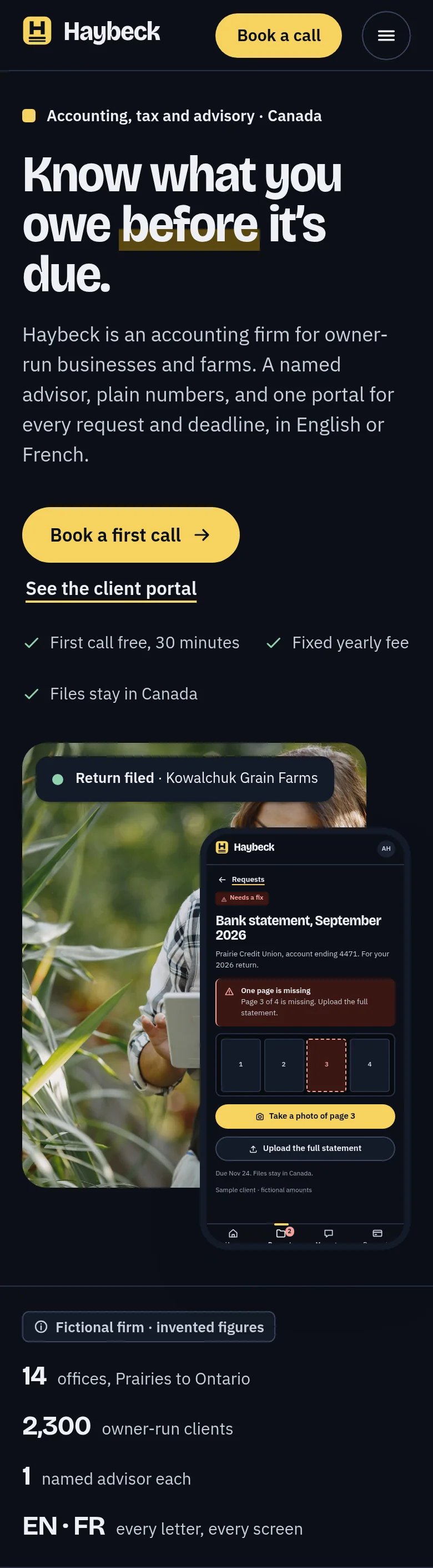
- Treat French, dark mode and keyboard use as part of each component, not a later pass.
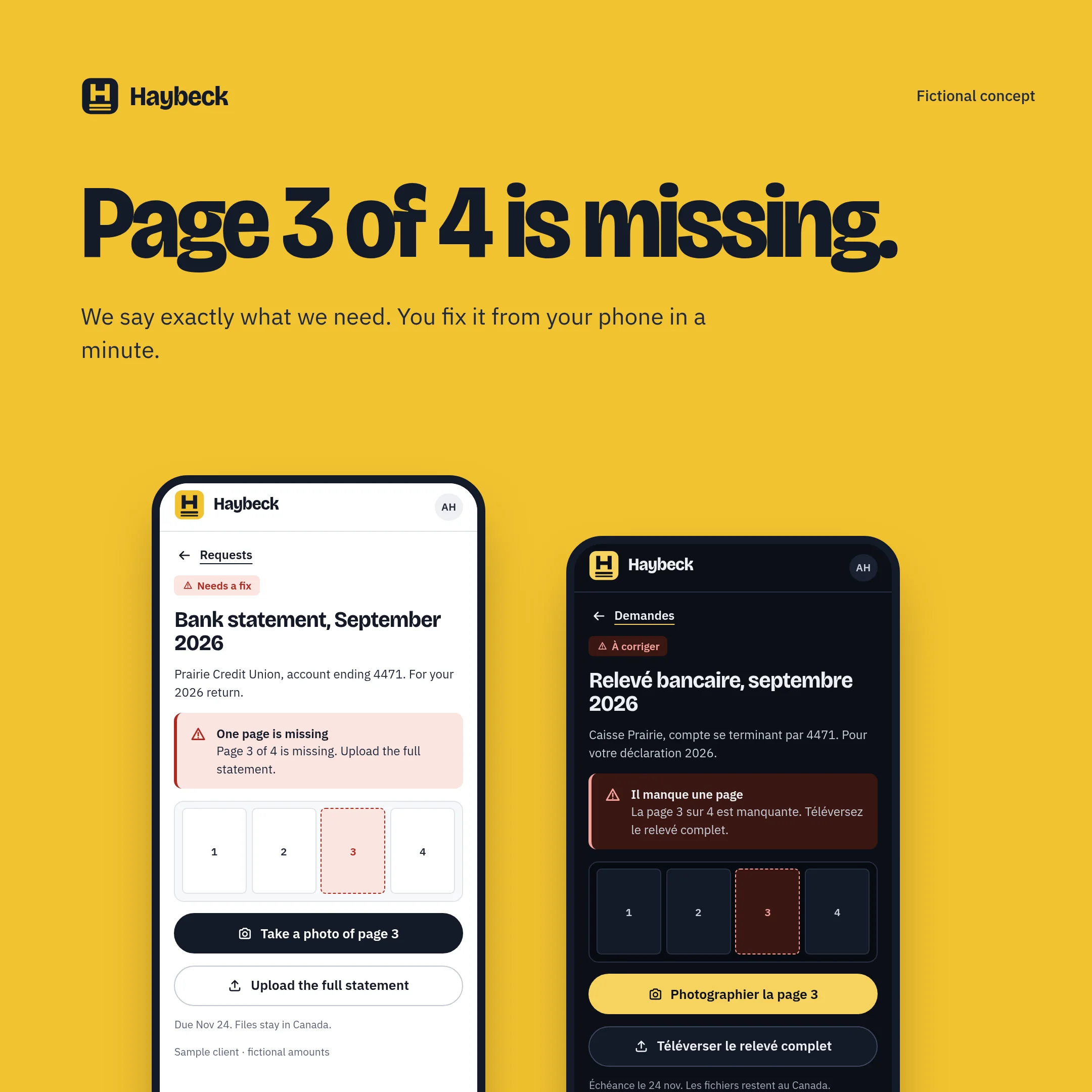
- Design the hard states first: a missing page, a locked signature, a first day with nothing in it.
- Keep every number honest: all figures here are invented and labelled as such.
A name that sounds like a founding partner.
Accounting firms are usually named after people, so the name had to read like a surname, be easy to say in English and French, avoid sets of initials, and share nothing with any real firm or with the other brands in my portfolio.
I checked each finalist three ways: domain records for the dot-com, dot-net and dot-ca, web searches for accounting, tax and software companies with the same or a similar name, and a comparison by sound and spelling.
- Haybeck, chosen. “Hay” for prairie farms, “beck” an old word for a stream. All three domains were free when I checked, and I found it only as a family name.
- Lundquill, second. A quill on the land, but it reads like a misspelt surname.
- Corlander, third. Practical and rooted, but too close to a herb.
Several others fell at the first check because a small accounting firm or a piece of accounting software already used something close. I did not search the trademark registers, so a formal search is needed before any real use. These are concept names only.
The double rule under every total.
The mark is an H standing on two lines: the double rule an accountant draws under a final figure. It is the one promise the firm makes, that you’ll know the total before it’s due. The tile is canola yellow, from a field in July; everything else is ink and paper.
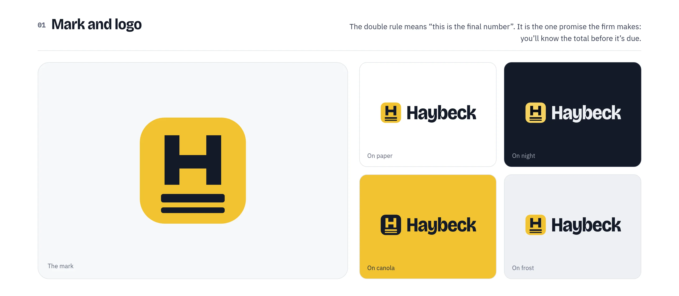
The mark sits on a small square grid so it stays sharp at the size of a browser tab. Below the smallest size the lower rule merges into the upper one and the tile stays square.
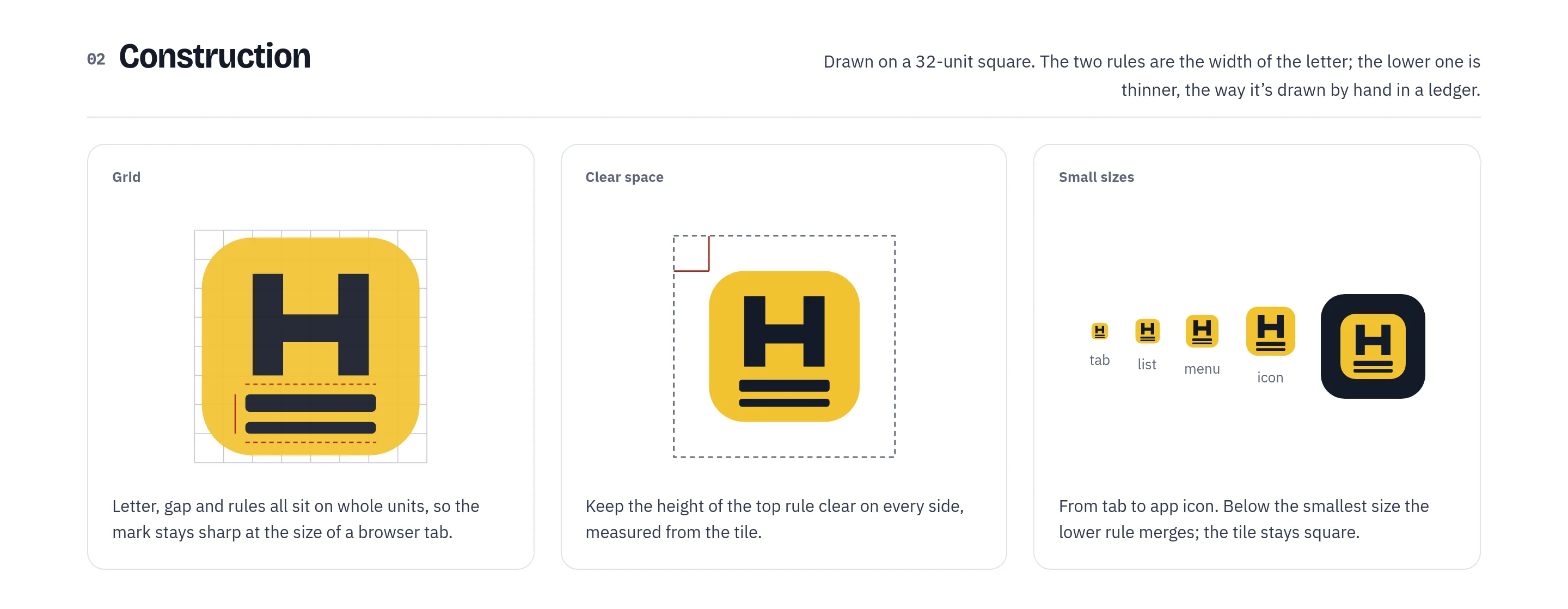
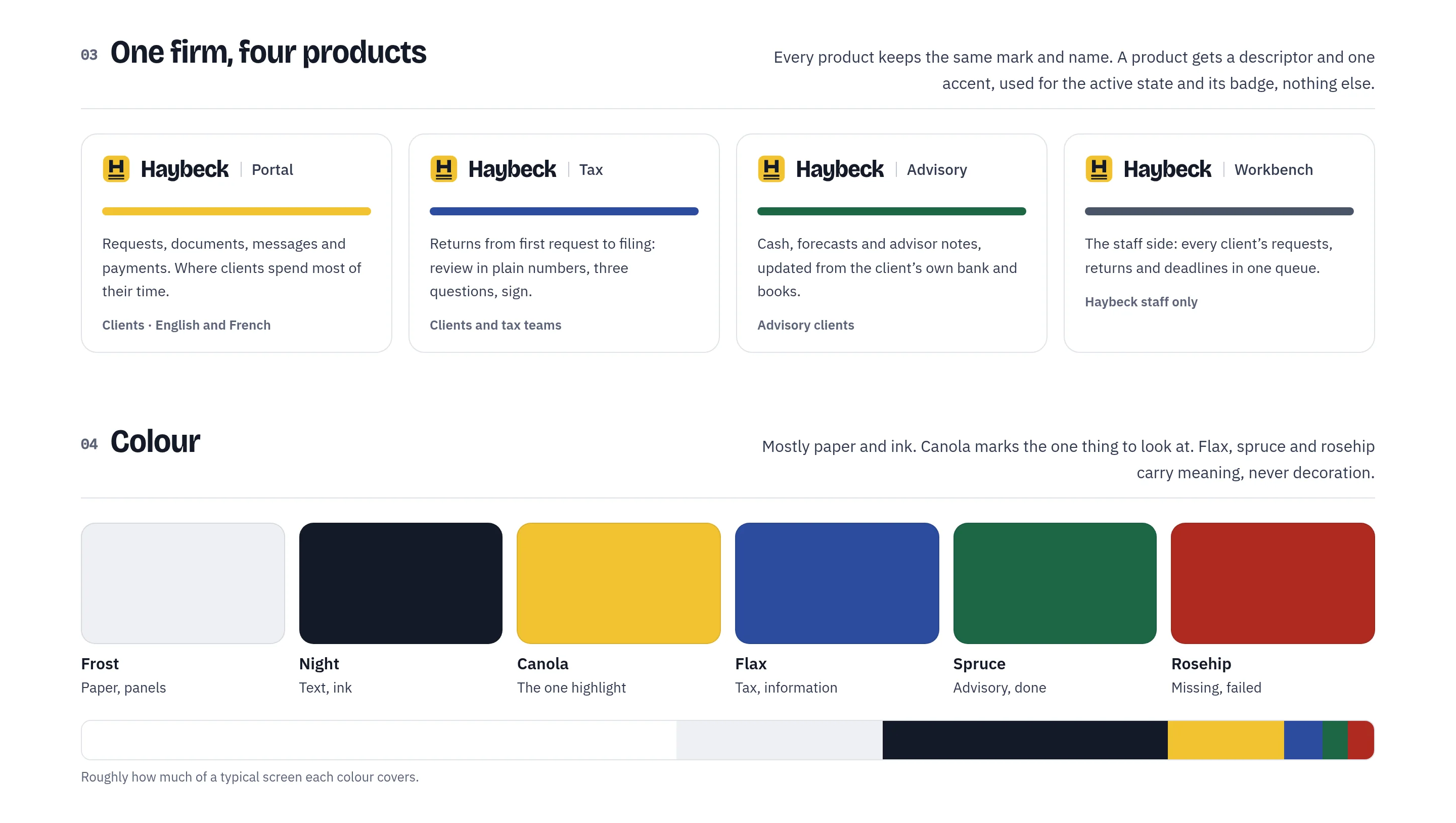
Every product keeps the same mark and name and gets a plain descriptor: Portal, Tax, Advisory and Workbench. A product owns one accent colour, used for its active state and badge and nothing else. Colour stays mostly paper and ink, with canola for the one thing to look at.
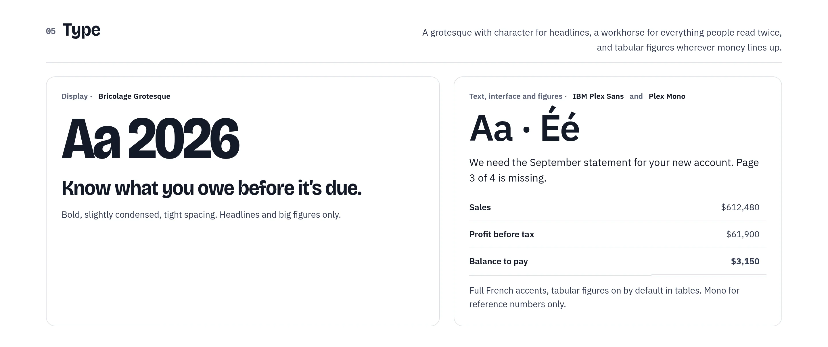
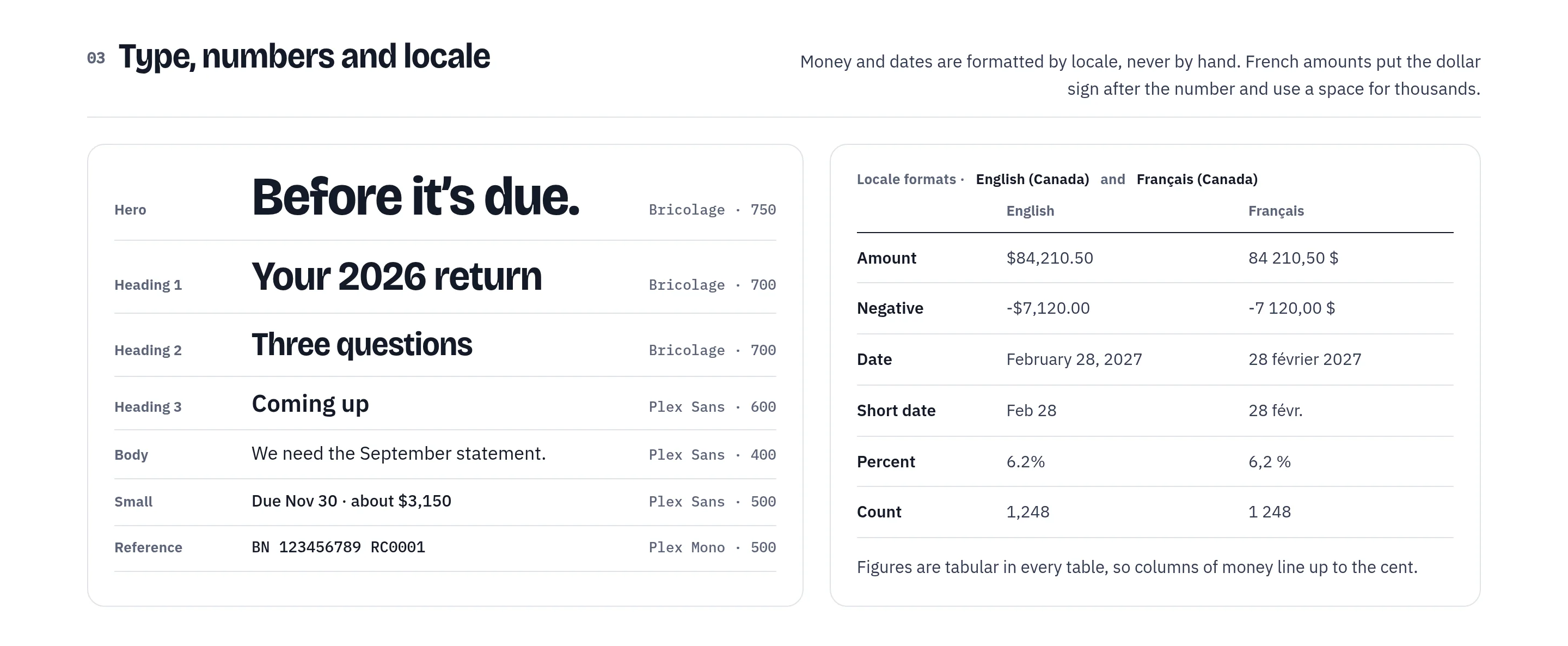
Bricolage Grotesque, bold and slightly condensed, carries headlines and big figures. IBM Plex Sans carries everything people read twice, with full French accents and tabular figures, so money lines up to the cent.
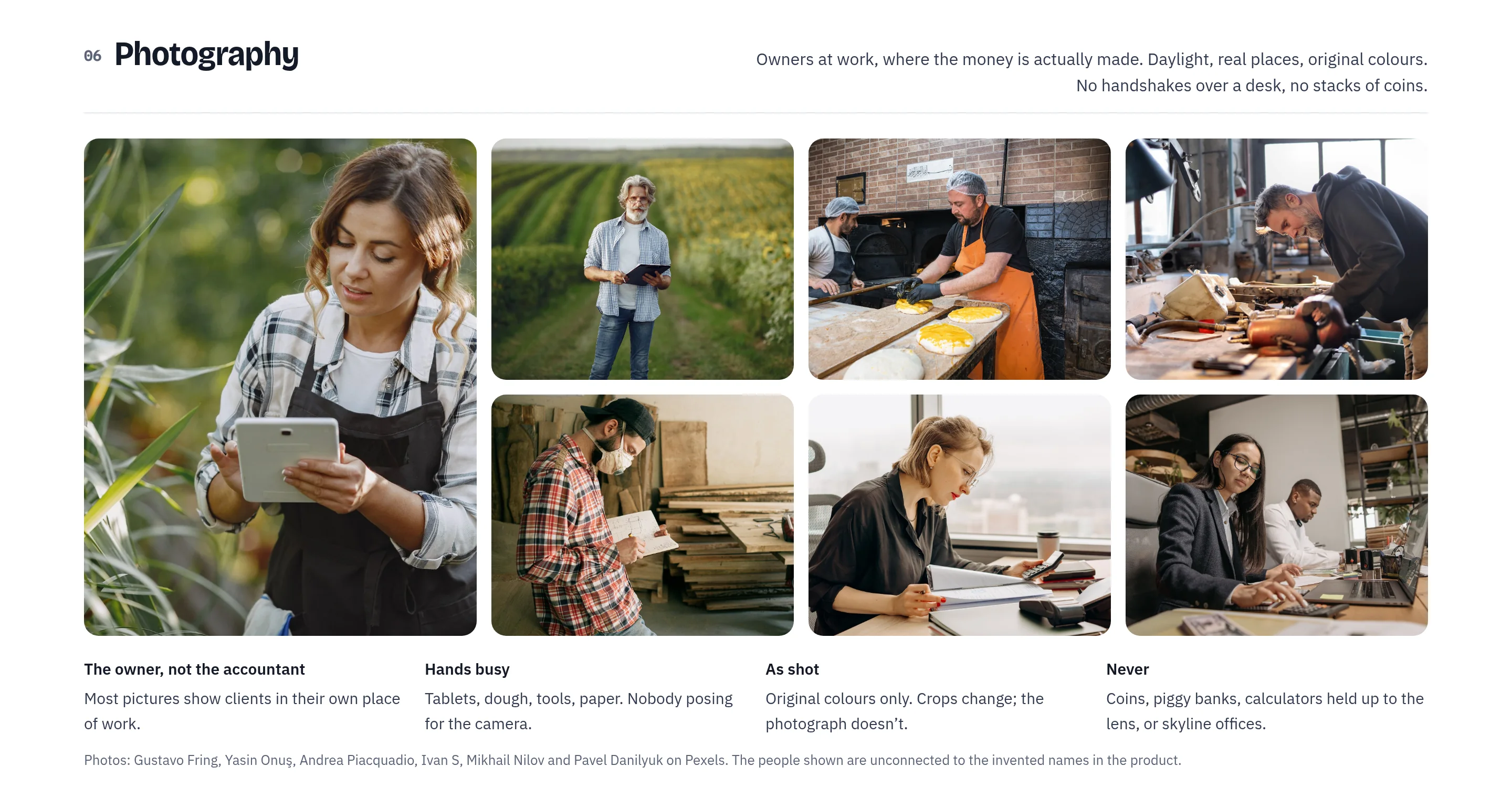
Photography shows owners at work where the money is made: fields, ovens, garages and workshops. Daylight, real places, original colours. No coins, no piggy banks, no handshakes across a desk.
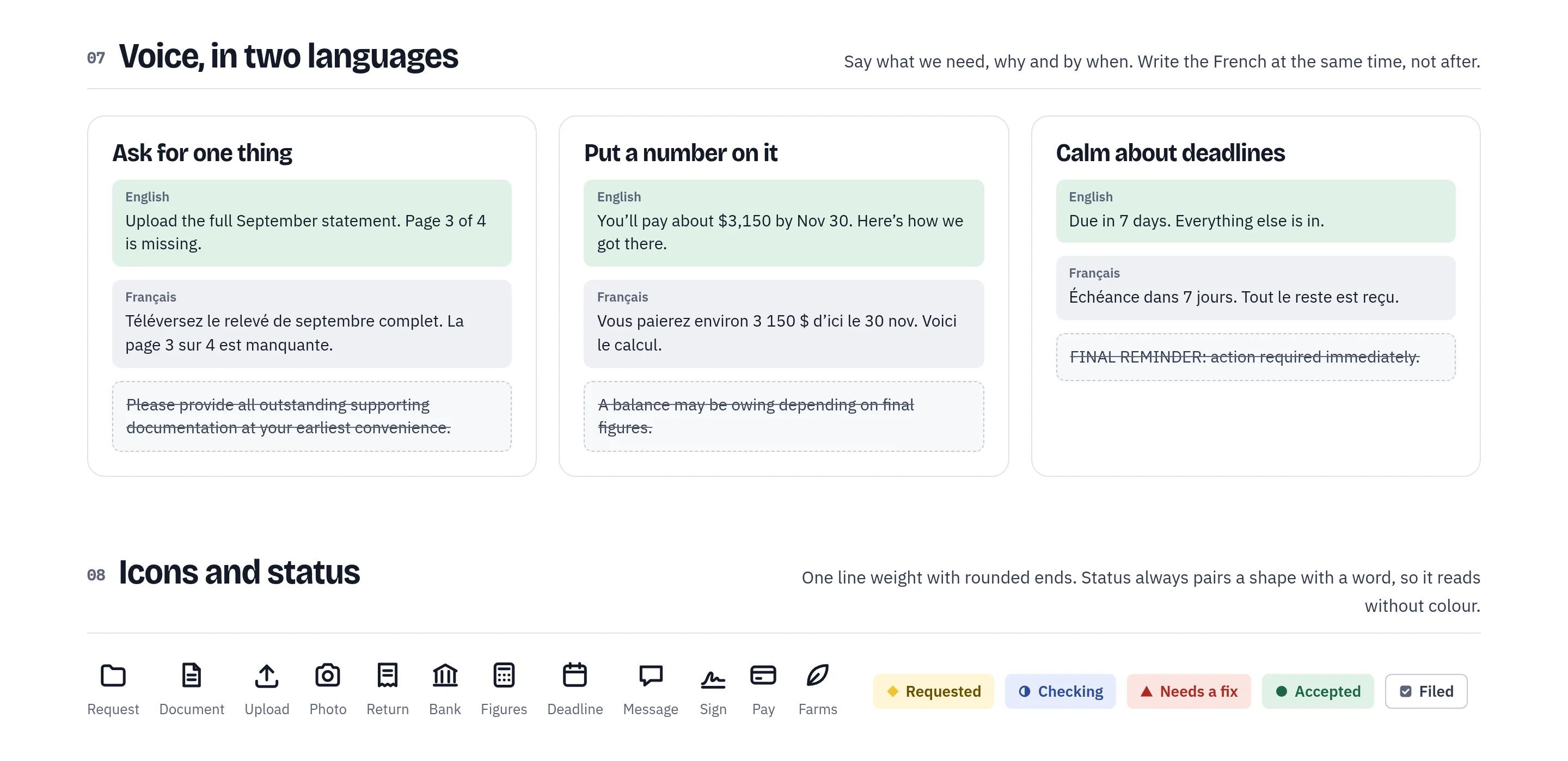
The voice says what we need, why and by when, in English and French written at the same time. Status always pairs a shape with a word, so nothing depends on colour alone.
One system, four products. Built so the next one is cheap.
Tokens come in three tiers. Reference colours are named after the prairie and never used directly. Role tokens say what a colour is for, and light and dark map the same roles. Component tokens say what a part uses. Components read role tokens only, which is why a new product or a dark theme is a small token file, not a redesign.
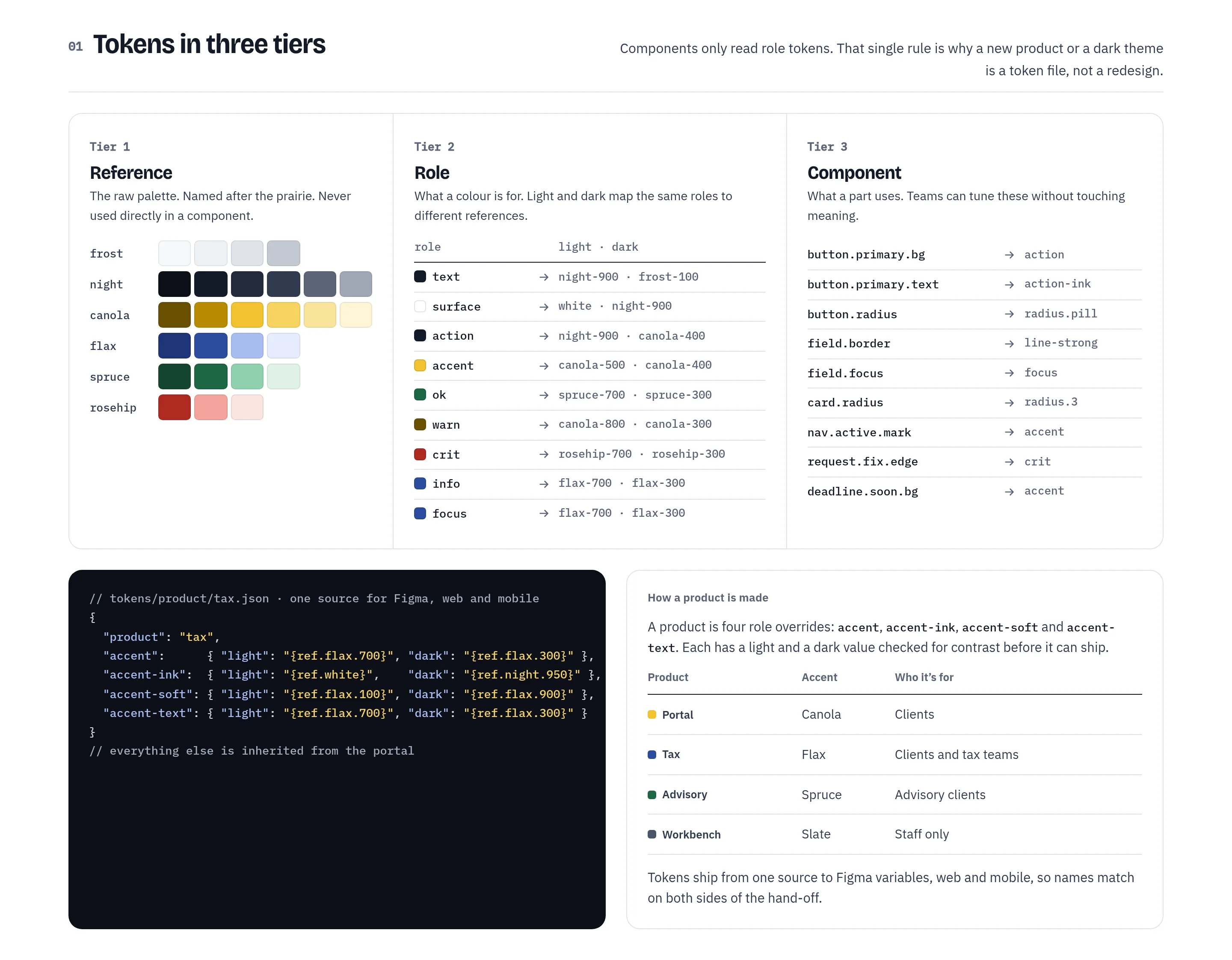
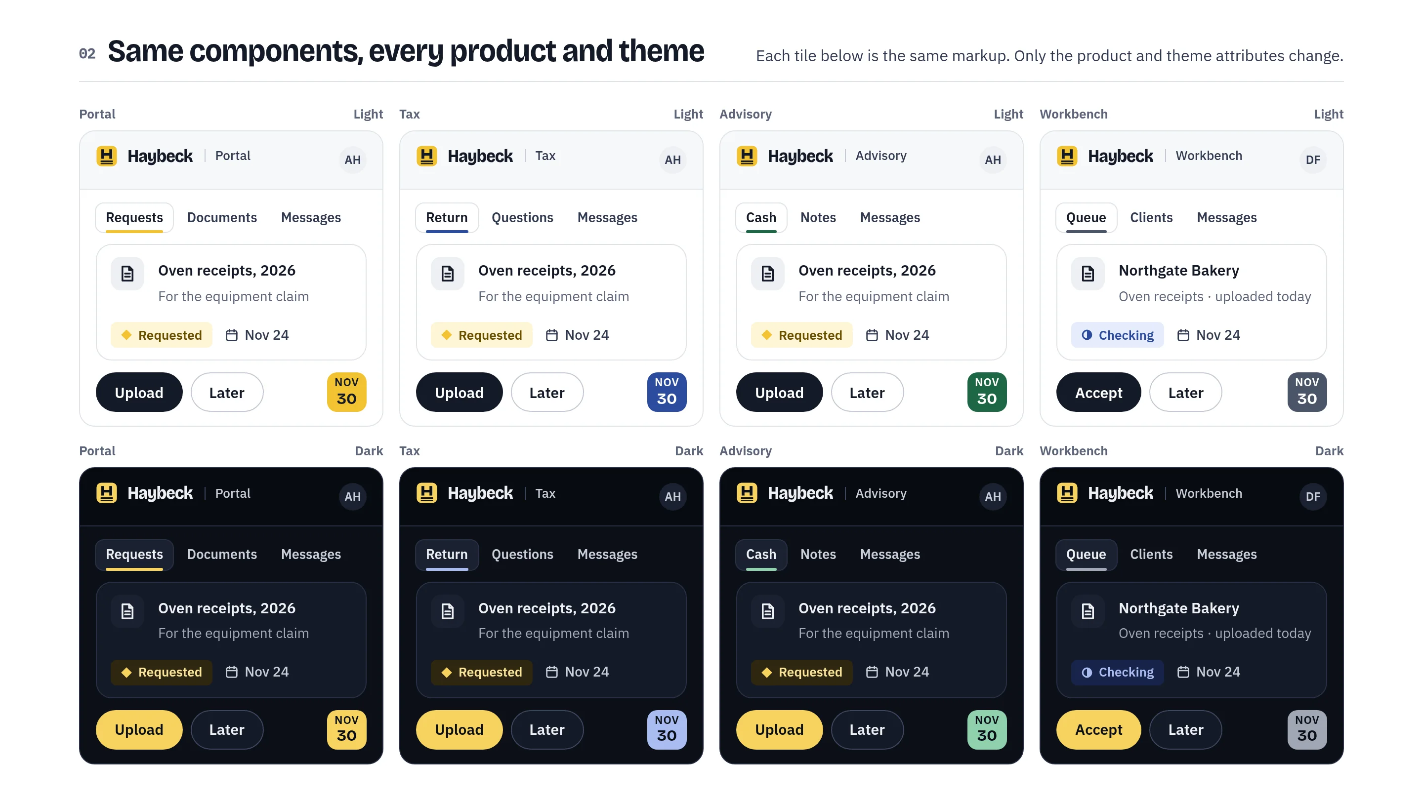
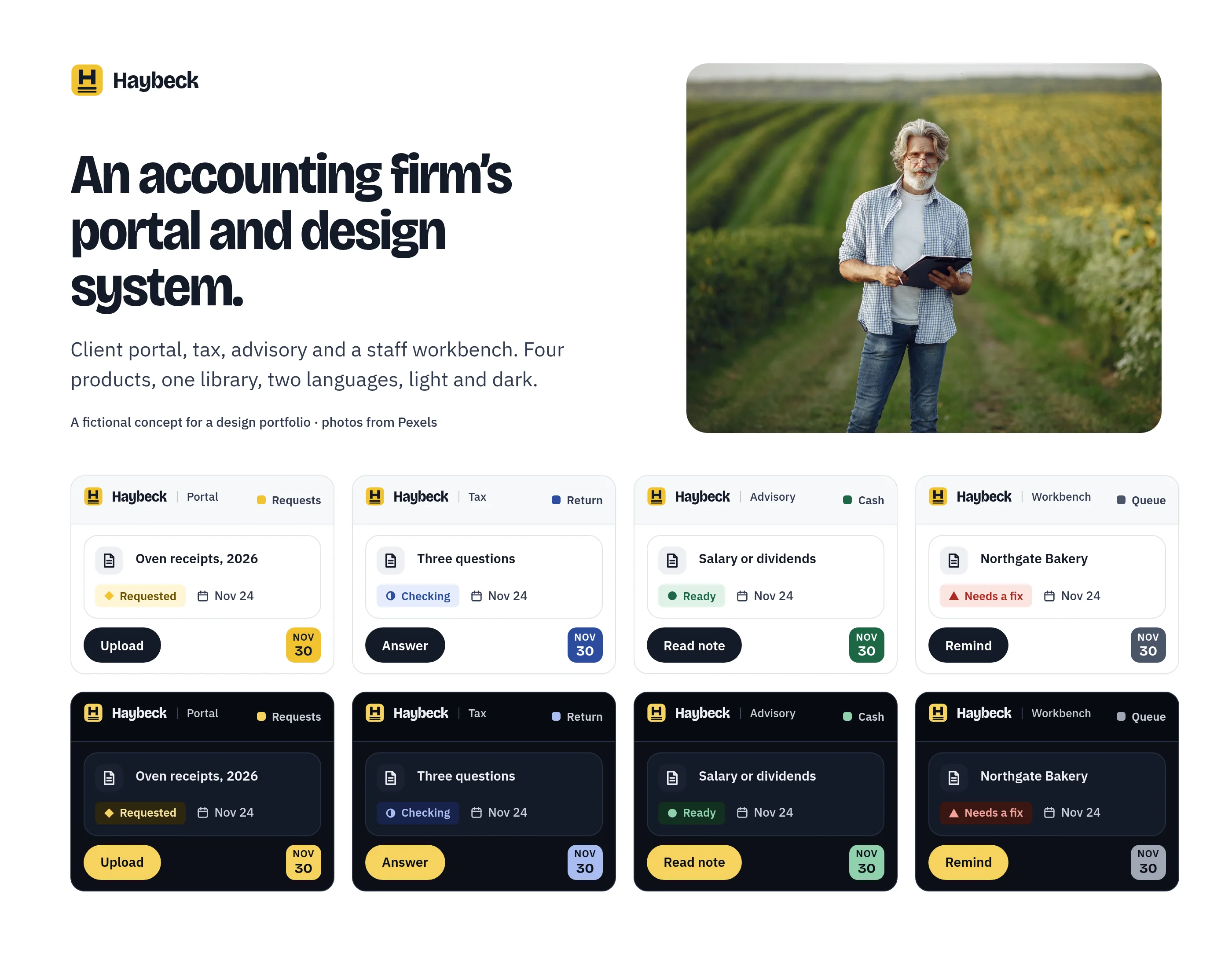
This is the core of the concept. Each tile below is the same markup with a different product and theme. Portal is canola, Tax is flax, Advisory is spruce and the staff Workbench is slate, each in light and dark.
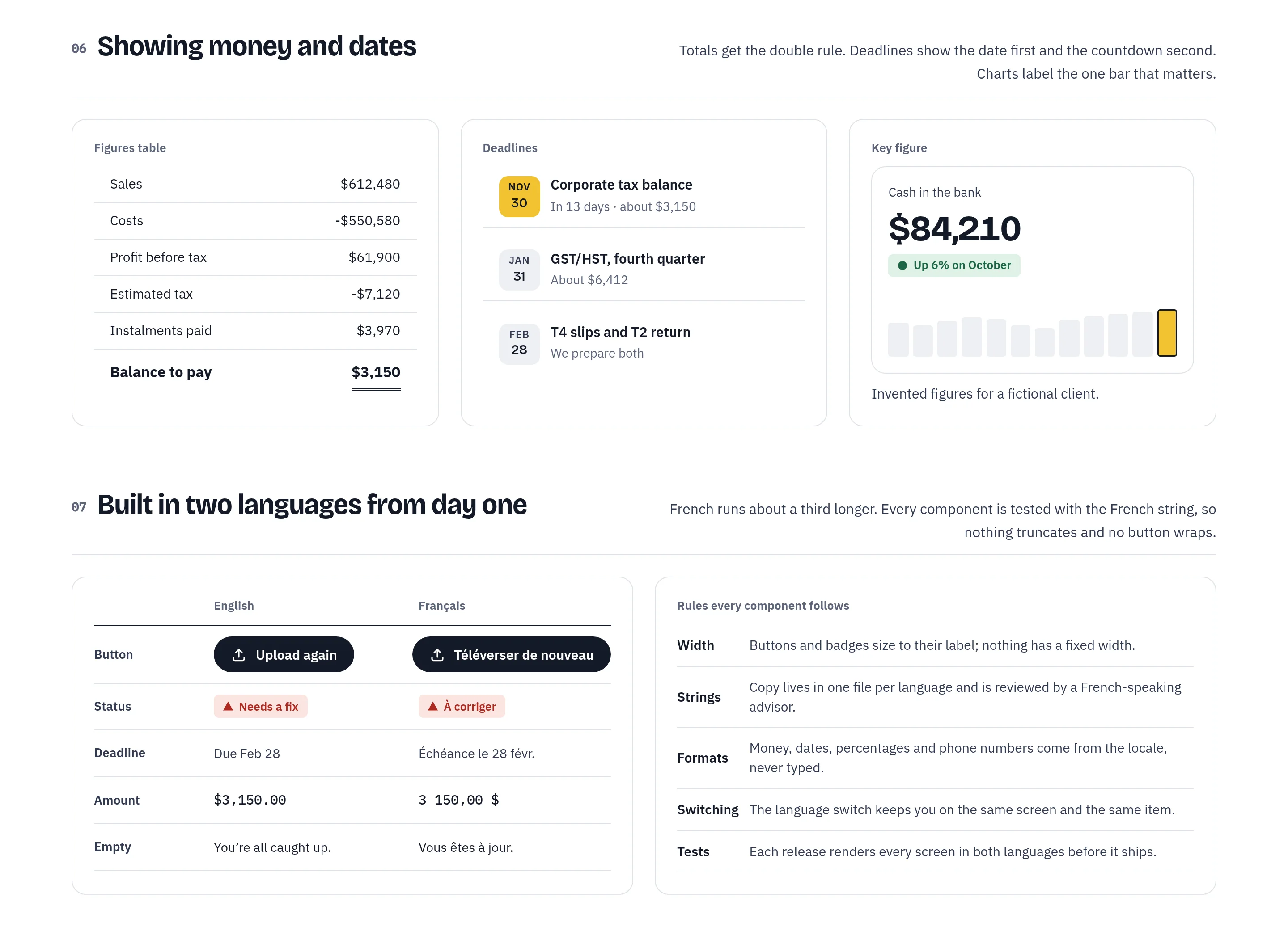
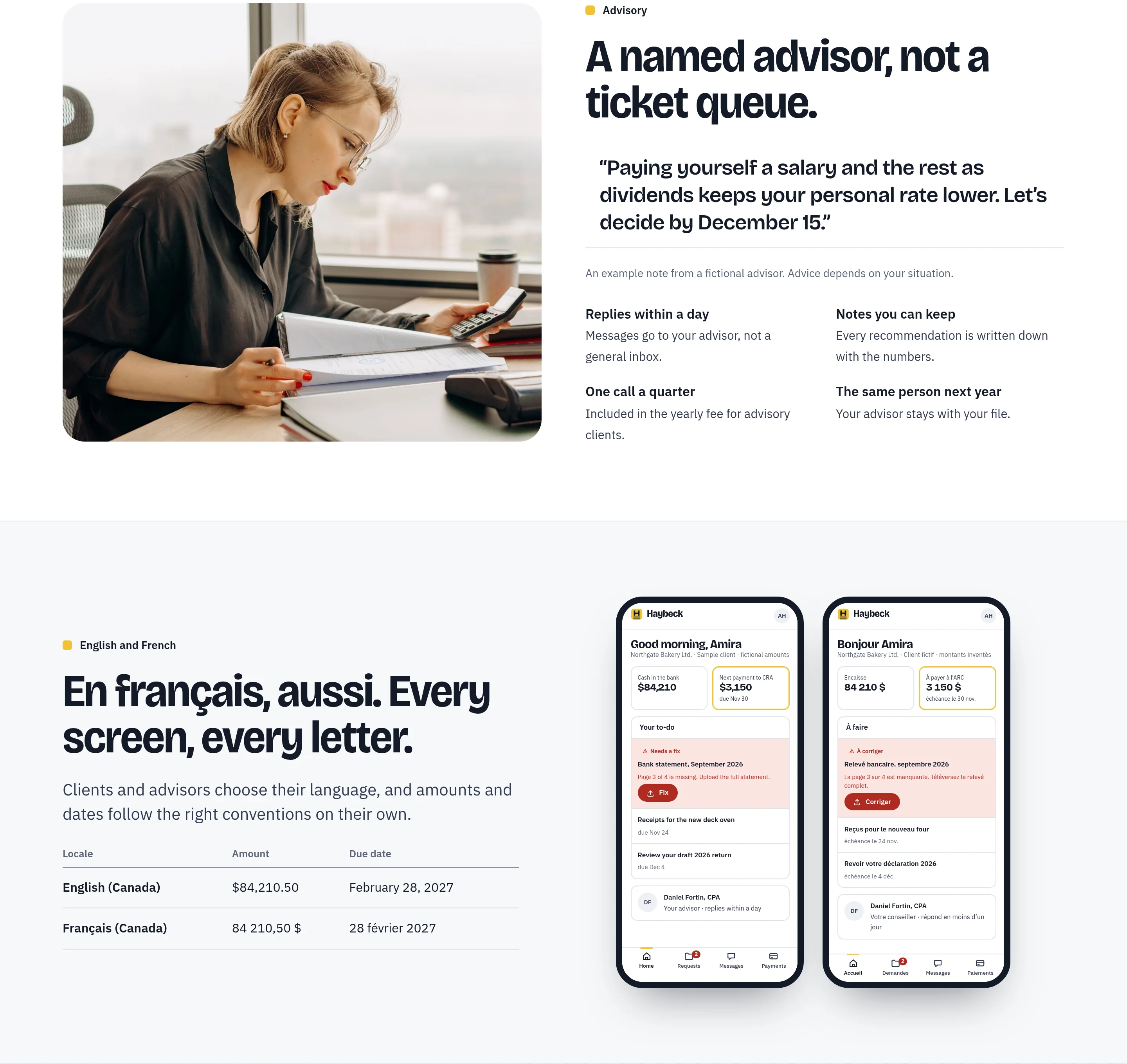
Money and dates are formatted by locale, never by hand. French amounts put the dollar sign after the number and use a space for thousands, and every table uses tabular figures.
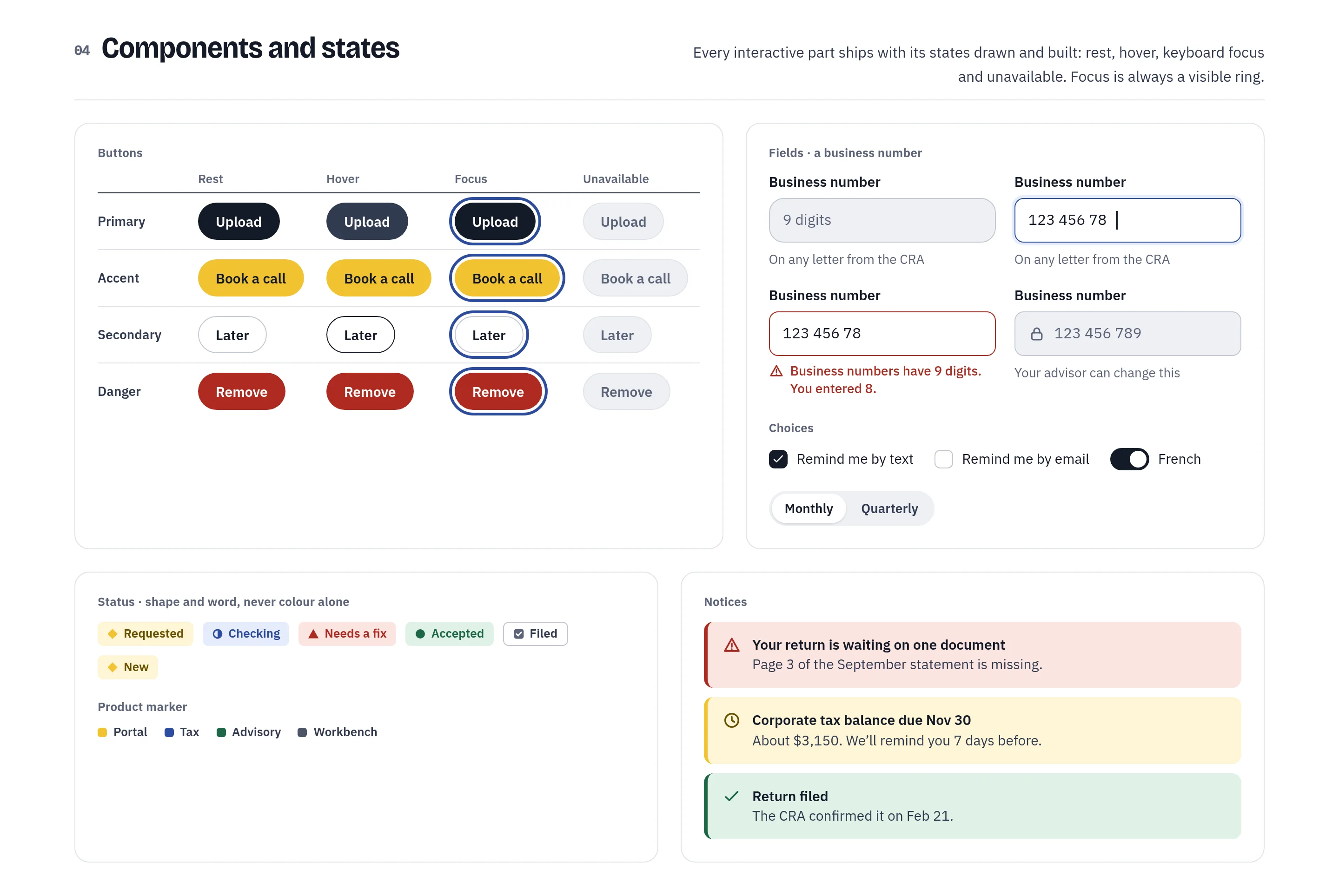
Every interactive part has its rest, hover, keyboard focus and unavailable states drawn and built. Field errors say what is wrong and how to fix it: business numbers have nine digits, you entered eight.
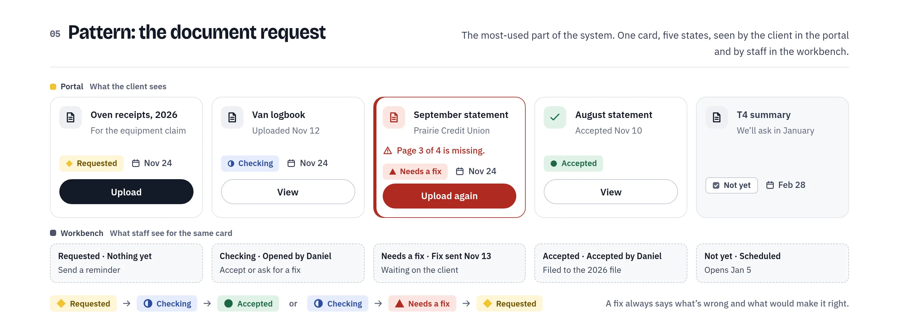
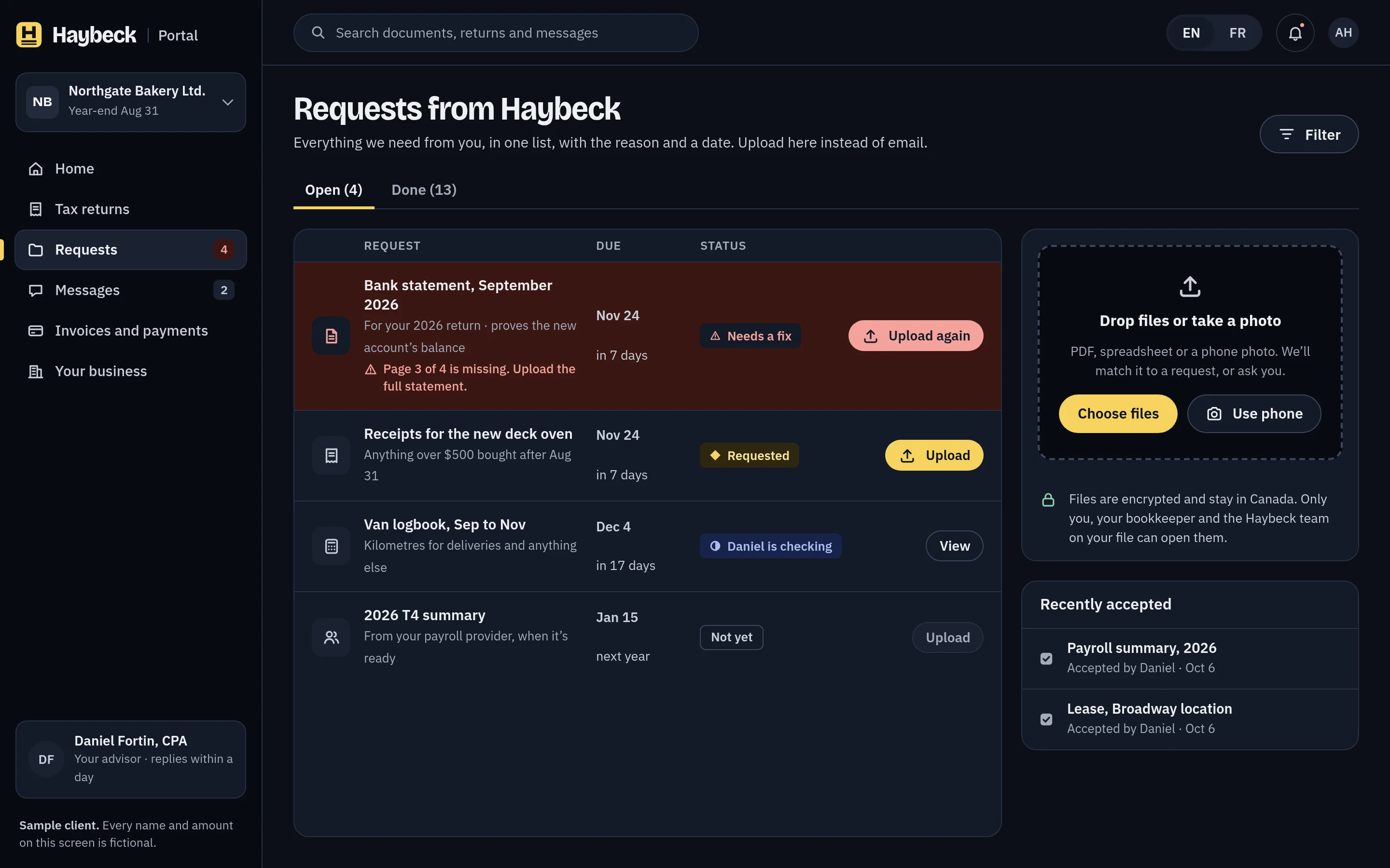
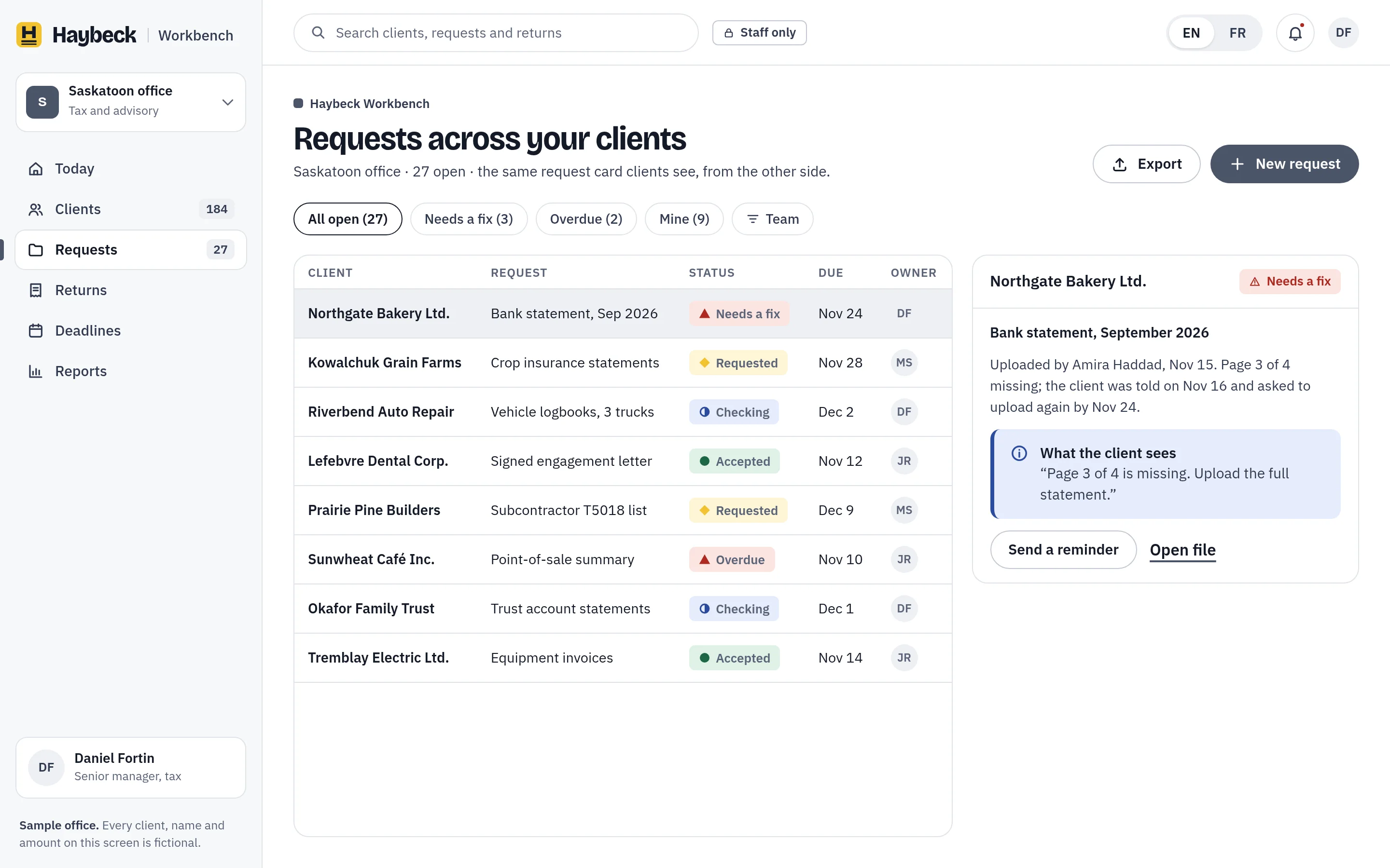
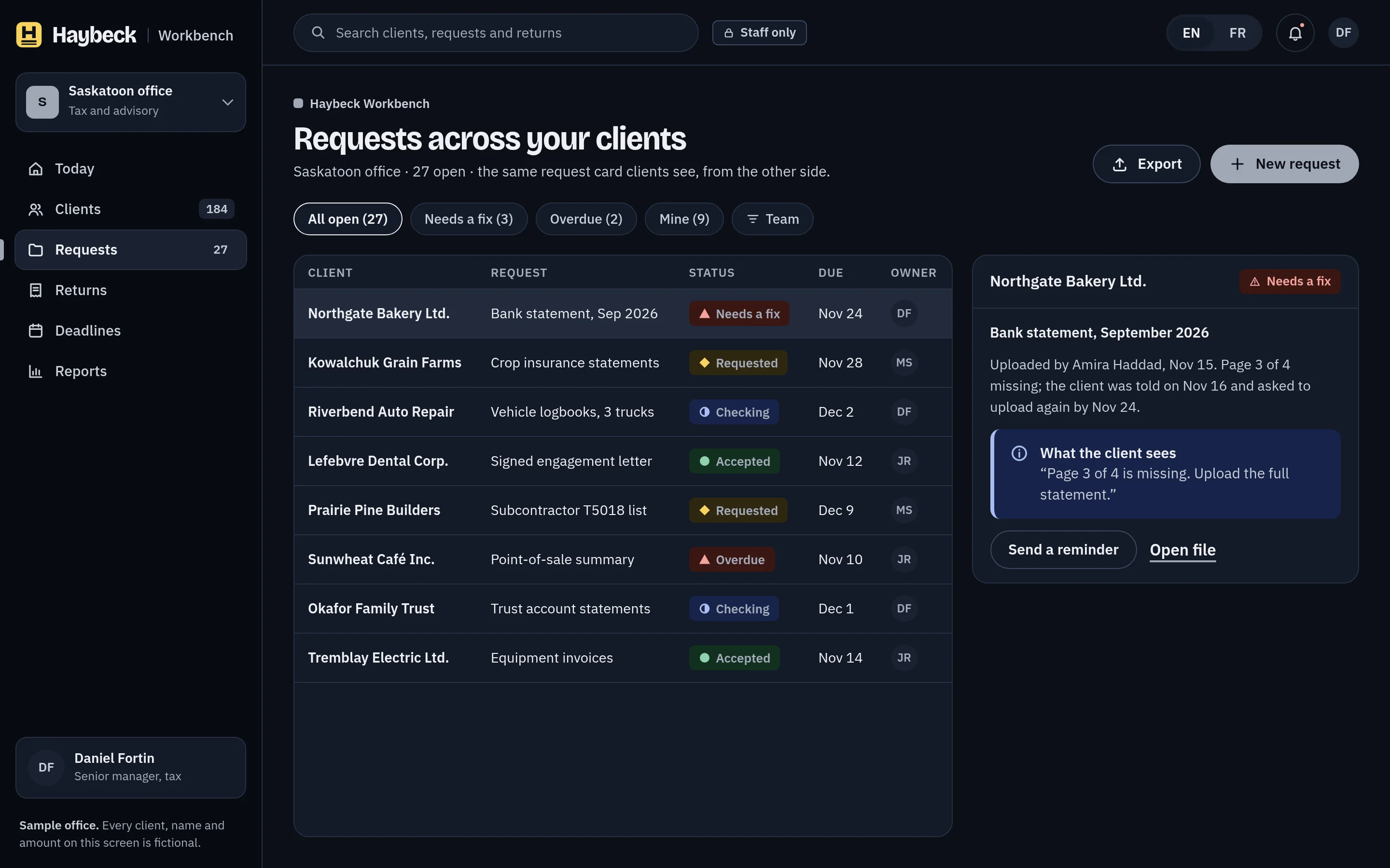
The document request is the most-used part of the system. One card has five states, and the same card appears in the client portal and in the staff Workbench, so both sides of the conversation share words.
Totals get the double rule from the logo. Deadlines show the date first and the countdown second. French runs about a third longer, so every component is tested with the French string before it ships.
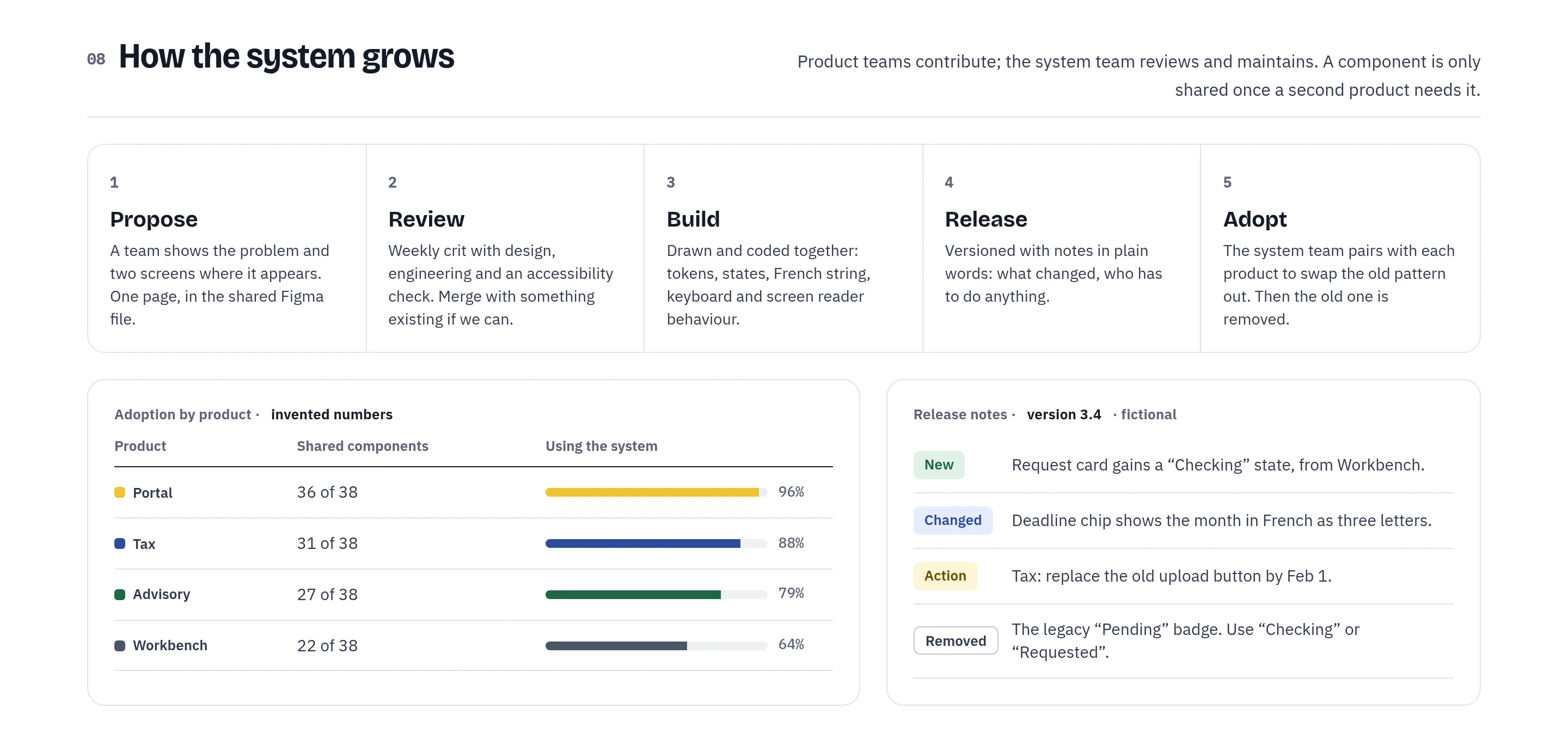
A system only works if teams can grow it. Product teams propose, a weekly crit reviews, design and code are built together, releases come with plain notes, and the system team pairs with each product to adopt the change. The adoption numbers are invented to show what I’d track.
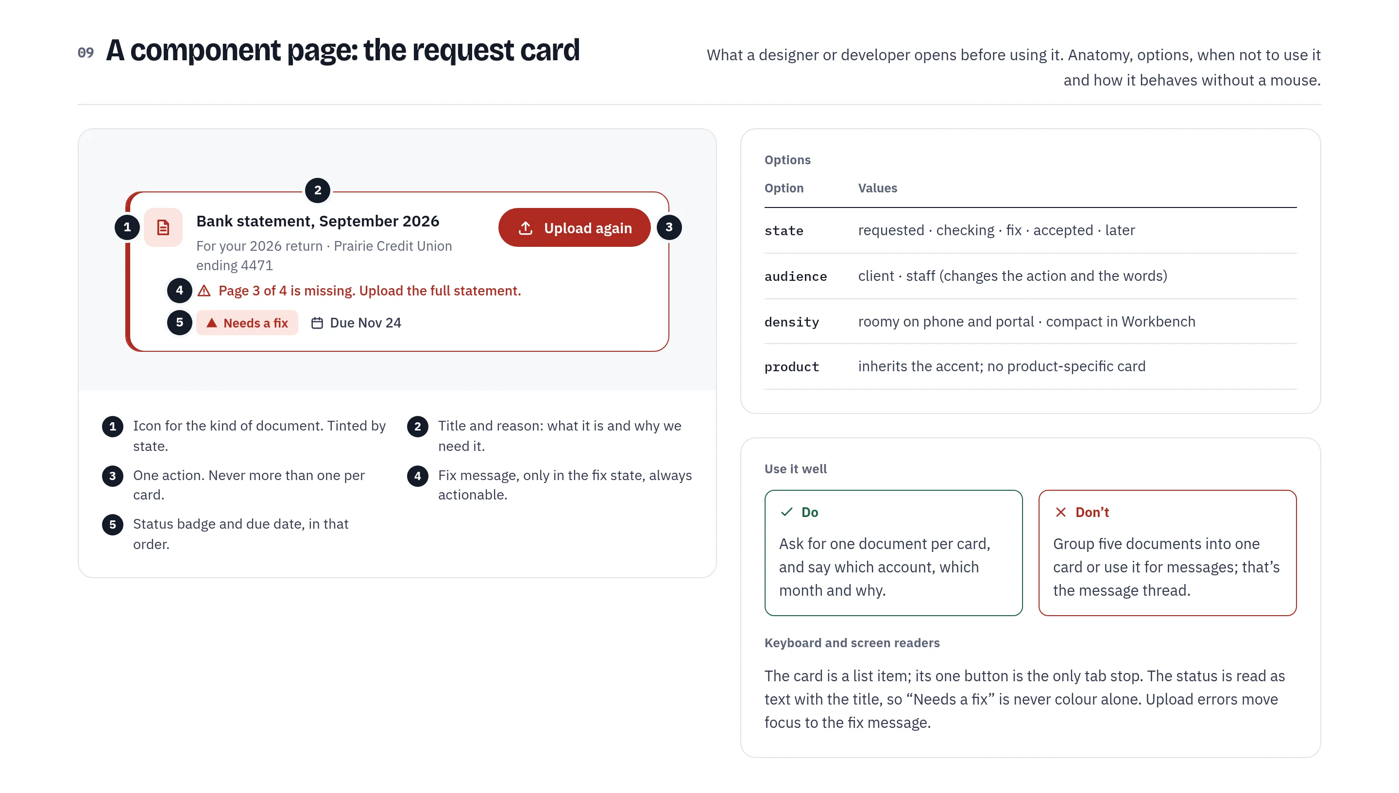
Each component gets a page that a designer or developer opens before using it: anatomy, options, do and don’t, and how it behaves with a keyboard and a screen reader.
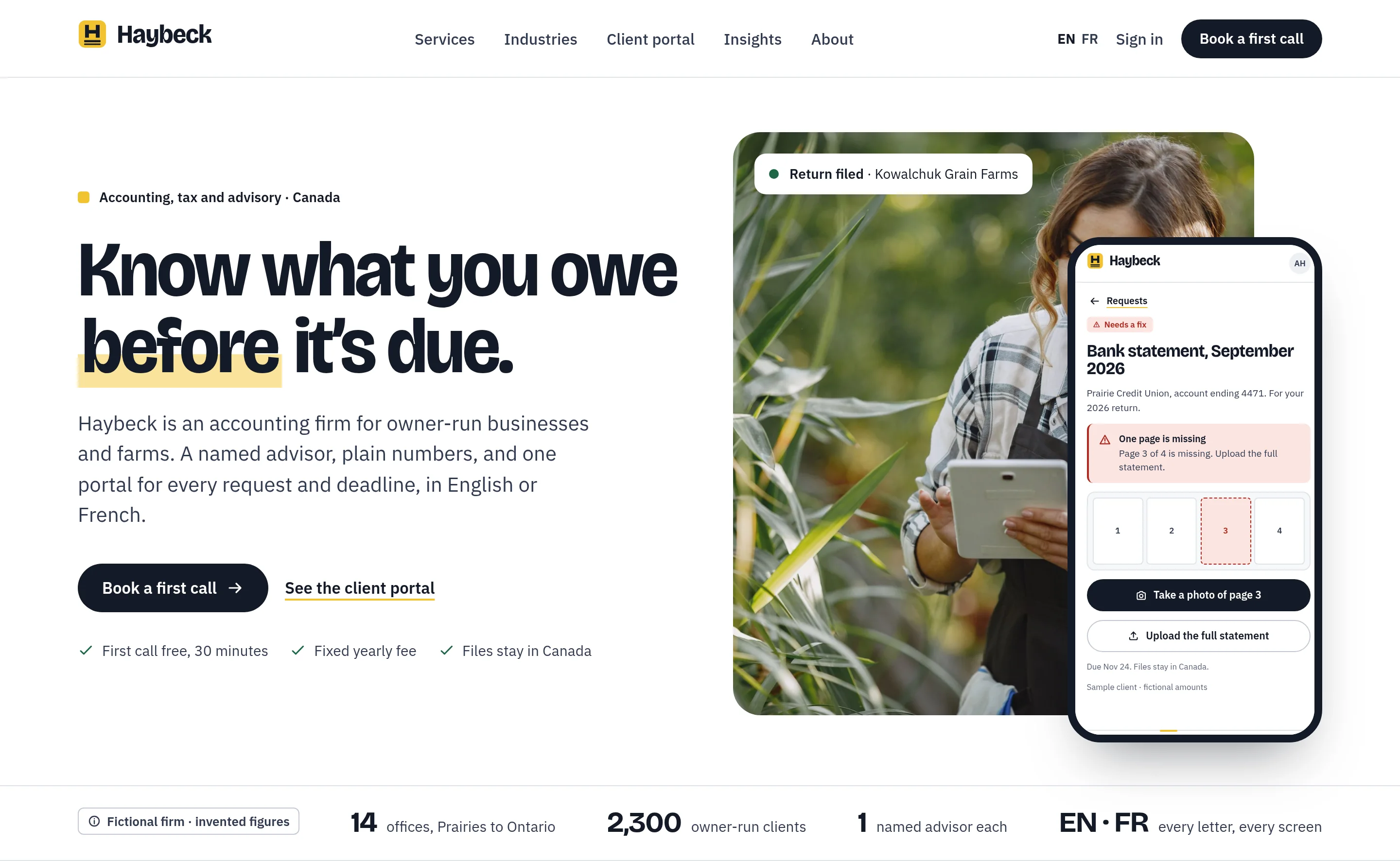
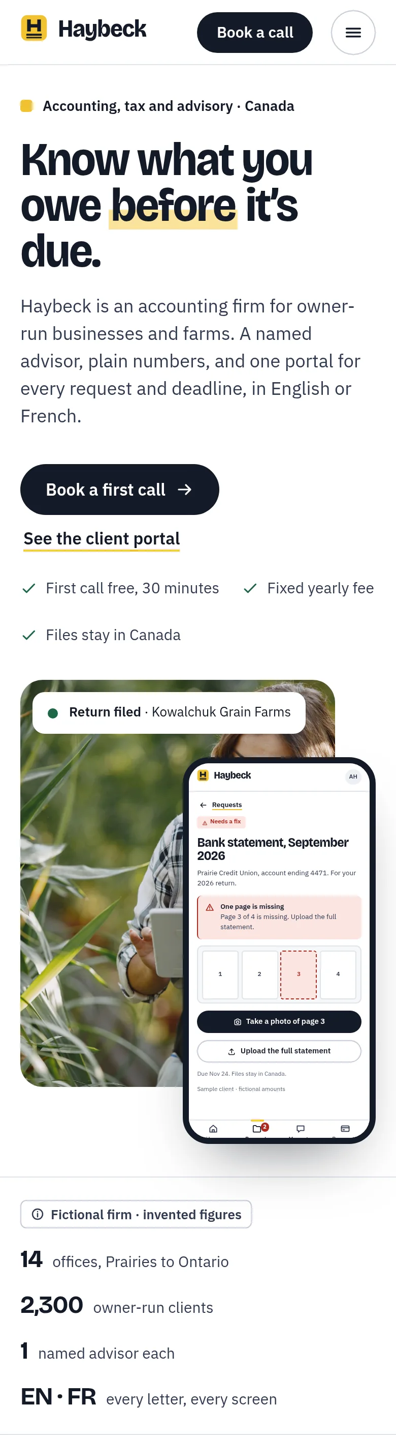
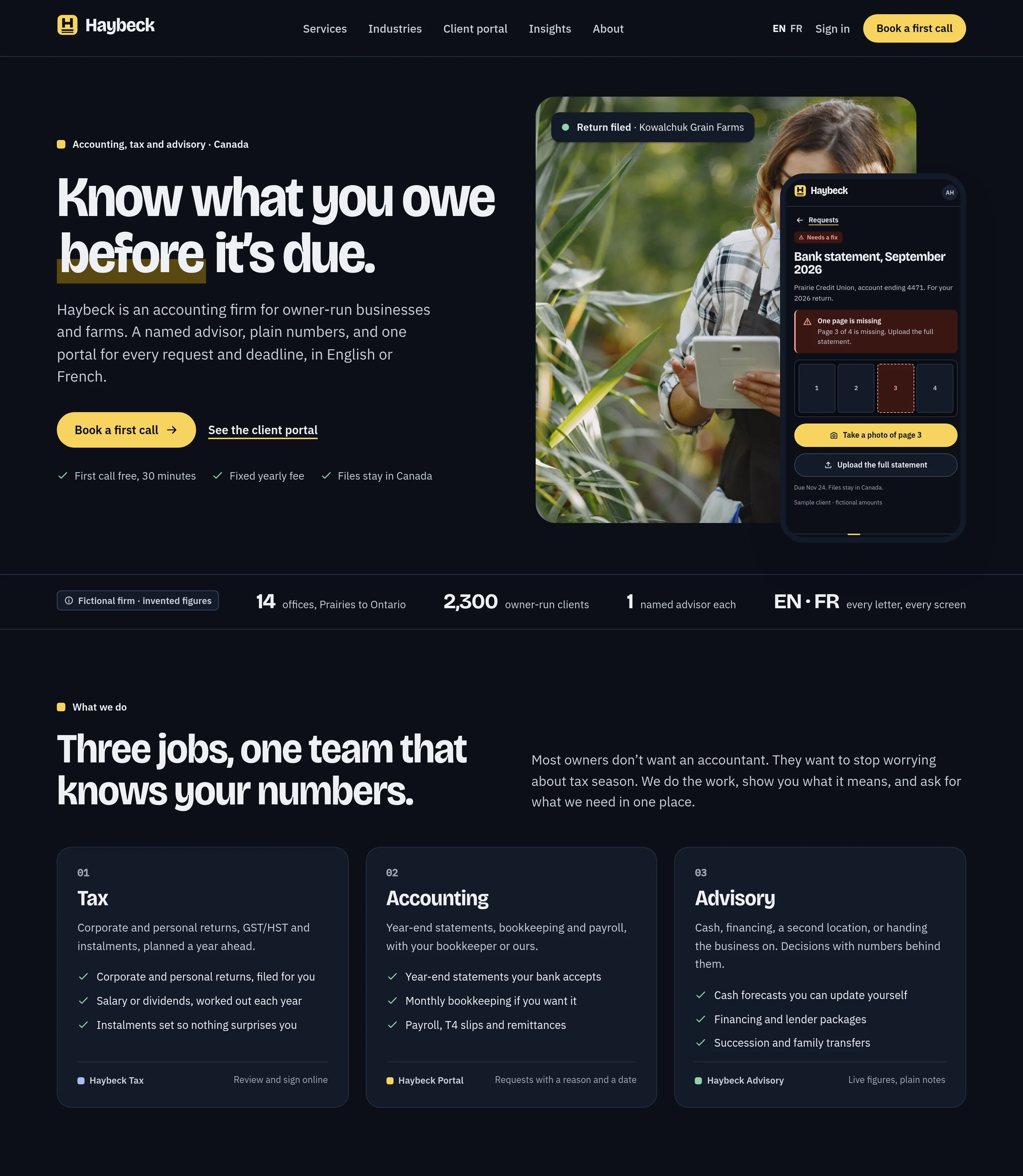
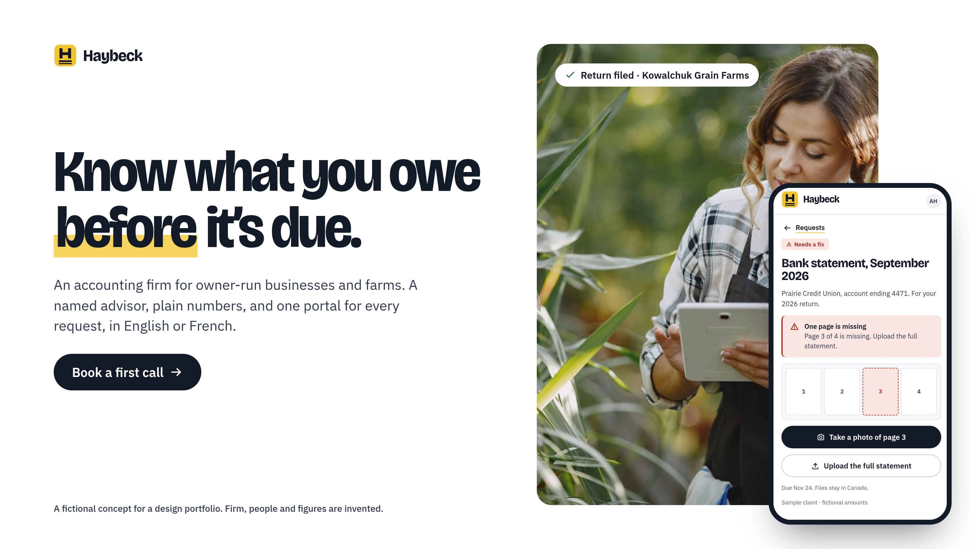
Know what you owe before it’s due.
The homepage opens on the promise and the product together: a grower checking her tablet, a “Return filed” tag and the phone screen that asks for one missing page. Below it, a strip of firm facts carries a “fictional firm, invented figures” label.
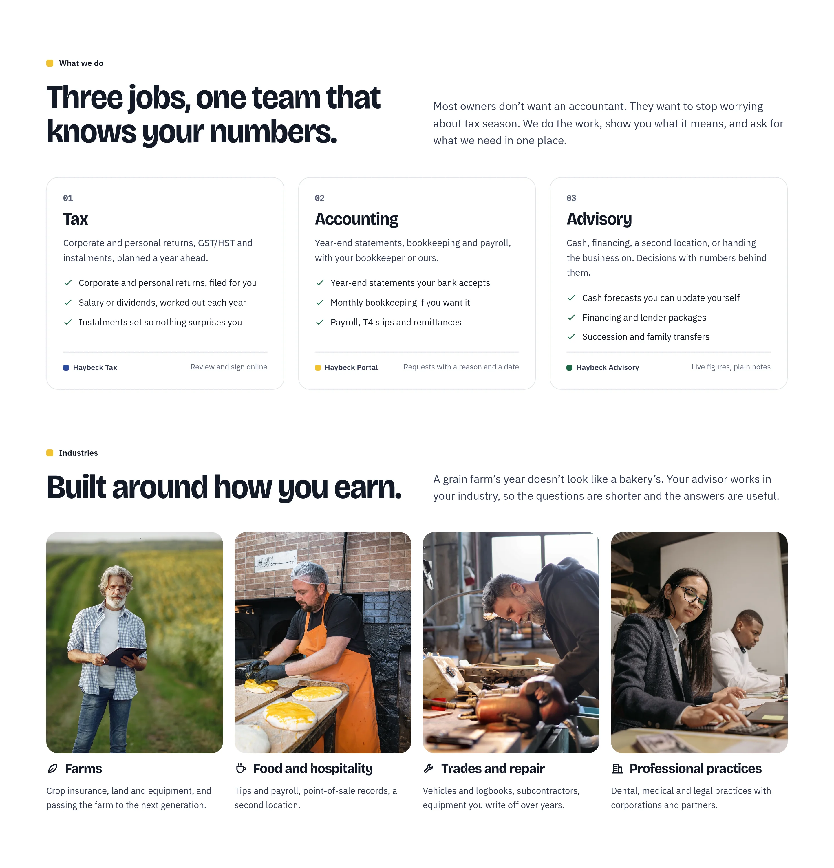
Three services, each tied to the product that delivers it, then industries shown through the people who run them.
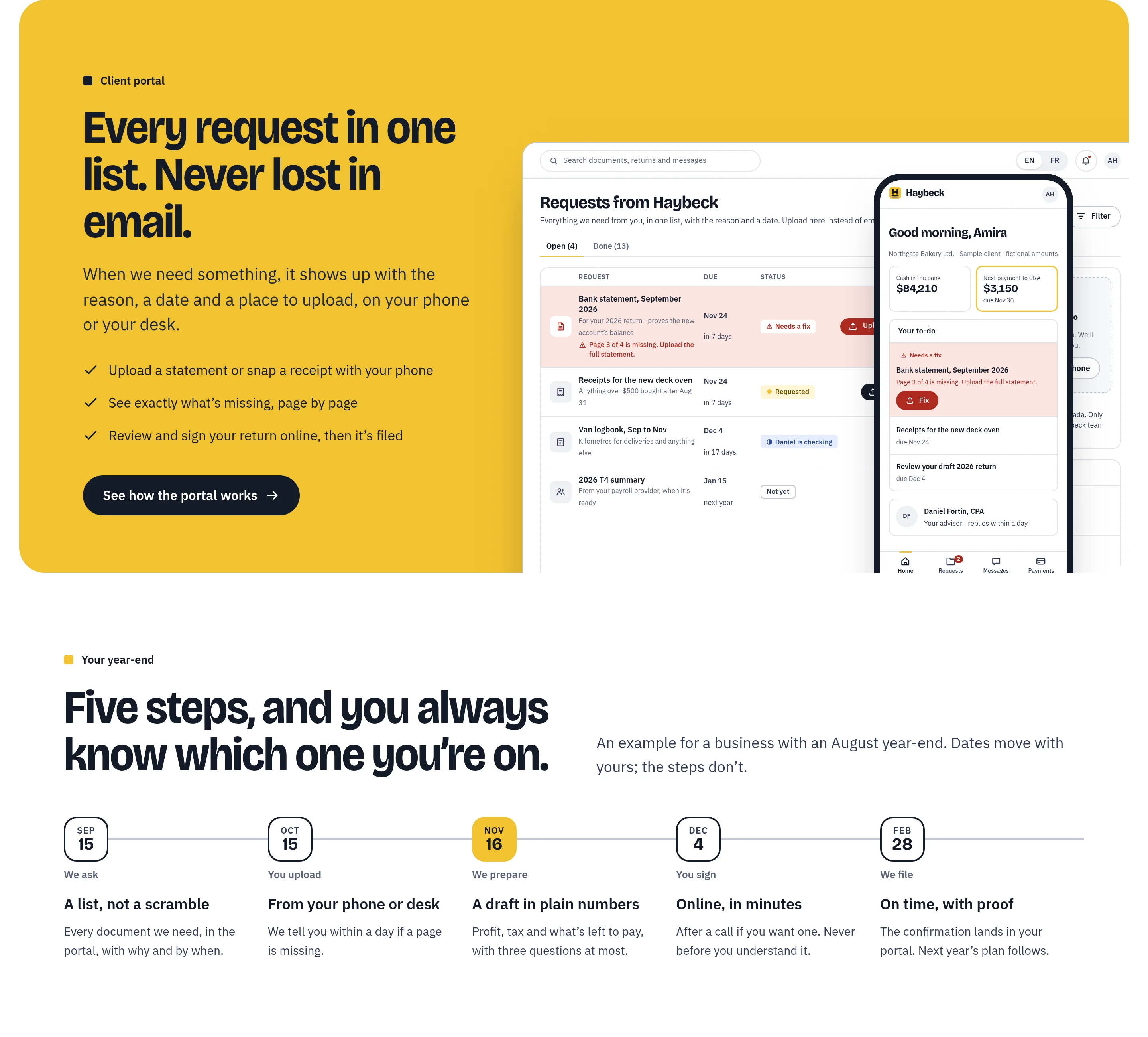
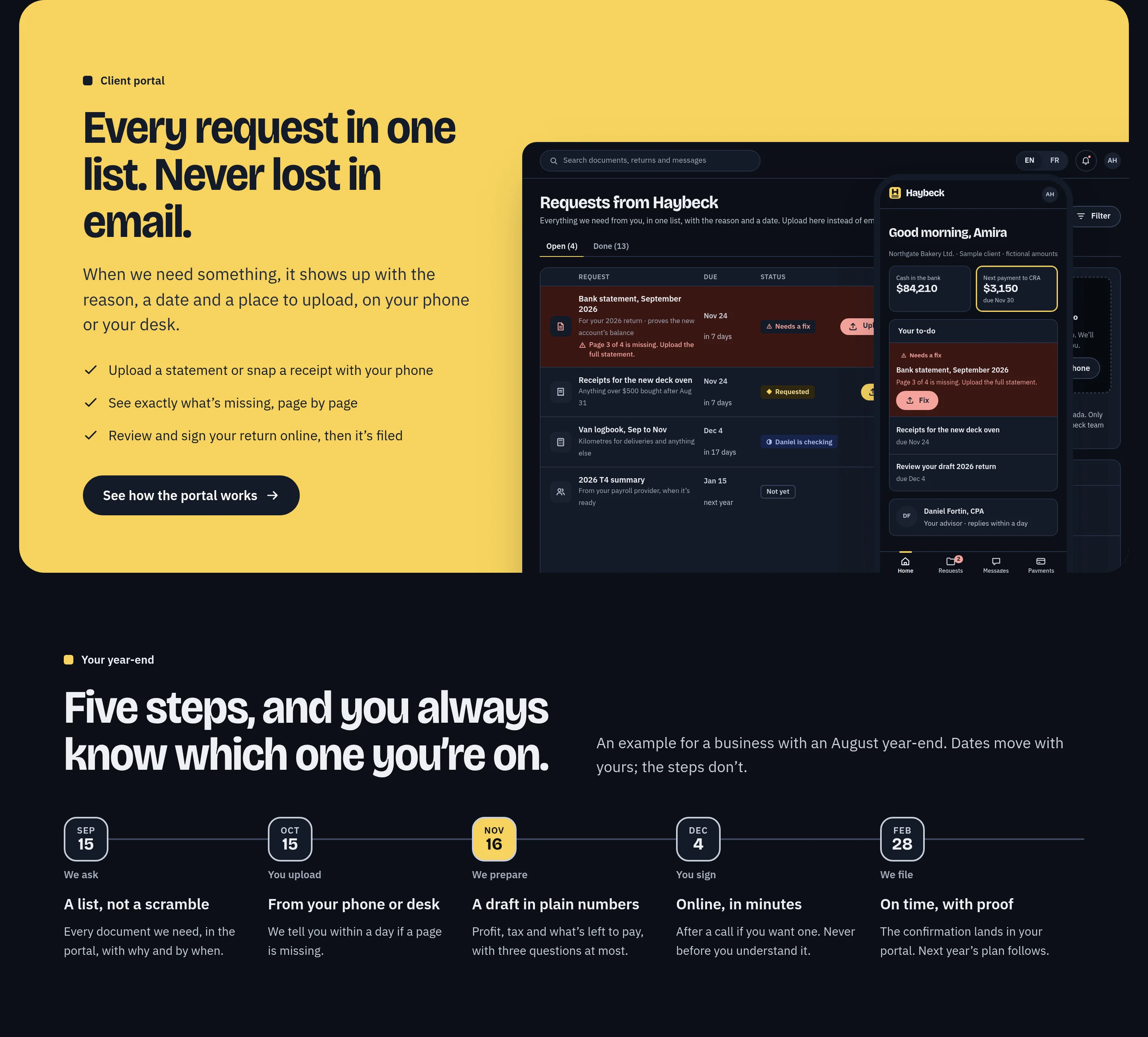
The canola section shows the portal itself, then the year-end in five dated steps so an owner always knows what comes next.
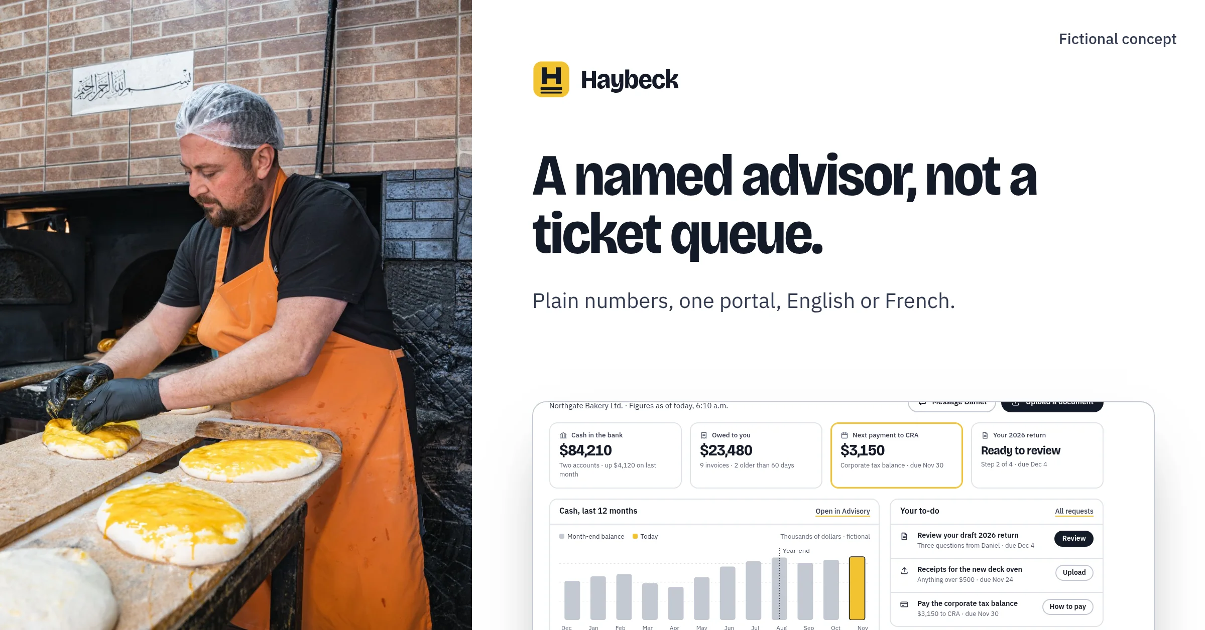
A named advisor rather than a queue, then French as an equal: the same screens with locale formats for money and dates.
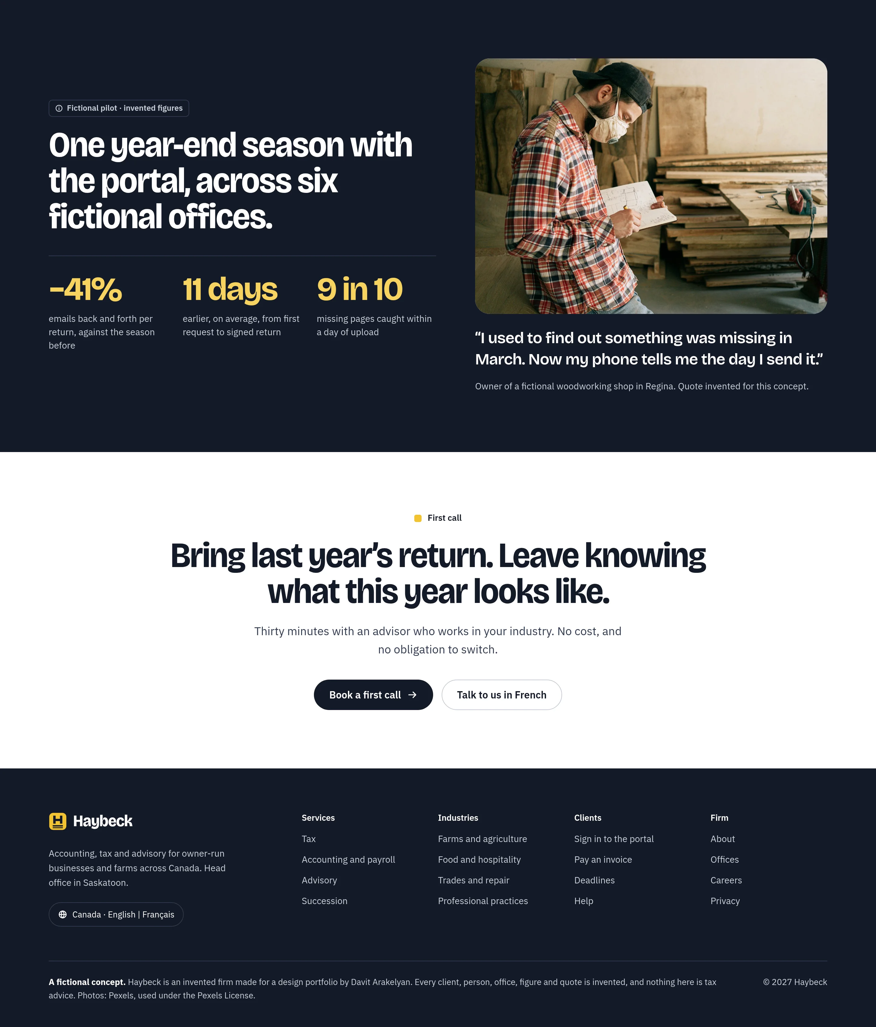
The proof band is a fictional pilot, and it says so in its label. The page closes with one clear action and a footer that calls the whole thing a fictional concept.
What’s due, what we need, and what your advisor thinks.
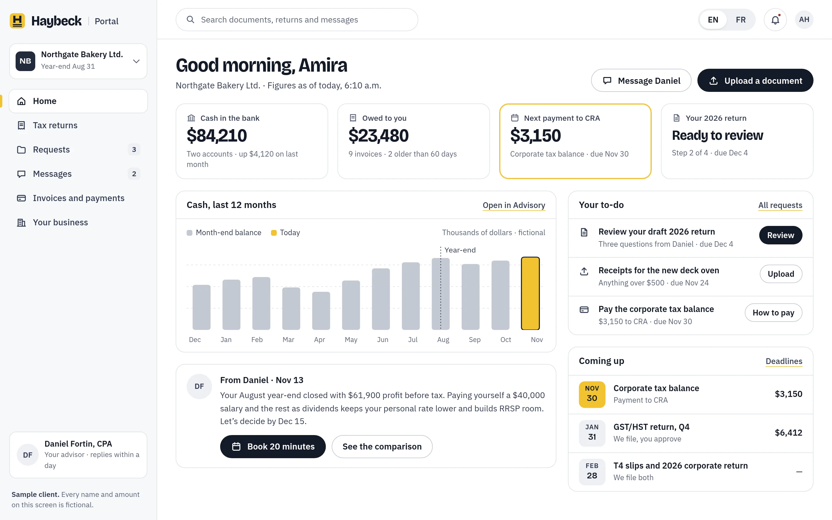
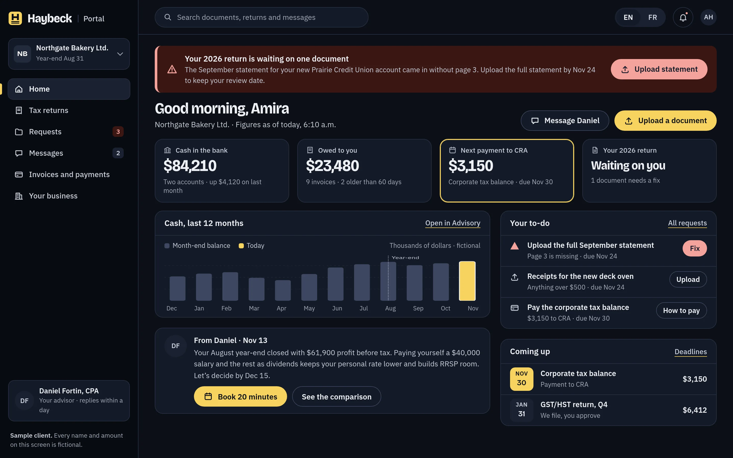
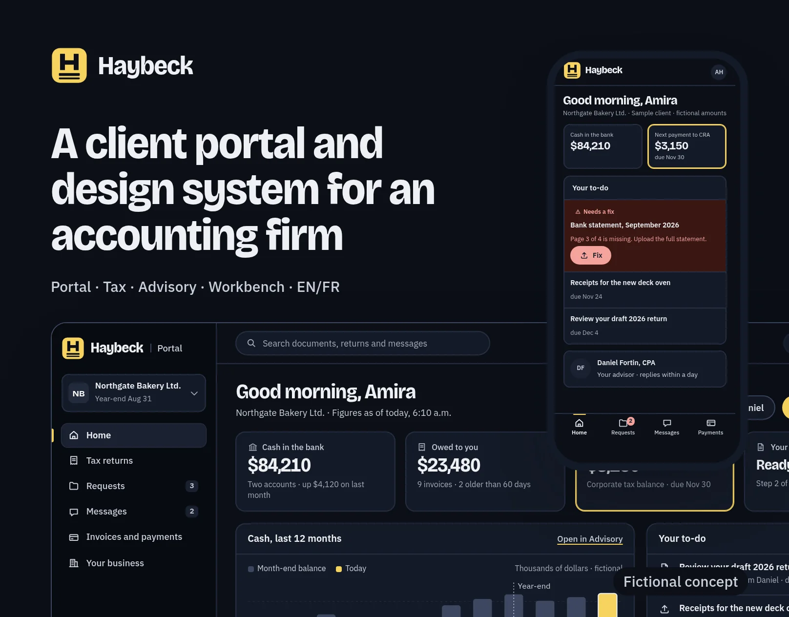
The portal home is built for an owner with five minutes: four figures they actually check, a to-do list, the deadlines coming up and a note from their advisor. The client, a bakery in Saskatoon, and every figure are invented.
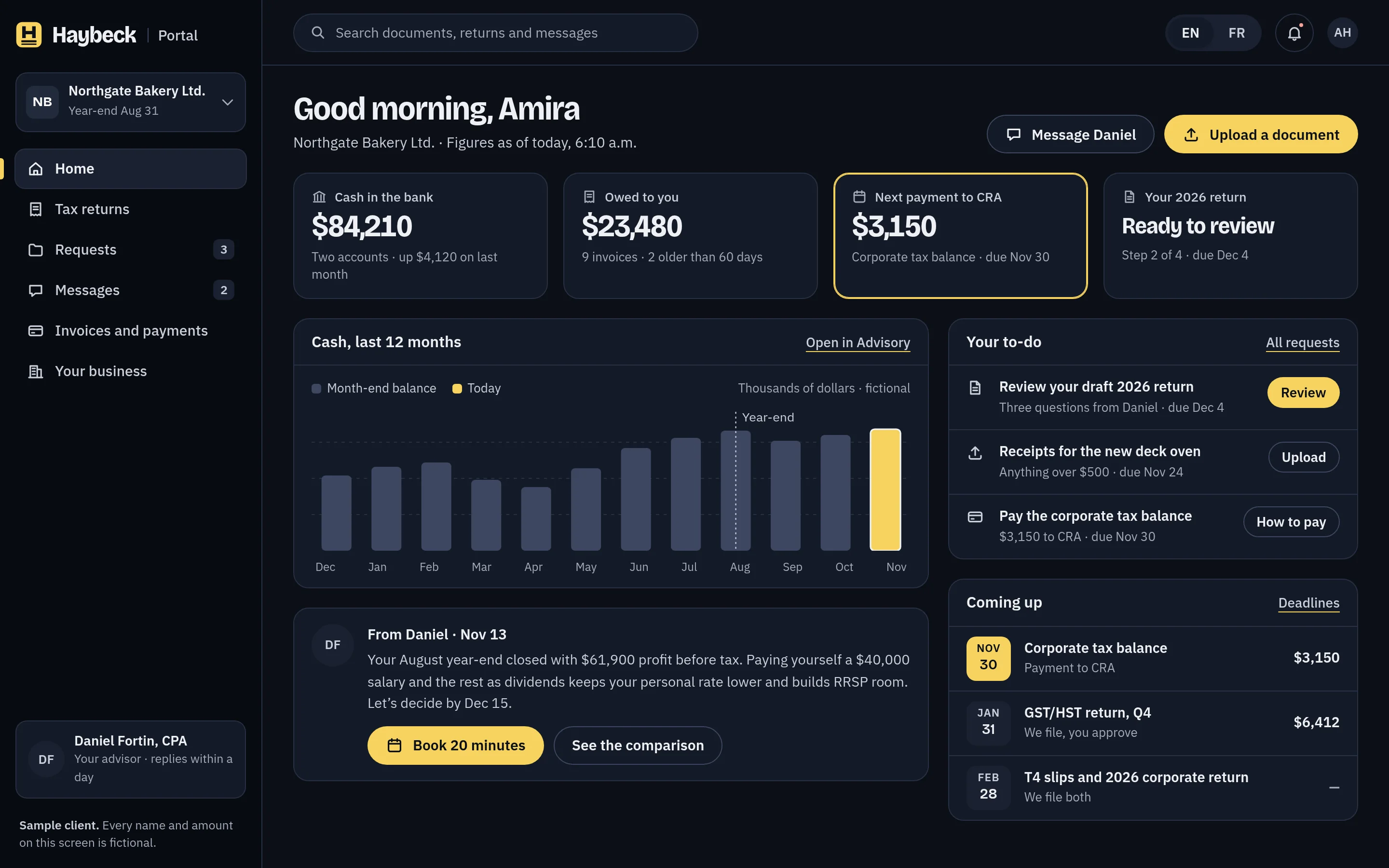
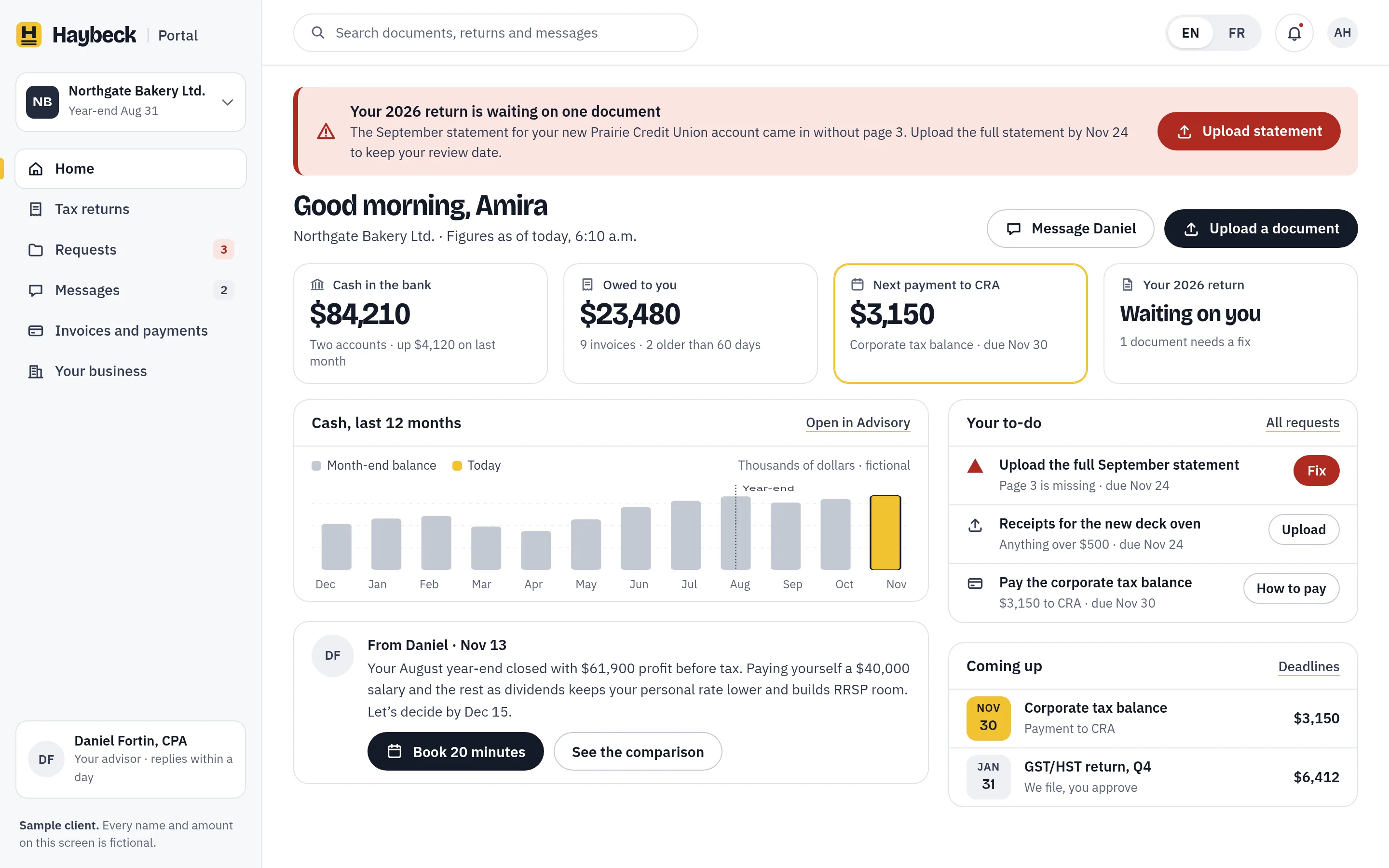
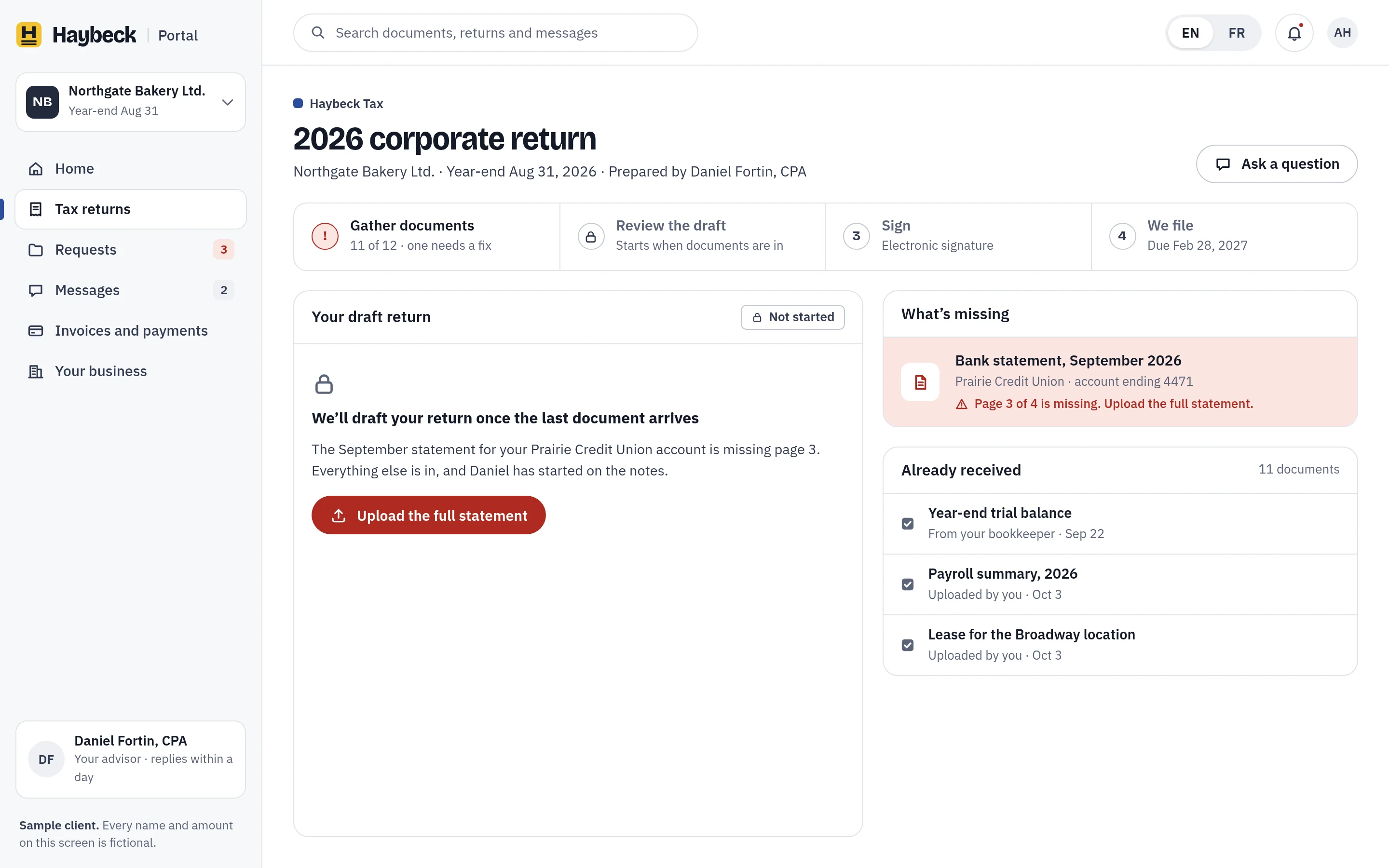
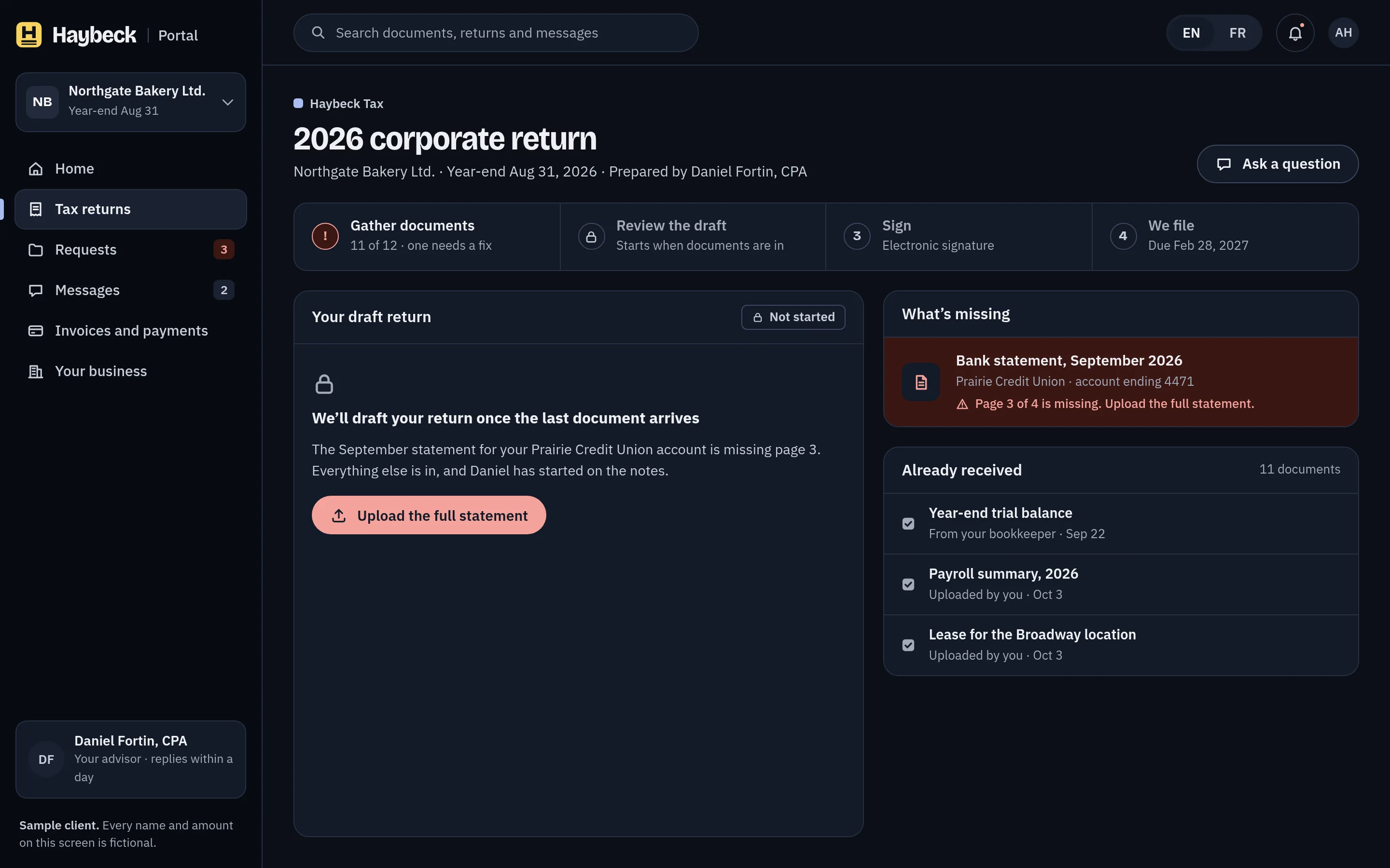
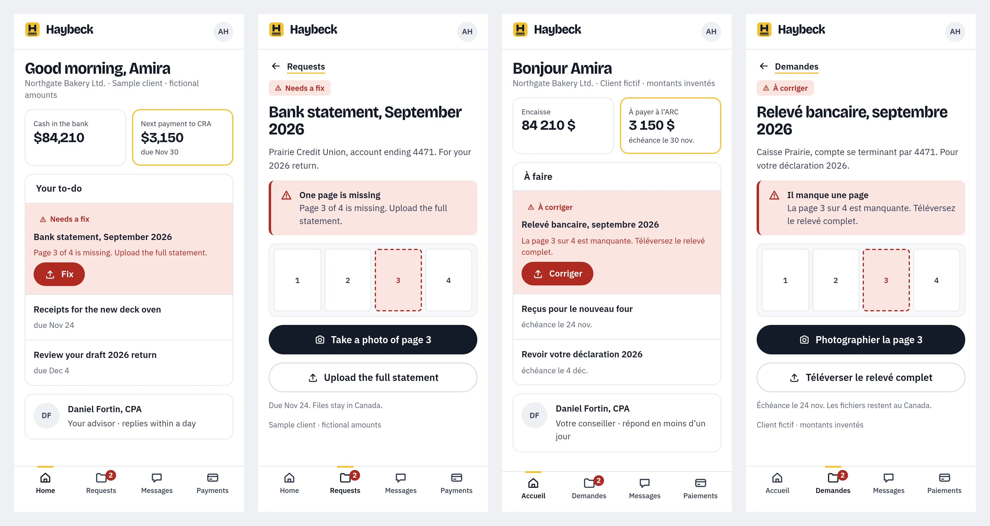
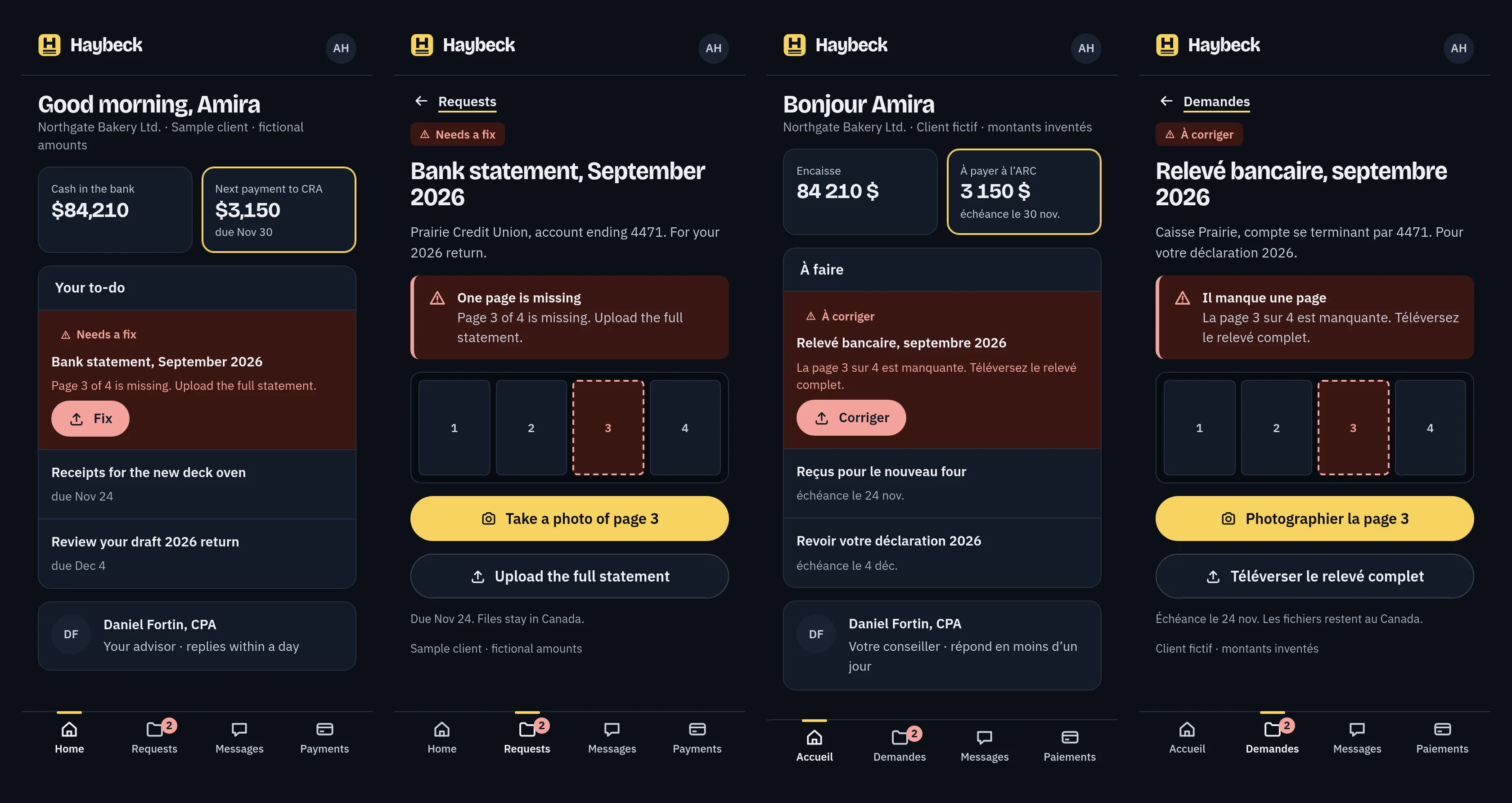
When one missing page blocks the return, it goes to the top in plain words with a single action. The alert keeps its shape and wording in dark mode, not just its colour.
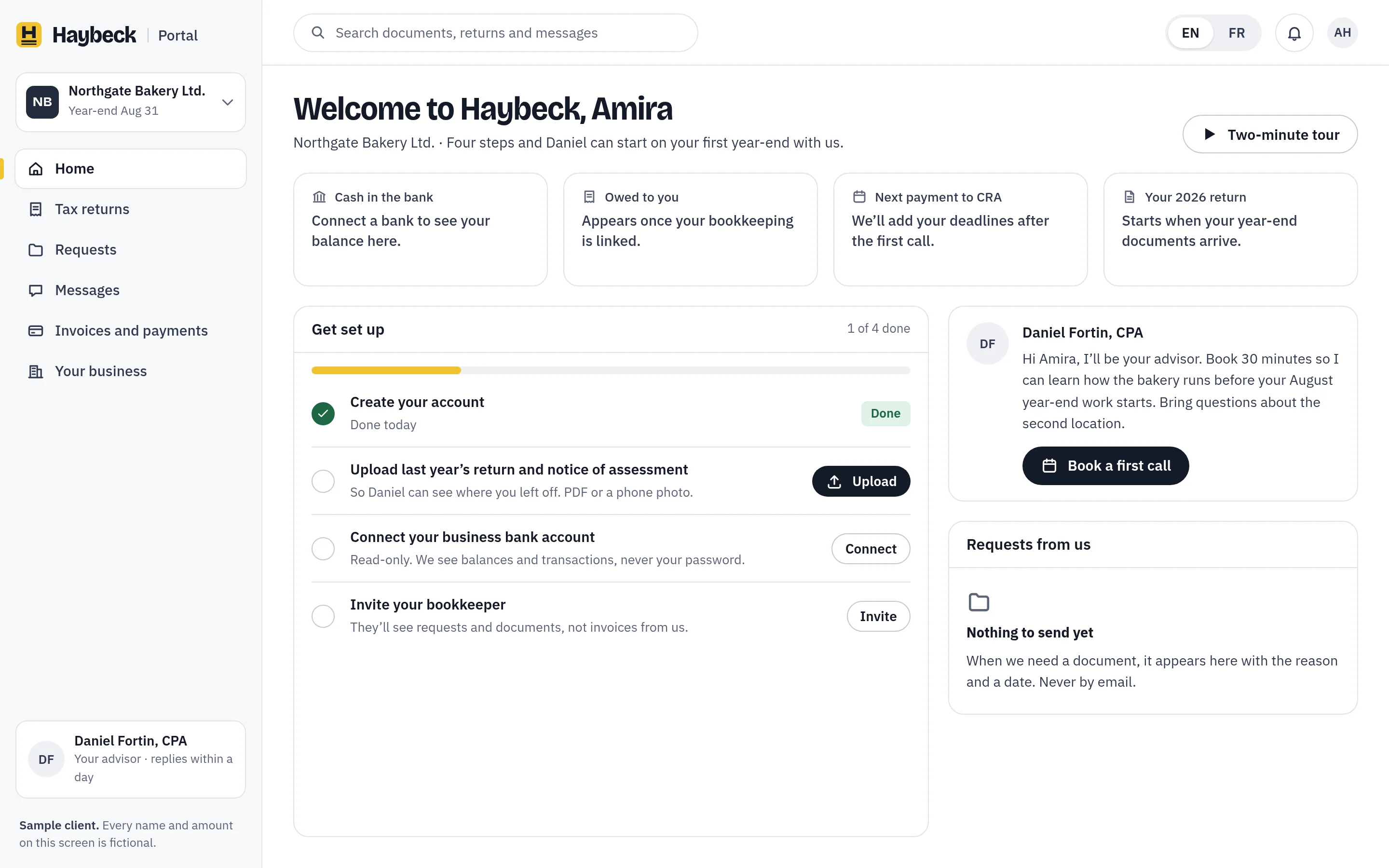
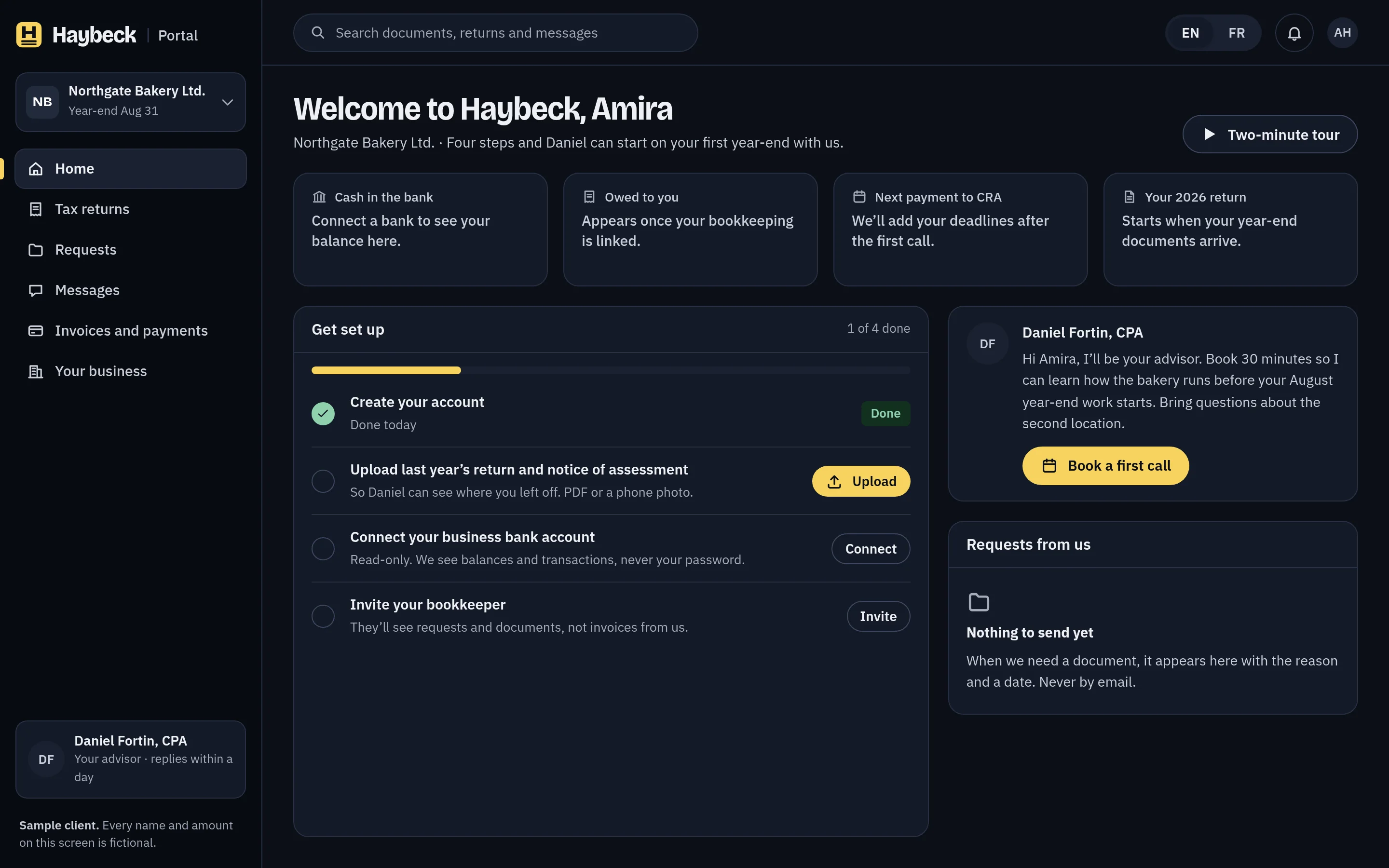
The first day is designed too: four set-up steps and the advisor’s name from the first minute, instead of empty charts.
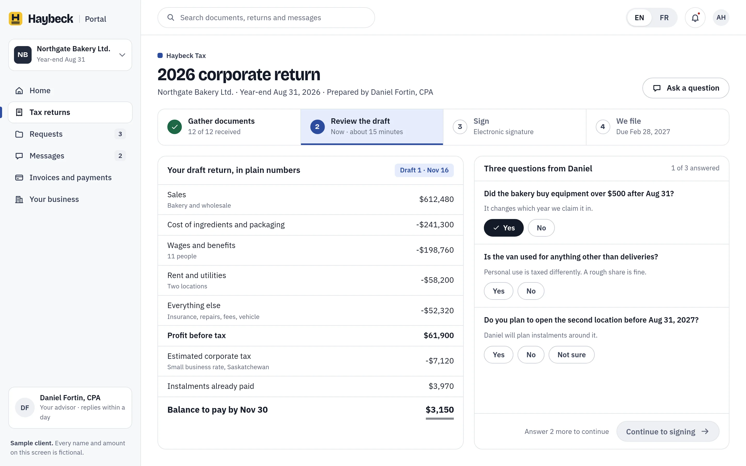
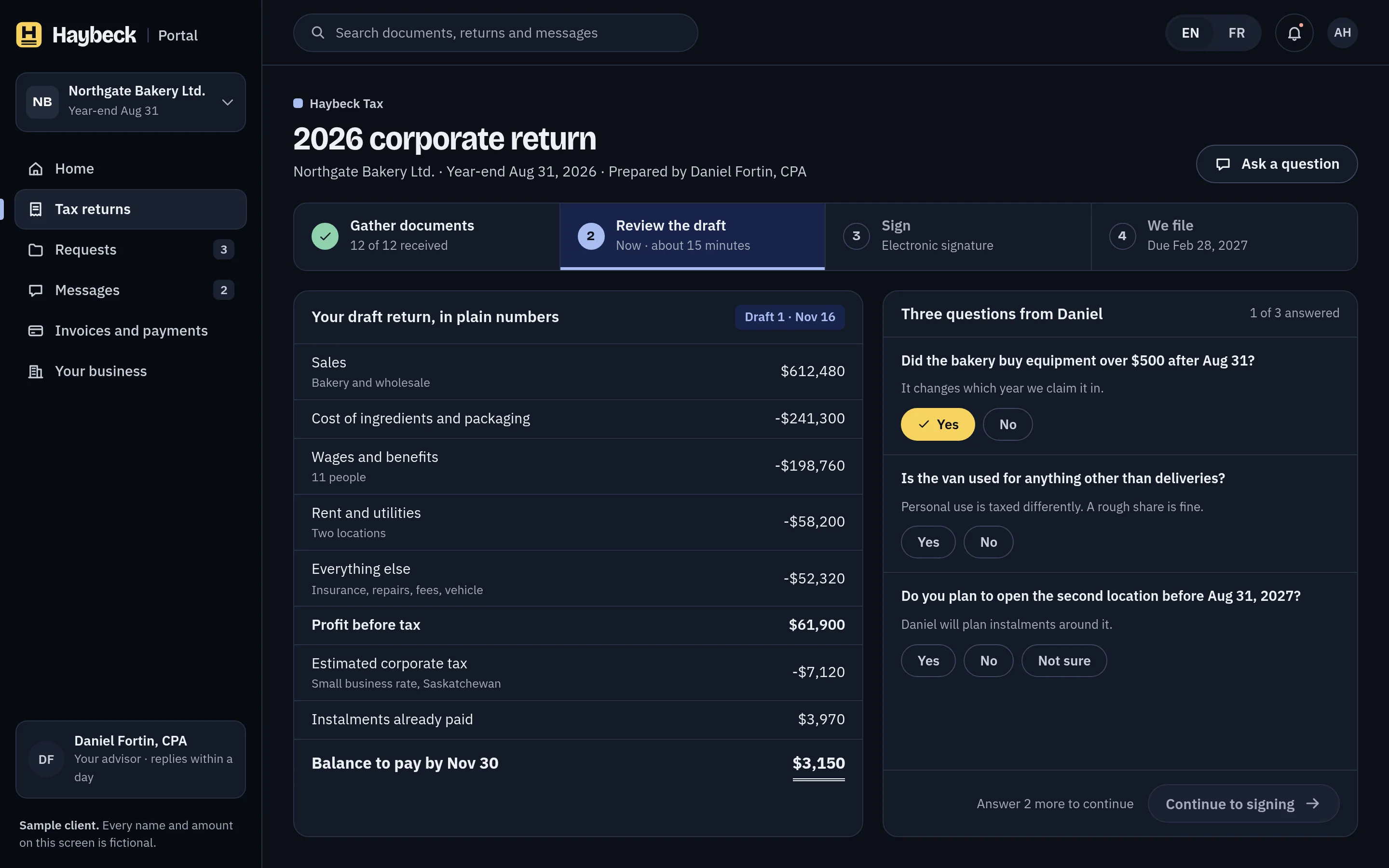
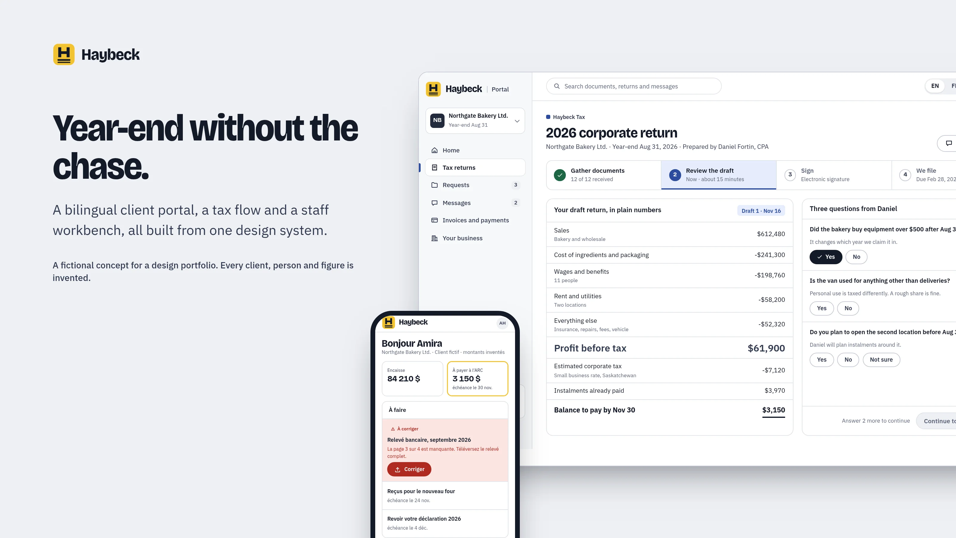
A draft in plain numbers, three questions, then sign.
The Tax product swaps the accent to flax and nothing else. The draft return shows the numbers that matter with the double rule under the balance, and the advisor asks three yes-or-no questions instead of sending a long organiser.
If a document is missing, signing stays locked and says exactly what unlocks it, next to what has already been received.
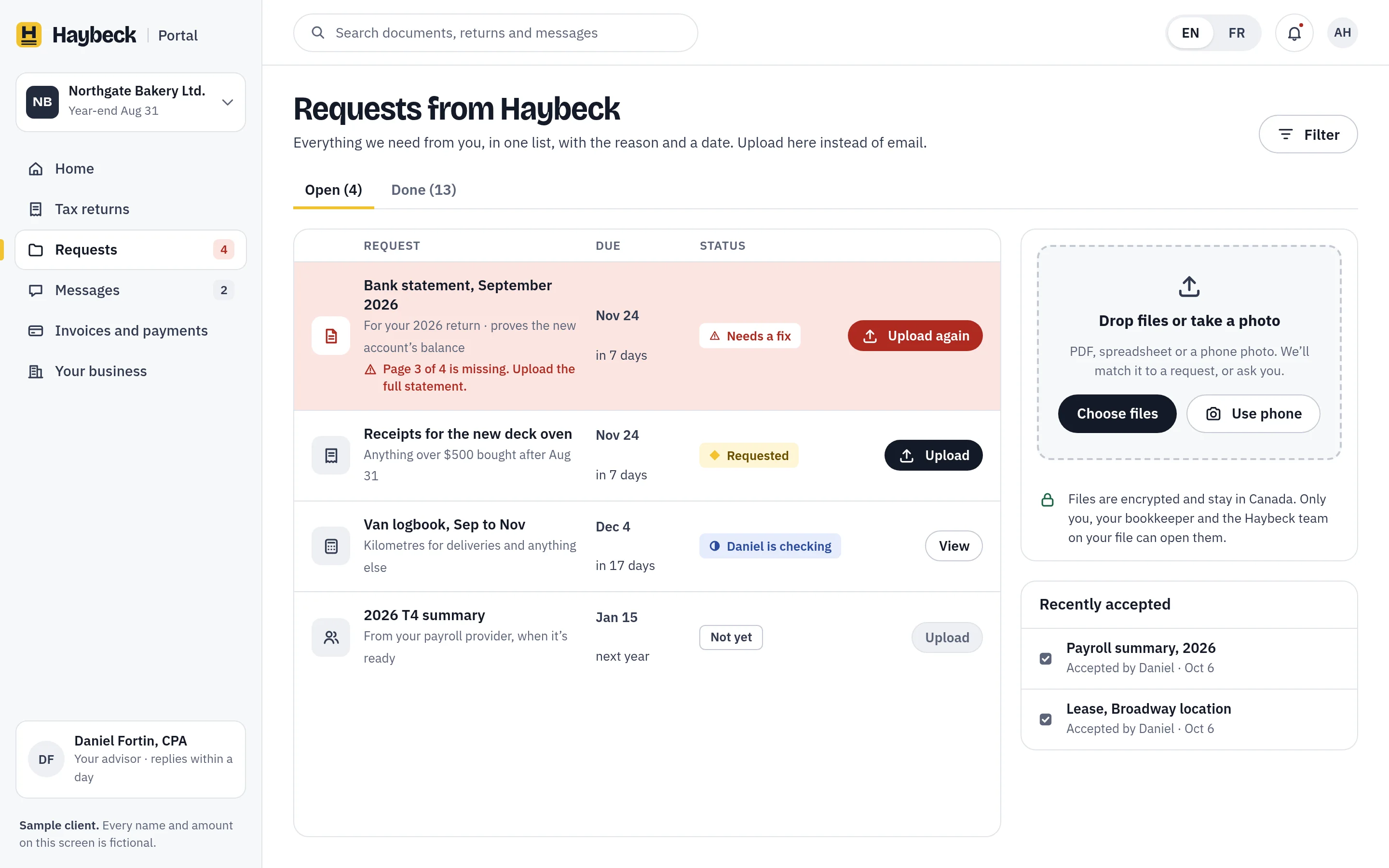
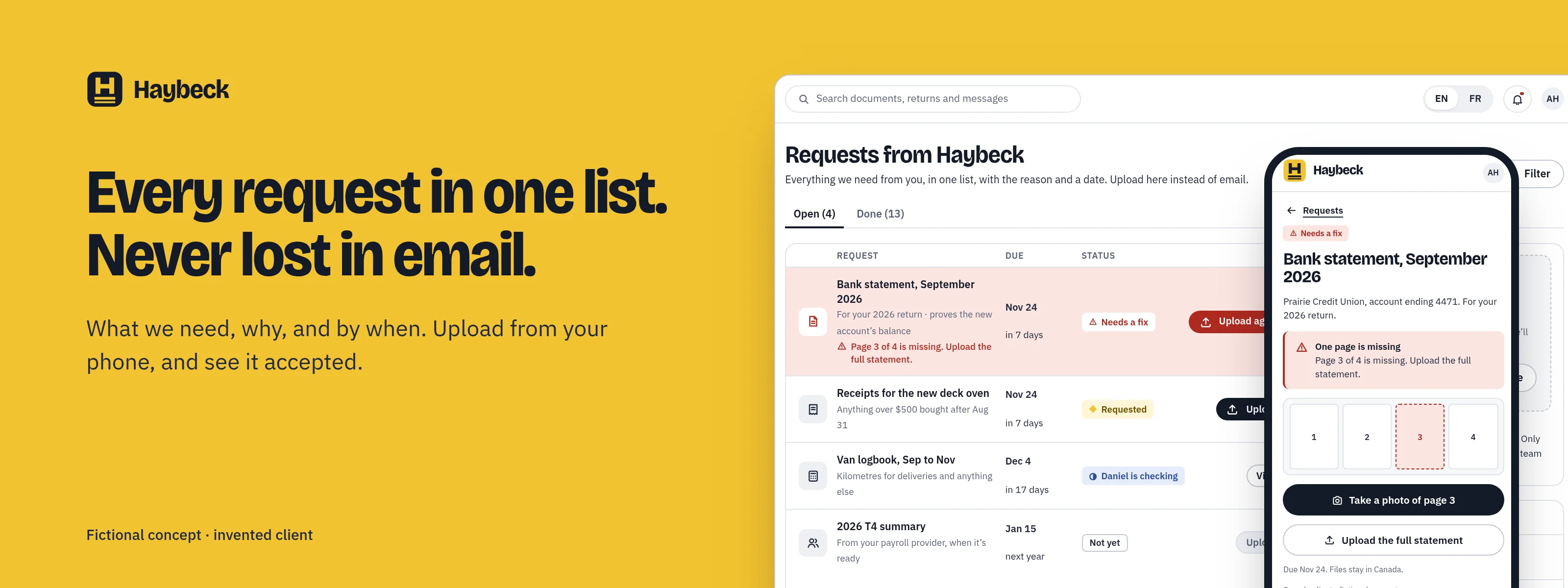
One list of everything we need.
Each request has a reason and a date. A fix says what is wrong and what would make it right, and uploads happen from a phone or a desktop and are checked by a person. Files stay in Canada.
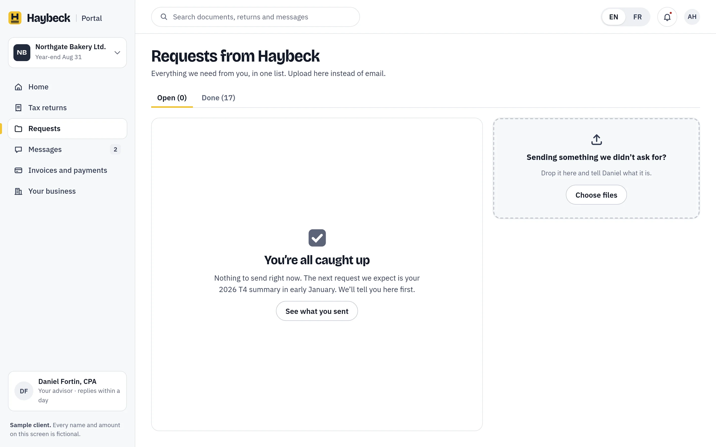
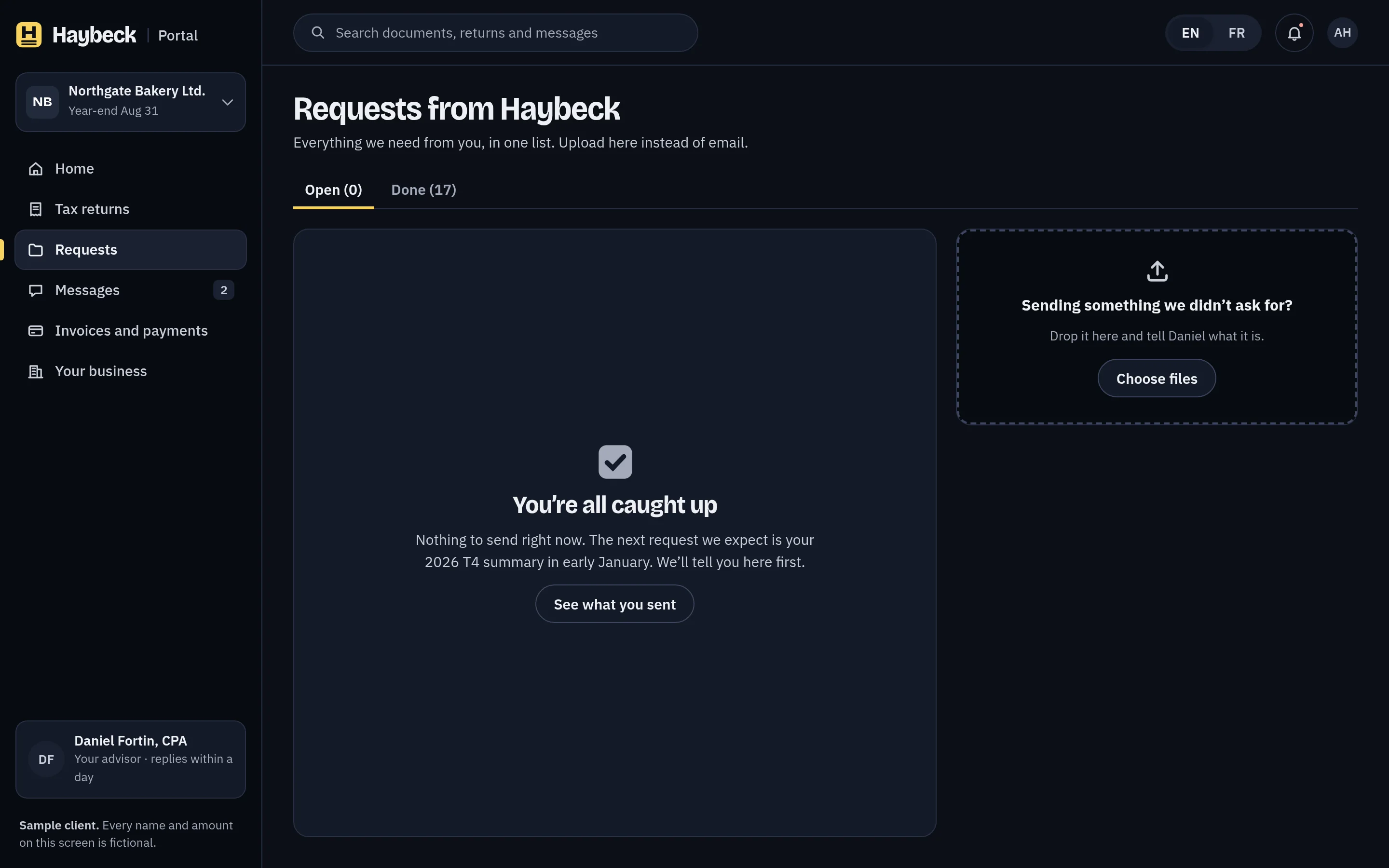
An empty list says what happens next, not just that there are no items.
The same card from the staff side.
Workbench is the internal product. It uses the same components and words as the portal in a denser queue, with a slate accent that marks it as a staff tool. Staff see exactly what the client sees before they send a fix.
Most documents arrive from a phone camera.
The phone screens are the same system at its smallest: the home screen, then fixing a missing page by photographing it. French is built at the same time, with locale formats for money and dates.
What changed, and how I’d measure it.
The research is a fictional study written for this concept: four invented interviews with owners and advisors, each tied to a change in the product.
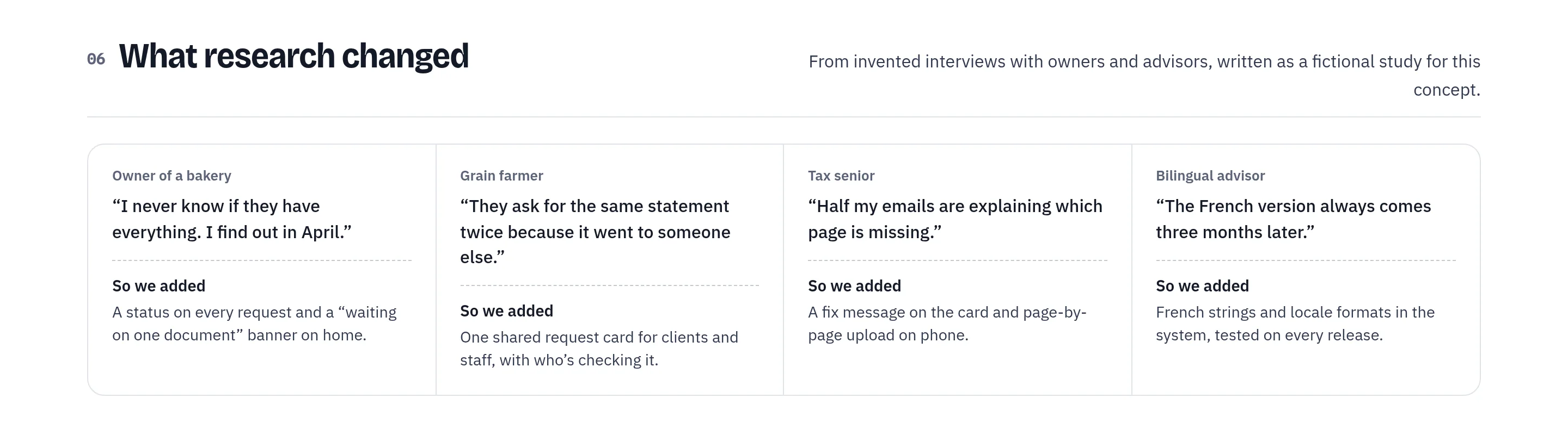
The after-ship note shows how success would be measured: fewer emails per return, a shorter path from first request to signature, and missing pages caught within a day. The numbers are invented and labelled that way.

One idea, from the cover to the feed.
The banners reuse the product, not a stock illustration: real photos, the request card and the phone screen, with one short line each.
What I’d test next
- Whether owners act sooner on a request that names the exact page and reason than on a generic “documents outstanding” message.
- Whether the locked “Continue to signing” button, with its reason beside it, reduces calls to the advisor or just moves them.
- How French-speaking owners rate the French screens against the English ones, and where translated strings still feel second.
- Whether a fifth product can be built from the token file and the shared library alone, and what it had to add.
- How the request card holds up in the staff queue at peak season, with hundreds of open requests and many fixes at once.
- Whether the canola accent still stands out for people with colour-vision differences, given that shape and word carry status too.
Wendsum Pay Later
Consumer payments concept
View case study →← Previous: Laneforth Fleet Operations