Laneforth Fleet Operations
Identity, design system, homepage, a dispatcher dashboard and an in-cab tablet for a Toronto operations platform that gives dispatchers, drivers and safety leads one live picture of the night.
Not a real company. Laneforth, its depots, people, customers and every figure in the mockups, including the pilot results, are fictional, made for this portfolio concept.
A fleet homepage that hides the product.
I started by reading the homepage of a large, well-known fleet-operations platform the way a buyer, or a hiring team, would. I looked for what to keep as much as for what to fix. It has a confident, plain voice, proof that is specific, and photos of real people at real work. I wanted to keep that instinct, not the look.
- The product is barely on the page. One dark map card is the only product screen, and nothing on it is interactive or shows a workflow.
- Two audiences, one page. Executives get numbers, operators get a slogan and drivers get a paragraph, so nobody gets a path.
- Safety, the core story, is a number and a paragraph. Nothing shows what a coaching moment feels like in the cab.
- The headline is a slogan in capitals over moving video. It says what the platform does only in the line below, and on a phone it takes four lines.
- Buttons compete and labels repeat: two main actions side by side, then “Learn more” again and again, so none of them says where it leads.
- The page is heavy and the menus are huge: five mega-menus and a footer of dozens of one-word product names, for people who may be reading from a cab.
- There is no “after shipping”. Results are claimed, but nothing shows what changed in the product because of the feedback.
The brief I set myself: open on the product, give each of the three people on a night shift their own door, show the safety moment, keep one main action in each section, treat dark mode and offline as equals, and keep the page light. I also stayed away from the category’s dark-and-amber look and its heavy capitals, so the work stands on its own.
Two plain words that are easy to say on a radio.
The name had to sound like movement along a shared route, be easy to say twice across a noisy depot, be spelled one way only, and share nothing with the company I audited or with any name already in my portfolio.
I brainstormed about seventy names and checked every survivor three ways: domain records for the dot-com and dot-net, web searches for companies, apps and games under the same name, and a comparison by sound and spelling with the audited company and my other concepts.
- Laneforth, chosen. “Lane” is the road, a shift’s lane, your lane at work. “Forth” is onward. Both domains were free when I checked, and the only companies I found under that name are defunct.
- Droveline, second. Warm and a little rural, but a bicycle wheel range already sells under that name.
- Tollwick, third. Friendly, but a browser board game already uses it.
The rest dropped out at the first check, because the dot-com was taken or a transport or software product already used the name. I did not search the trademark registers, so a formal search is needed before any real use. These are concept names only.
A lane that bends forward.
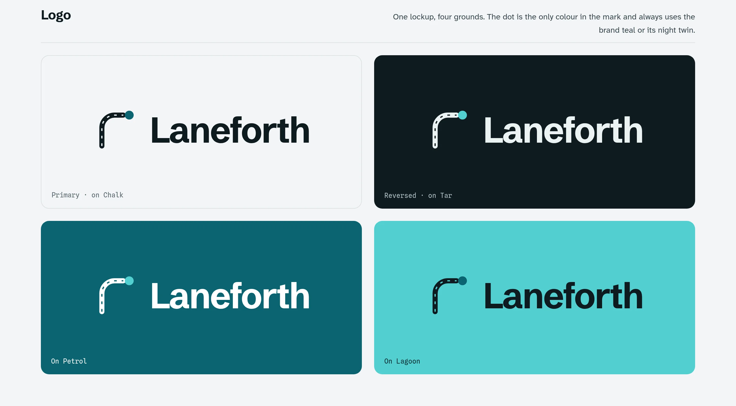
The mark is a road bending ahead, with its centre line cut through and one dot at the end of the lane: the next stop, and the vehicle on its way. The dot is the only colour in the mark, and it always uses the brand teal or its night twin.
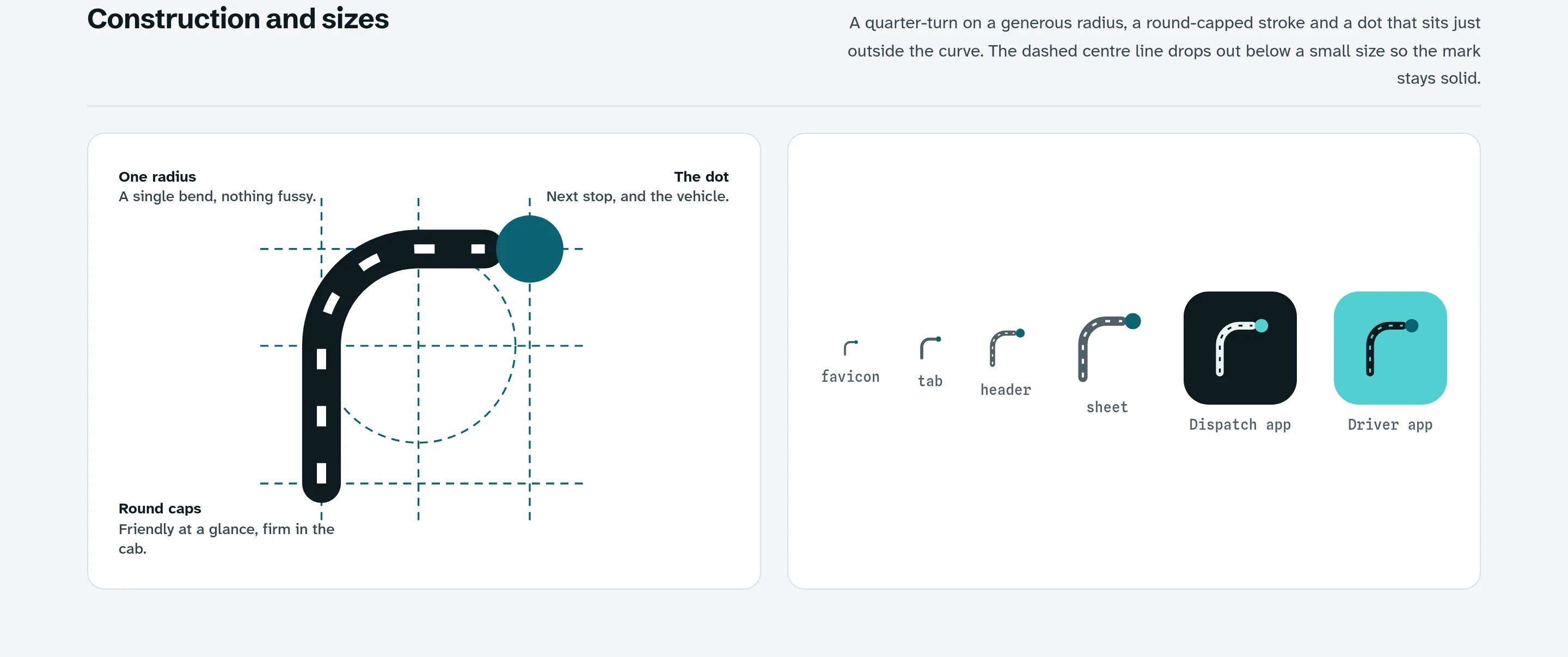
The shape is one quarter-turn on a generous radius with round caps, friendly at a glance and firm in the cab. The dashed centre line drops out at small sizes, so the mark stays solid in a browser tab or an app icon.
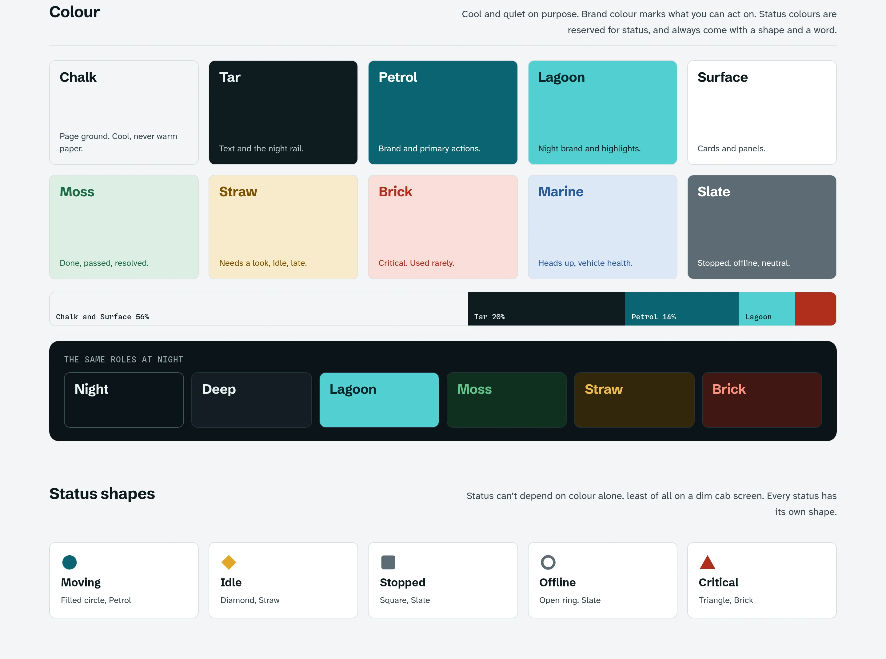
Colour is cool and quiet on purpose. Petrol, a deep teal, marks what you can act on, and Lagoon is its night twin. Status colours are kept for status, and every status also has its own shape and a word, because a dim cab screen can’t depend on colour alone.
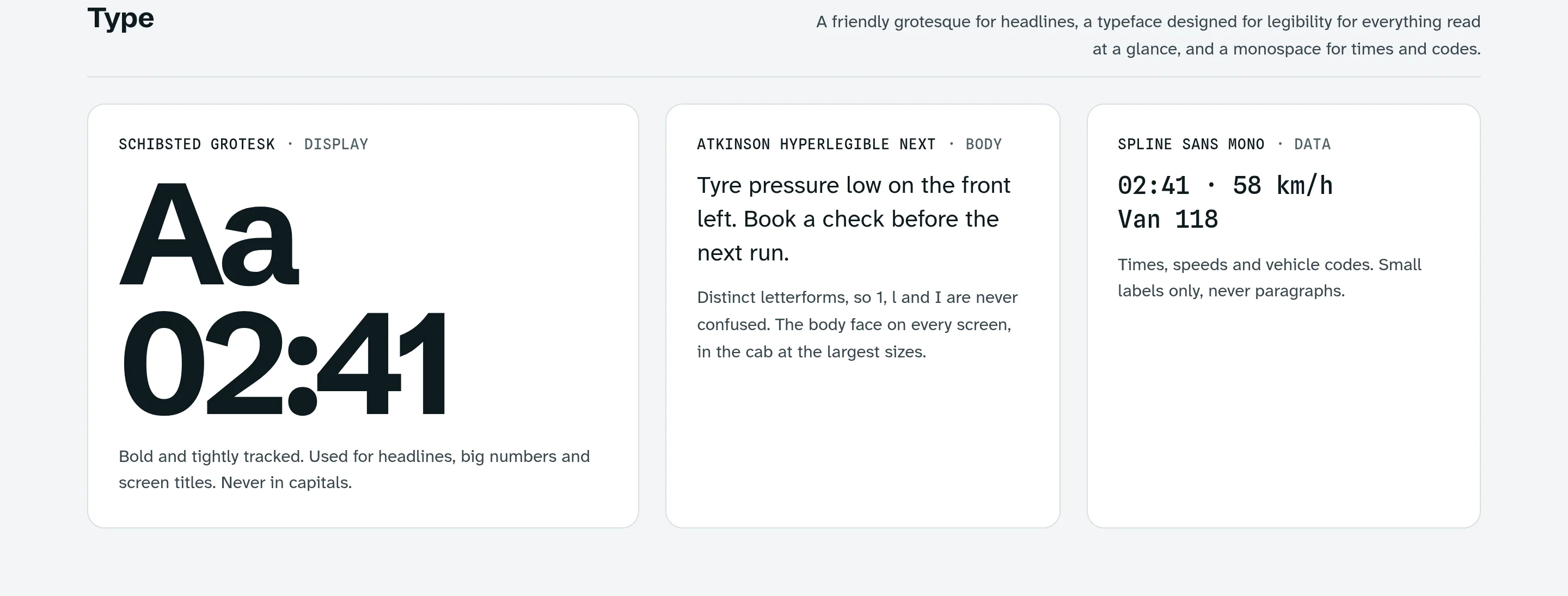
Schibsted Grotesk carries headlines and big numbers, never in capitals. Atkinson Hyperlegible Next, designed so that 1, l and I are never confused, carries everything read at a glance. Spline Sans Mono is for times, speeds and vehicle codes, in short labels only.
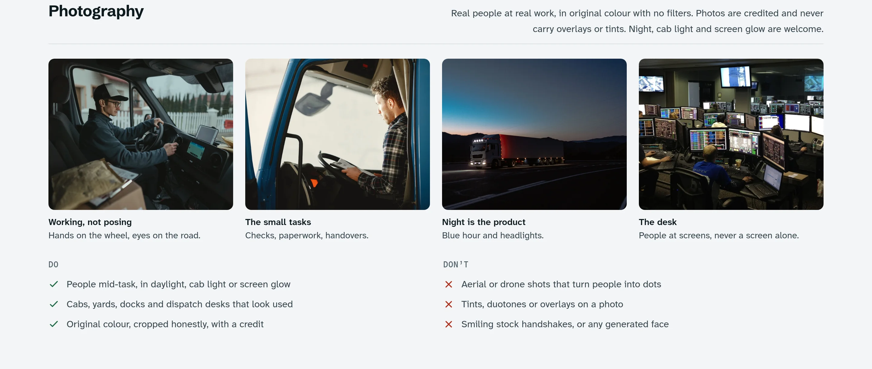
Photography shows real people at real work, in original colour with no filters, overlays or tints, and every photo is credited. Night, cab light and screen glow are welcome. Aerial shots that turn people into dots, tinted photos and smiling handshakes are out.
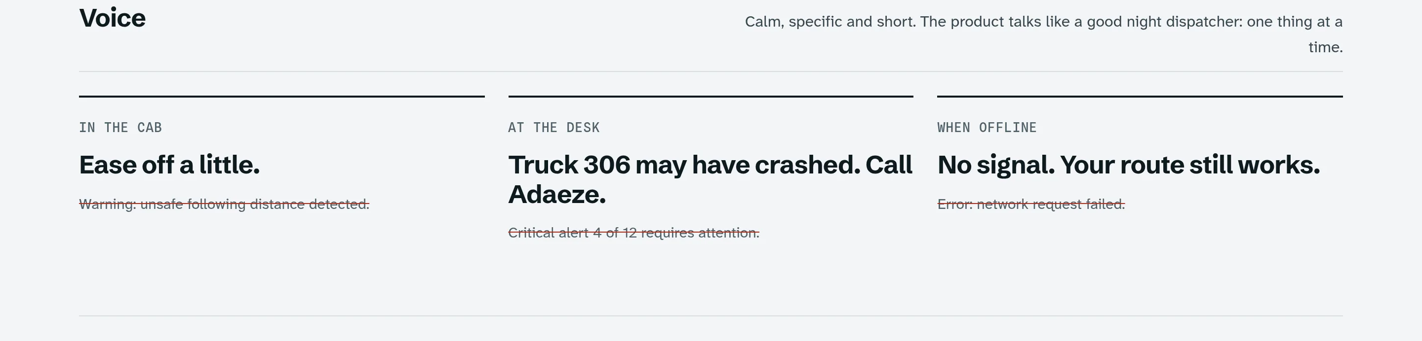
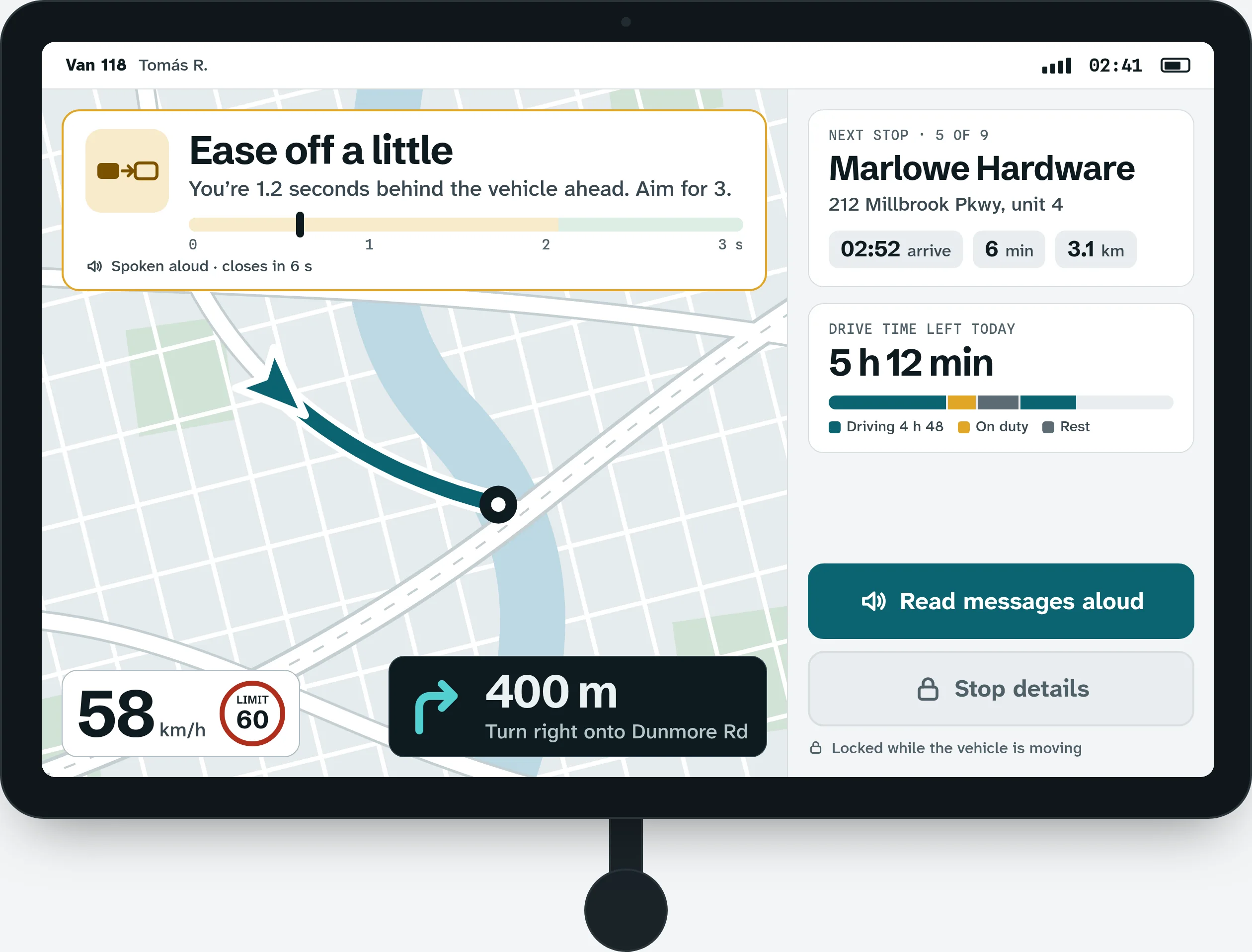
The voice is calm, specific and short, like a good night dispatcher: one thing at a time. The line in the cab is “Ease off a little”, not a warning label.
One set of parts for the site, the dispatcher and the cab.
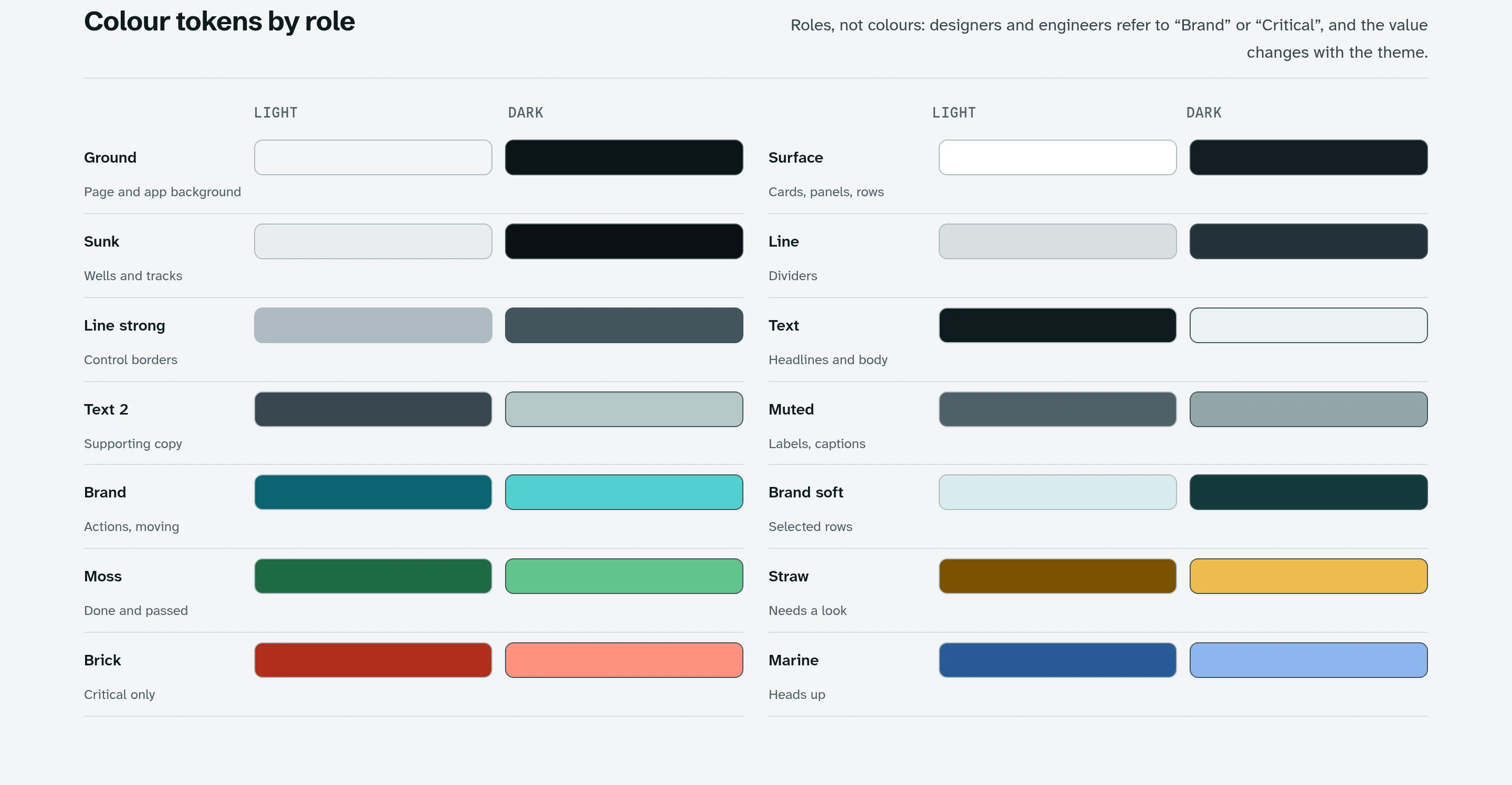
Tokens are named by role, not by colour, so dark mode swaps colour only and every part keeps its size and rhythm. Every text pairing was checked for readable contrast in light and dark.
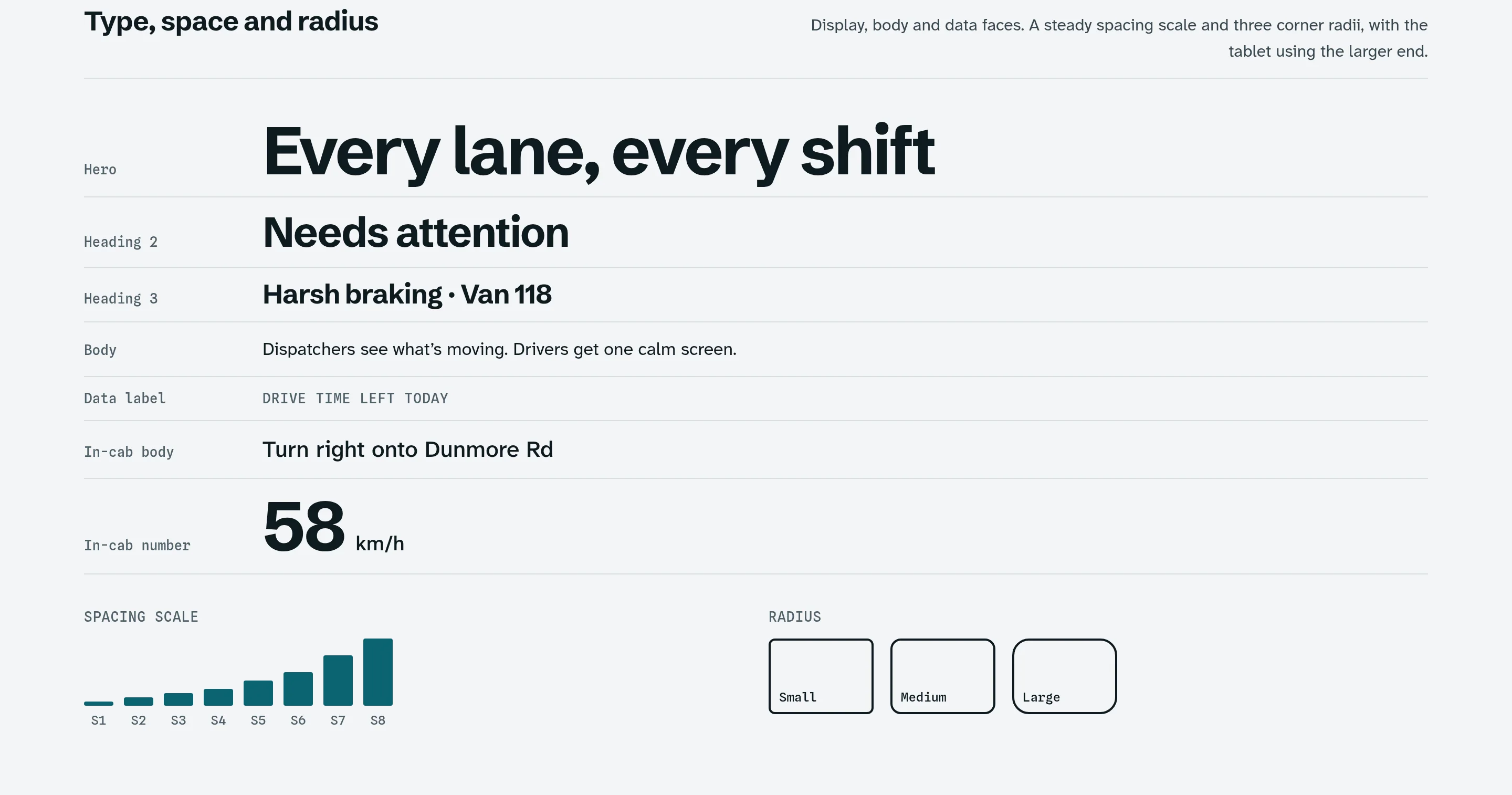
Display, body and data faces, a steady four-point spacing scale and three corner radii. The tablet uses the larger end of each scale.
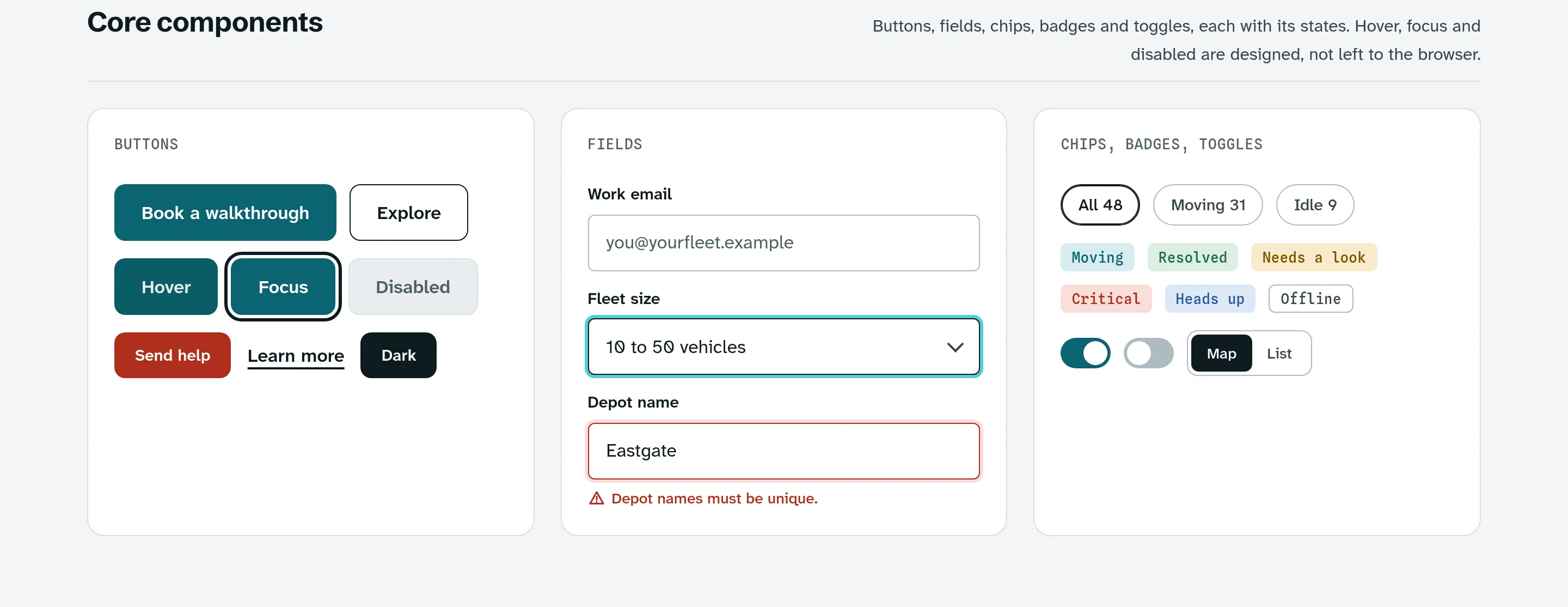
Buttons, fields, chips, badges and toggles each have designed hover, focus and disabled states, not whatever the browser gives.
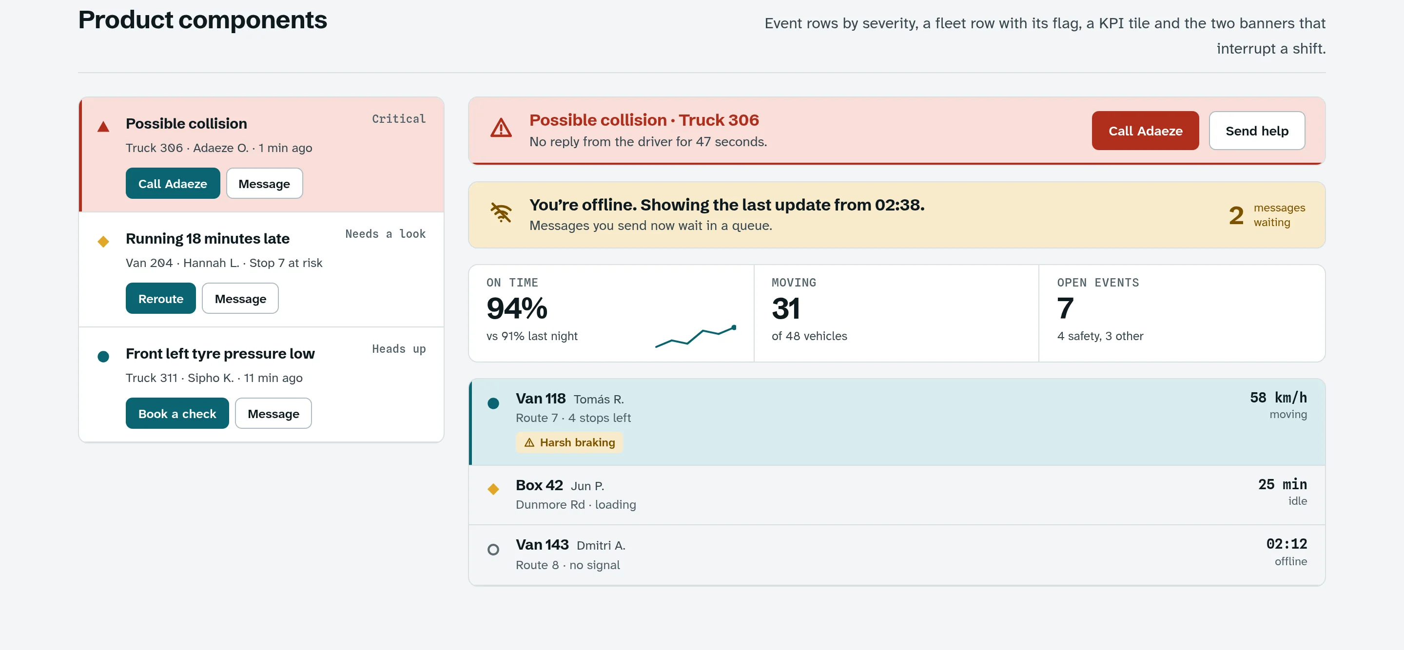
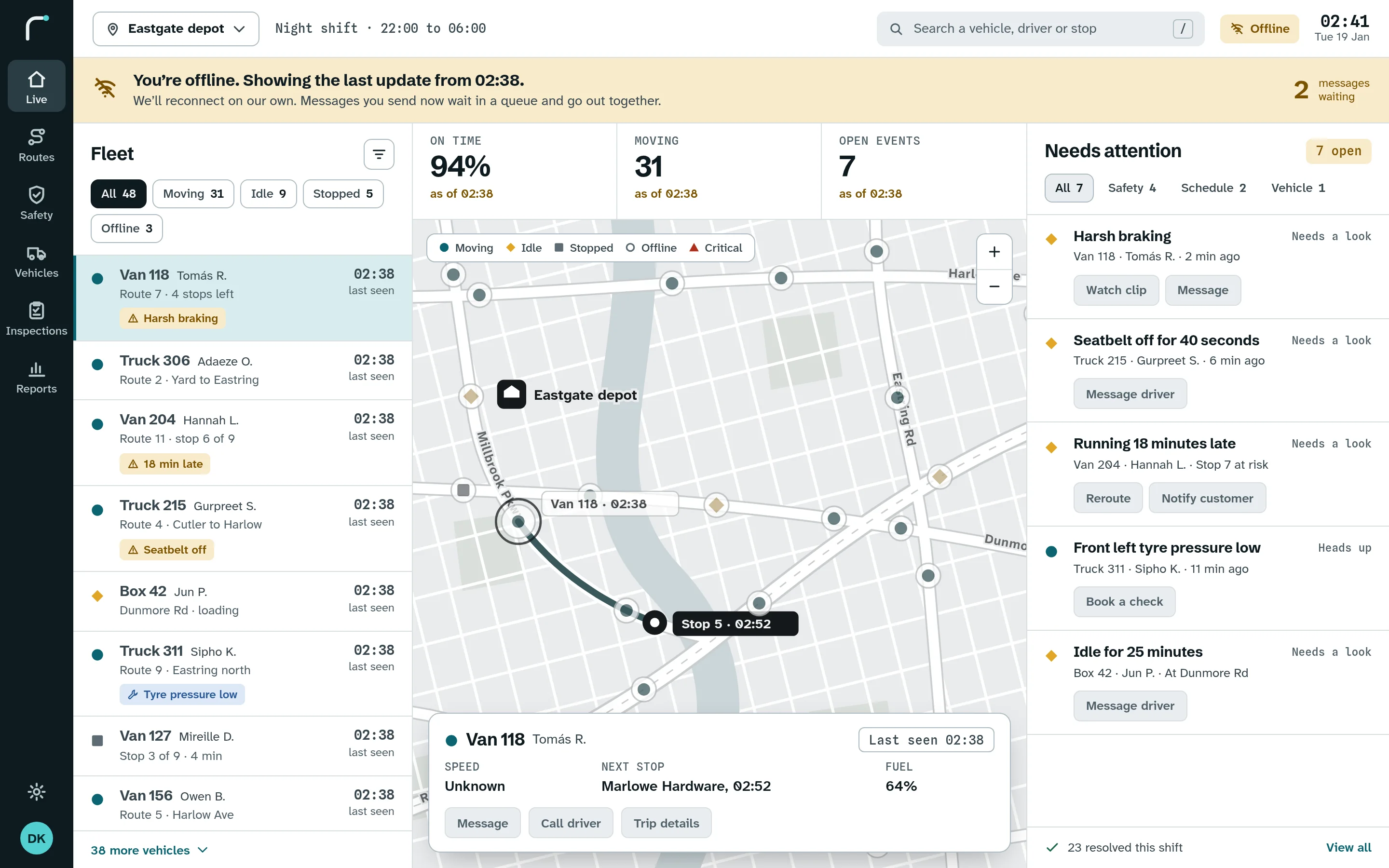
Event rows by severity, a fleet row with its status shape, a tile for one number, and the two banners that can interrupt a shift: a possible collision and a lost connection.
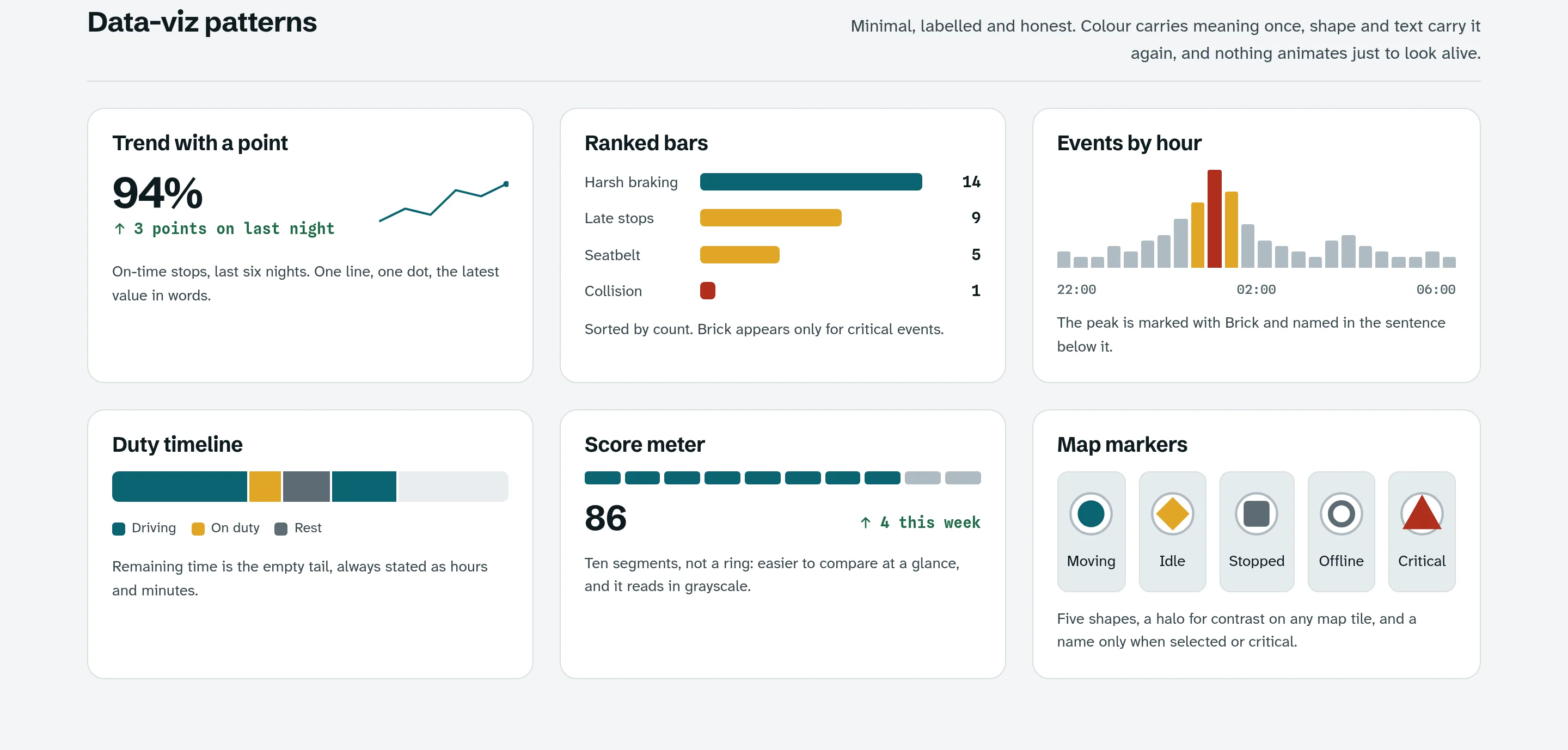
Charts are minimal, labelled and honest. Colour carries meaning once, and shape and words carry it again. Nothing animates just to look alive. The score meter uses ten segments rather than a ring, so it is easier to compare and still reads in greyscale.
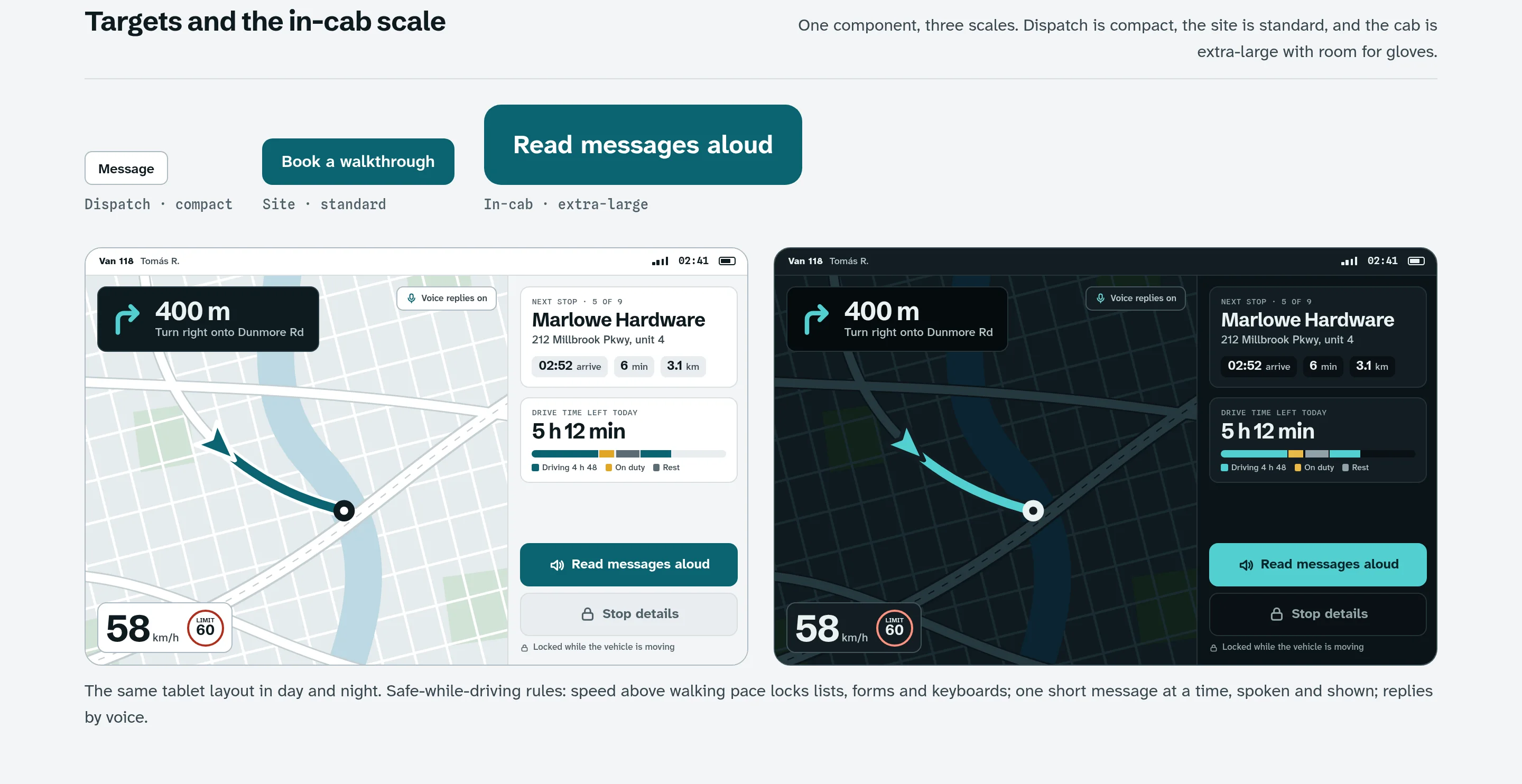
One component comes in three scales: compact for dispatch, standard for the site and extra-large in the cab, with room for gloves. The tablet scales the same parts up instead of inventing new ones. Above walking pace, lists, forms and keyboards lock, one short message shows at a time, and replies are spoken.
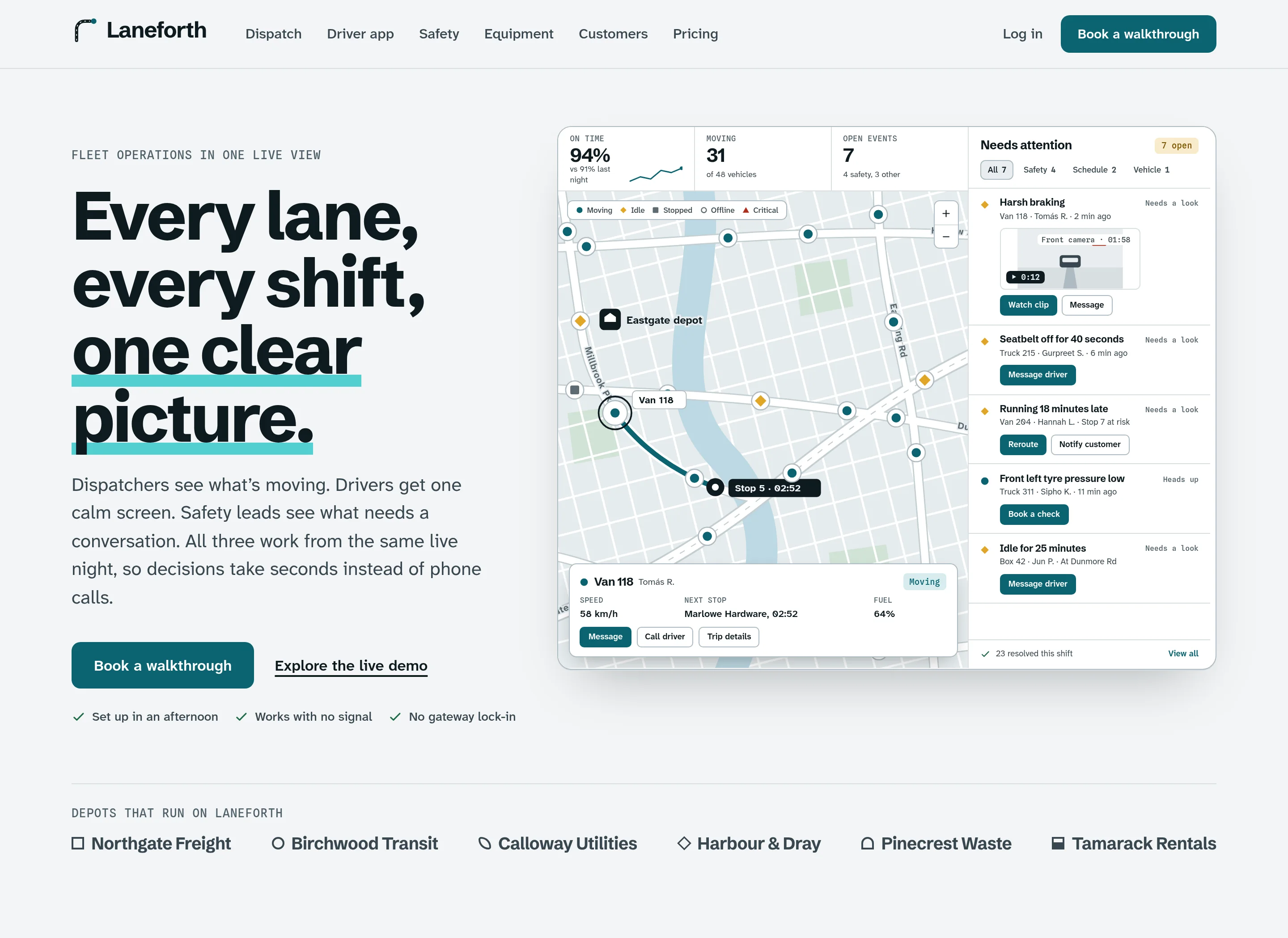
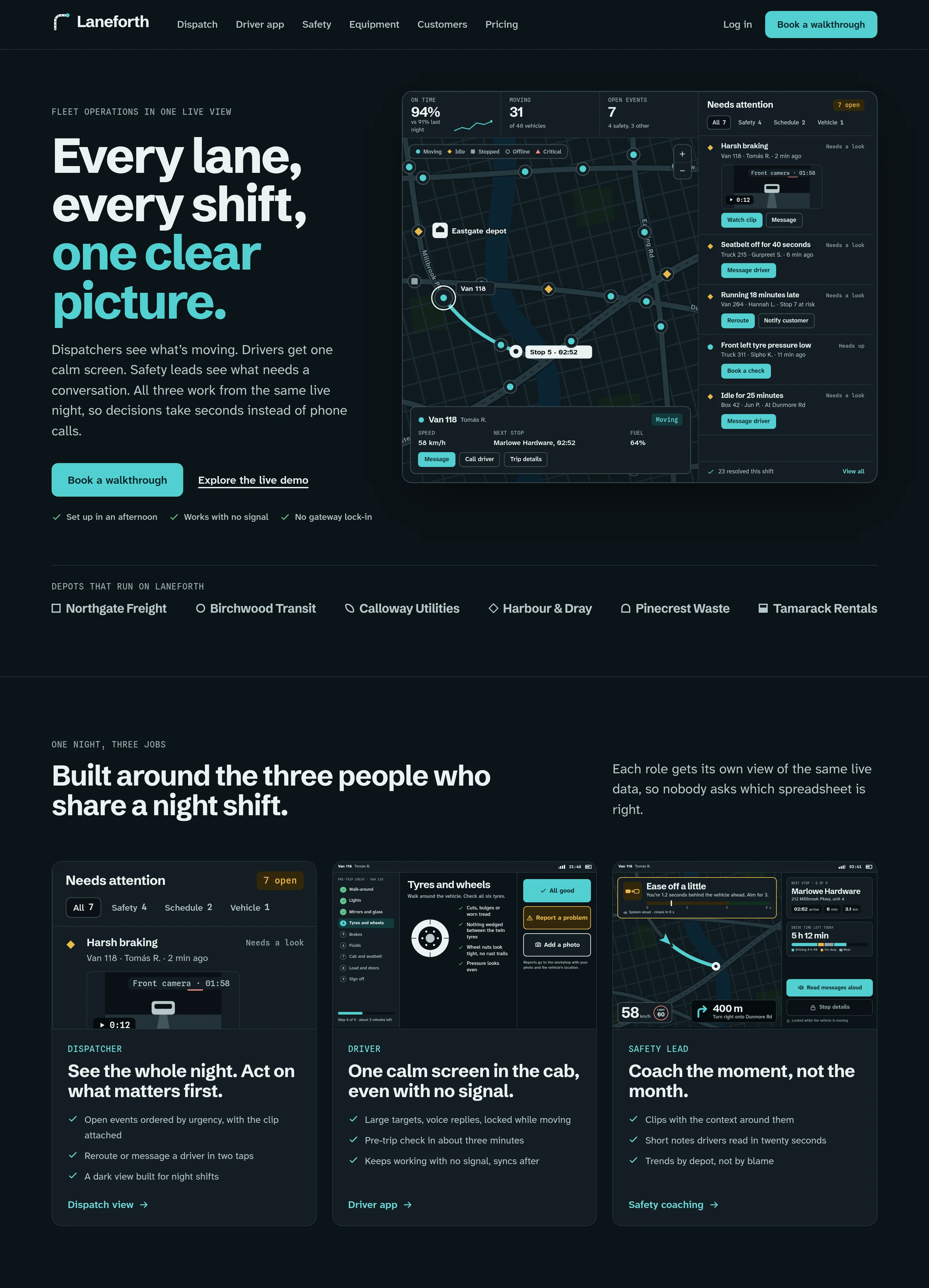
The first screen is the product.
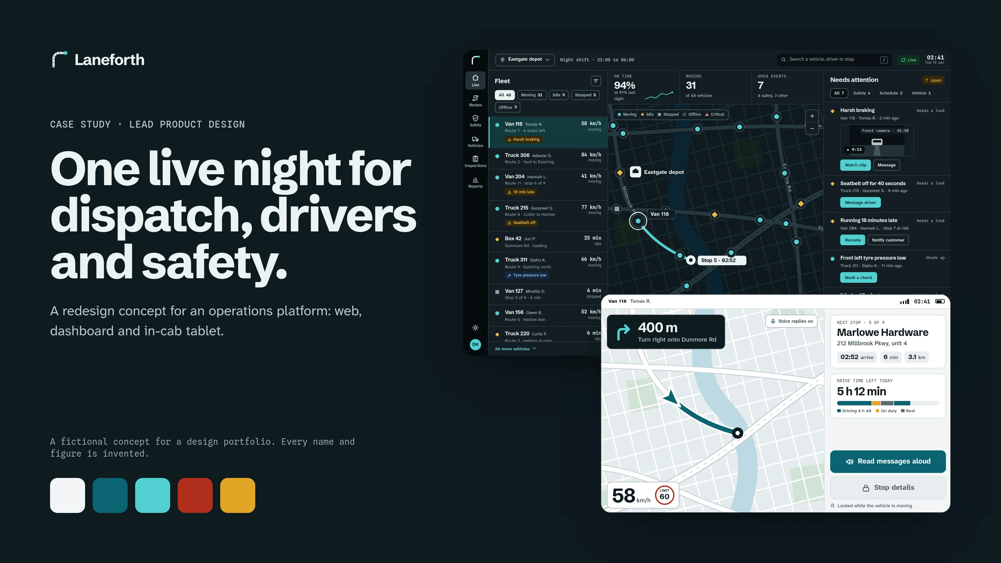
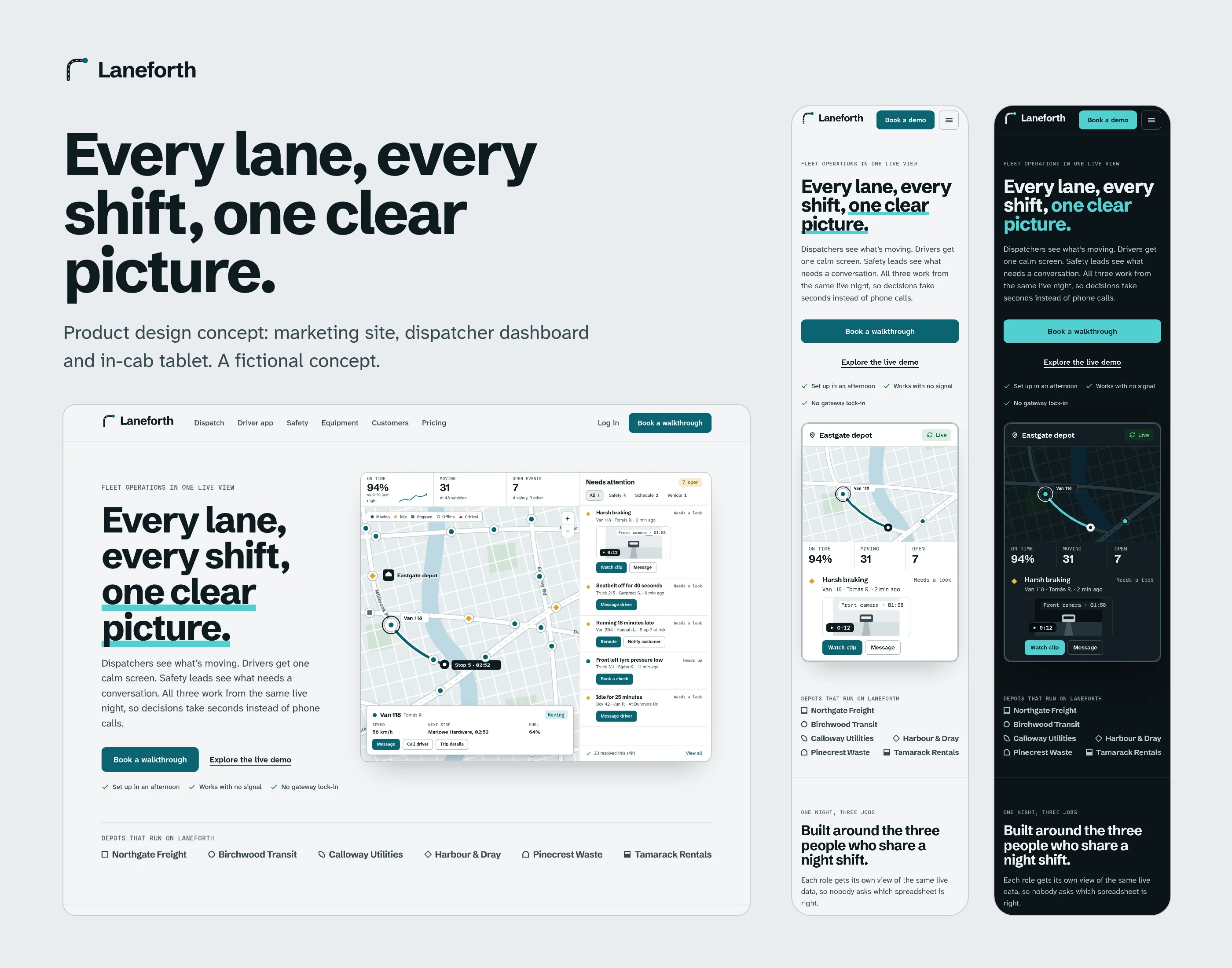
The hero is the dispatcher view itself, drawn with live-feeling data, with one headline, one sentence and one main action. A row of depots that run on Laneforth follows. Every depot is invented.
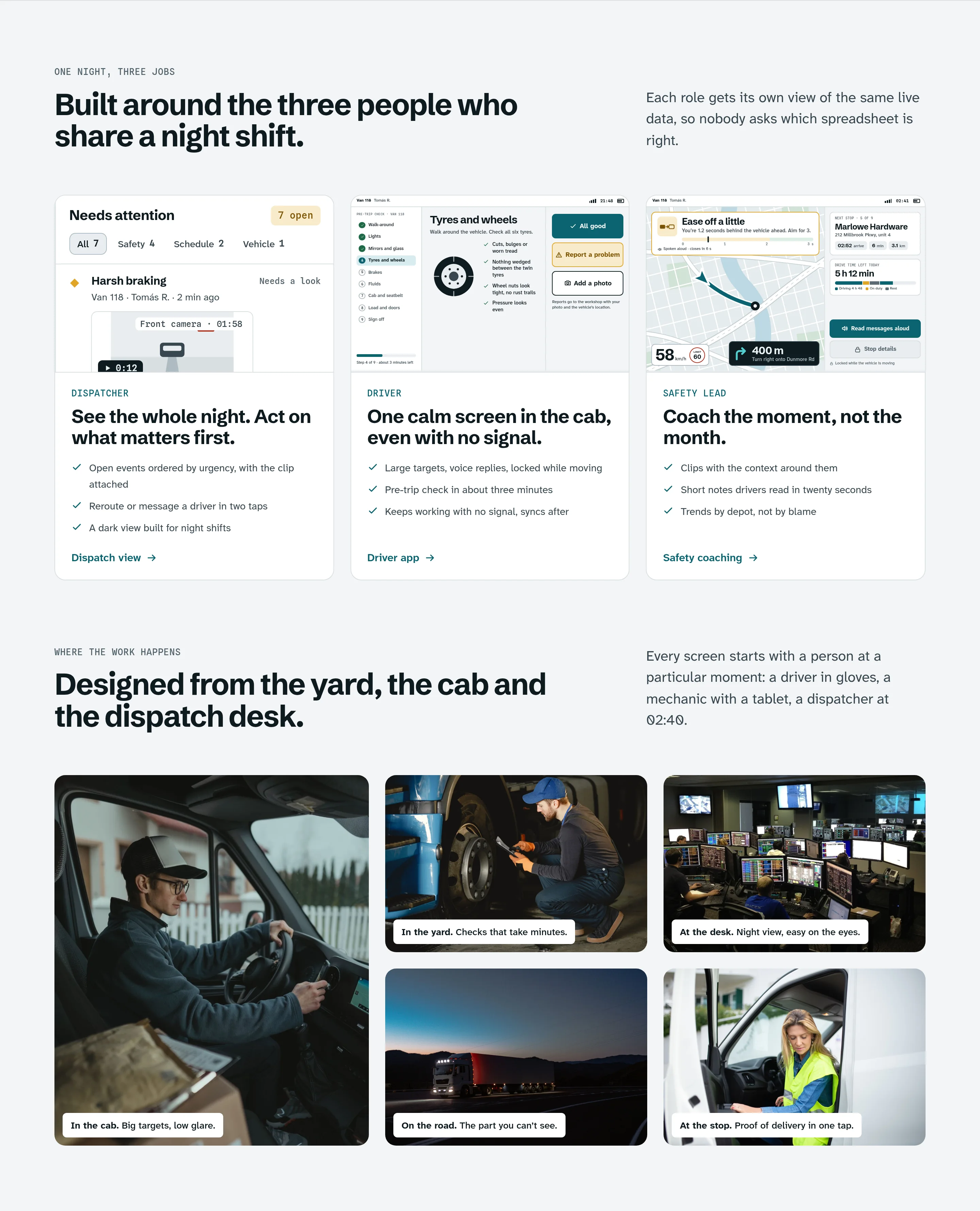
Next come three doors, one for each person on a night shift, each with a real screen. Photos of the places where the work happens sit below, each with a caption about the setting. None sits beside a quote, so nobody pictured appears to endorse the product.
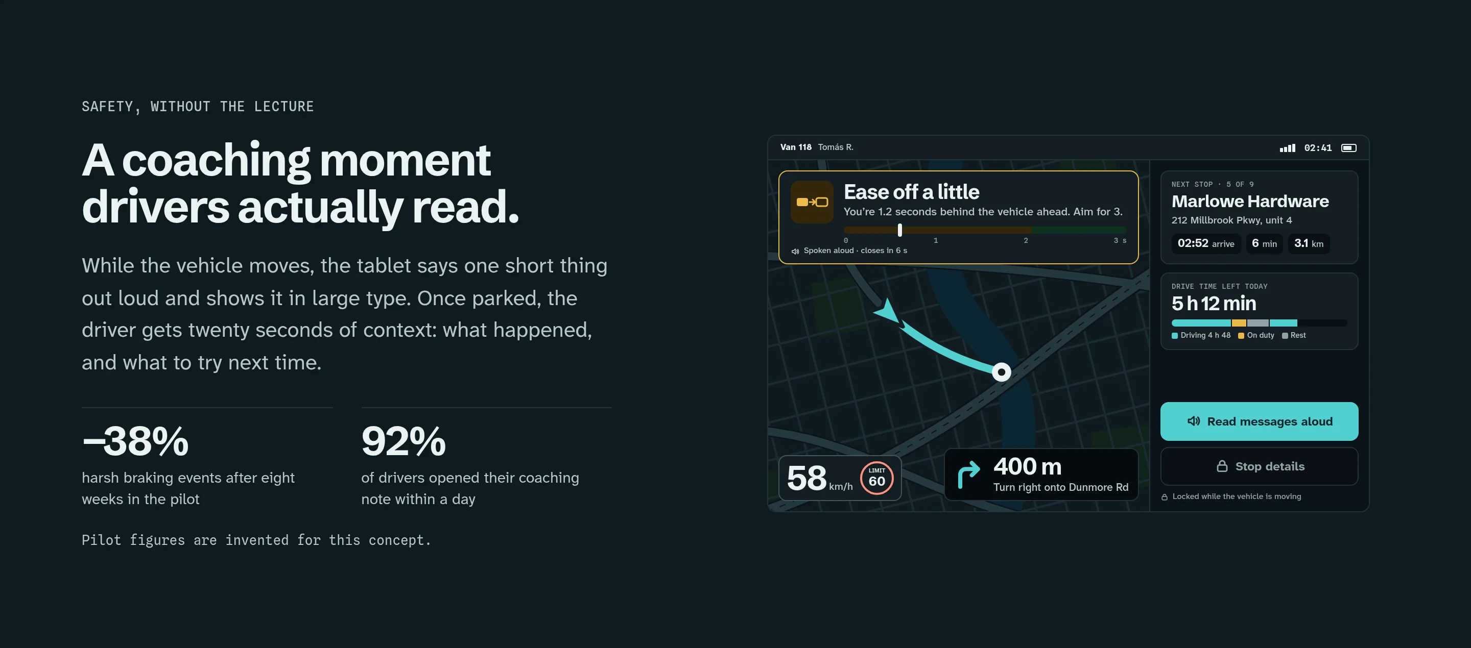
The coaching section shows what drivers get in the cab. The two figures beside it come from a fictional pilot, and the page says so right under them.
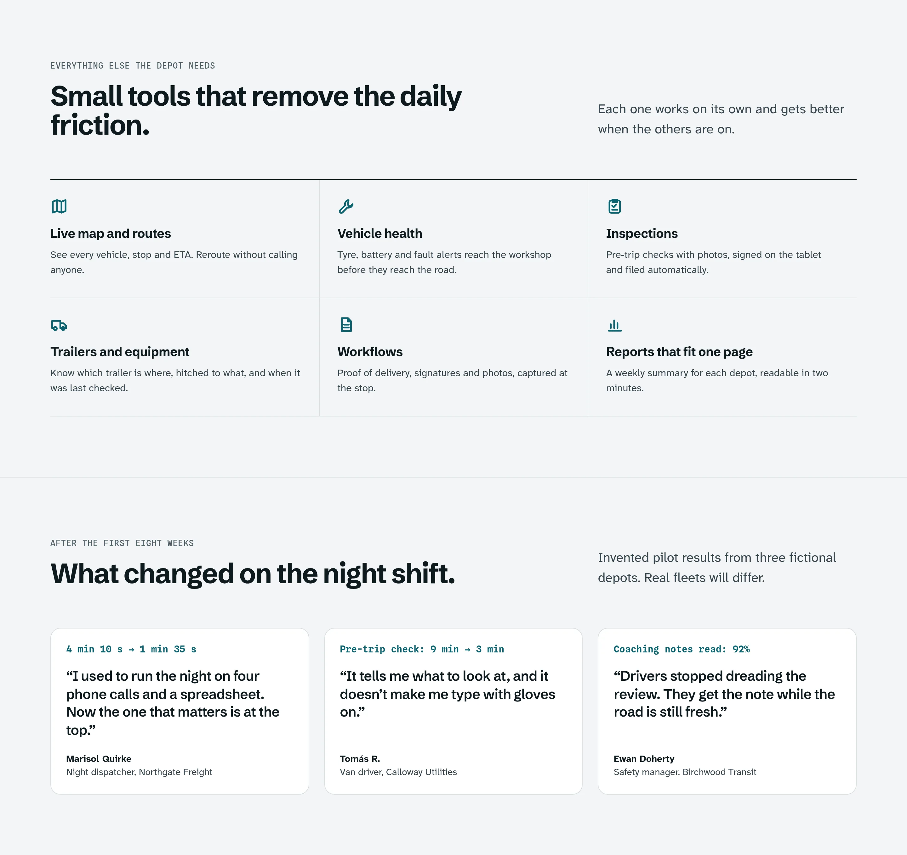
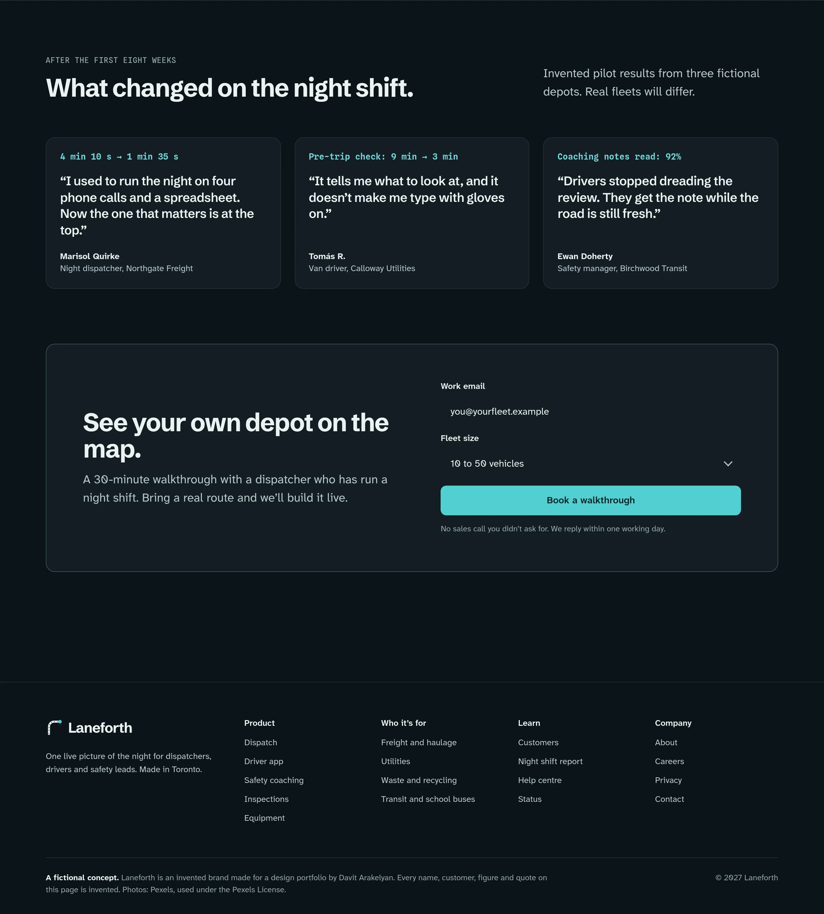
Six small tools follow, one line each, then three quotes from invented customers under “What changed on the night shift”, with a note that real fleets will differ. The page closes with a short form and one button that says what happens next.
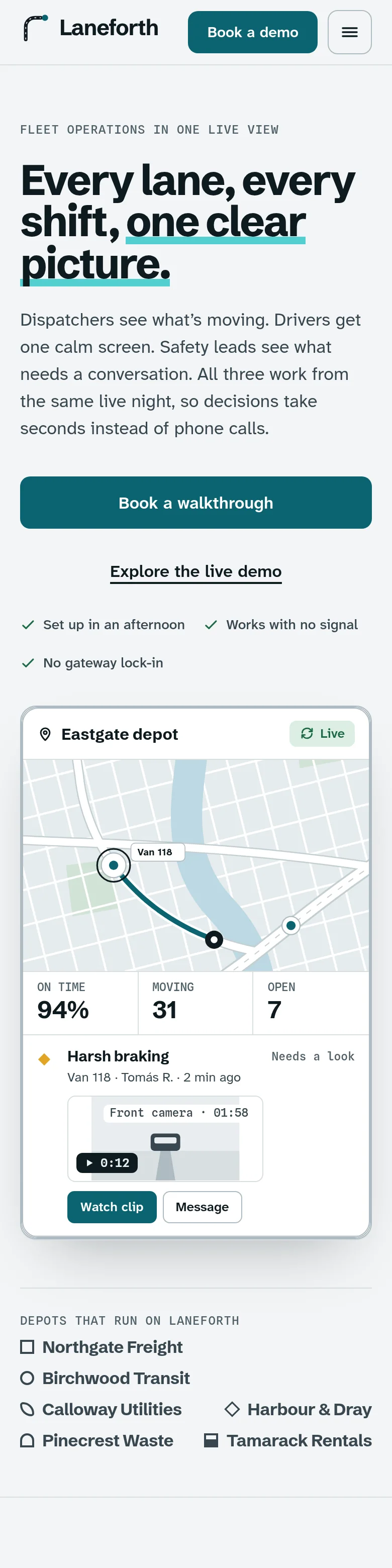
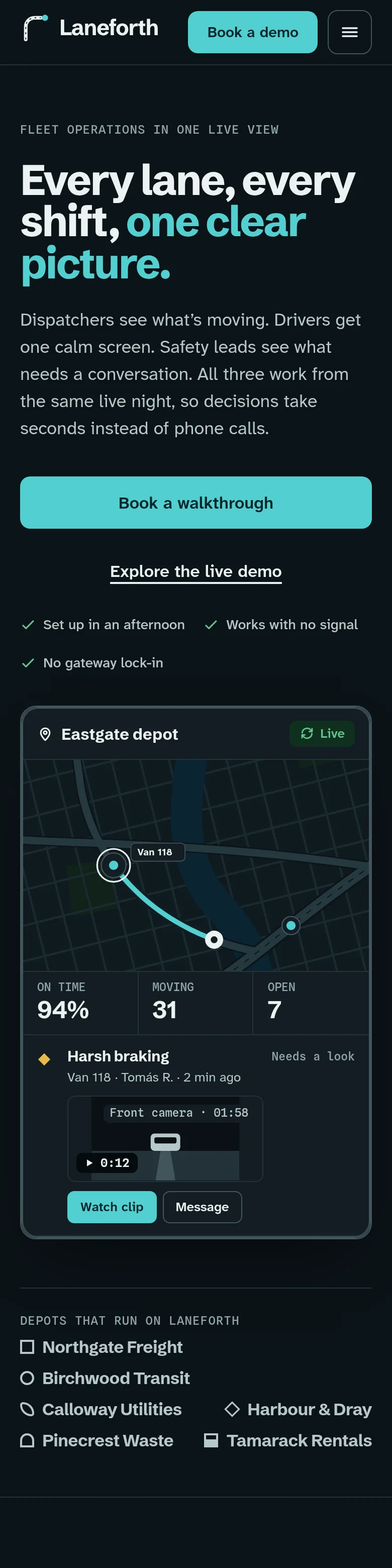
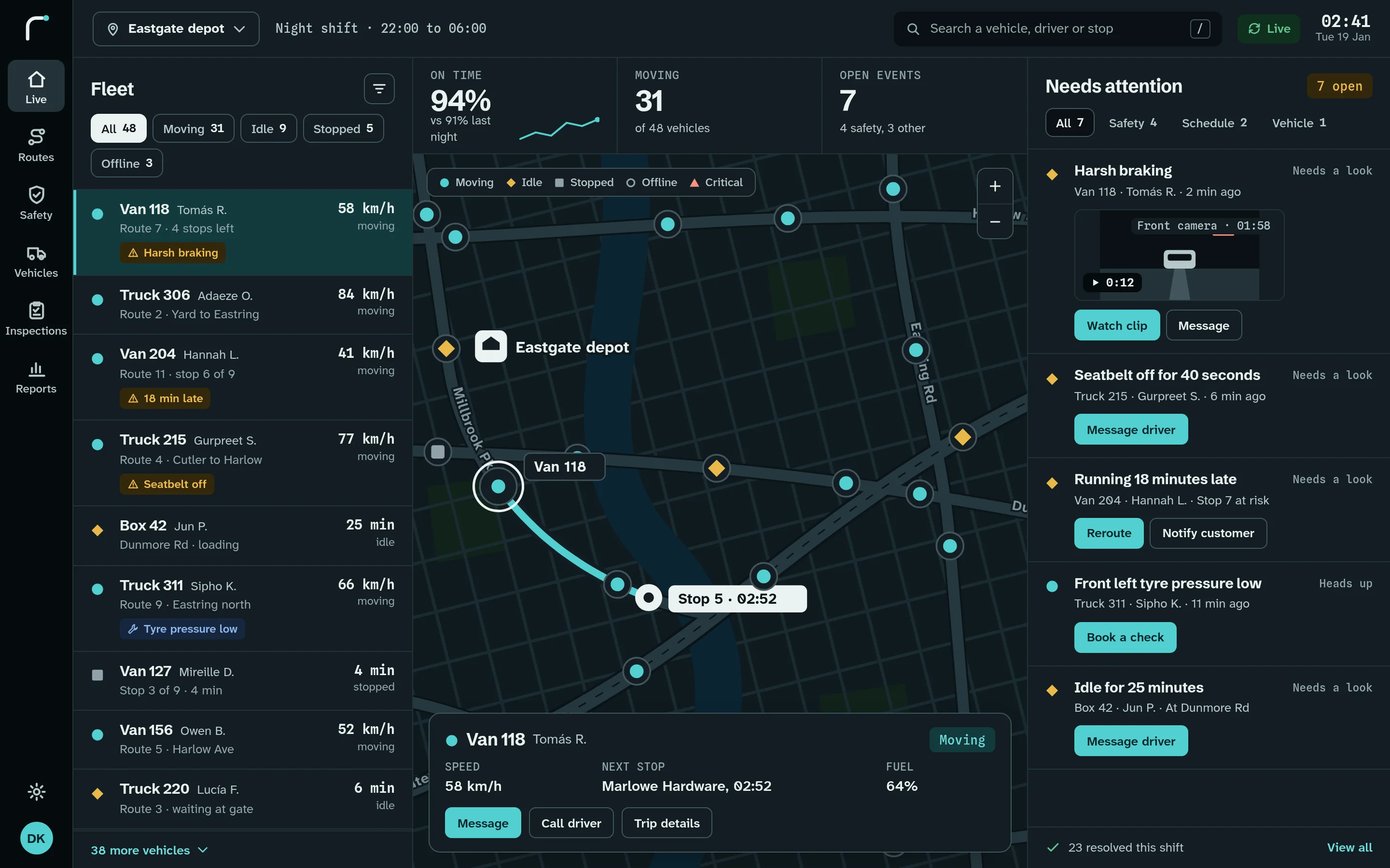
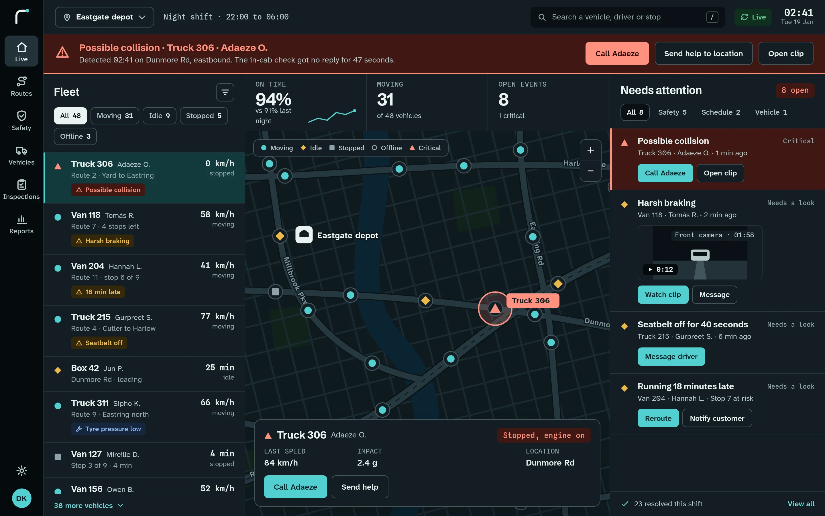
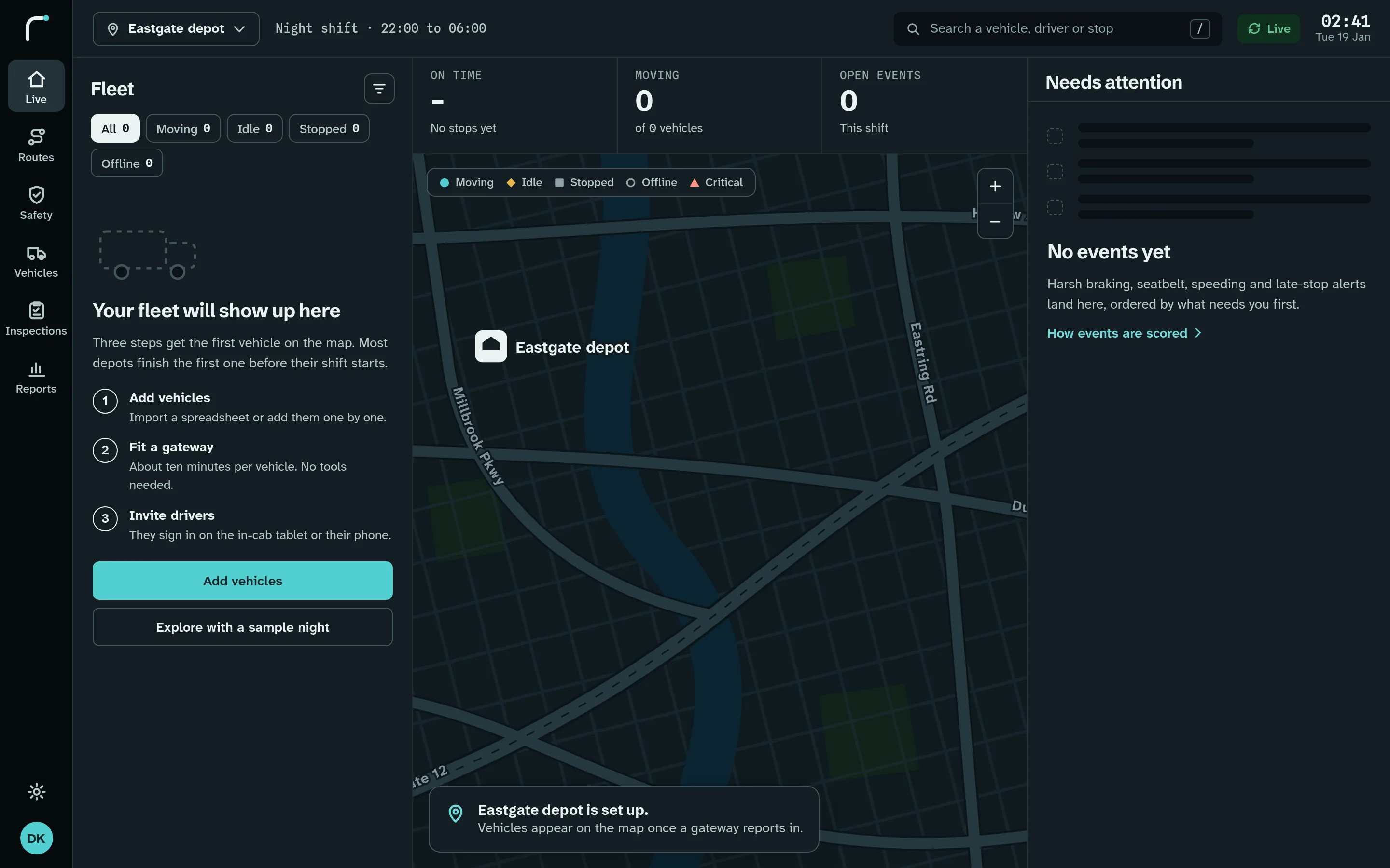
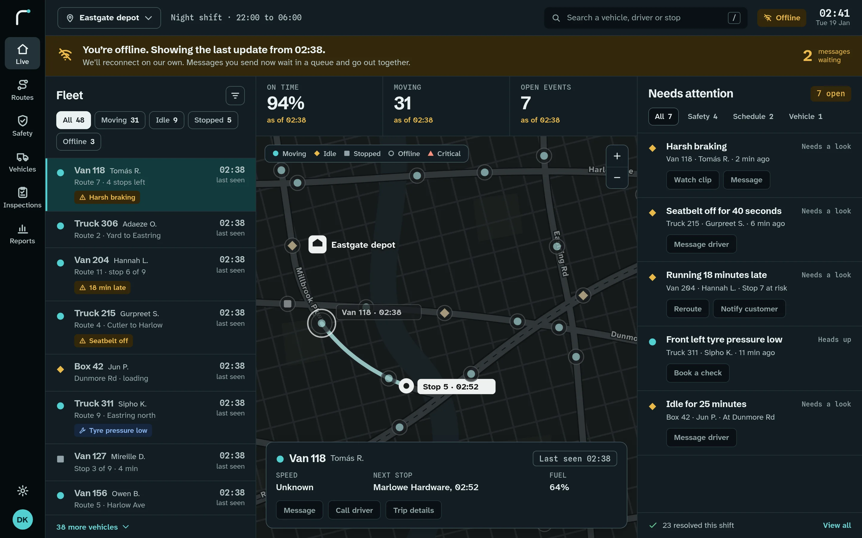
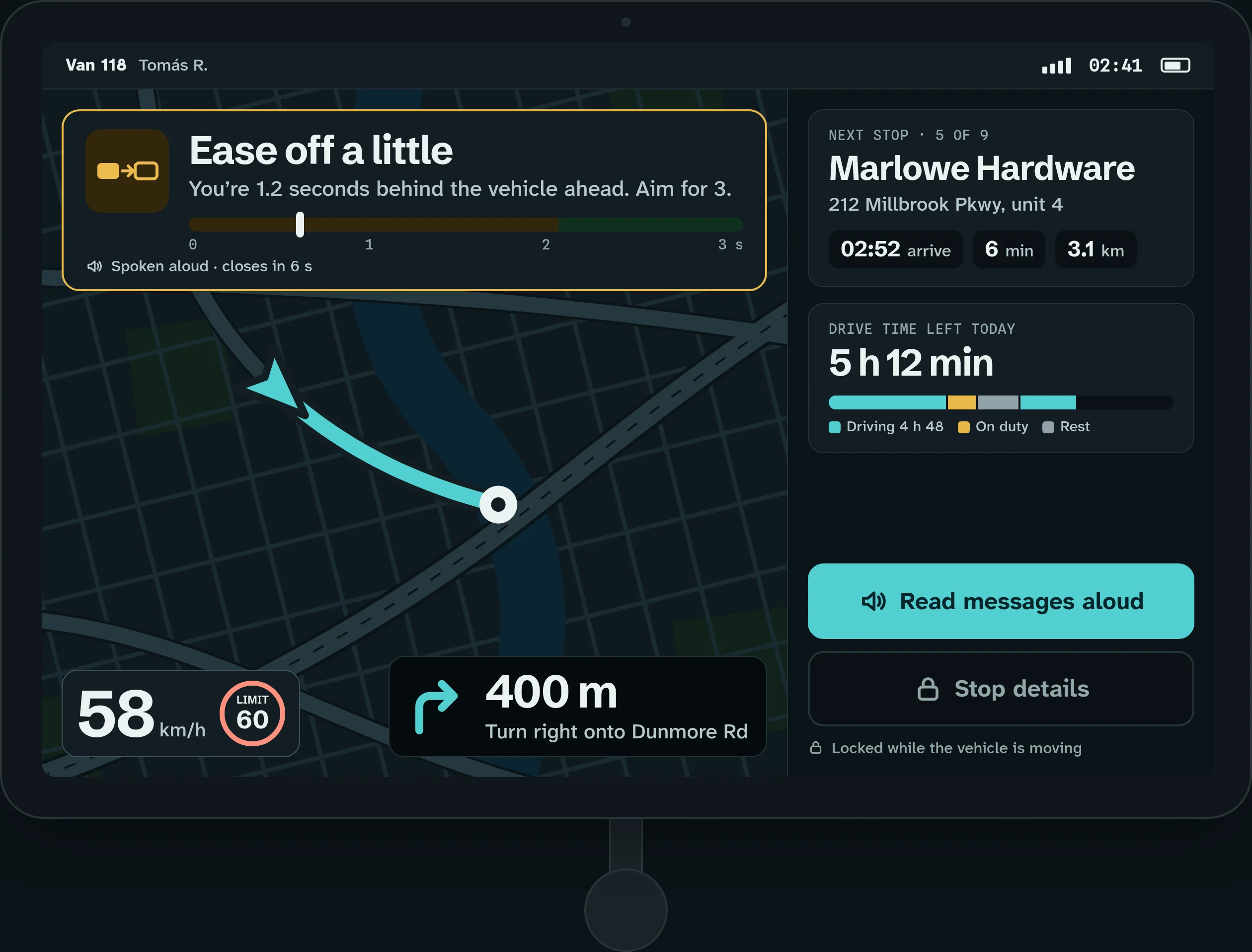
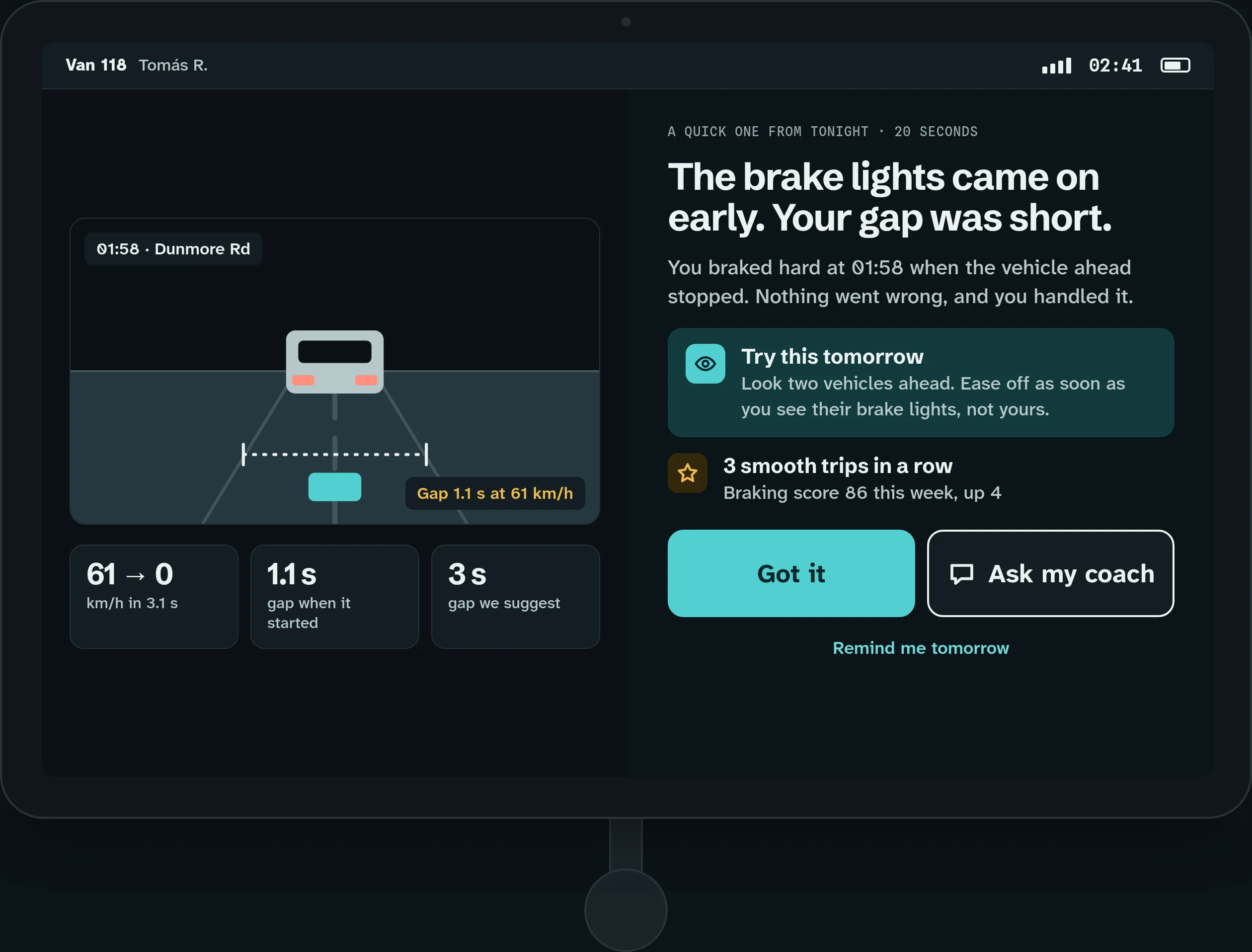
Dark mode is an equal, not an afterthought, because night operations are not a rare case.
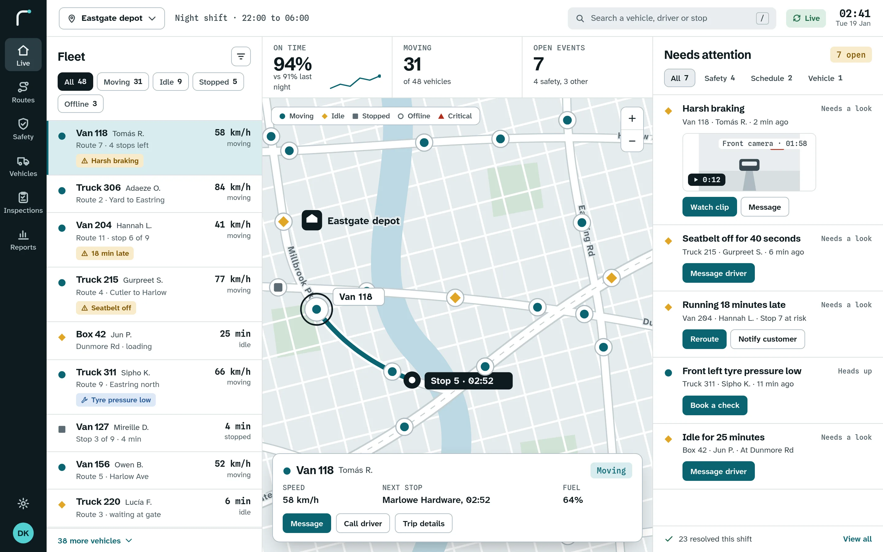
Fleet on the left, the map in the middle, what needs attention on the right.
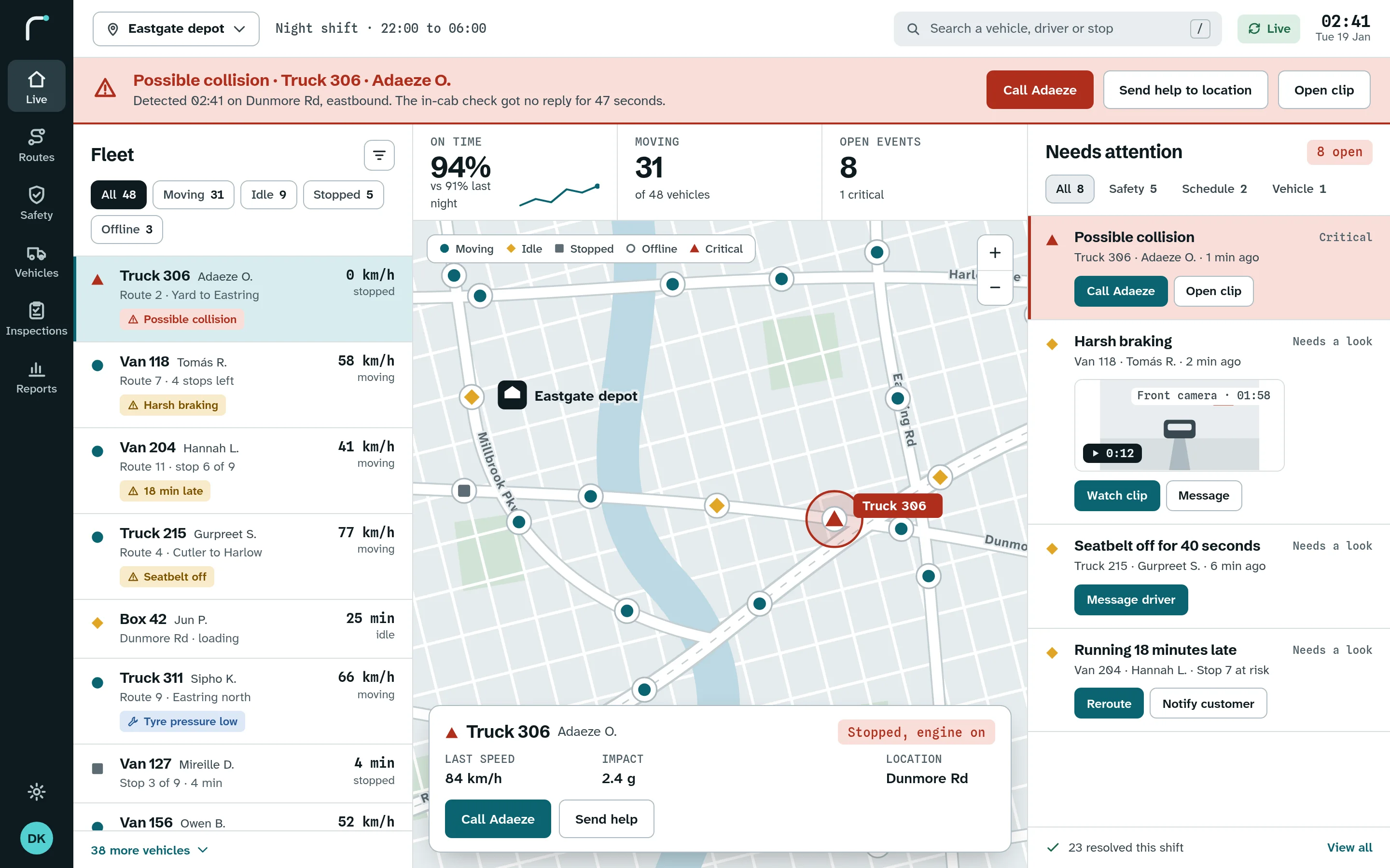
The dashboard is built for a night shift. The list on the right is ordered by urgency, never by time alone, and a critical event pins to the top and takes over the banner. Every state tells the dispatcher what happened, what is still true and what to do next.
When a possible collision comes in, the banner turns critical and offers one-tap calls and help. The event pins to the top of the list, and the map marks the vehicle.
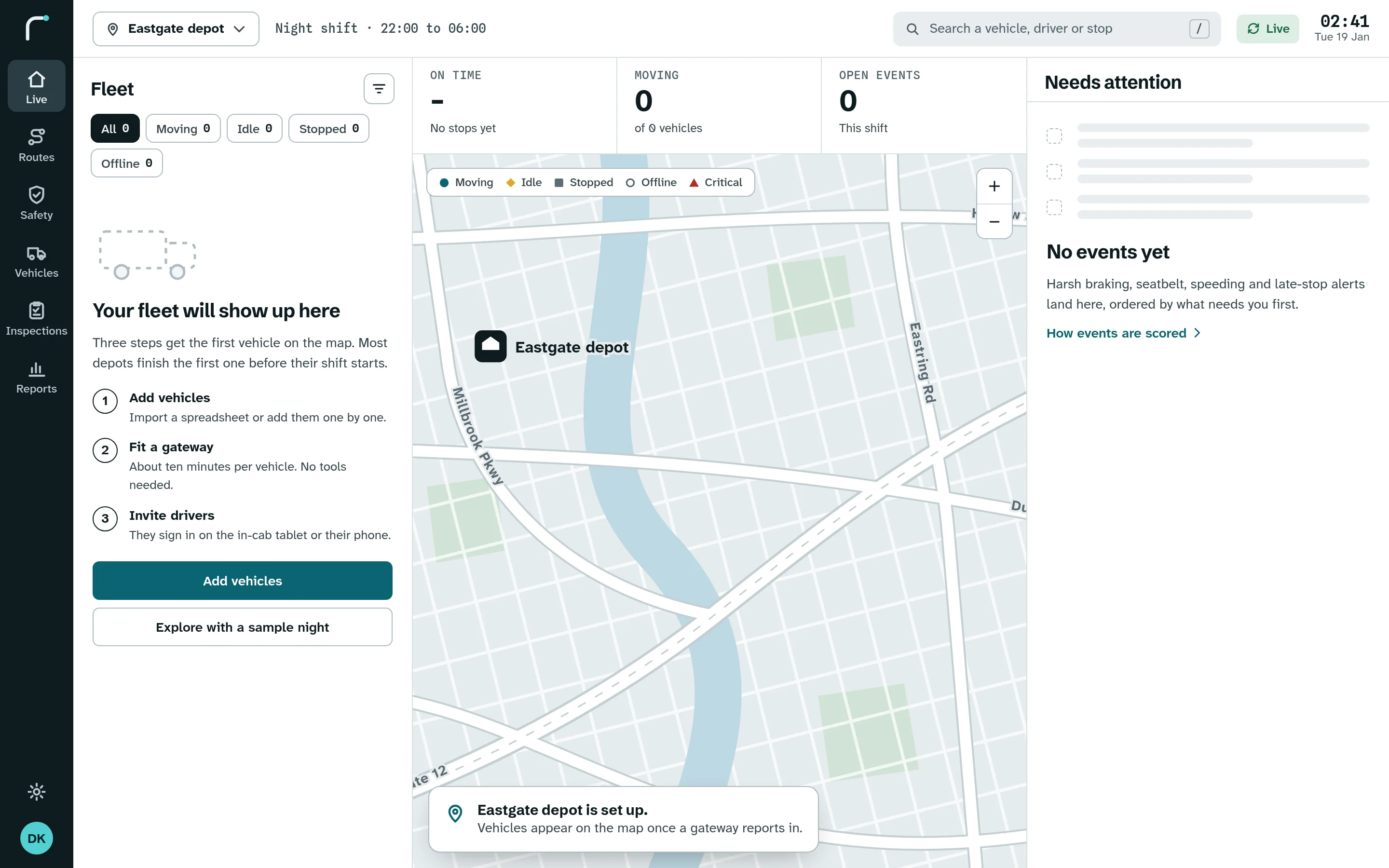
A new depot never sees a blank screen. It sees three steps to put its fleet on the map, and a sample night to explore in the meantime.
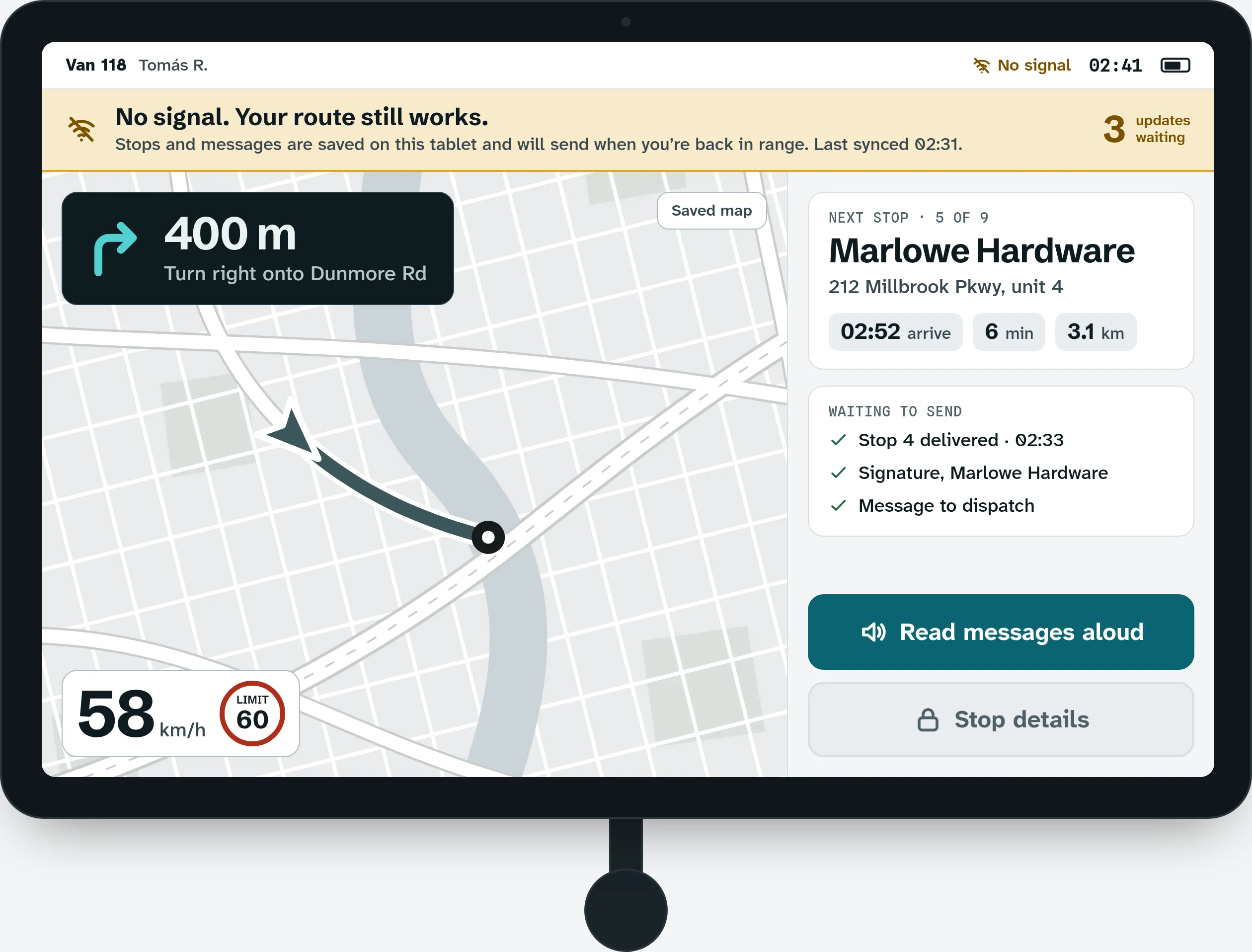
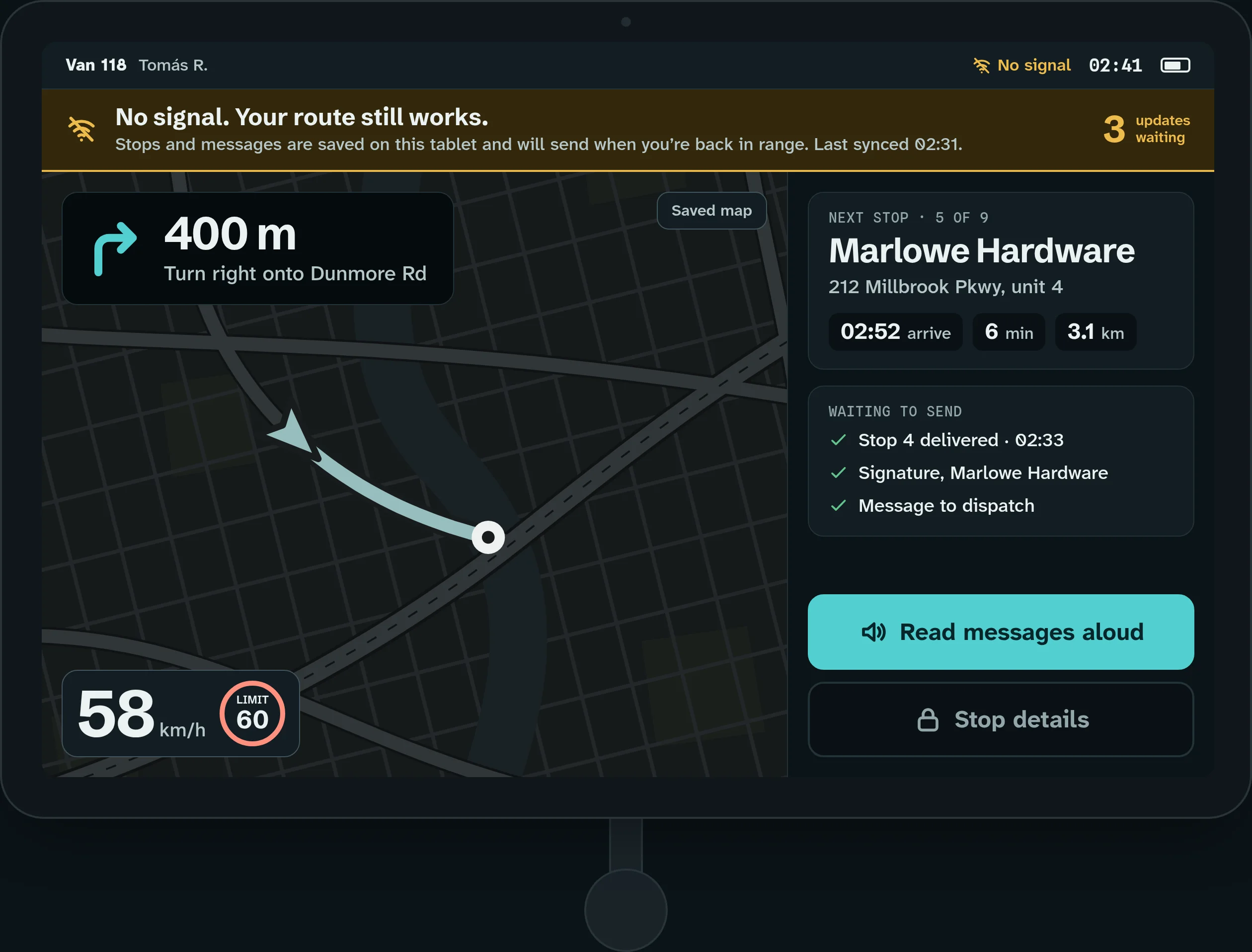
When the connection drops, the dashboard keeps showing the last update, says when it was taken, and queues messages to send when the signal returns.
One calm screen, big enough for gloves.
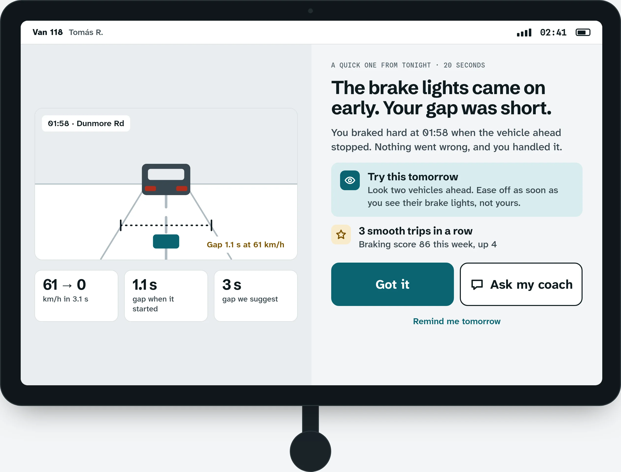
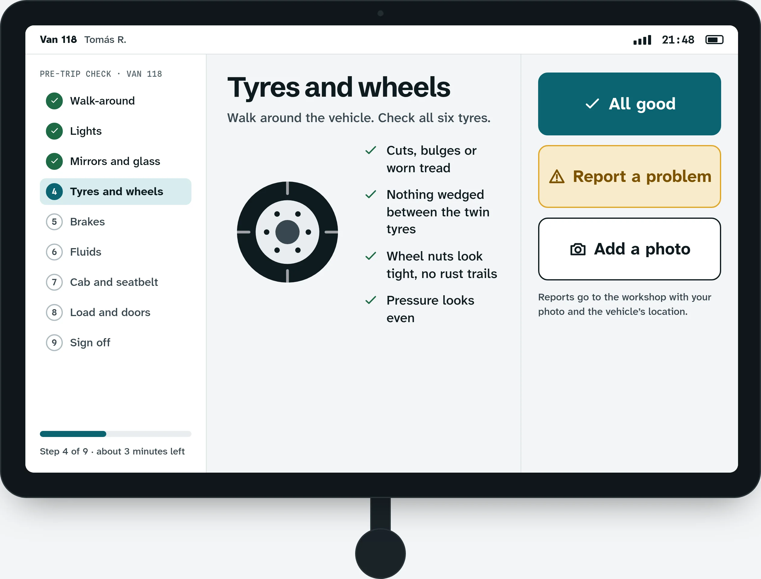
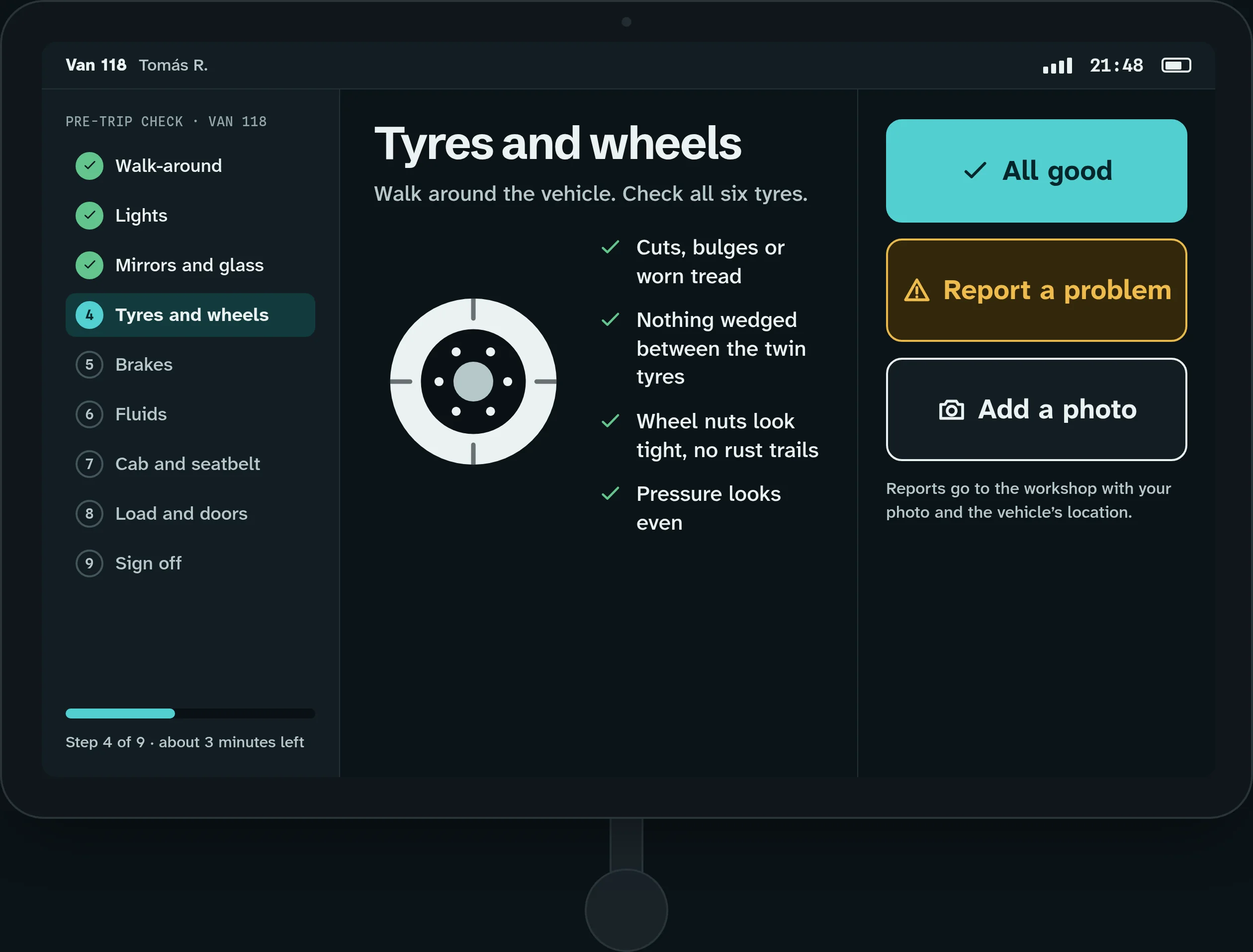
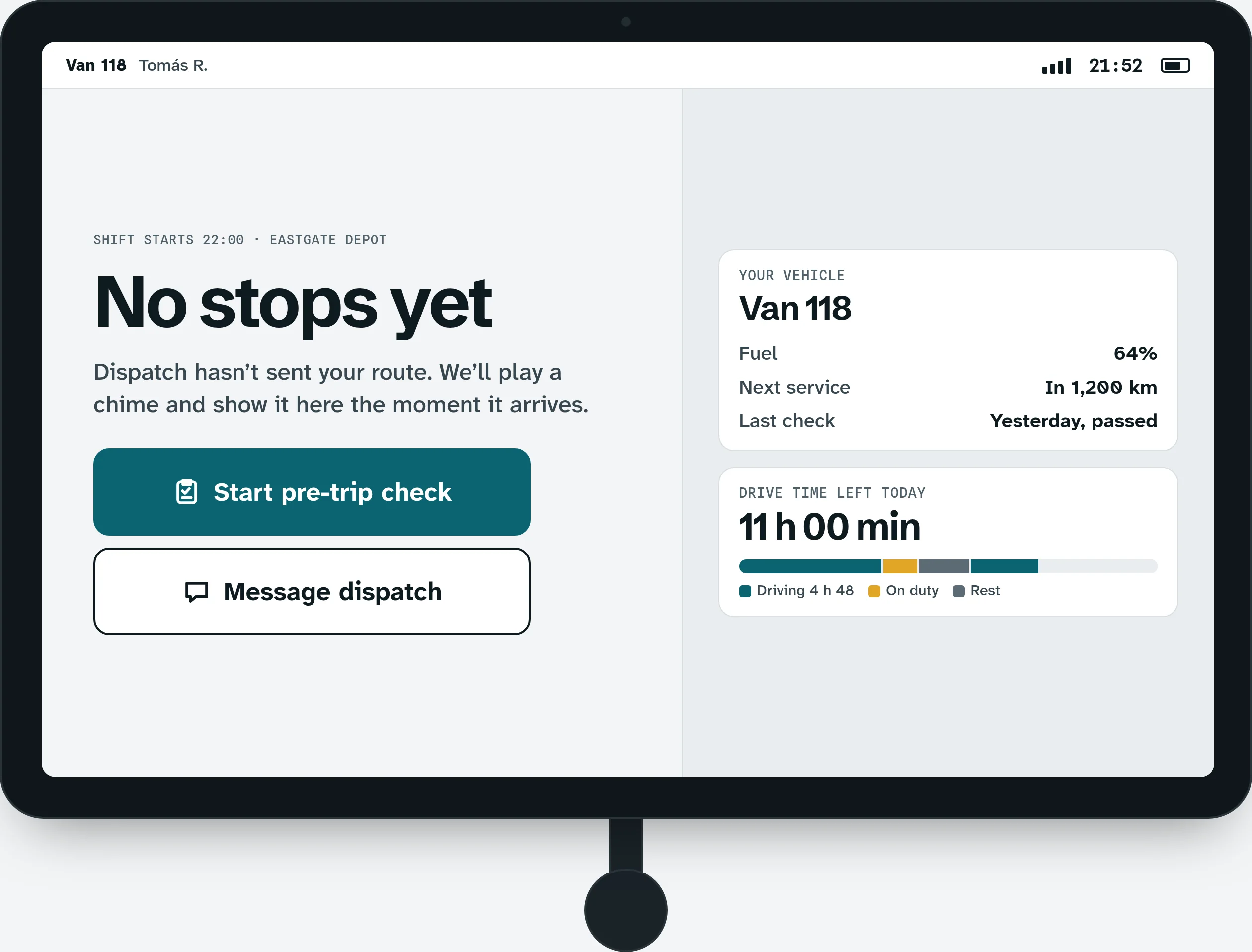
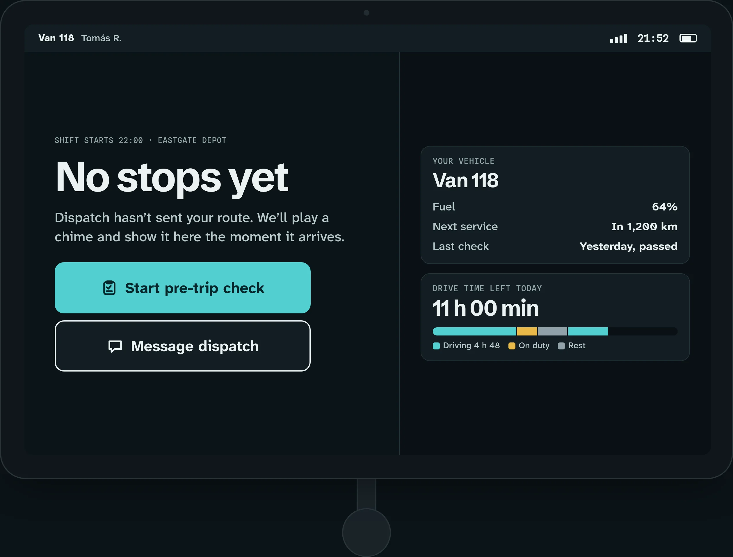
The driver screens are for a tablet in a mount. There is no phone version, on purpose: a glance needs a big, steady screen. Type and targets are sized for gloves and glare. While the vehicle moves, the screen says one thing, out loud and in large type, and anything that needs reading waits until the driver parks.
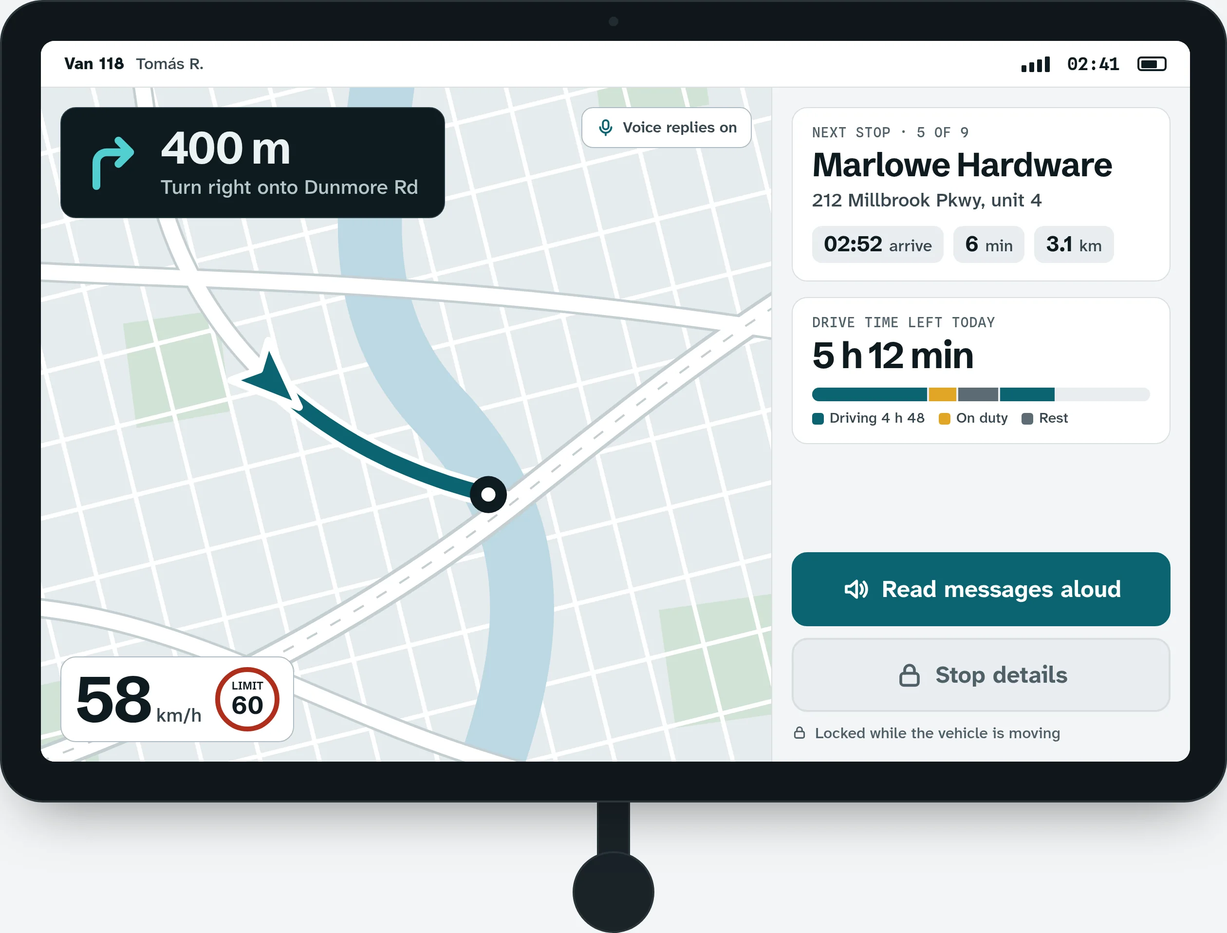
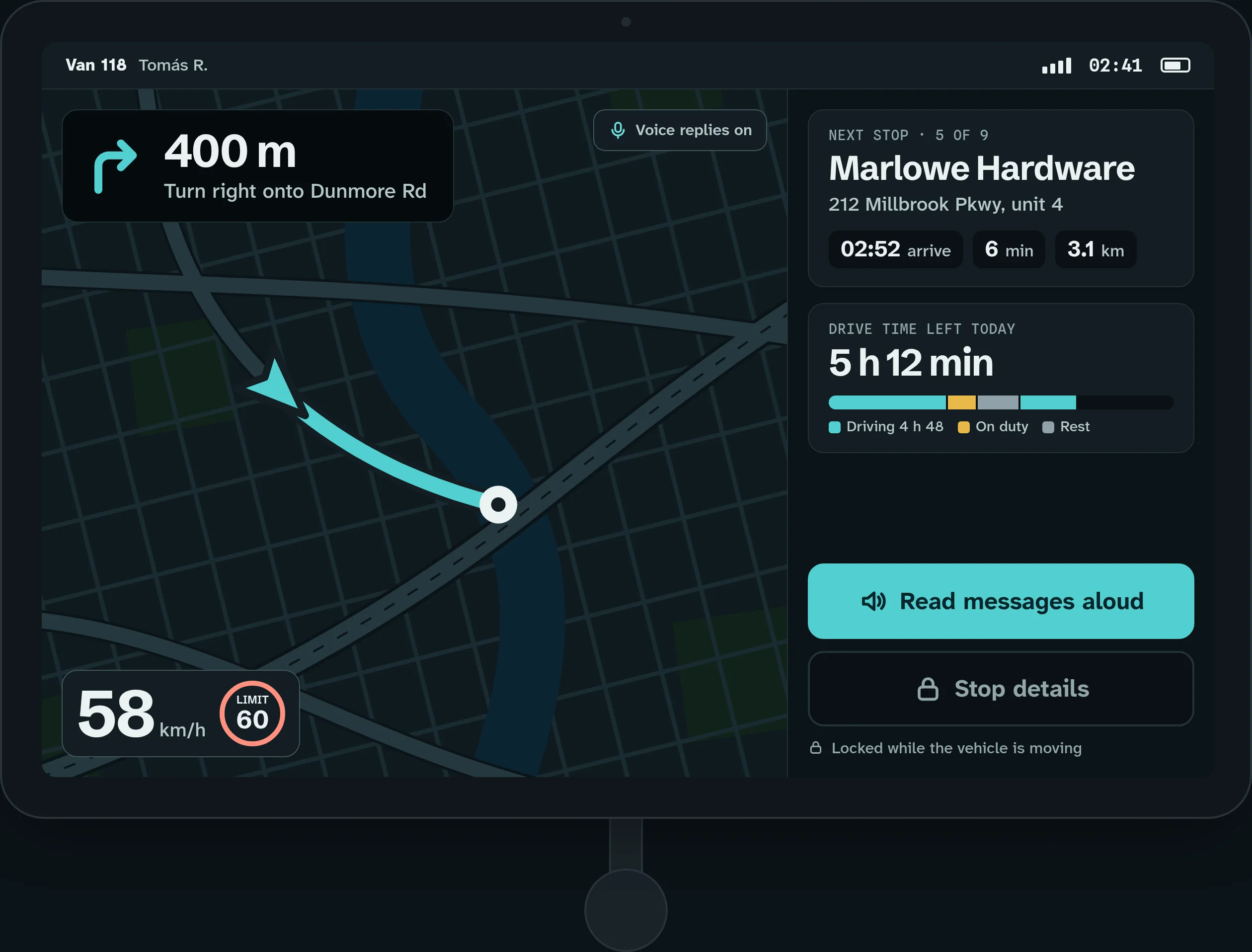
Coaching while moving is one short line, spoken and shown in large type, with nothing to tap. Once parked, the driver gets twenty seconds of context: what happened and one thing to try next time.
The pre-trip check takes one area at a time with three big answers, and it is signed on the tablet. Photos attach to a problem, and the report goes to the workshop with the vehicle’s location.
Real routes go through tunnels and empty queues, so both are designed states. Navigation and the stop list keep working with no signal, and a short queue shows what will sync later. With no stops, the screen offers a pre-trip check or a message to dispatch.
What the interviews changed, and a fictional pilot.
The decisions rest on invented interview themes from nine dispatchers, twelve drivers and five safety leads. Each theme drove one change: severity now leads the alert list, targets and type grew for gloves, navigation keeps working with no signal, and coaching arrives as a short note right after the drive.
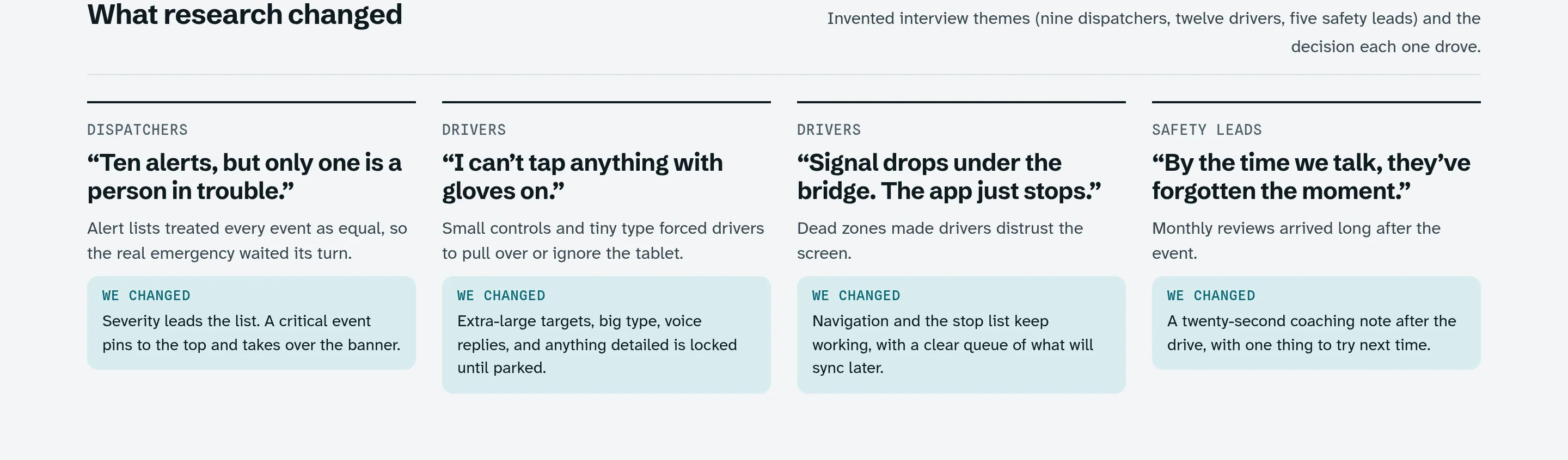
After ship is a clearly fictional follow-up, written as if the concept had shipped to three pilot depots for eight weeks. The median time to acknowledge a critical event falls from four minutes ten seconds to one minute thirty-five seconds. The pinned incident banner and the one-tap call did most of the work. Every figure here is invented for this portfolio piece, and the sheet says so at the top.
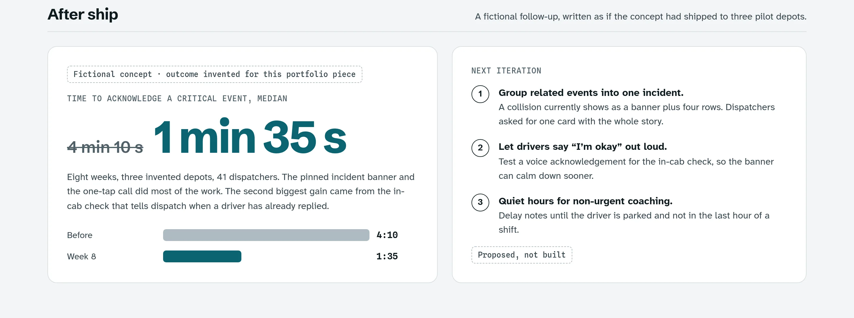
The next steps are marked as proposed, not built: group related events into one incident, let drivers say “I’m okay” out loud, and hold non-urgent coaching until the driver is parked and not in the last hour of a shift.
One idea, from the cover to the feed.
The banners reuse the product, not a stock illustration: the dispatcher view and the tablet sit over real photos at work, with one short line and one button. There is a hero, a dark launch banner, two social posts and a portfolio cover.
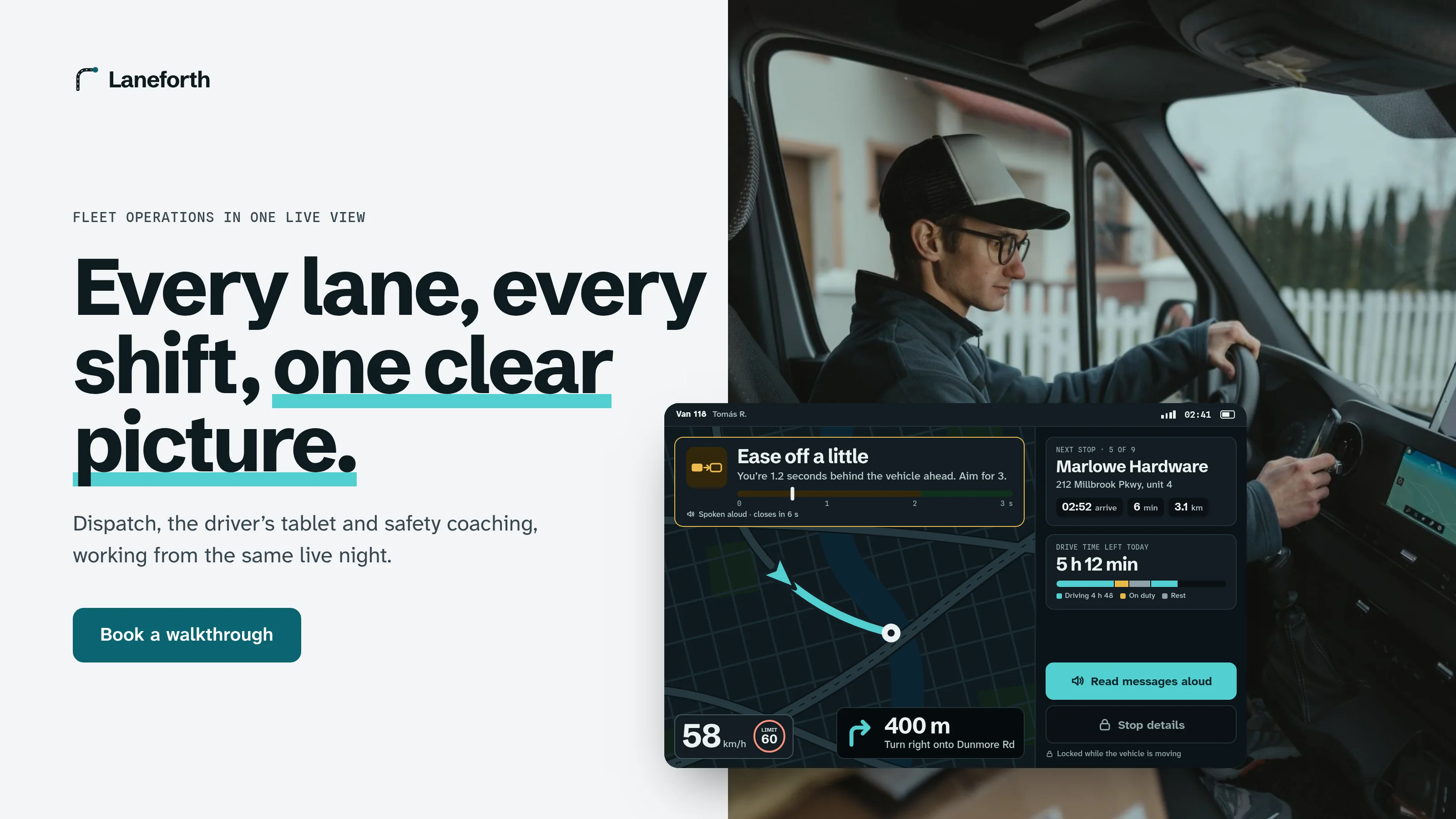
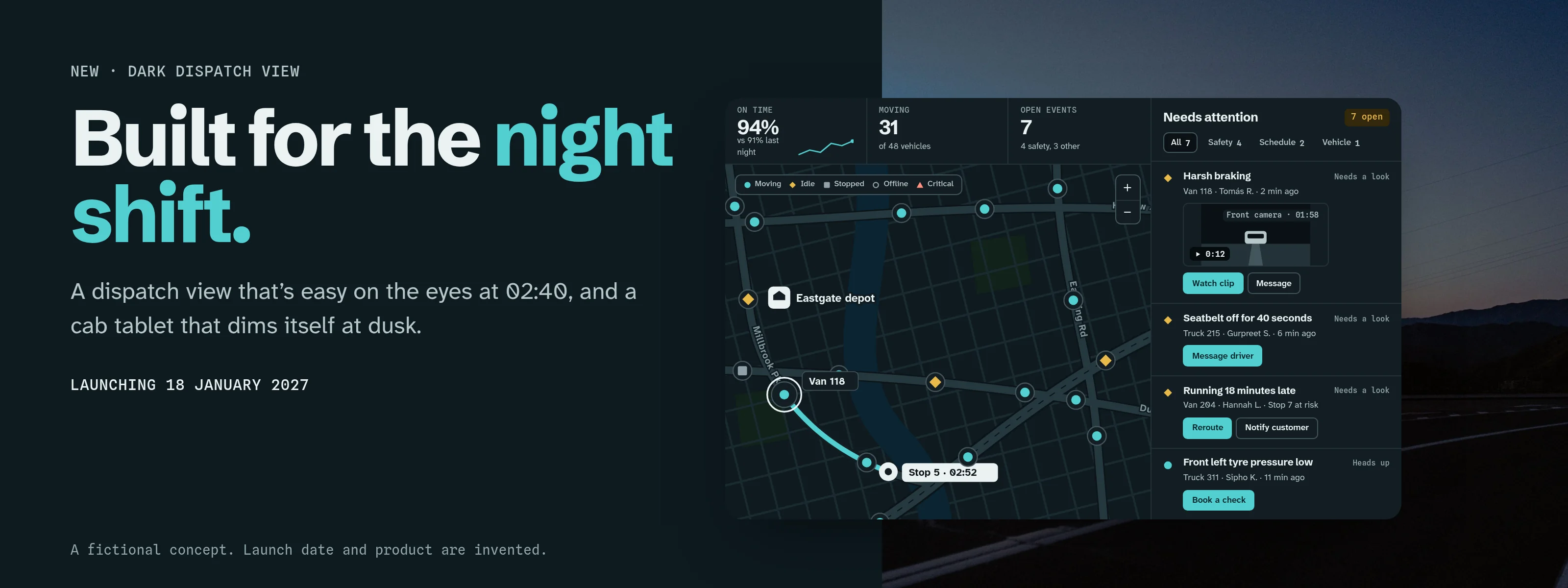
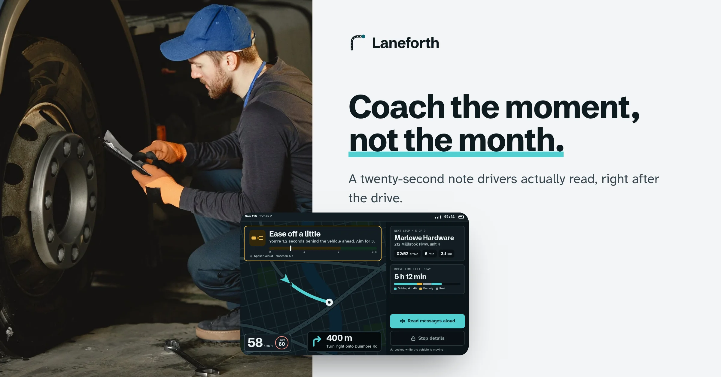
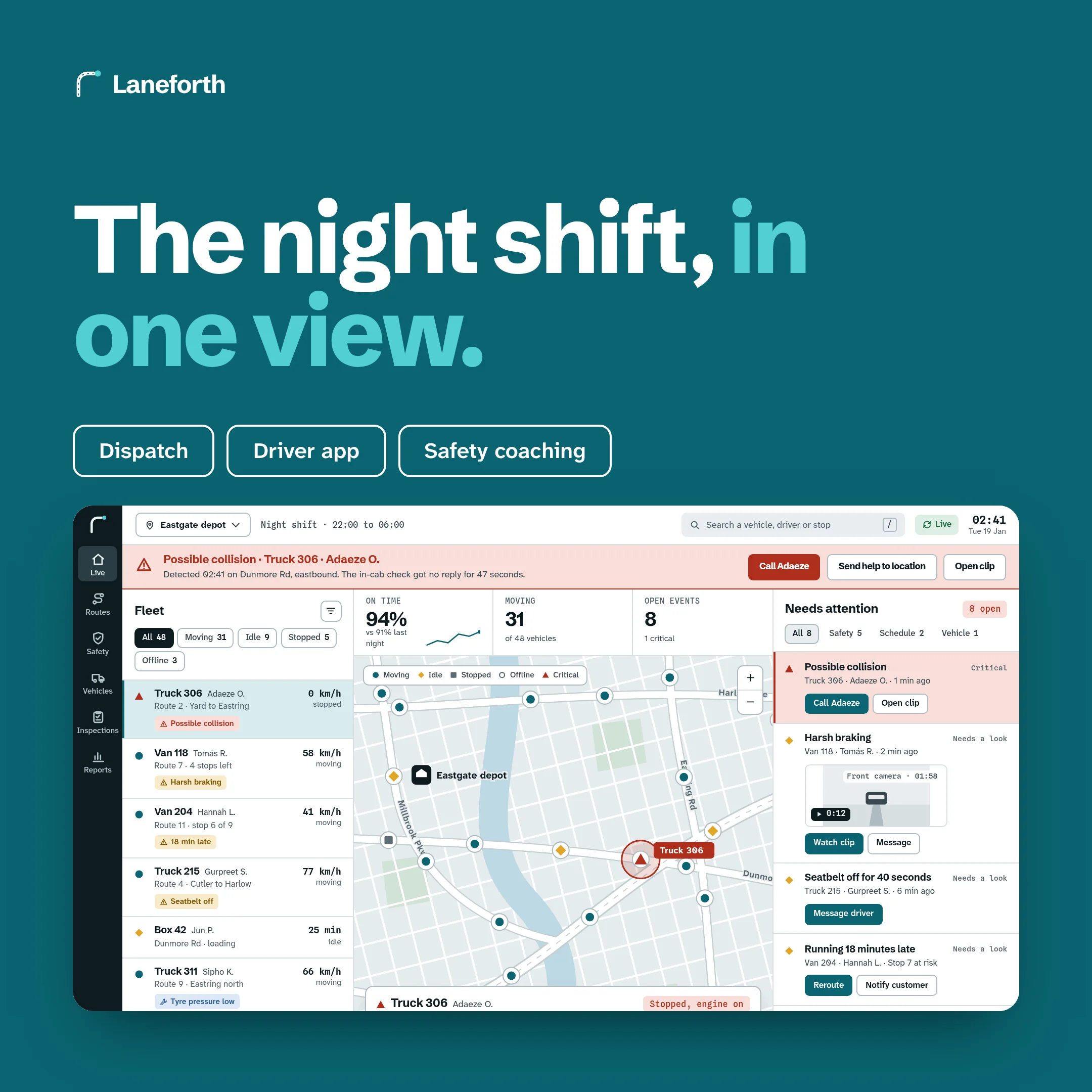
Photos from Pexels, used under the Pexels License: Tima Miroshnichenko (the driver in the van), Gustavo Fring (the cab check and the yard), Kampus Production (the courier at the van door), Pixabay (the dispatch desk) and Sergei Skrynnik (the truck at night). No colour was changed in any of them.
What I’d test next
- Whether a dispatcher who sees the real map on the first screen books more walkthroughs than one who reads a slogan. A homepage with the live view against one with a plain hero would show it.
- Whether the pinned incident banner still works on a bad night, when a depot has several incidents at once, and whether one card per incident helps.
- Whether drivers use a spoken “I’m okay” in a real cab with engine and road noise, or still reach for the screen.
- Whether a coaching note that waits until the driver is parked is read more often than one that arrives while the vehicle is moving.
- How the cool Chalk and Petrol palette stands out next to the category’s dark pages in paid search and social feeds.
- How the tablet layout holds up on the smallest mounted tablets, with gloves, in glare.
Haybeck Accounting Portal
Accounting portal and design system concept
View case study →← Previous: Tellroom Video Platform