Davit Arakelyan
← All work
Case study · Fictional brand concept · 2026

Wendsum Pay Later

Identity, a design system, a homepage and an app for a buy now, pay later service in Utrecht: checkout, what’s due, moving a date, returns, and a friendly way back if you miss a payment.

Not a real company. Wendsum, its shops, people and every figure in the mockups, including the late fee, are fictional, made for this portfolio concept.
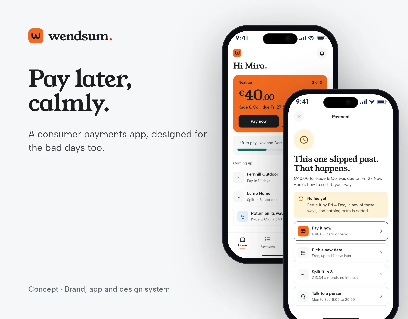
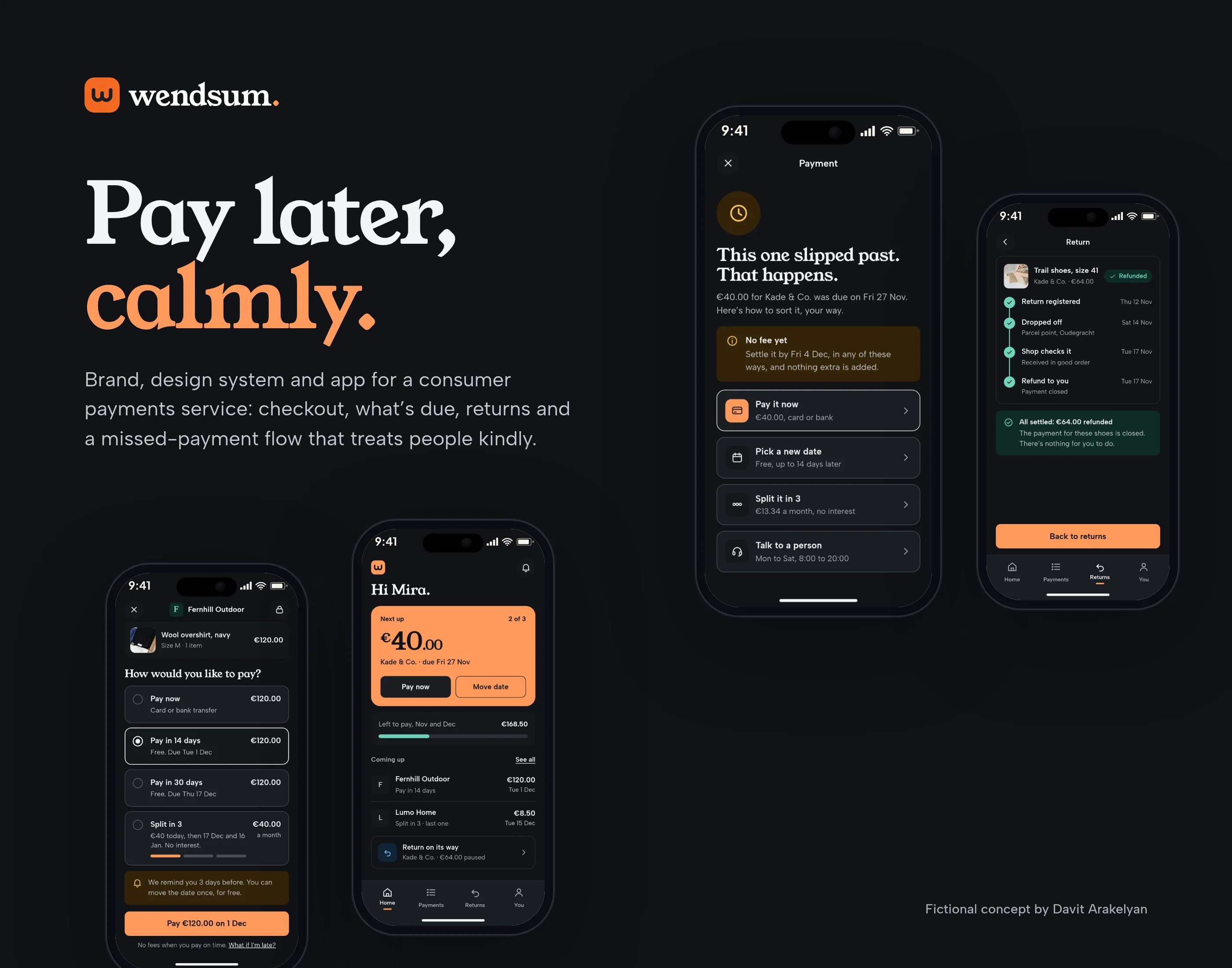
Wendsum cover: the mark, the line “Pay later, calmly.” and two phone screens, one for what’s due and one for a missed payment
Fig. 01Work cover: the mark, the line “Pay later, calmly.” and two phone screens.
Role
Brand identity, design system, product UI
Scope
Self-initiated concept
Year
2026
Deliverables
Identity, design system, homepage in light and dark, app screens for checkout, what’s due, moving a date, returns and missed payments, desktop account, banners
01The brief

Pay later, calmly, when the day doesn’t go to plan.

People already know how to pay later. What they don’t trust is the day something goes wrong: a payment they can’t make, a parcel they need to send back, a fee they didn’t see coming. This concept is a buy now, pay later service for everyday shops, tram tickets and parking in the Netherlands, designed around those moments rather than the happy path.

  1. Show every date, amount and fee before anyone says yes.
  2. Make what’s due a single number, with a way to move the date in a couple of taps.
  3. Pause a payment the moment a return starts, and show each step of the refund.
  4. Treat a missed payment as a bad day, not a bad customer: no blame, a real deadline, and a few ways back.
  5. Keep the invented late fee of €3 visible and labelled, never hidden in small print.
  6. Build one design system that works in light and dark, on a phone and on the desktop account.

All shops, people, amounts, dates and the late fee are invented and labelled as such.
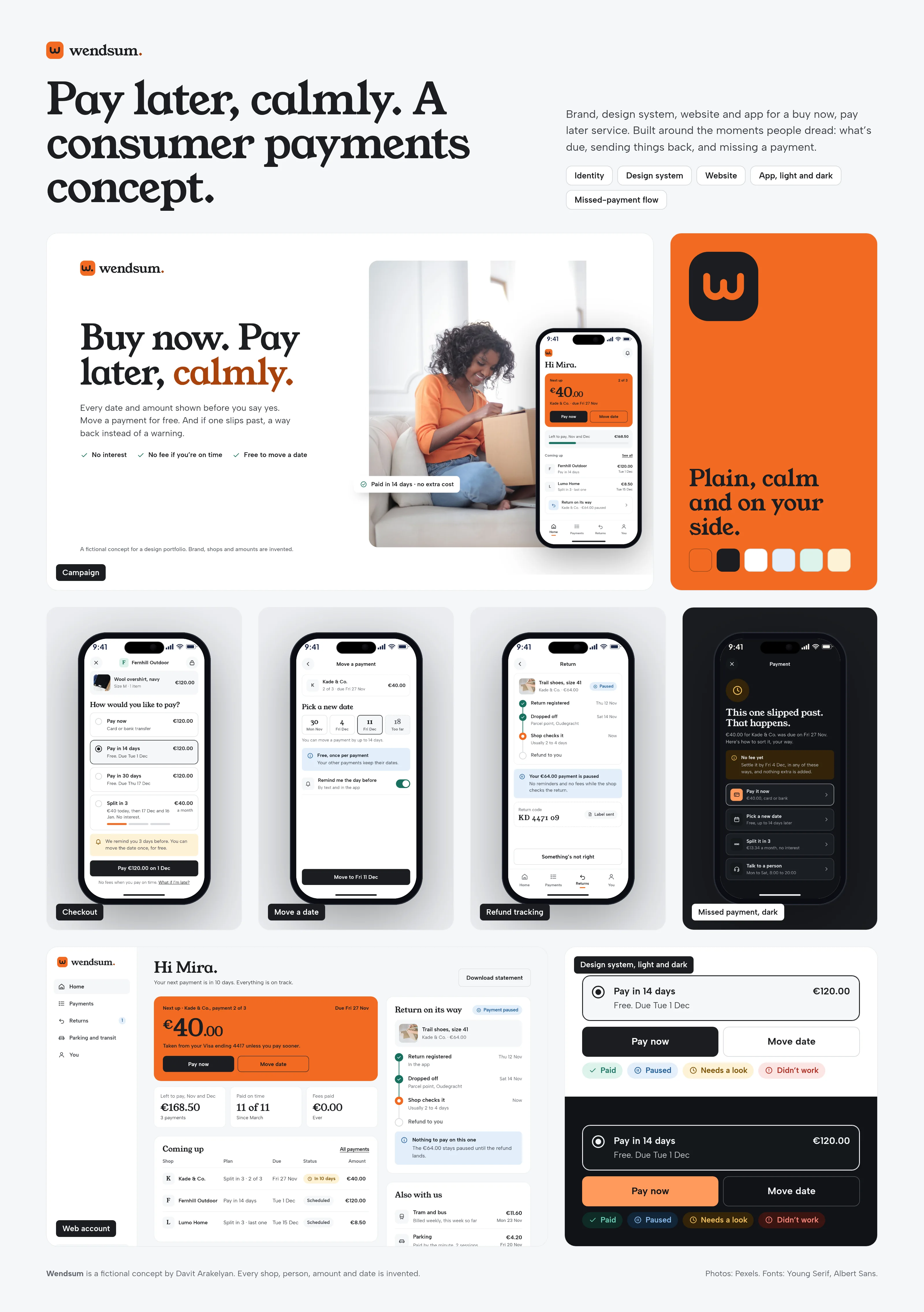
Overview of the Wendsum identity, design system, homepage and app screens
Fig. 02The whole project on one page: identity, the system, the site and the app. Every figure is invented.
02Naming

A name that sounds like winsome, and means going at your own pace.

Wendsum comes from “wend your way” (go at your own pace) and “sum” (what you owe). It sounds like “winsome”, which is friendly without being cute. I also considered Quaywell, Cairnsum and Ebbsum. Domain and app-store checks were clear; the official trademark registers should still be searched before any real use.

03Identity

A lowercase w, drawn in one unhurried stroke.

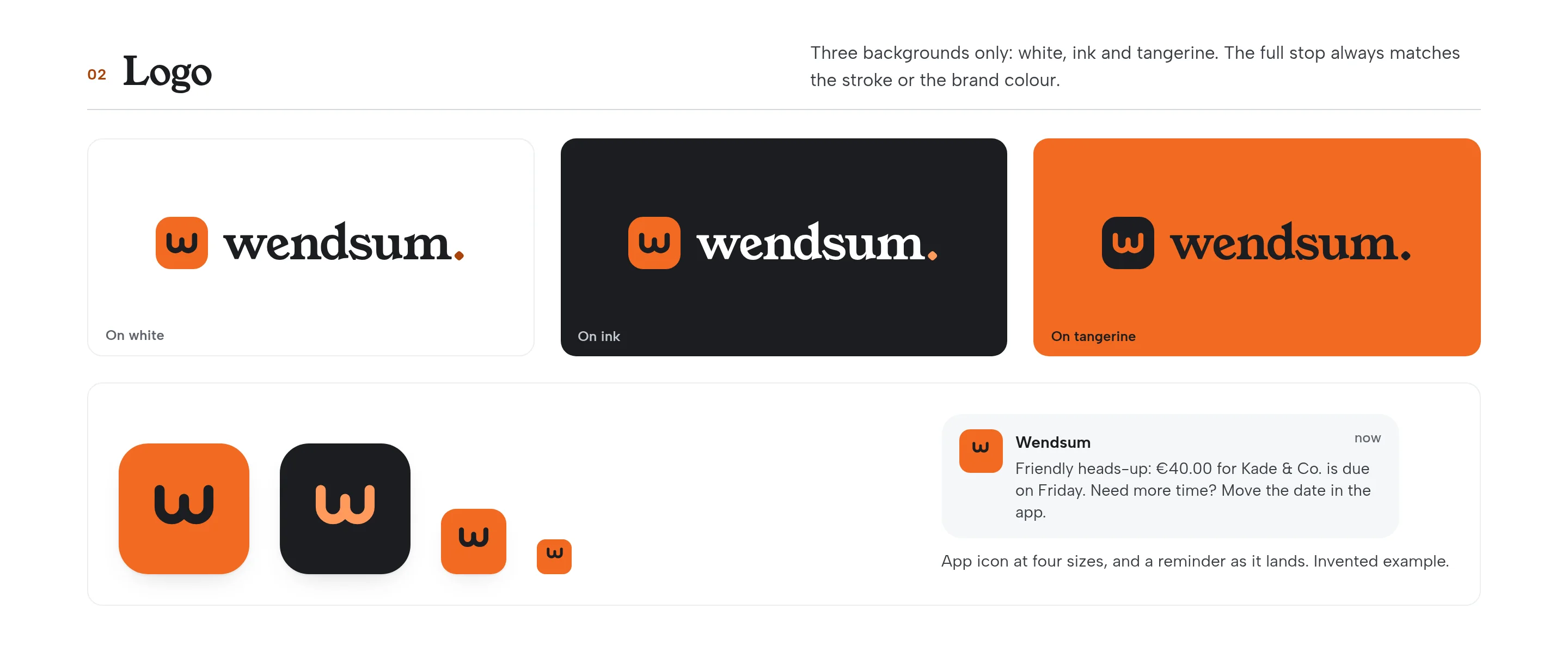
The mark is a single stroke, centred in a rounded tile. The name in type still ends with a full stop: wendsum. That stop belongs to the wordmark only.
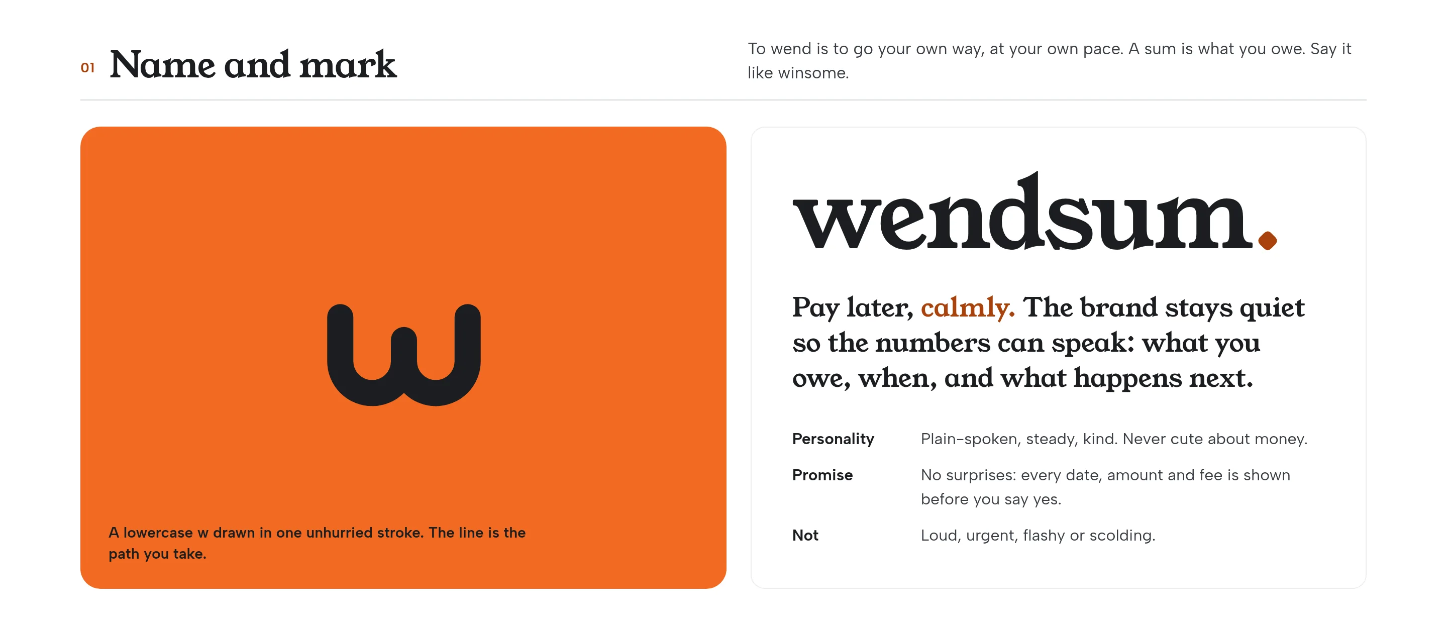
Large tangerine tile with the Wendsum w mark, beside the wordmark wendsum. and the brand promise
Fig. 03The mark beside the wordmark. The full stop sits on the name, not in the tile.
Logo on three backgrounds and the app icon in tangerine and ink, plus a sample reminder
Fig. 04The lockup on white, ink and tangerine, and the app icon at four sizes.
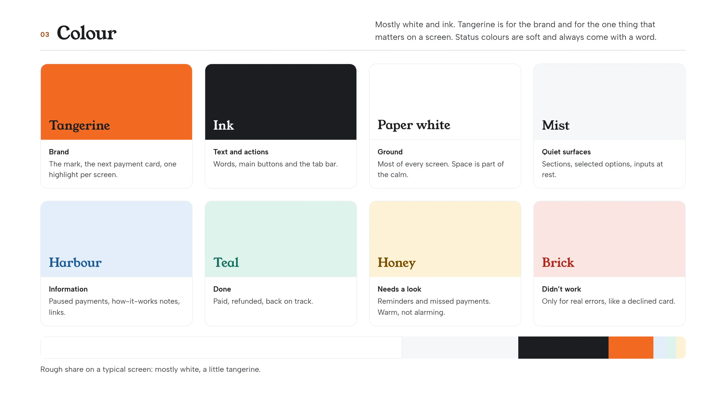
Colour palette: tangerine, ink, paper, mist, harbour, teal, honey and brick, with a rough share bar
Fig. 05Mostly white and ink. Tangerine is for the brand and for the one thing that matters on a screen.
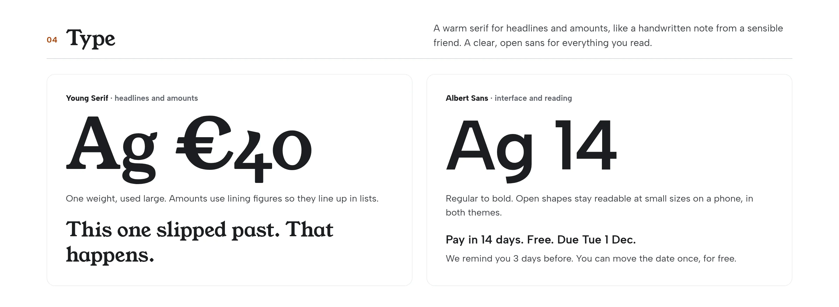
Type specimens of Young Serif and Albert Sans with example interface copy
Fig. 06Young Serif for headlines and amounts, Albert Sans for everything you read.
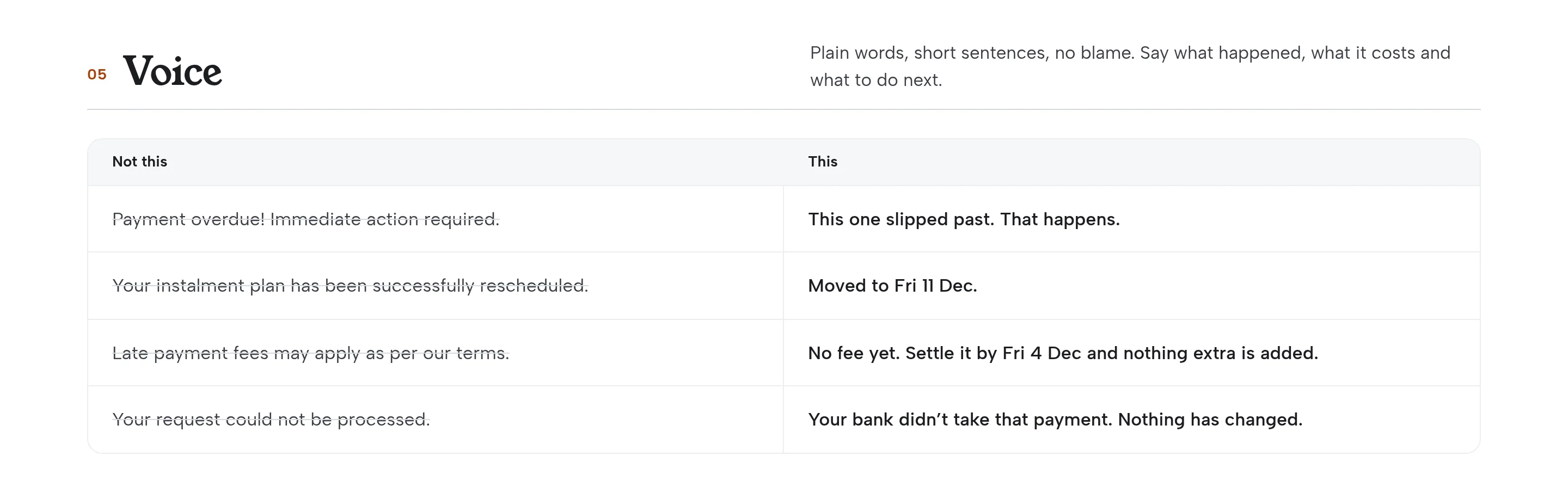
A voice table contrasting harsh payment language with calmer lines
Fig. 07Plain words, short sentences, no blame.
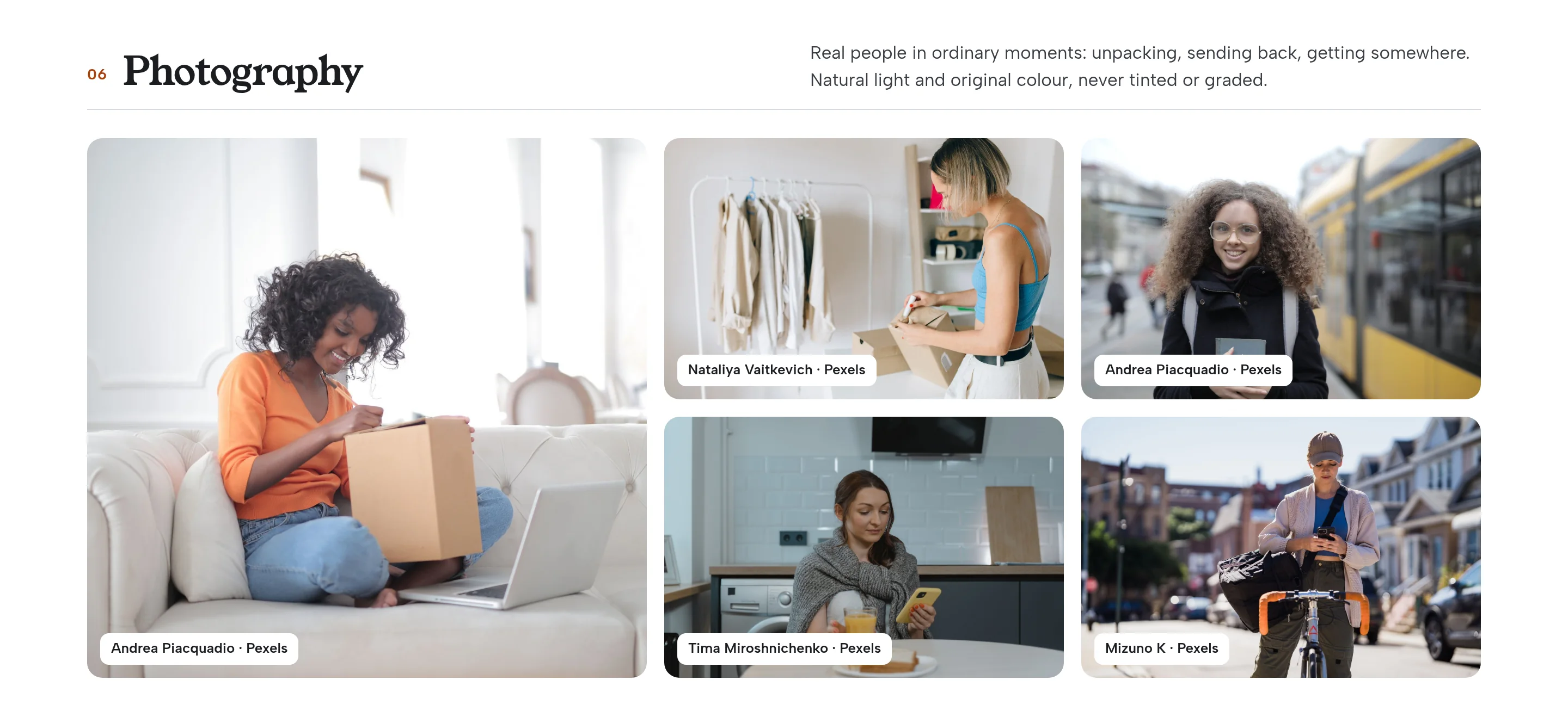
Five licensed photographs of people unpacking, returning a parcel, waiting for a tram, at breakfast and cycling
Fig. 08Real people in ordinary moments, in original colour: unpacking, sending back, getting somewhere.
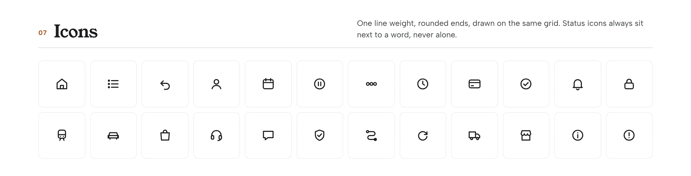
A grid of interface icons drawn for Wendsum
Fig. 09One line weight, rounded ends. Status icons always sit next to a word.
04Design system

One set of parts for every state a payment can be in.

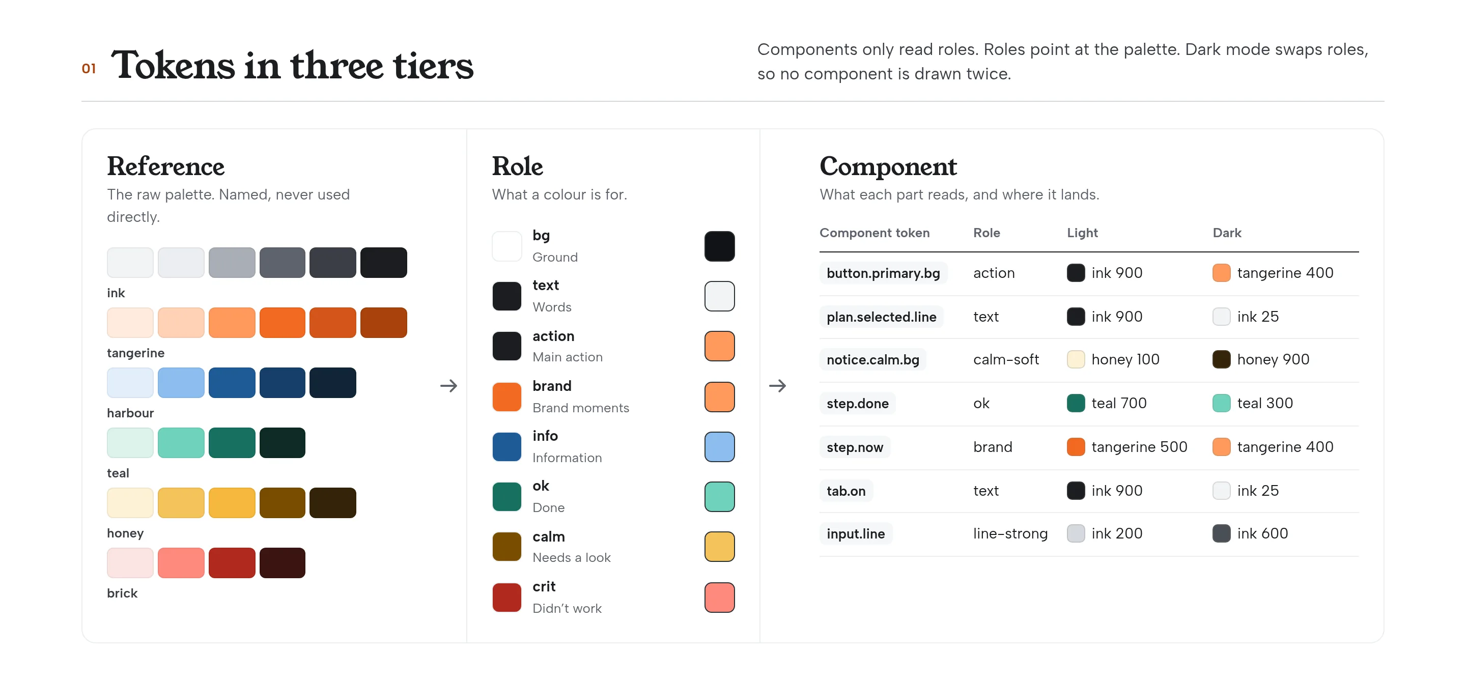
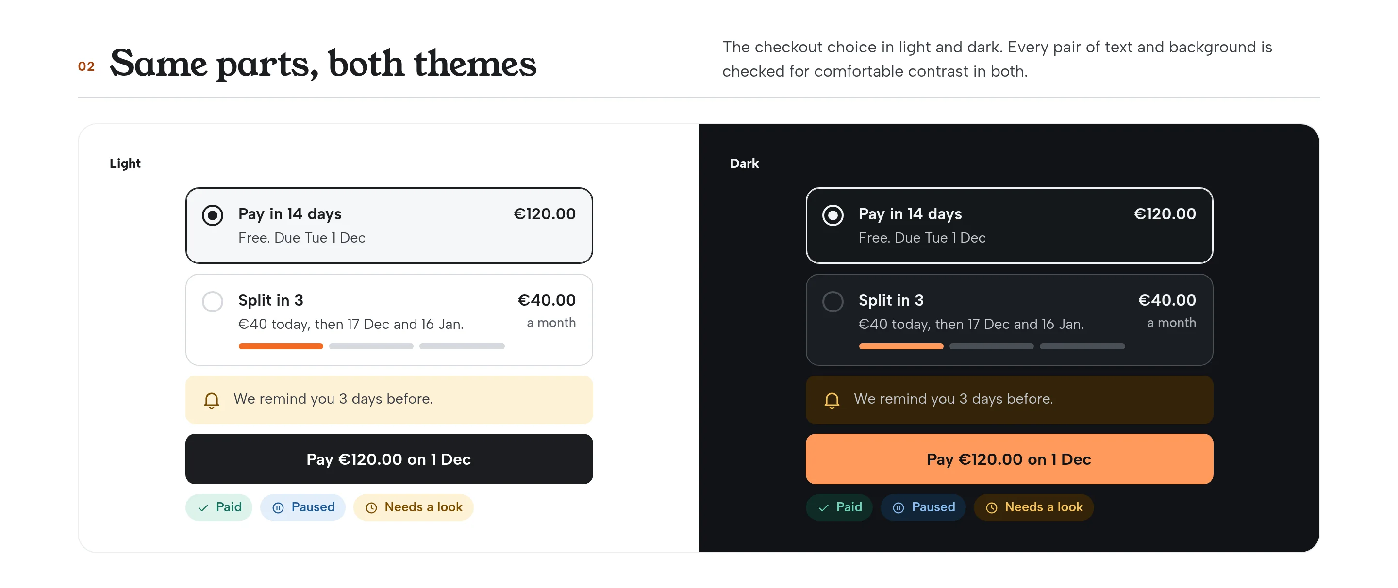
The system is the lead piece of this work. Components never touch the raw palette: they read roles, and roles point at named colours. Dark mode swaps the roles, so nothing has to be drawn twice.
Design-system token sheet showing reference colours, roles and component mappings in light and dark
Fig. 10Tokens in three tiers: the palette, the roles, and what each part reads.
The checkout plan picker shown in light and in dark
Fig. 11The checkout choice, in both themes, built from the same parts.
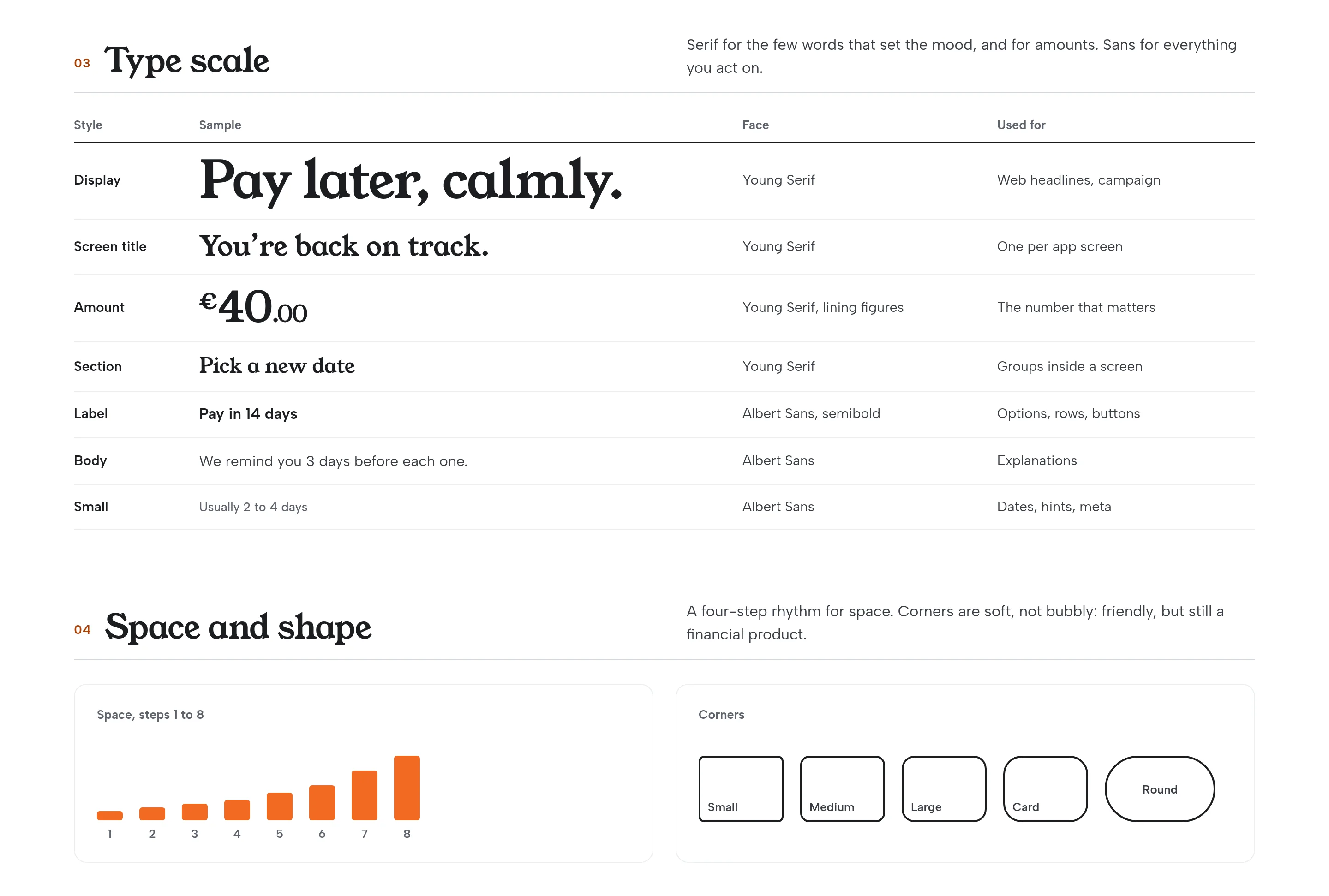
Type scale and spacing and shape rules for the Wendsum system
Fig. 12A type scale for mood and for amounts, and a four-step rhythm for space.
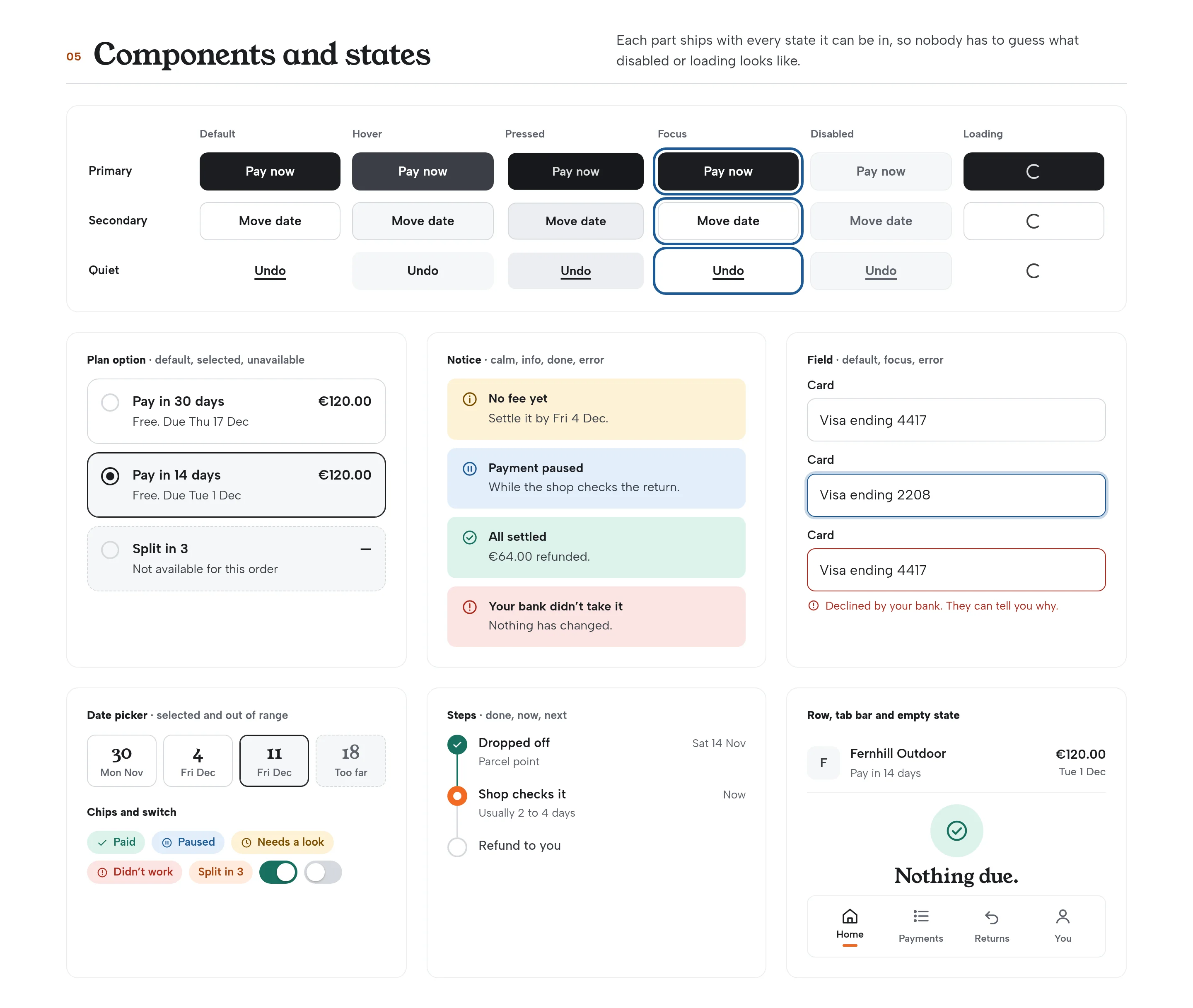
Component gallery: buttons, plans, notices, steps, chips, inputs and empty states
Fig. 13Each part ships with every state it can be in, so nobody has to guess what an error or an empty list looks like.
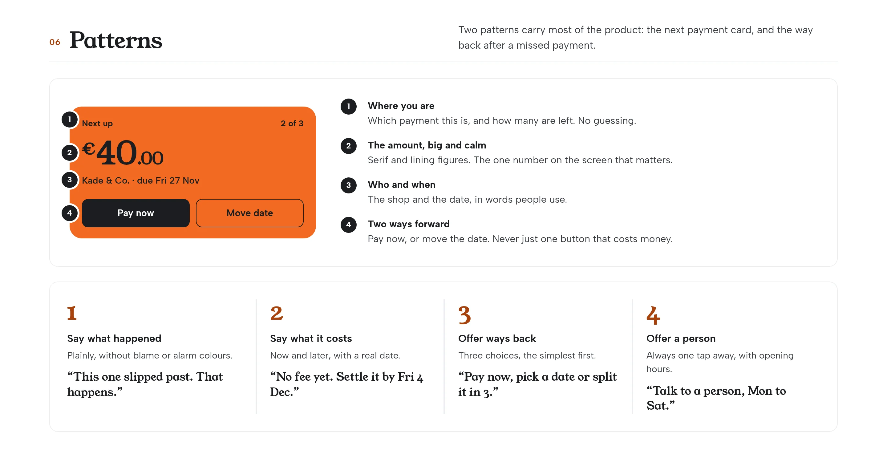
Pattern examples of the next-payment card and the missed-payment recovery
Fig. 14Two patterns carry most of the product: the next payment card, and the way back after a missed payment.
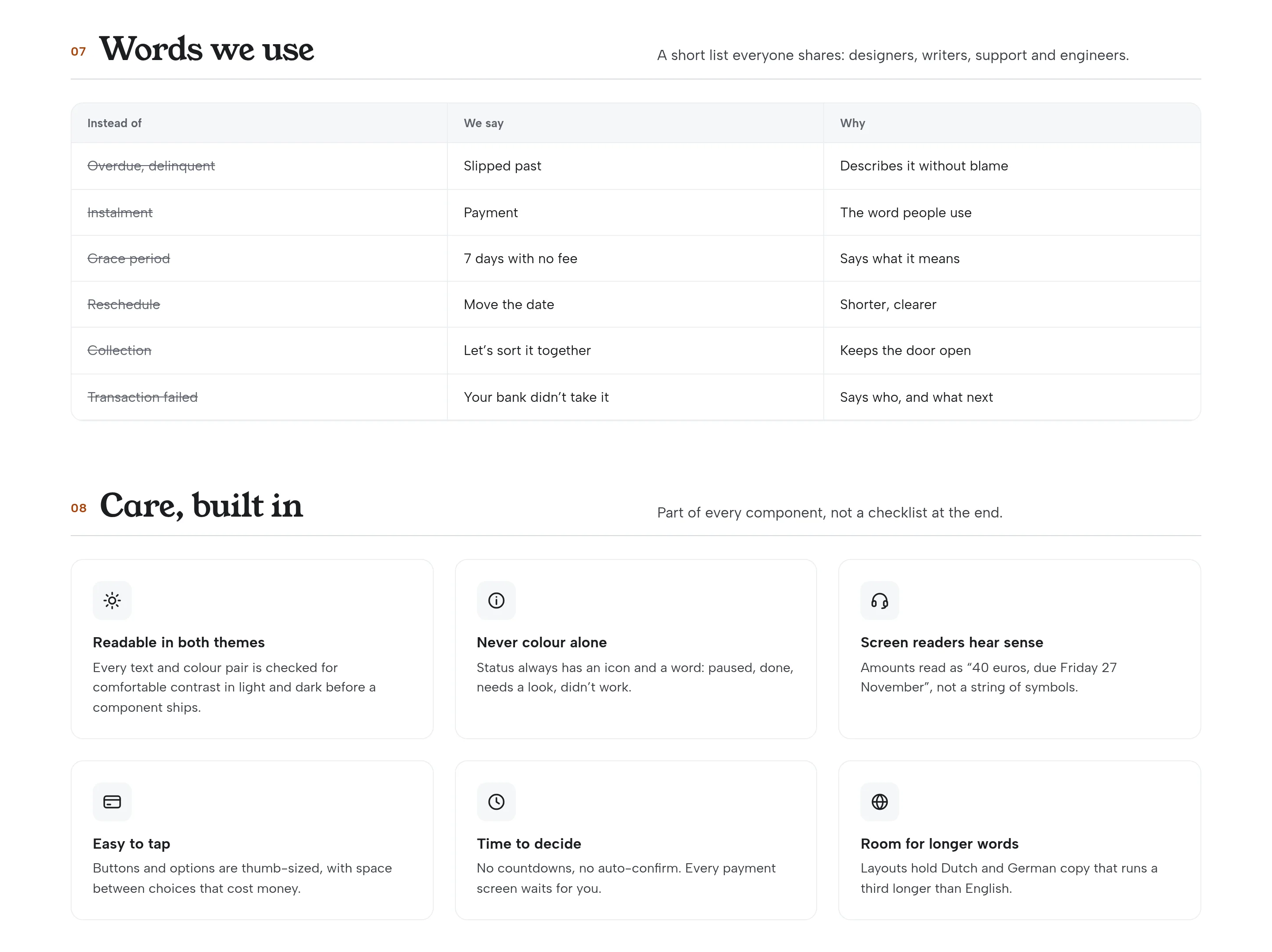
Words-we-use list and a care checklist for contrast, language and states
Fig. 15A short shared list of words, and care built into the components rather than added at the end.
05Homepage

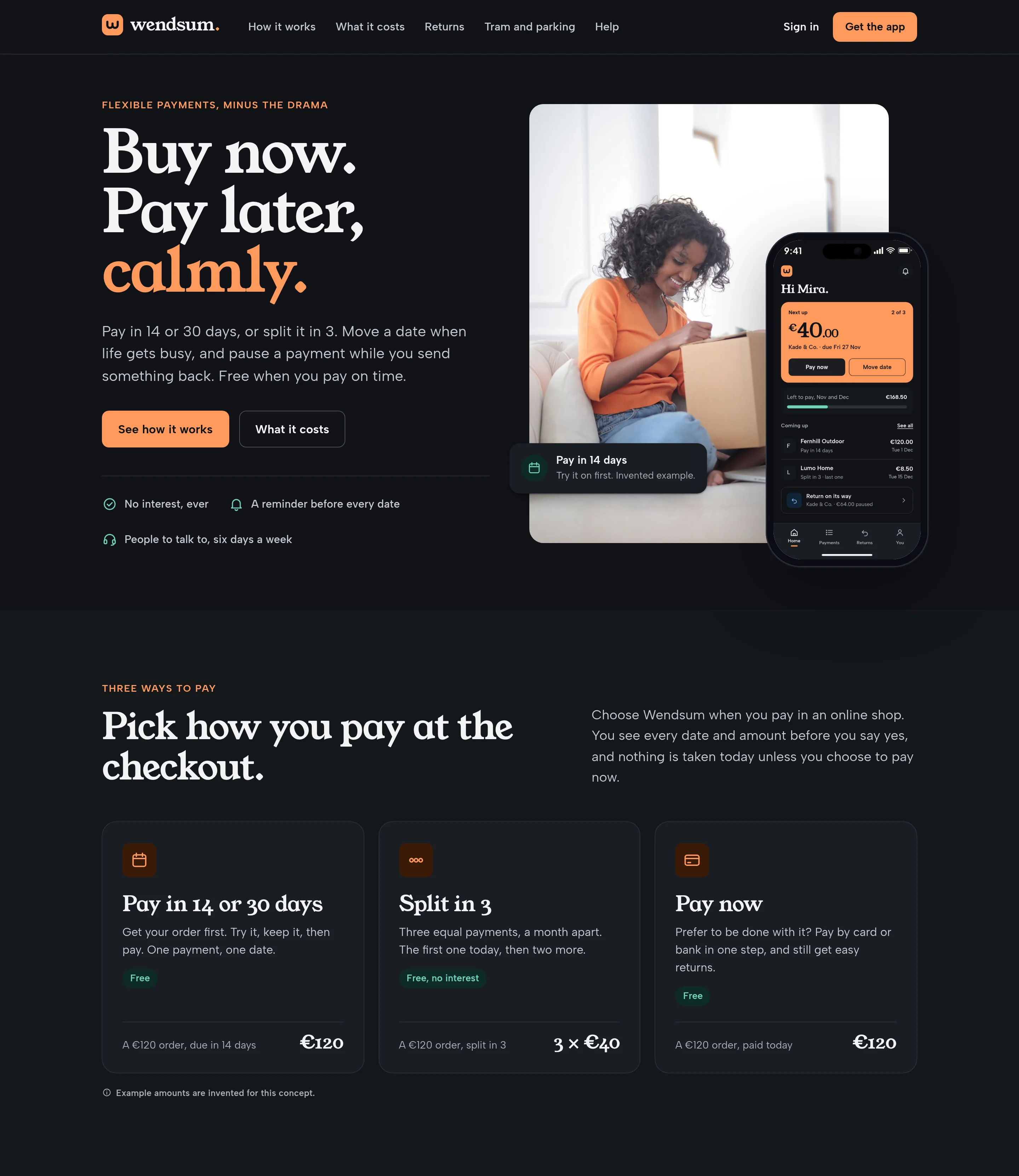
Buy now. Pay later, calmly.

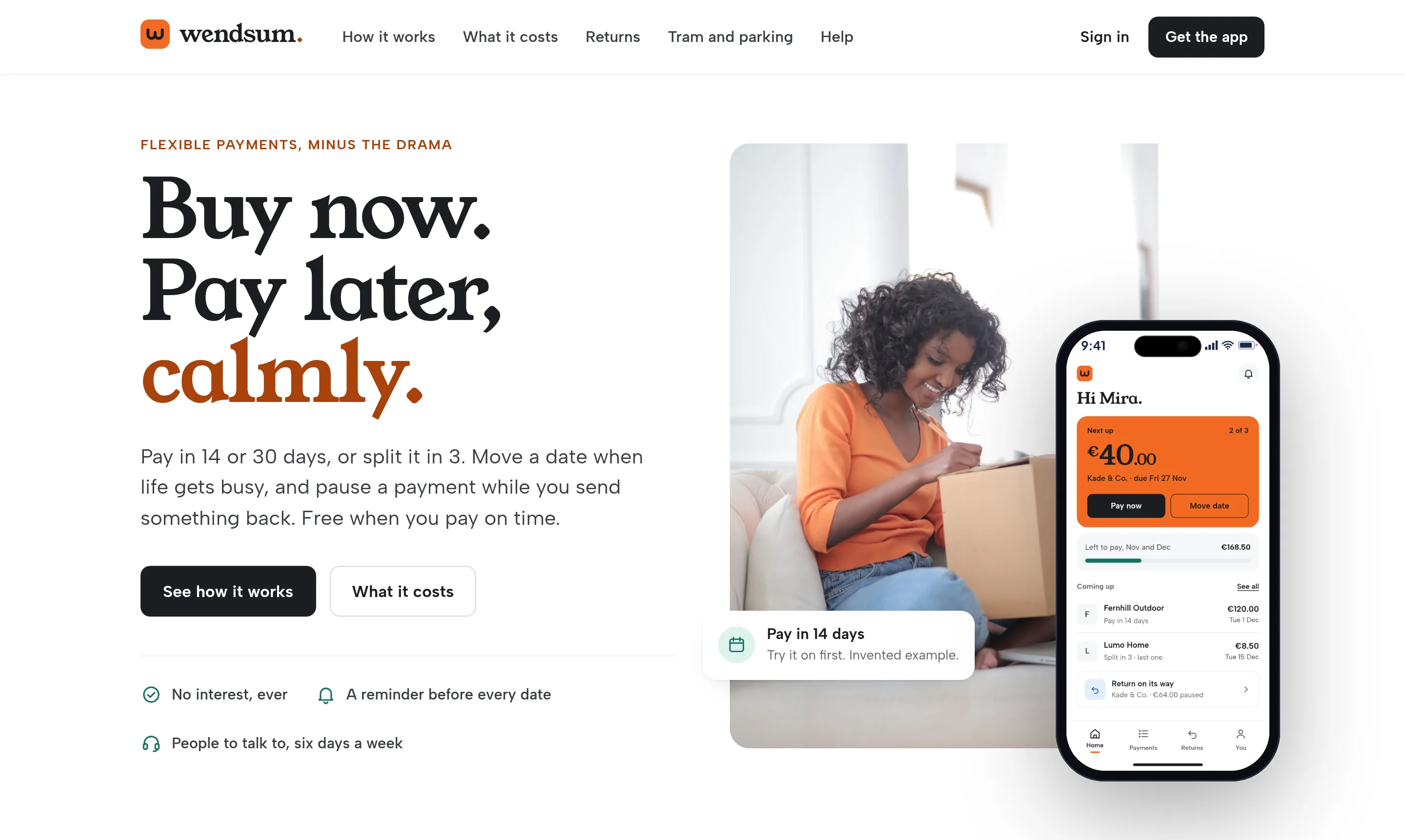
The site opens on the promise, then shows how you pay, what it costs, and what happens when plans change. Fees are listed in full, and marked as invented, so nothing important hides in a footnote.
Homepage hero: Buy now. Pay later, calmly, a photo of someone opening a delivery, and a phone showing what’s due
Fig. 16The homepage hero, with the next payment on a phone beside it.
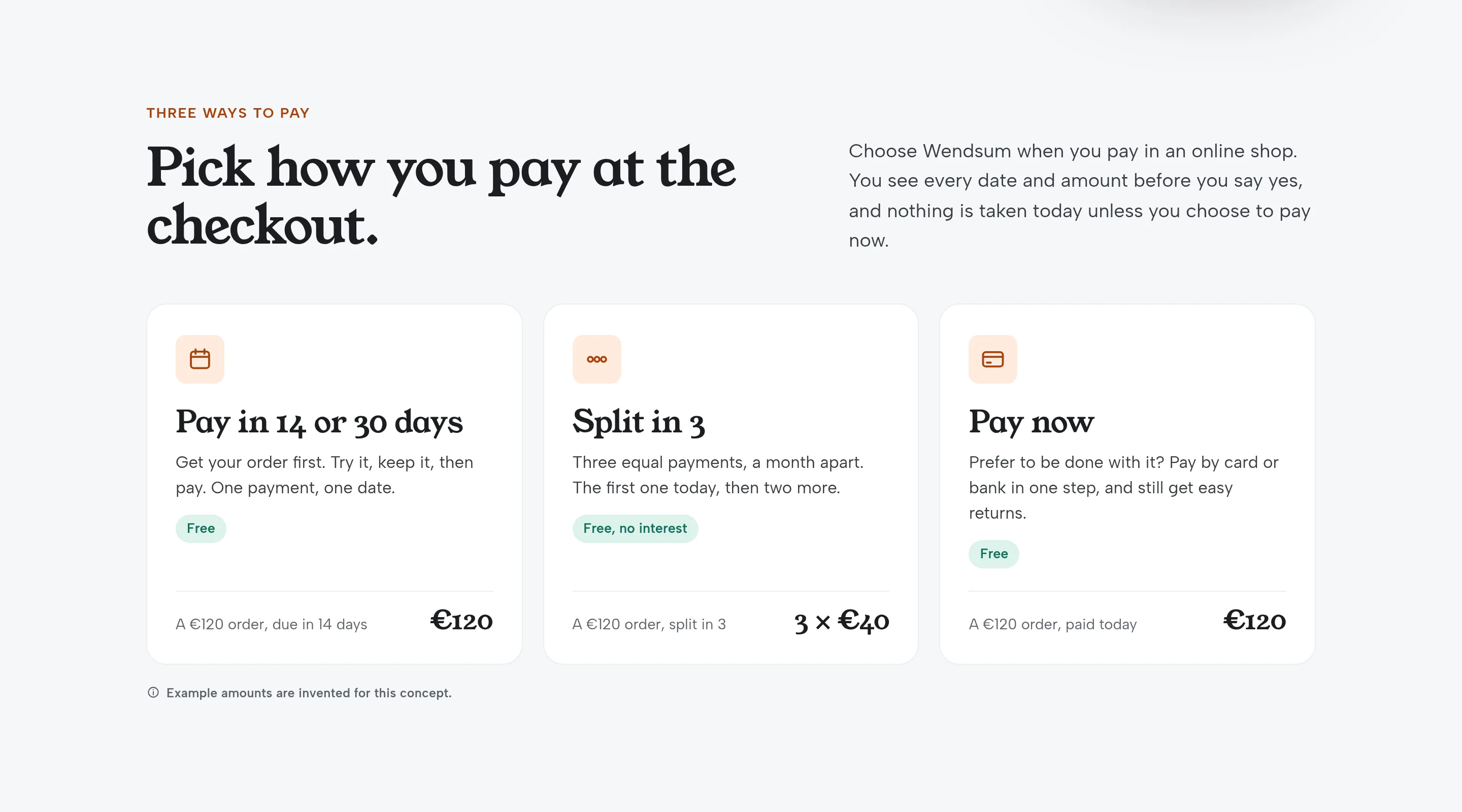
Homepage section explaining pay in 14 or 30 days, split in 3, and pay now, with invented example amounts
Fig. 17Three ways to pay at the checkout, each with a real date and amount.
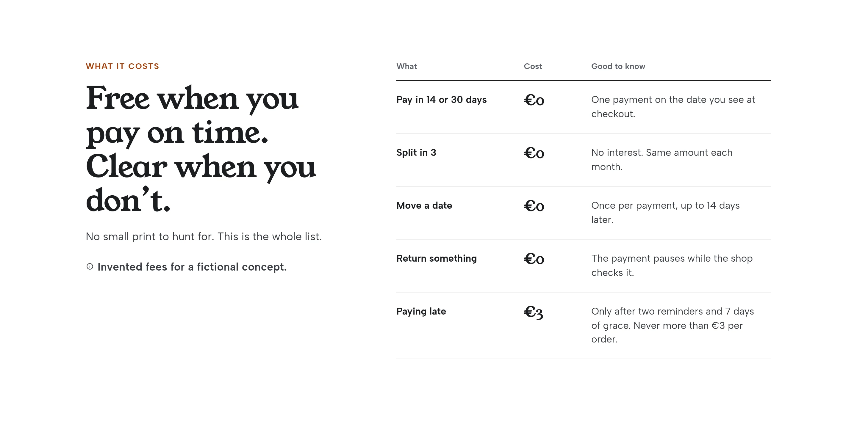
Fee table for a fictional concept, including the invented late fee of €3
Fig. 18The whole fee list, on one screen, labelled as invented.
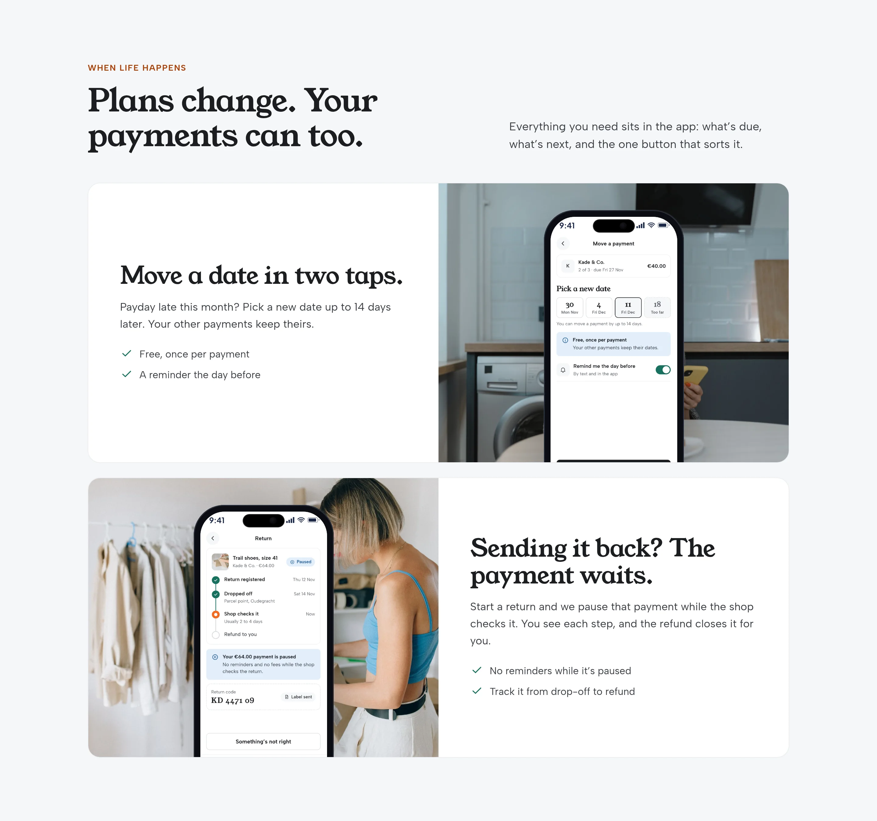
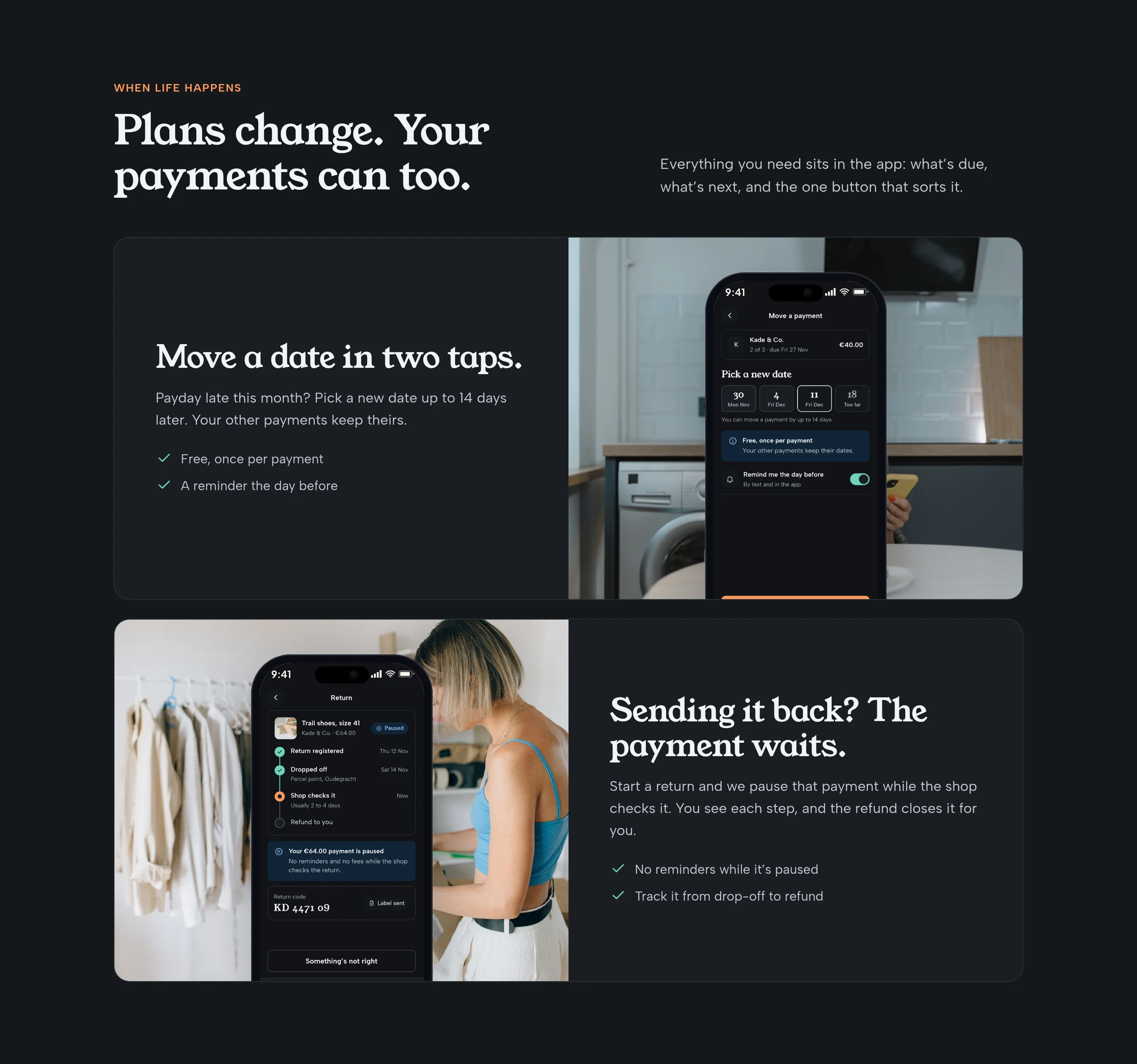
Homepage features for rescheduling a payment and tracking a return, each with a phone screen
Fig. 19Move a date in two taps, or start a return and let the payment wait.
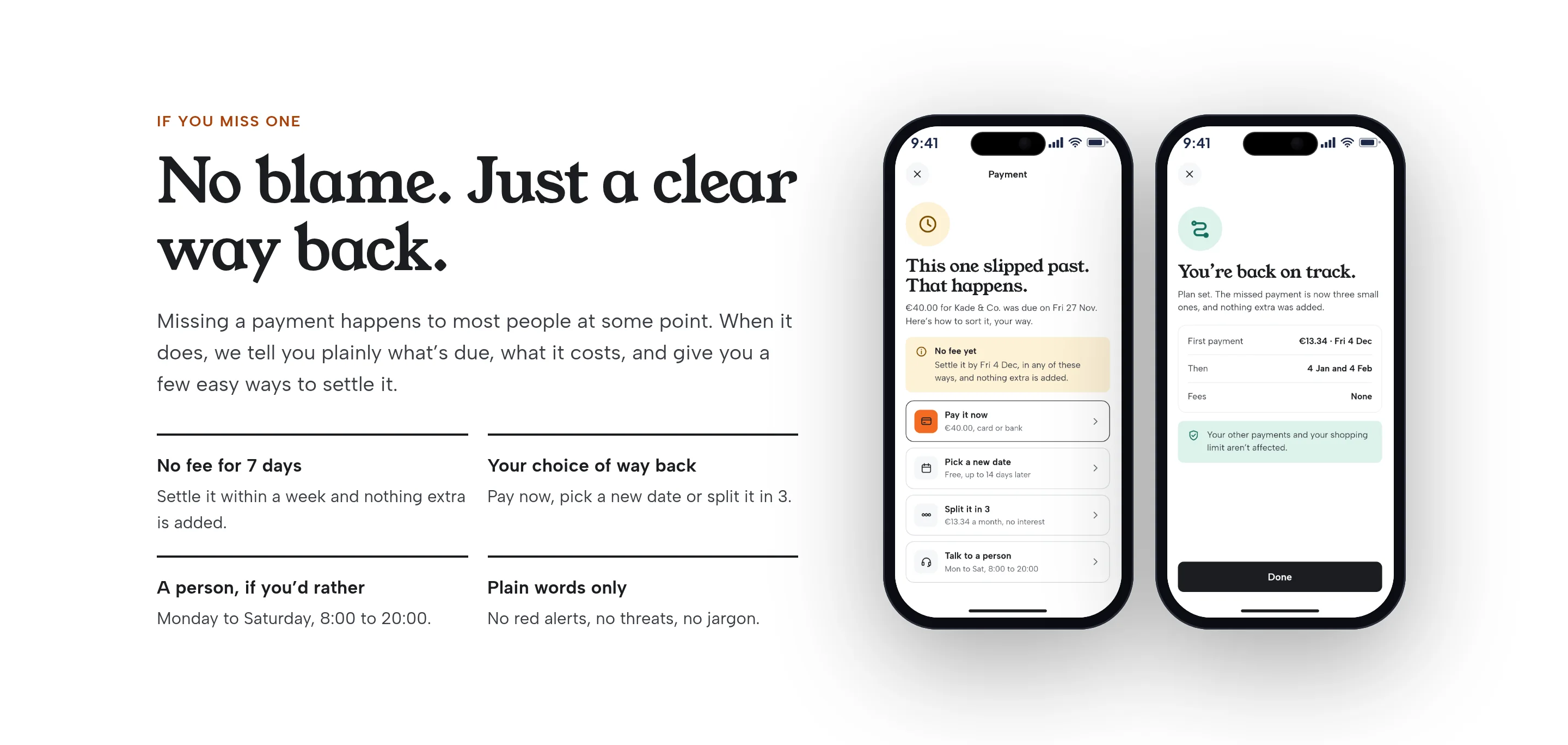
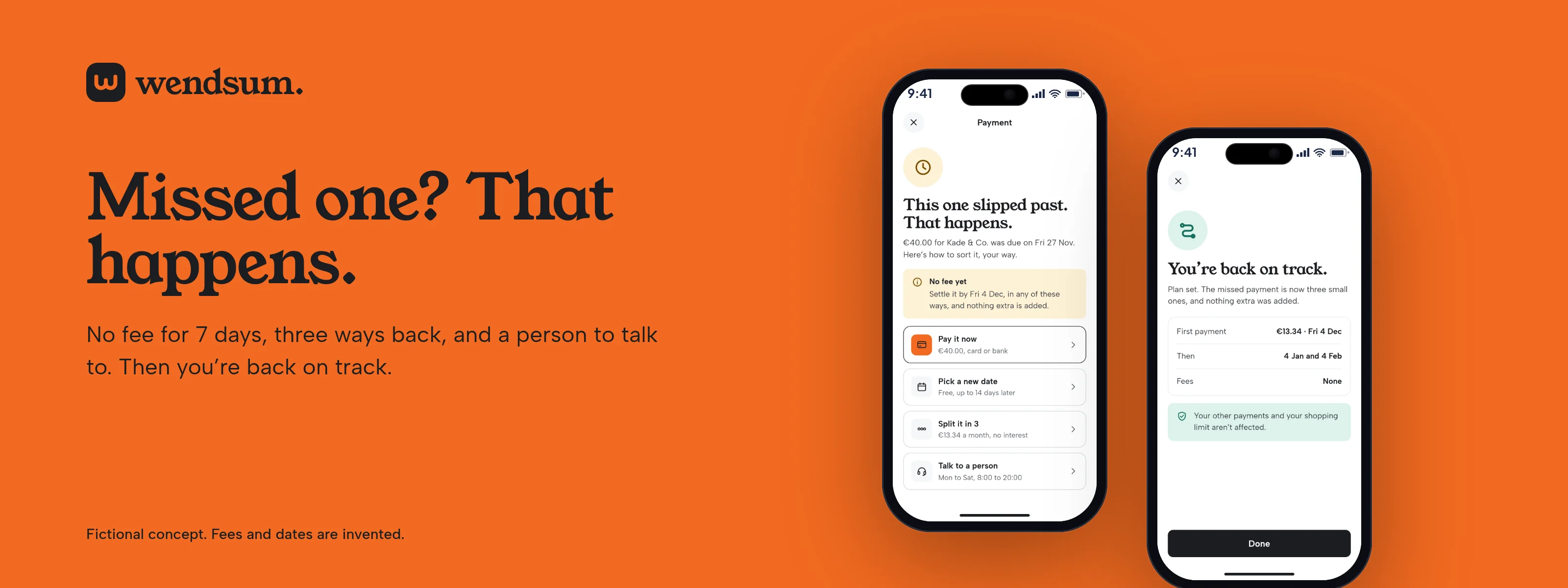
Homepage missed-payment section with two phone screens and the line This one slipped past. That happens.
Fig. 20If you miss one: no blame, a clear way back.
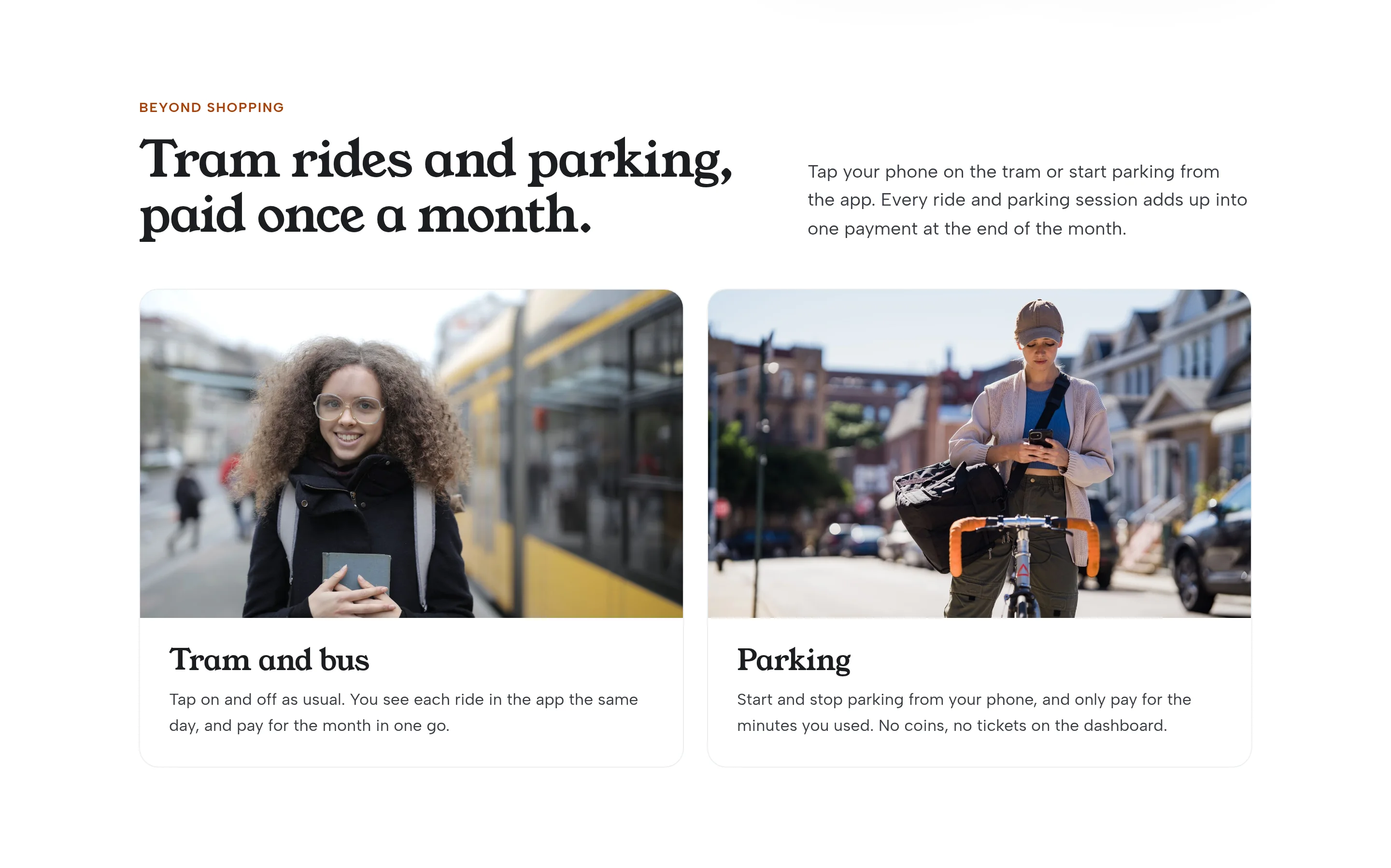
Homepage cards for tram and parking, with licensed photos of a tram stop and a cyclist
Fig. 21Tram rides and parking, paid once a month.
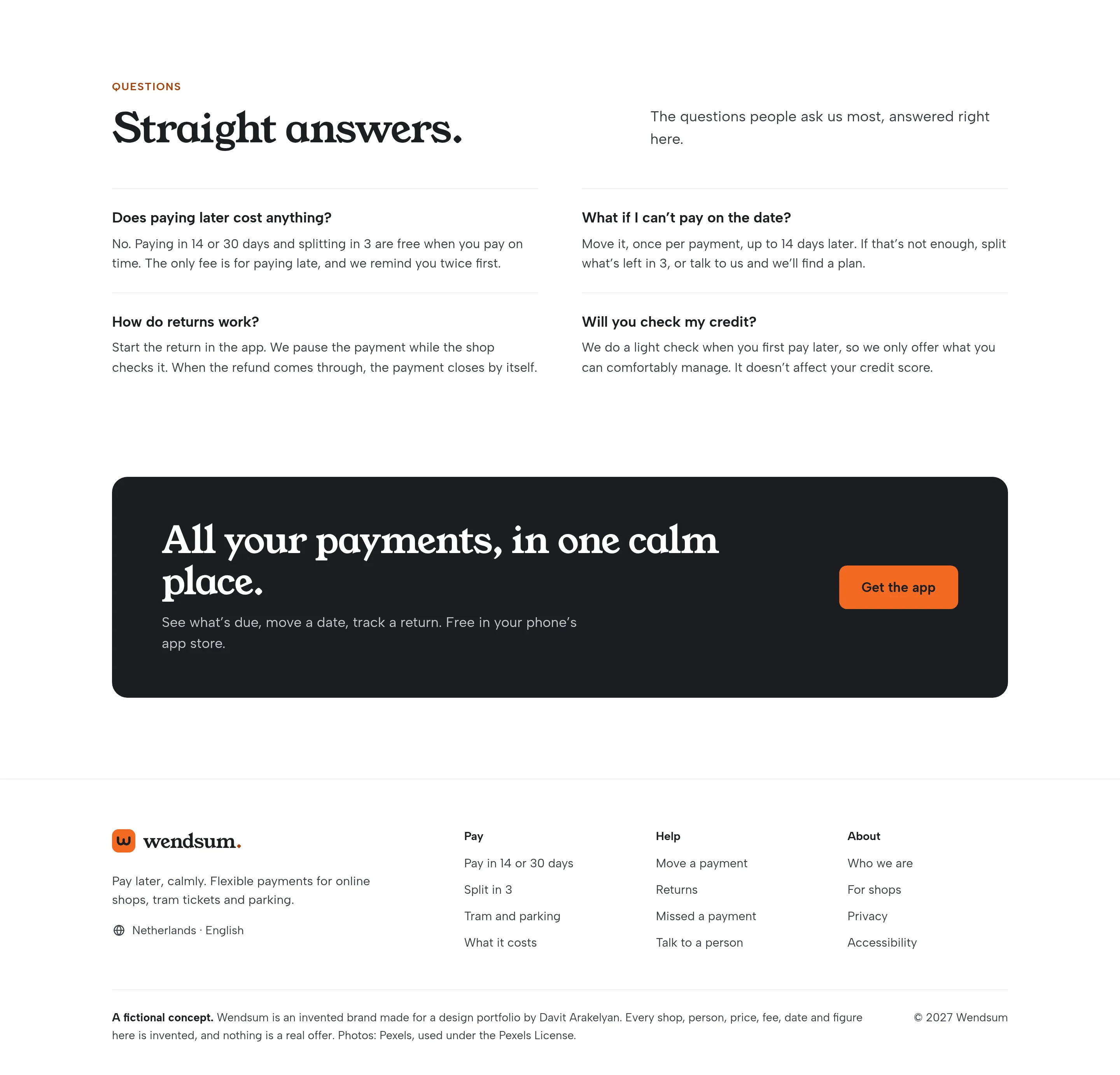
Frequently asked questions and a closing band inviting the visitor to get the app
Fig. 22Straight answers, then a quiet close.
Mobile homepage, light, showing the hero and the three ways to pay
Fig. 23The homepage on a phone, from the hero through choosing how to pay.
Mobile homepage, dark, showing the hero and the three ways to pay
Fig. 24The same stretch in dark mode.
Dark homepage hero and checkout section
Fig. 25Desktop, dark: the hero and the ways to pay.
Dark homepage features for rescheduling and returns
Fig. 26Desktop, dark: moving a date and sending something back.
06Checkout

Every date and amount, before you say yes.

The free options come first. Split in 3 shows all three dates, not a duration. If an option isn’t open, the screen says why and how to unlock it, instead of greying it out. A done state confirms there is nothing to pay today, and exactly when there will be.
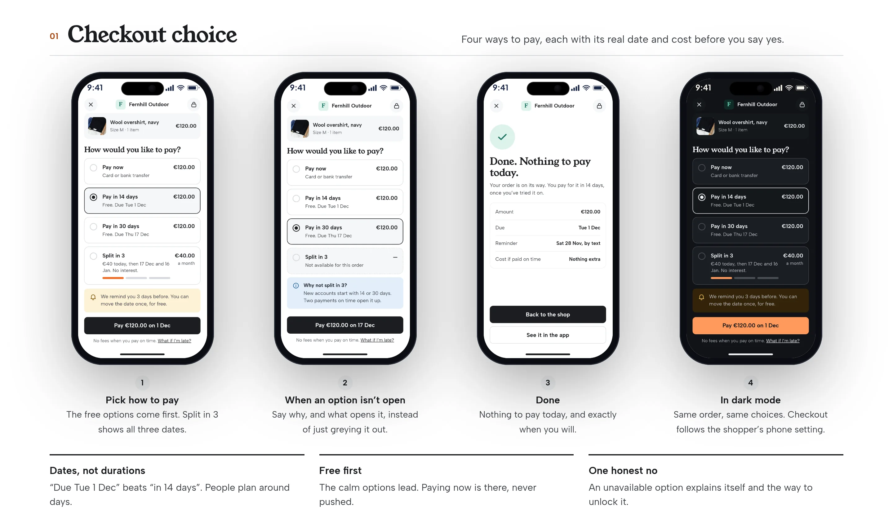
Four phone screens for checkout: the plan picker, an unavailable option explained, a success state, and the picker in dark mode
Fig. 27Checkout: pick how to pay, an honest “not yet”, a confirmation, and the same choice in dark mode. Invented shop and amounts.
07What’s due

One number up top, and a way to move it.

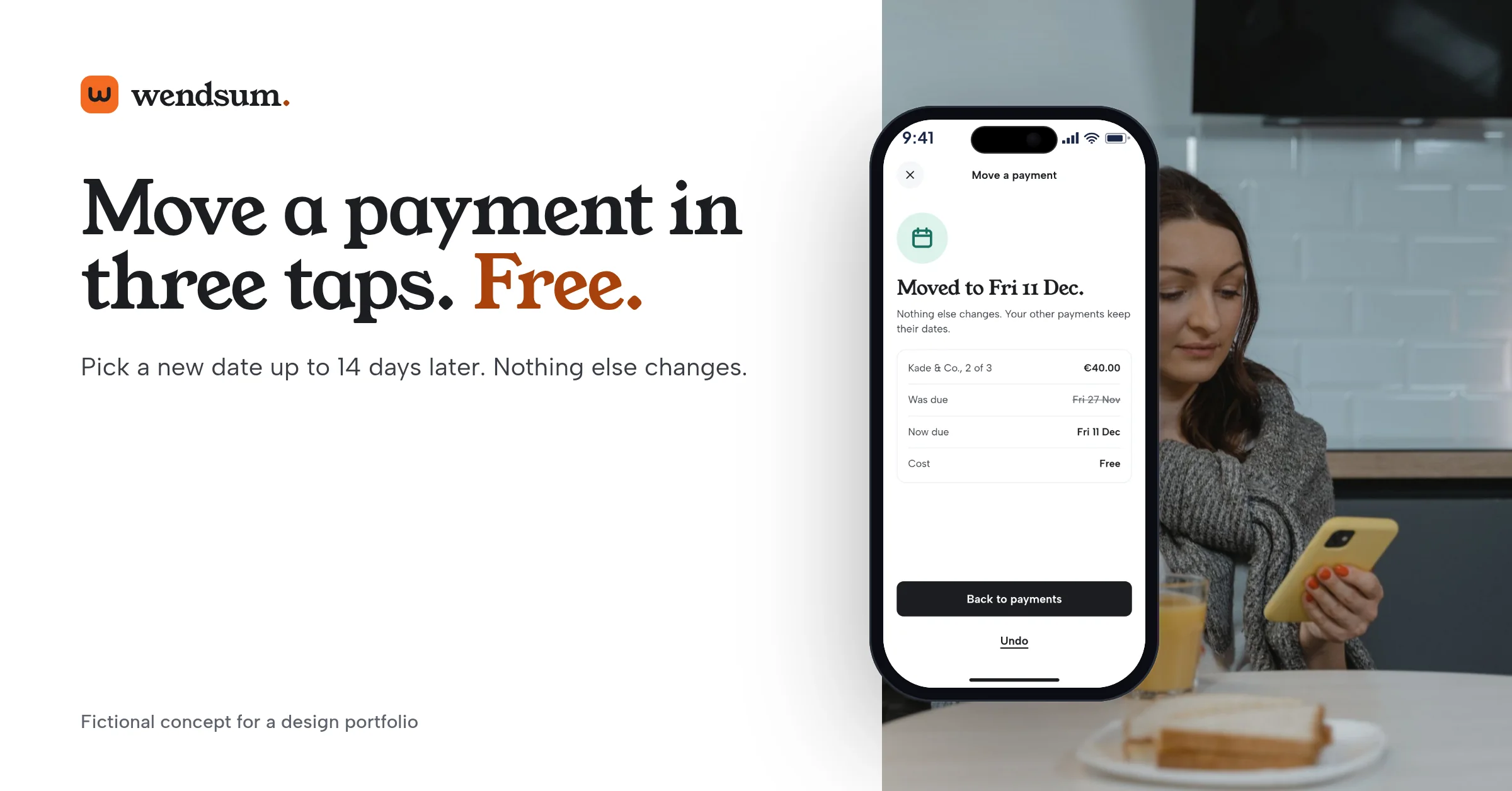
The home screen leads with the next payment, what’s left this month, and what comes after. Nothing due is a thank you, not a blank page. Moving a date takes three taps, is free once per payment, and shows the limit up front. When it’s done, the old date is struck through and you can undo.
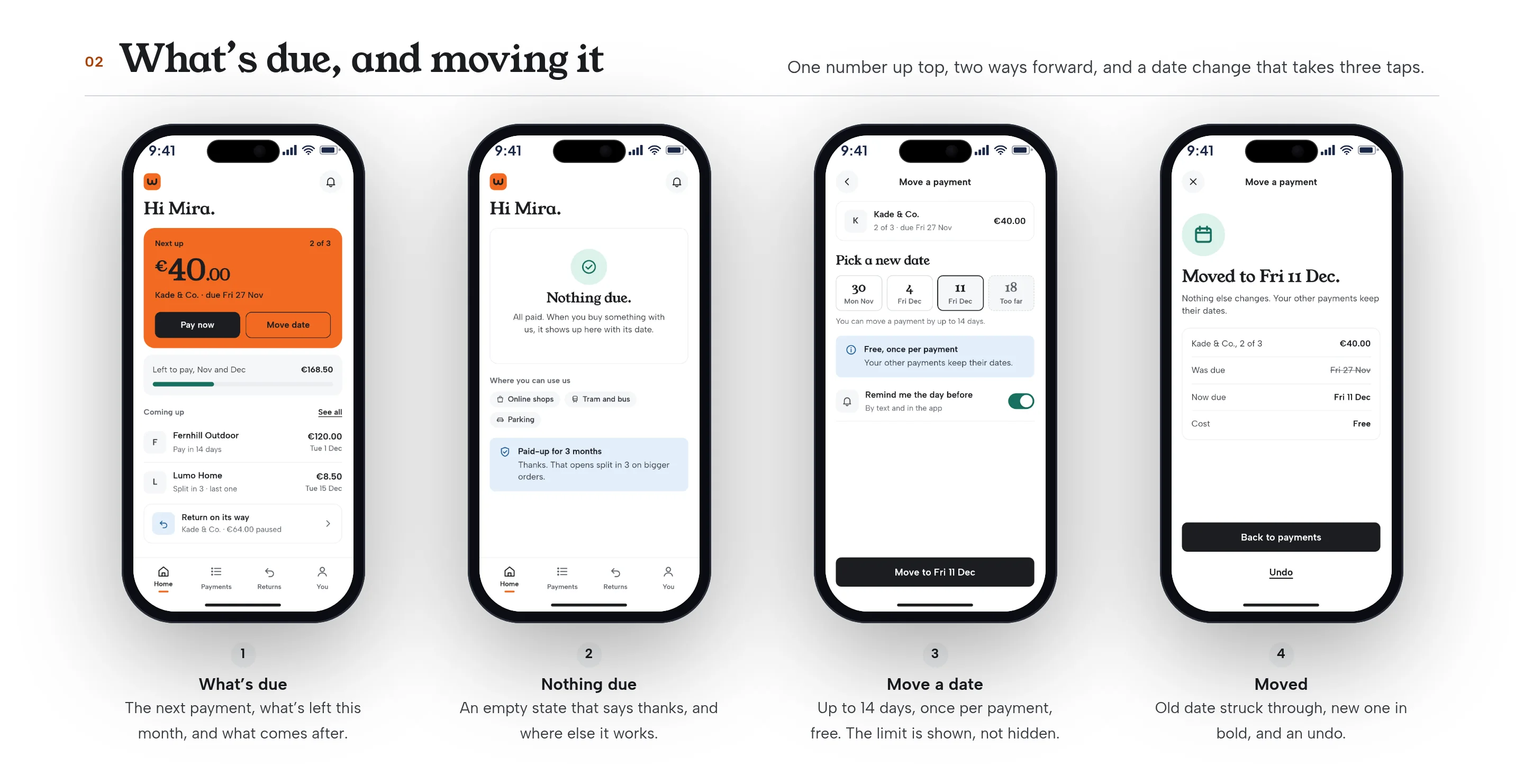
Four phone screens: the home list, an empty state, the date picker, and a confirmation that the date has moved
Fig. 28What’s due, nothing due, moving a date, and the date moved. Invented payments and shops.
08Returns

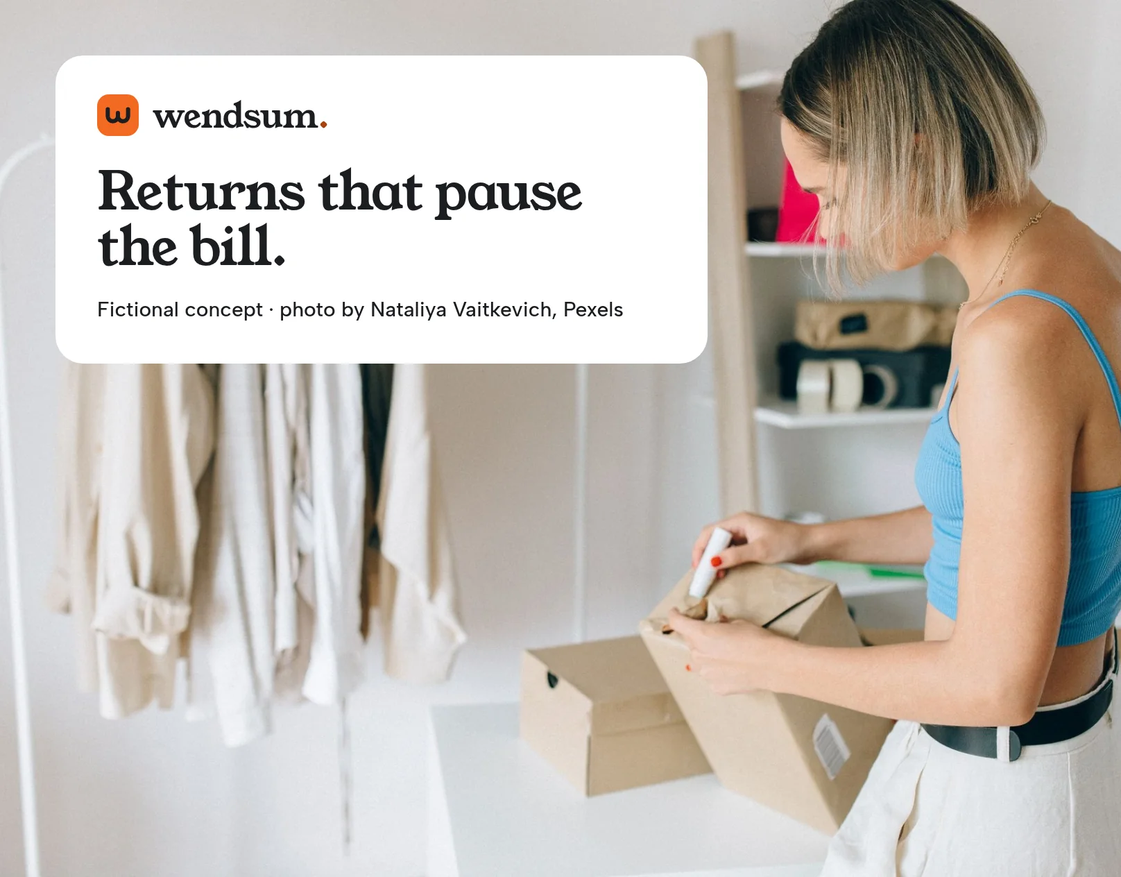
Sending it back pauses the payment.

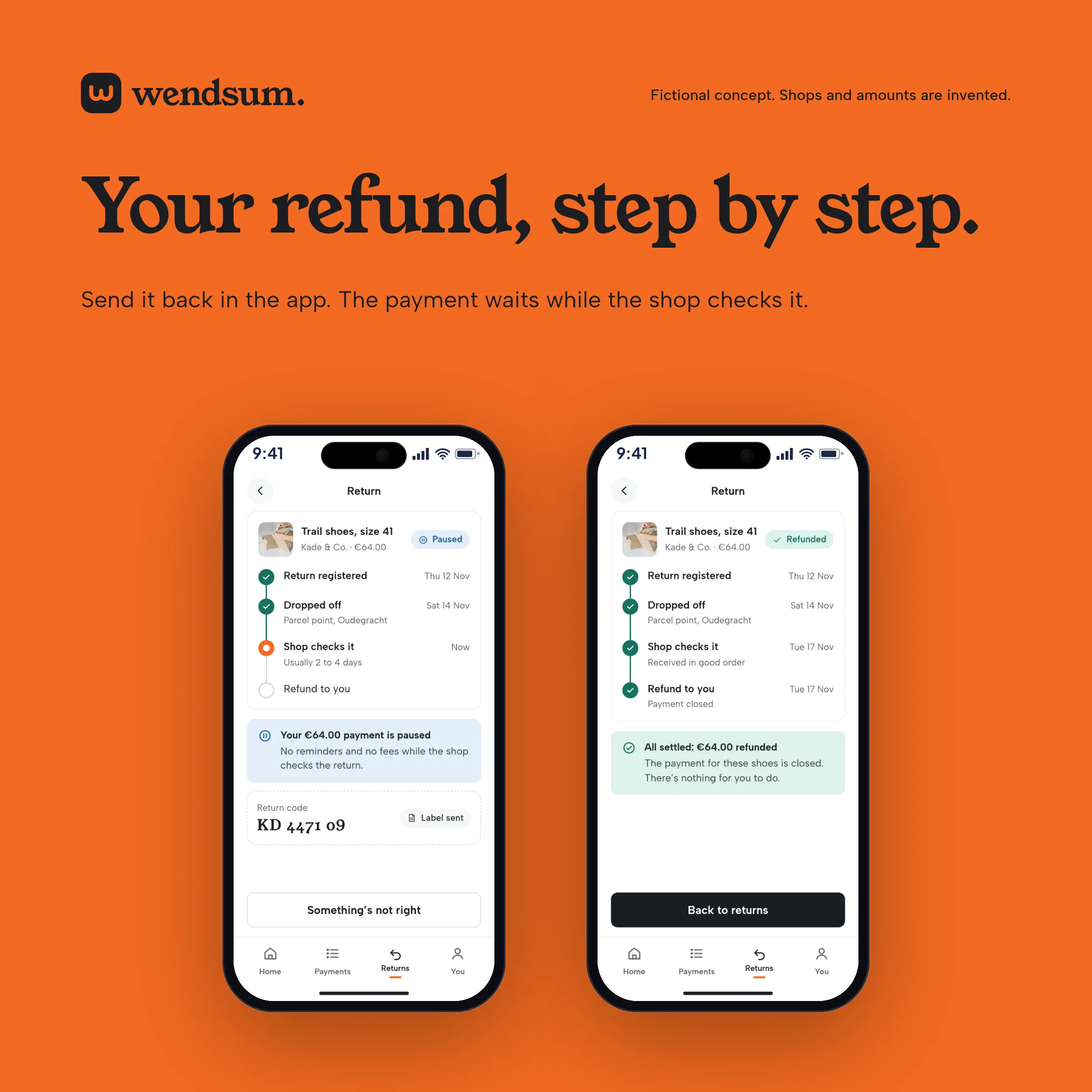
Start the return in the app and that payment waits while the shop checks the parcel. Each step is dated, so nobody has to email to ask where things stand. When the refund comes through, the payment closes by itself. The empty state is a short how-to, in case someone arrived here to start one.
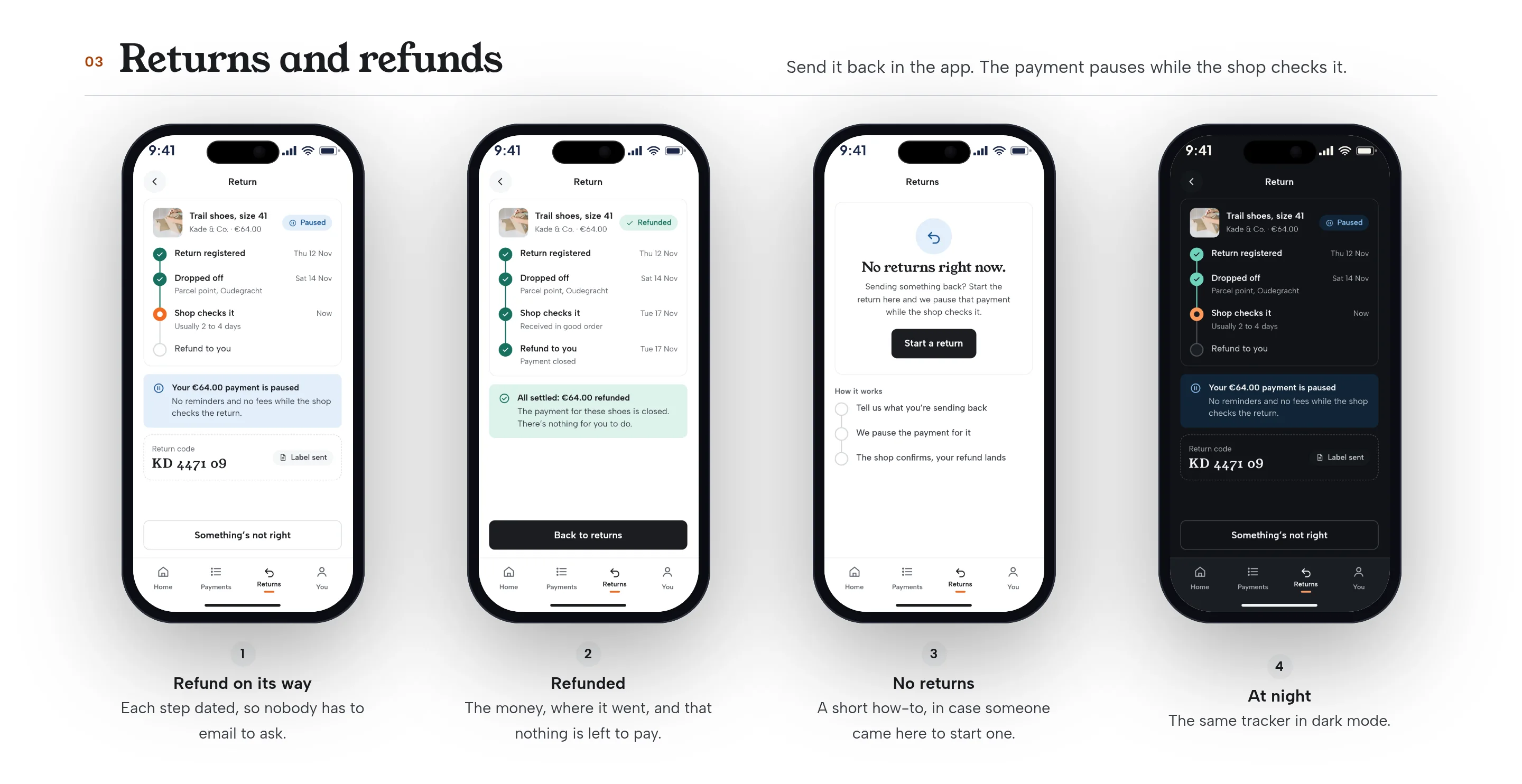
Four phone screens for returns and refunds, including a completed refund and an empty how-to
Fig. 29A return on its way, a completed refund, an empty state, and the tracker at night. Invented order and dates.
09Missed payment

No blame. Just a clear way back.

Missing a payment happens to most people at some point. The screen says so, shows what’s due, and is clear that no fee has been added yet. There are three ways back: pay it now, pick a new date, or split what’s left. If a card is declined, it says who said no and that nothing has changed. Landing back on track is a thanks, not a lingering warning.
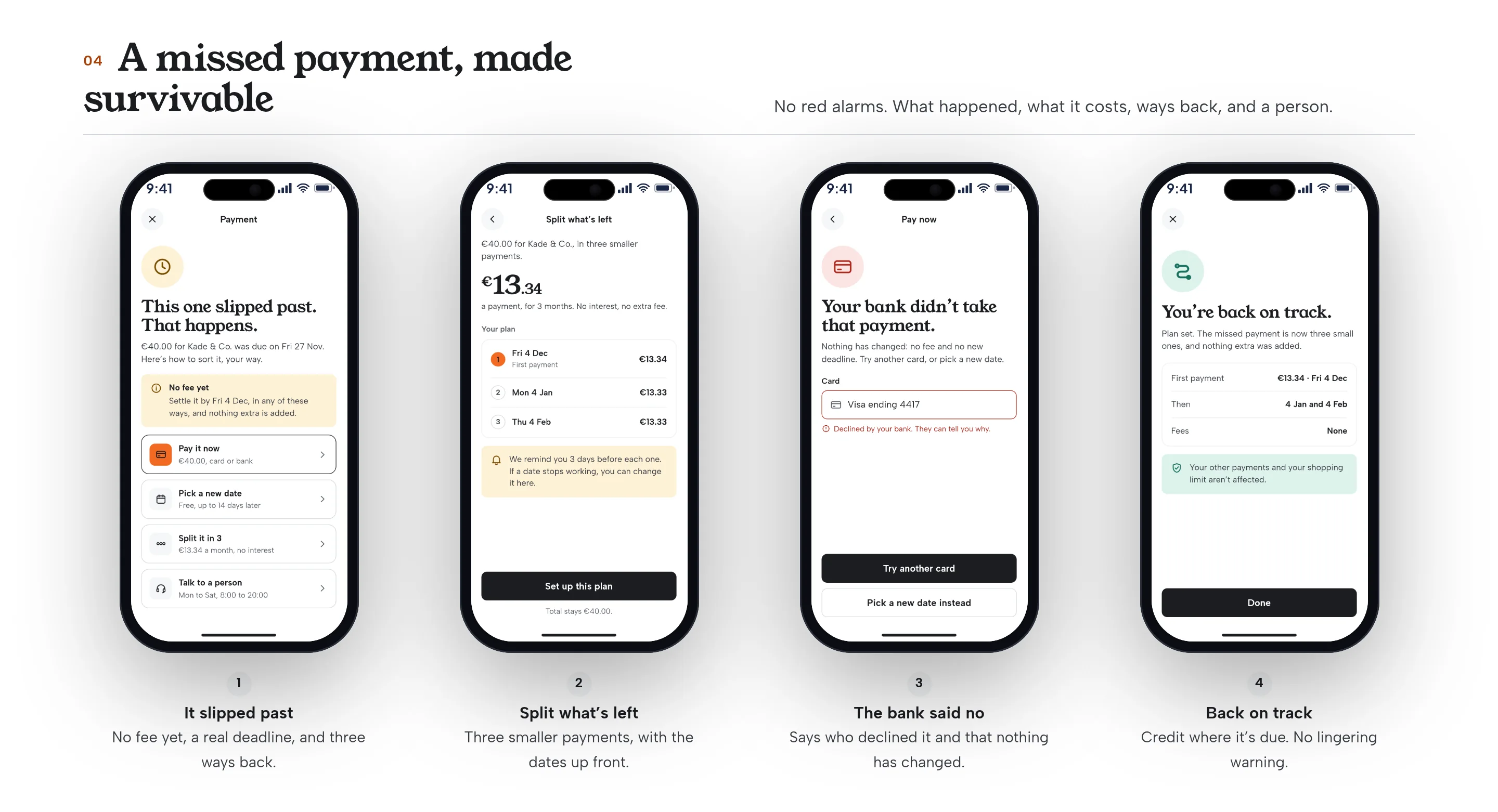
Four phone screens for a missed payment: the first heads-up, splitting the remainder, a failed payment, and a recovery confirmation
Fig. 30A missed payment, a plan to split what’s left, a declined card, and back on track. The €3 late fee is invented.
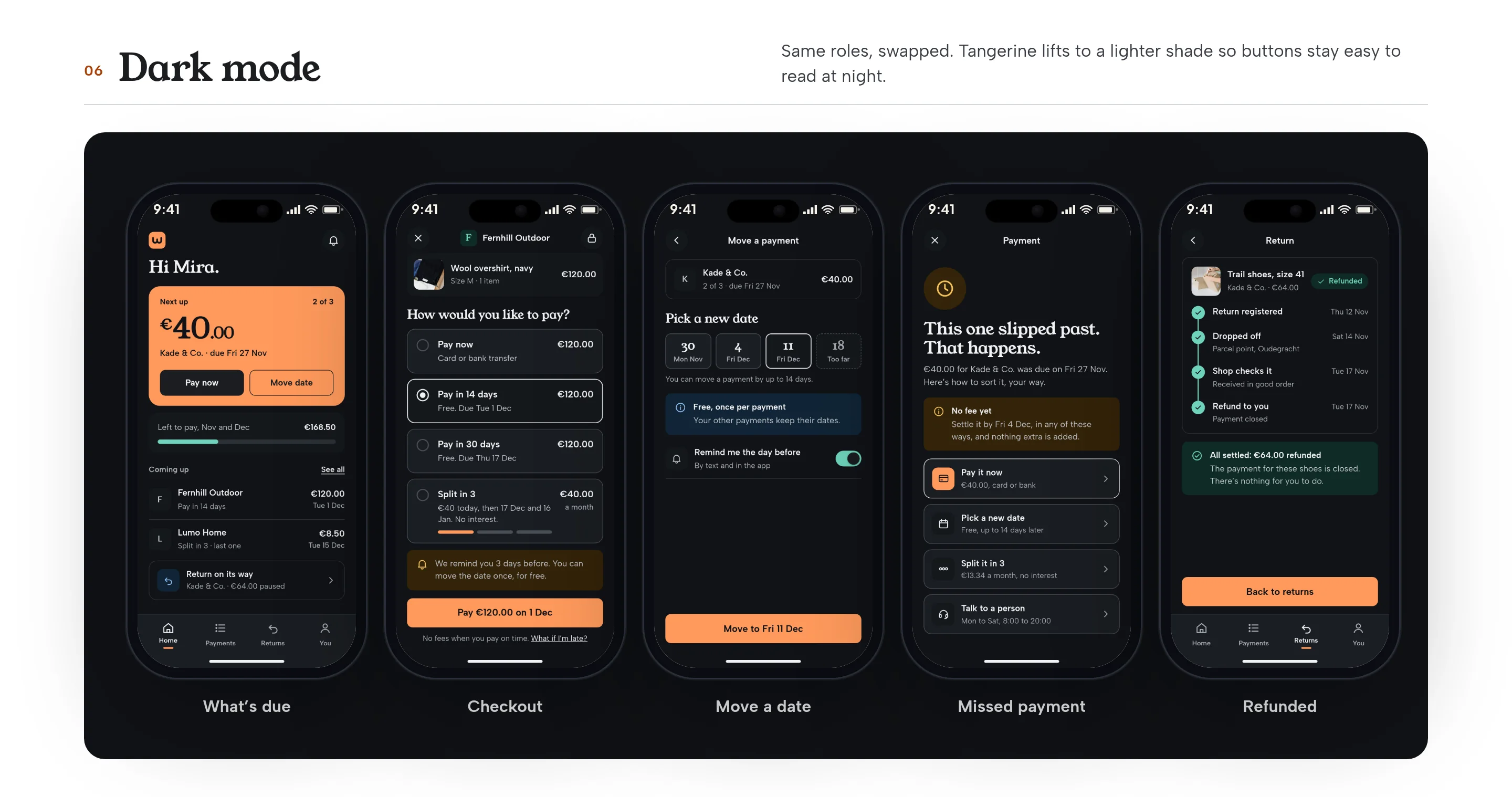
Five phone screens in dark mode: checkout, what’s due, a moved date, a return and a missed payment
Fig. 31The five moments in dark mode, from the same set of parts.
10On the desktop

The same account, on a wider screen.

The web account is for the moments that are easier at a desk: following a return, checking what’s left, and seeing the same numbers as the phone. It uses the same system, in light and dark.
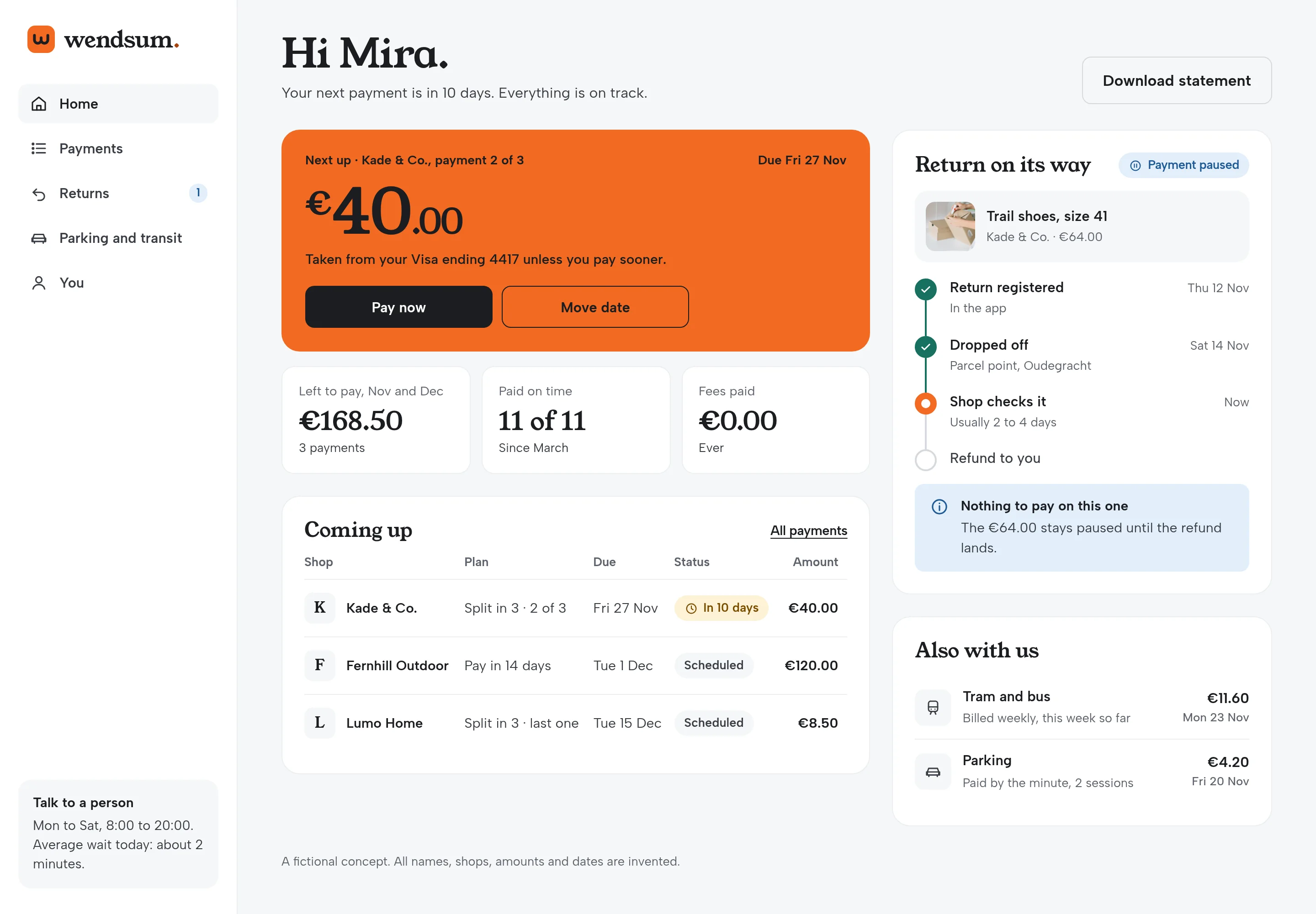
Desktop account in light mode, showing a return being checked by the shop
Fig. 32A return in progress on the desktop account. Invented order and dates.
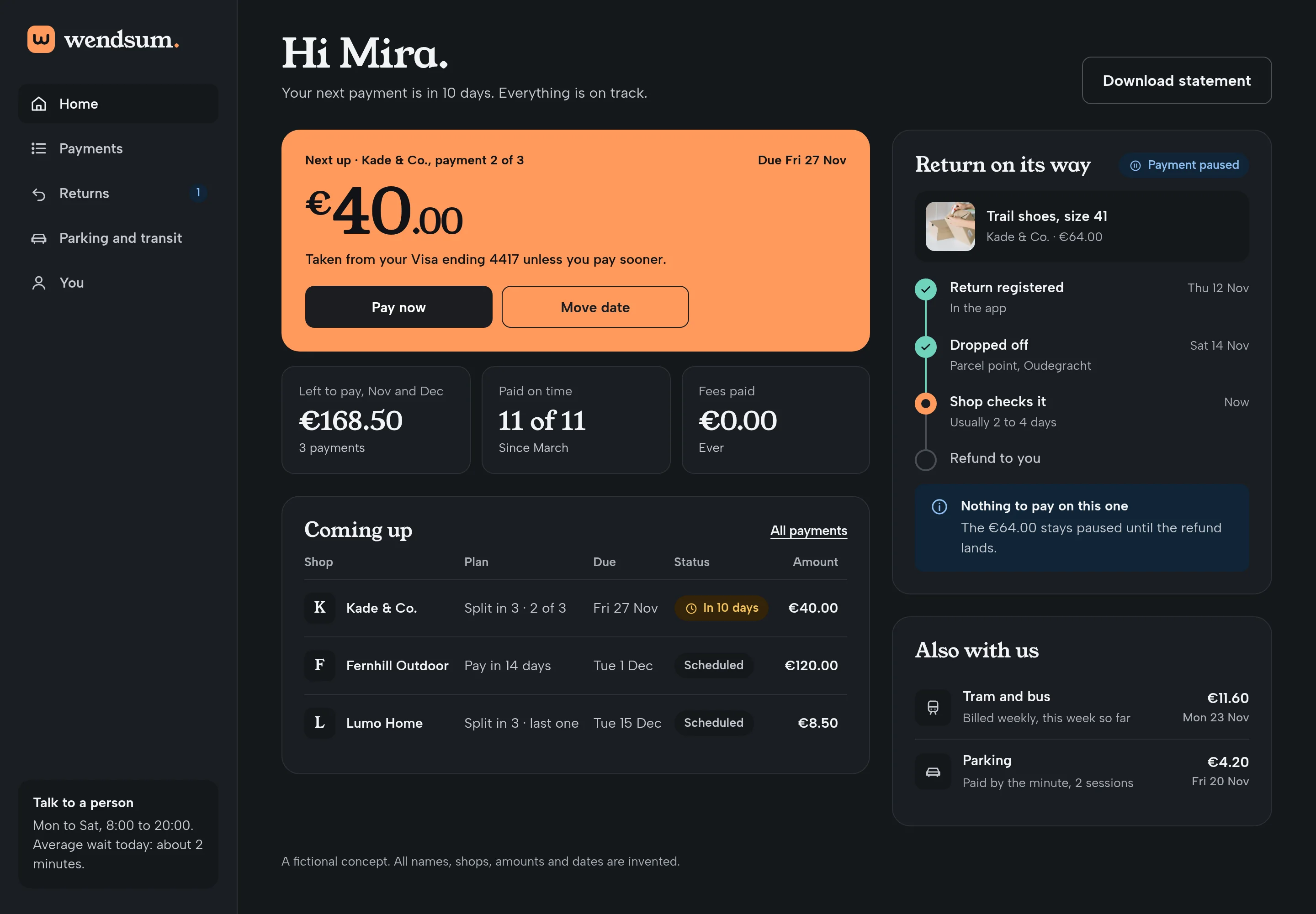
Desktop account in dark mode, showing a return being checked by the shop
Fig. 33The same account in dark mode.
11Banners and social

One idea, from the cover to the feed.

The banners reuse the product and the photographs, not a separate campaign world: one short line, the mark, and a screen a customer would actually see.
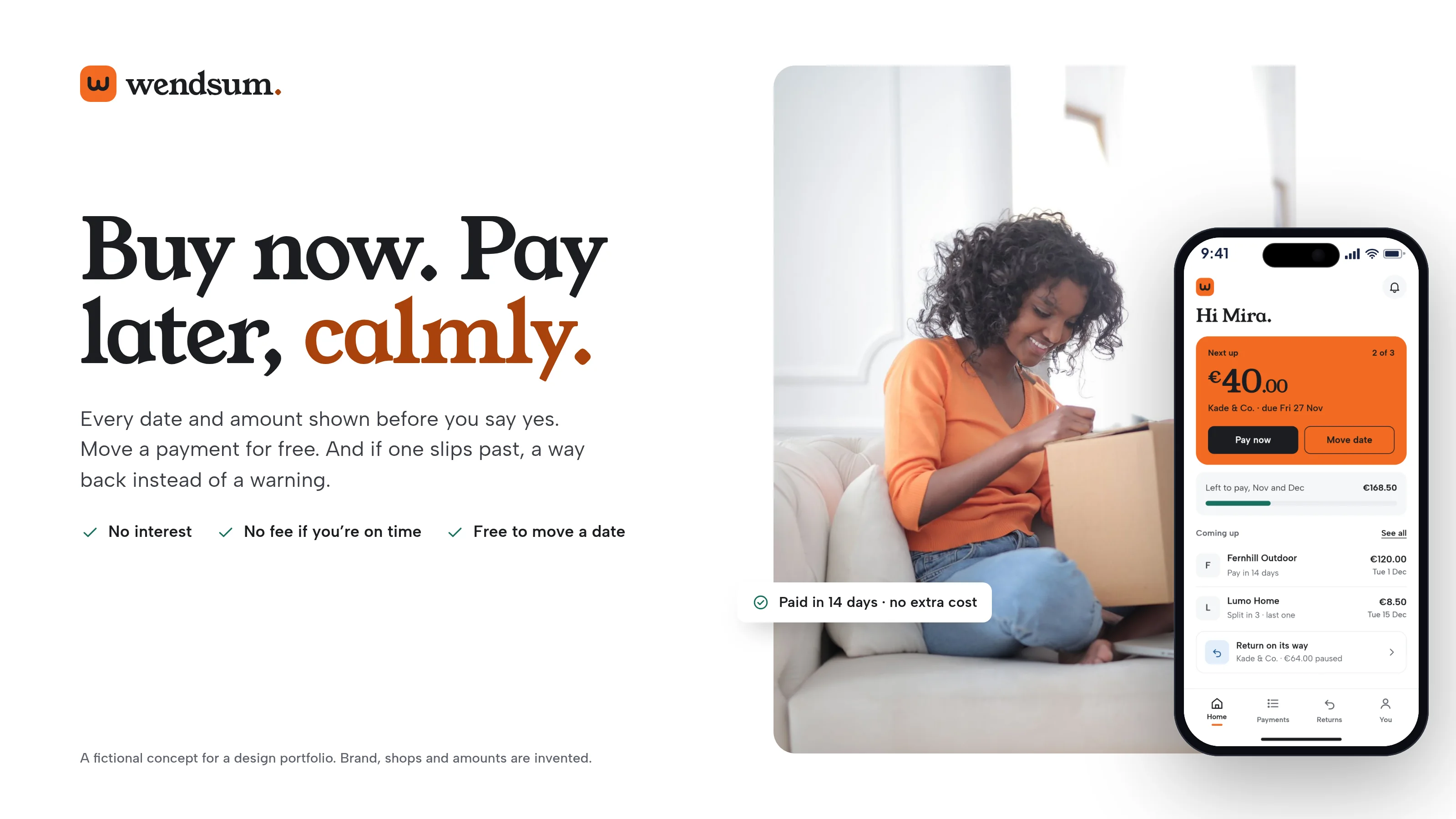
Hero banner with a photo of someone opening a delivery, the headline, and a phone showing what’s due
Fig. 34Hero banner: buy now, pay later, calmly.
Wide campaign banner with the missed-payment screen and the line This one slipped past. That happens.
Fig. 35Campaign banner: this one slipped past, and that’s all right.
Social banner with a breakfast photo, the headline and a phone
Fig. 36A wide post: all your payments in one calm place.
Square social post with the Wendsum mark and two phone screens
Fig. 37A square post: the mark, the line, and two screens.
Portfolio cover: Pay later, calmly, with product tiles and photography
Fig. 38Portfolio cover with the mark, the line and the product.
Tangerine case cover with the Wendsum lockup, the headline and a phone
Fig. 39Case cover on tangerine.
12

What I’d test next

  1. Whether shoppers pick “pay in 14 days” more often when every date is shown up front, versus a duration like “in 14 days”.
  2. Whether people who can’t pay this month use “move the date” or go looking for a help article.
  3. Whether the missed-payment screen, with no fee yet and three ways back, gets more people to settle before the fee than a warning-heavy version would.
  4. Whether starting a return in the app, and seeing the payment pause, reduces “don’t charge me” messages to support.
  5. How the invented late fee of €3 is understood: is “no fee yet, settle by Friday” clearer than showing the fee as a future line.
  6. Whether the tangerine mark and the next-payment card still stand out for people with colour-vision differences, given that words and shape carry the status too.
Next project

Tuckbell Food Delivery

Food delivery and promotions concept

View case study →
Tuckbell Food Delivery cover
Contact

Let’s get in touch.

Open to remote roles. Let’s talk.

davitarakelyan92@gmail.com